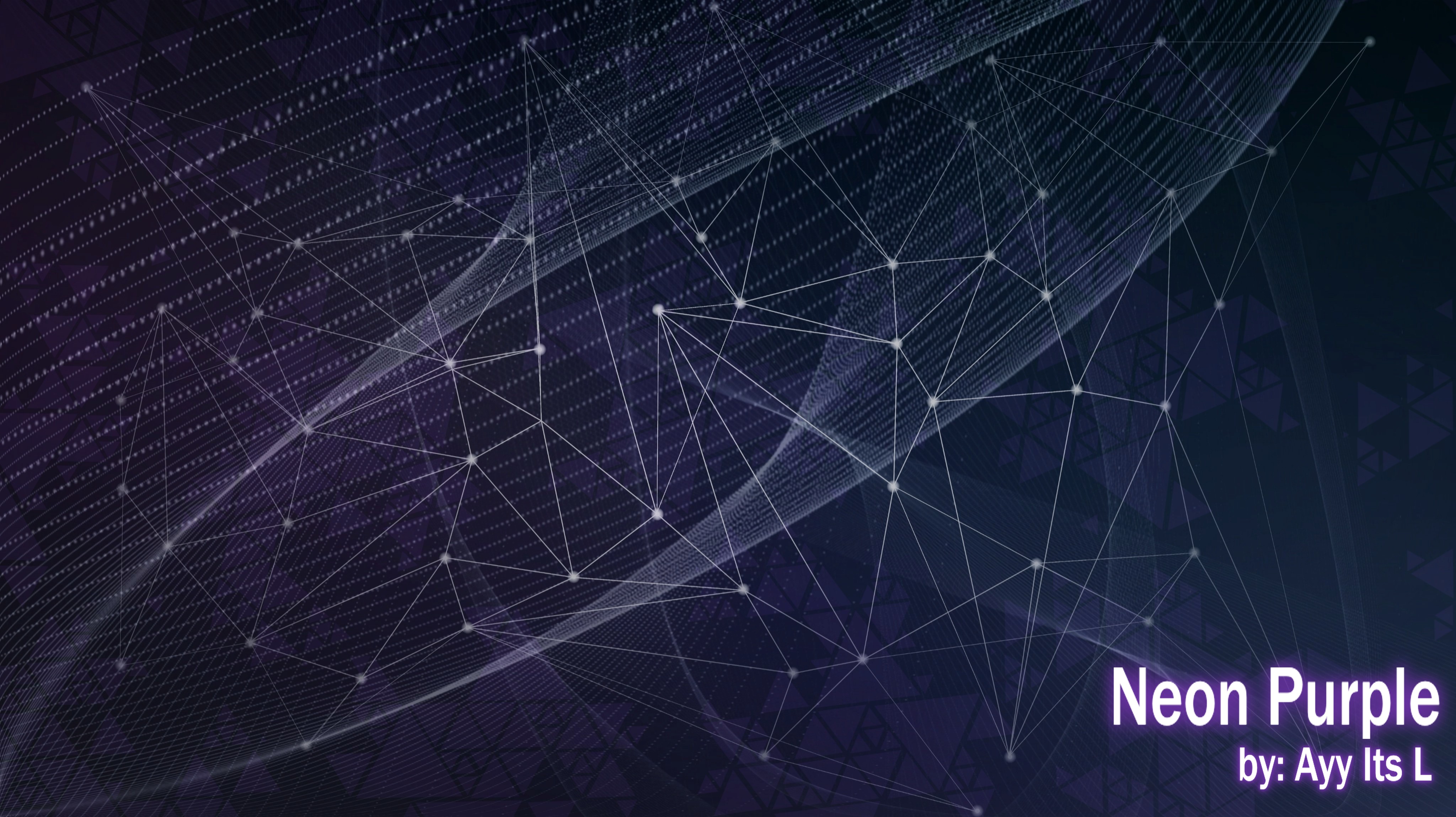
Hello, this is my submission for the Unchained Skinning Contest
First time skin maker here, this has been on the small project I did here and there over the past year. Not made for any particular skinning contest but will be submitting to the "Unchained Skinning Contest". Learned on the fly while making this, meaning I did a lot of Google and Youtube searches(lol). Solo made by me unless specified otherwise. I focused most of my attention to the hitsounds, ui sounds, and hitcirlces.

My motivation behind this was personal preference. I do not like flashy or anime girl skins(sorry), made purely in mind for (my)eye comfort during gameplay. It might me simple but I hope to help and just show other people. I am just one guy but I double checked the rules of the contest and tried to follow them the best of my ability. I am bound to miss something, so please give me your honest opinions. Another thing is the name I chose was the first thought that came to my mind, so if you have a better name feel free to share your thought. I am looking for better name/title suggestions.
Download Link
ScreenShots
First time skin maker here, this has been on the small project I did here and there over the past year. Not made for any particular skinning contest but will be submitting to the "Unchained Skinning Contest". Learned on the fly while making this, meaning I did a lot of Google and Youtube searches(lol). Solo made by me unless specified otherwise. I focused most of my attention to the hitsounds, ui sounds, and hitcirlces.
My motivation behind this was personal preference. I do not like flashy or anime girl skins(sorry), made purely in mind for (my)eye comfort during gameplay. It might me simple but I hope to help and just show other people. I am just one guy but I double checked the rules of the contest and tried to follow them the best of my ability. I am bound to miss something, so please give me your honest opinions. Another thing is the name I chose was the first thought that came to my mind, so if you have a better name feel free to share your thought. I am looking for better name/title suggestions.
Download Link
ScreenShots
credits
U.I. - Ayy Its L (Menu Background sampled from pixabay author placidplace and edited by me. The osu transparent triangles sampled from this wikipedia page unedited)
U.I. Sounds - Ayy Its L (go.wav,ready.wav, pausemusic, and failed.wav sampled and edited by me from pixabay author UNIVERSEFIELD)
Hitsounds - Ayy Its L (drum,soft,and normal hitsounds edited by me, samples from forkypic 1.0 hitsound pack)
Catch the Beat - Ayy Its L
Standard - Ayy Its L
Theme - i got the inspiration from my favorite color being purple and abstract patterns. the purple triangle pattern is made by me but the idea came from this.
notes
i really tried my best to not sample any sounds, ui, or gameplay elements from anywhere but some things i cant make myself. all samples not made by me are free to use and properly credited(even if not needed) to the best of my ability. i do have more options for hitcircles, slidercircleoverlays, cursors, and hitsounds. almost all ui pngs, hitsounds, ui sounds, and catch the beat pngs, are the identical through all three versions. color combos can be changed yourself in the skin.ini if you do not like the colors of the hitcircles. none of these files were shared with anyone else during the making of this, everything was done solo by me on my own pc
programs used
Audacity- audio software
krita- art software
Microsoft Clipchamp- for making of youtube video
krita- art software
Microsoft Clipchamp- for making of youtube video
fonts
combo numbers are 'lucida sans unicode' edited by me
ranking letters, score numbers, and everything else inbetween are 'bahnschrift' edited by me
ranking letters, score numbers, and everything else inbetween are 'bahnschrift' edited by me
permissions
if you just wanna use any of my sounds for personal use thats perfectly fine by me. but if you want to use any of my sounds or gameplay elements for non personal use. all i ask is for proper credit in your post, or in the skin.ini

