i don't know what's worse
the song or me modding this
i owed you a mod a while ago
like 20 years ago, i think it's time to fix all these mistakes i made
normal00:11:685 (5) - what i'm going to say can be a little bit dumb, however this is the longest pattern throughout the entirety of the difficulty and it is barely the beginning, without even being intense whatsoever. as such, i think a circle would be a much better option, since deleting 00:12:757 (2) - for the sake of "simplicity" will make this even worse
00:32:685 (1,3) - could make these symmetrical for better /aesthetics/
00:36:971 (3,4,5,6) - i would say you are prioritizing the wrong vocals here. you can take a different approach to this rhythm by mapping 00:38:471 - and ignoring 00:37:614 - because there's nothing worth emphasising with this 00:37:400 (4) - 1/2 slider. this pattern
https://i.imgur.com/DcW4E2d.png would be more fitting
00:58:400 (3) - minor, but this slider stands out for the rest of the map. the shape is way too different to everything else, even 00:46:400 (1) - , and that makes this pattern as a whole look quite unpolishde
01:28:400 (1) - the spinner starts off at a quite questionable spot, why there instead of 01:27:971 - ? why is there even a spinner, tbh. i cannot seem to find a solid reason as to why you wouldn't map the en ding... like you CAN. also! the finish hitsound at the end? yea that doesn't fit at all, too loud and it doesn't even belong there
 hard
hardwhy is this difficulty so hard
like, it's meant to be a 'Hard'... but this hard?
there's not a single break when there could be some
i'm not asking you to nerf the difficulty immensely, but at least add some sort of breaks for the players, because in terms of density this isn't much different from the insane. and the normal has constant breaks
let me list some examples of objects that could be deleted for the sake of simplicity:
00:05:043 (7) - 00:08:471 (7) -
00:10:185 (4) - 00:11:900 (4) -
others, while not deleted, could be turned into less objects, such as 00:34:400 (1,2,3,4) - being reduced to 1/1 slider + circle + 1/1 slider instead of 4 1/2 sliders
that aside,
00:39:114 (4,1,2,3,4,5) - pattern doesn't look cool at all, and the stack makes it even harder to read
01:03:543 (1,2,3,4) - i don't understand why would you map these different from the rest of the whole section...like everything else was mapped with 2circles+slider and this is a vague slider spam? odd, to say the elast
01:30:114 (3) - hitsound thingy? yea same here; and on the insane too, but lazy to mention it
there's also other things i think are worth fixing, such as 01:27:328 (4,1) - vs 01:23:900 (4,1) - ; or 01:18:543 (5,6,1,2,3,4) - in roder to have an actual contrast between different obejkcts instead of playing the same, but that's going into too much mionr details, and probably you have a reason for these inconsistencies
insanenow, i think this is the difficulty that will bring up the most controversy
actually it won't, but i want to say something about how this difficulty is mapped vs how it should be mapped. like i cannot actually tell you that, because everyone has its own style and feels this differently, but the way you are representing different ob jects and sounds has literally no impact on the song
you map the same patterns over and over again even when the music is completely different; or rather than different, the emphasized sounds aren't properly mapped. that's because you have focused entirely on aesthetics instead of rhythm
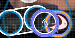
whistle hitsounds get the same spacing and angles than drum/clap sounds, and that is something that doesn't go unnoticed. the biggest example (as this happens every single pattern throughout the map) is 00:12:114 (1,2,3,4,1,2,3,4,1,2,3,4) - , where 00:12:543 (3,3) - get the same kind of impact (always speaking about gameplay) as the most prominent beats 00:12:971 (1,1) - . while not a huge deal, it actually bothers people who cares about the song a bunch, simply because it's getting ignored for the sake of making a harder difficulty instead of presenting something more suitable like squares into jumps or something like that. an example of proper emphasis would be
https://i.imgur.com/57TBg5K.jpg e.g.
now, there's many different approachs you can take to this single problem, but the thing is that this simple thing affects the map as a whole. it just wasn't mapped accordingly to the important beats of the song
there are other instances where the emphasis is properly done though, so don't get me wrong. you know when to properly emphasize objects, but you do it way too often, resulting in most objects not reflecting what the song is actually doing
as for what sliders do, pretty much applies the same that i have already said, emphasis isn't put well. the example i'm going to take is 00:15:543 (1,2,3,4) - and how there seems to be little to no contrast between the drum hits and the non-drum hits. i came up with this idea that you might (or not) like, but it pretty much shows what it could be done
https://i.imgur.com/LOLZKsG.jpg - you apply pressure on (3), but you keep the distances from the quiet notes with little spacing
so yea that's it
the ending of the map is neat, you could leave that as-is even though i'd suggest some tweaks here and there as well; but overall it's better than the intro
[]
sooo good luck and cool set!


