forum

Beginner's GFXB #2: Color Palette Challenge [Finished]

posted
Total Posts
6
Topic Starter
Reunilu
Affiliiated with Artem Familia

This is a personal favorite art meme as an illustrating artist! I find using limited palettes very fun and using limited palettes in GFX is very satisfying to me.

Remember the following if you want to participate:

  1. Your entry must follow the theme and GFX type.
  2. Your entry must be within size limits.
  3. Work must be submitted before midnight GMT of the due date.
  4. Plagiarism is absolutely, most definitely, and highly not allowed. You will be disqualified if you are found using or editting someone else's work and banned from future Bimonthlies.
  5. All submissions have to be anonymous. If you're participating, you can leave a post here saying that you're participating, but it's not required. You can also leave comments about your entry, but don't outright post what it looks like.
  6. As such, please PM Reunilu or any other person hosting the with the form below. DMing via Discord is allowed.
  7. Because this is all anonymous, if you have a watermark that includes your name, please use a different watermark.
Rules Specific to Beginners GFXB

  1. Those who have already participated in regular GFX Bimonthy cannot participate in Beginner's.
  2. Those who have won Beginner's at first place four times times must move on to regular.
  3. People can move onto regular anytime before winning first four times.
Details

  1. Images for the color palette challenge can be found using standard Google Images. Pick one and choose which color pallete you're going to use.
  2. Please include the image of the color palette meme you chose with your submission. You may use this one.
  3. Not all colors of the palette you chose have to be used, nor do they have to apply to the render that you chose.


Theme: Color Palette Challenge
GFX Type: Signature/Tag
Max Size: 700 px x 400 px


Form and Example:

[insert entry here]
[insert forum code for image here]
Proof:
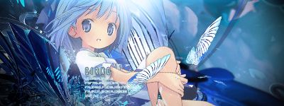

[img]http://orig06.deviantart.net/f6f2/f/2014/158/a/4/a4abacda5735b72780f54392e700b5ff-d7lfc7o.png[/img]
Proof: http://www.mediafire.com/file/hianexample


Due Date:June 3rd


Banlist

  • Kamikazy - Plagiarism. Cannot participate 'til hell freezes over.
Topic Starter
Reunilu
My mouse seems to be almost out of battery and there aren't any more batteries in my house, so I'm not going to format it like I usually do and using my pen tablet as a mouse is a pain.

Unfortunately, there were only two entries, so Bimonthy might slow down in response unless you guys REALLY want Bimonthy to keep going as it is, and for that I need your responses.
Same rules for voting apply for this competition.

  1. Everyone is able to vote. However, the participants will not be able to vote for themselves, as votes towards themselves will not count.
  2. Voting is about who has the most skill.
  3. Votes will be counted by post, not poll.
  4. All votes must have a reason for their vote. You don't have to be a GFX artist to list technical reasons, of course. That said, constructive critcism is highly encouraged.
  5. One vote per person.
  6. This isn't a required part of voting, but if you would like to suggest themes for future GFX Bimonthies, go ahead. : >
A quote from my friend Spitty:

  1. Does the signature fit the theme?
  2. Does it look pleasing?
  3. Do you think proper techniques were used?


Kurochiie
Oh, I get it. This is a battle between Gandalf and Genji. Well, GG. Hahahaha. Hahaha... //kills self
asdfghjjkl Improvements here and there, people!
Gandalf
This is fantastic. Choice of render is a plus because it's Gandalf.
The artist could've lower the opacity of the black canvas (?) because I can't really see the background. Hafta squint to actually see the cat.
It's well-blended. Simple yet naisu.
Over-all, it's outstanding!

PS: The artist improved a lot. :>
Genji
Ah, Genji. *insert Mercy's KYS emote here*
I love the concept for this one. I bet the artist took his time rendering Genji's skins. I love how he/she put Genji's default skin behind.
The techniques used are carried out so well but the circles surrounding the renders aren't that pleasant to look at and the red-yellow-blue-green color combination. But the concept is freakin' superb!
Hard time choosing which one to vote. But--
My vote goes to Gandalf because of the theme.

Fvck English.
MoeChuu
Both was good, but I'm not really a fan of the primary colors together, love that Genji renders though.
But, I vote for Gandalf. It has a really nice ambiance to it even if it's simple. Should've made it lighter, but I like the effect on it.
notkesh
Aight, let's do this.

Gandalf
This is pretty good! Render well blended with the background, good lighting on the render aswell, and the general vibe of the picture fits together. However, the image is too dark. You could've CC'ed it a lil bit better; also, it lacks depth. I think some kind of smoky texture on the bottom, front of the render would look nice. The shadow of the cat is also too sharp, could use a little bit of blur, but i loved this detail. Finally, the text. Awesome choice of style, good placement, but i don't like the font, just personal preference. Overall this is damn good, congratulations!

Genji
Okey, so i'm a little confused by this one, because i don't think the artist followed the theme for this one, which was Color Palette. While the 1st one kept everything in the B&W and a little bit of very de-saturated orange, you're kind of all over the place; blacks, whites, grey, red, green, blue, yellow; you should keep the theme of the contest in mind for the next one :> Now, with that out of the way i really like the concept here. You placed the renders very well together, and i also love the glow you put on each one. I also like the background and the fading away render behind everything. What i'd would've liked to see is some C4D's. I think they would've fitted so well around the renders and compliment the general vibe of the style you were going for. The one thing i'd change is that honeycomb texture tho. Remove it, or put it in a different blend mode or on low opacity. Solid stuff, good work!

So, my vote goes to Gandalf.
Topic Starter
Reunilu
I blame Persona 3 for this delay.

Three Votes - Akito


None - Phenlex

Please sign in to reply.

New reply