forum

GFX Bimonthy #5 - Restricted Layers [Voting]

posted
Total Posts
16
Topic Starter
Reunilu
Affiliiated with Artem Familia

Back in my day, we didn't rely on thing like adjustment layers to make things look good! All we had are sharpen filters! So now I'm taking you back to the old days! /oldtimey

Remember the following if you want to participate:

  1. Your entry must follow the theme and GFX type.
  2. Your entry must be within size limits.
  3. Work must be submitted before midnight GMT of the due date.
  4. Plagiarism is absolutely, most definitely, and highly not allowed. You will be disqualified if you are found using or editting someone else's work and banned from future Bimonthlies.
  5. All submissions have to be anonymous. If you're participating, you can leave a post here saying that you're participating, but it's not required. You can also leave comments about your entry, but don't outright post what it looks like.
  6. As such, please PM Reunilu or any other person hosting the with the form below. DMing via Discord is allowed.
  7. Because this is all anonymous, if you have a watermark that includes your name, please use a different watermark.
Special Rules

  1. The blend mode Luminosity is banned.
  2. The adjustment layer Gradient Map is banned.
  3. Text is not allowed unless used as decoration (such as using typography textures like this one) or as a watermark.
  4. Fractals, bokehs, and anything focused on being sparkly are banned.
  5. You cannot use more than 4 adjustment layers.
FAQ/Things That Are Not Banned

  1. Layer Masks
  2. C4Ds


Theme: Restricted Layers (Freestyle)
GFX Type: Any
Max Size: None


Form and Example:

[insert entry here]
[insert forum code for image here]
Proof:
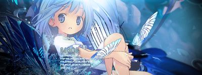

[img]http://orig06.deviantart.net/f6f2/f/2014/158/a/4/a4abacda5735b72780f54392e700b5ff-d7lfc7o.png[/img]
Proof: http://www.mediafire.com/file/hianexample


Due Date: May 13th


Banlist

  • Kamikazy - Plagiarism. Cannot participate 'til hell freezes over.
juesus
One question, do the patterns count as a layer?
Topic Starter
Reunilu

juesus wrote:

One question, do the patterns count as a layer?
To me, yes. I consider anything that isn't an adjustment as a layer.
Topic Starter
Reunilu
I also forgot to ask for resources used as suggested by someone, but I'm sort of stressed out and busy for the next couple weeks that if you don't have them it's fine. Also any people who wanna participate may have to send their stuff to a different person for the same reasons, so keep an eye out for that.
Topic Starter
Reunilu
So I don't know what's happening with me today, but I seem to be sick? My eyes started hurting after crying for a bit and a while after I had some vomit reflex, but drinking water seems to make it go away, but not for long. I'm feeling a little weak as of typing this so no formatting (and also the reason why I'm posted this two hours and 30 minutes early), but just put numbers for your vote.


notkesh
AAAAAAAAAAH, this was a hard one to call. I really like both the 3rd and 4th entries. But my vote is gonna be on the 4th; pull out a photo manipuation without adjustment layers is not an easy task. The coloring is good, the PNG's fit the theme and everything is well blended together. I'd like to see the BG with a little blur tho, just to see the effect. Anyways, very good job :3
MEERset
For me it has to be the 2nd or 5th. The 2nd because of the style and great lighting. Then the fifth for the good contrast of colors that I just like :3
But in the end I chose #2 :DD
Phenlex
Shitter nobody returns to voting. TL;DR: Vote goes to the 5th one. (I'm not biased, pls belief me)

I really like the concept of the 2nd one, and it's very much a style I'd like to try myself. The dark shades blend together really well, getting the best of both worlds: creating a dark, enigmatic atmosphere, as well as still keeping a fair amount of detail through the outlines and the slight contrast of the different shades. Kudos to the creator. However, the reason it doesn't get my vote over the 5th one is simply because it lacks some "oomph" (aka "I dont know wtf I'm talking about so just throw in an ambiguous words, yeah"). The contrasts in the shades are enough to distinguish the elements of the edit, but not quite enough to "stick out" as much. The eyes look sick though, so maybe if there was more apparent contrasts it'd be 10/10. Minor note: That lighting omg. I love how the light matches the angle of the character's tilted head. Nice detail.

For the 5th one...colours are on point, a lot of flashy stuff (aka too lazy to elaborate fully), the lighting is believably realistic, shit's good fam, basically. There's symmetry in the...foreground? I'm actually unsure whether the girl is supposed to be behind or in front of the black & blue stuff (prob just going blind), but the point is, there is a nice depth effect. Anyway, my vote's going to this one pretty much because of the flashy colours. Maybe I am a lil bit biased (but not for the creator, but the style hehexd )
Akito
My vote goes to the second entry, I like the theme, the character, and the effect it has when you look at it and it really seems like the character is looking right at you from the dark. When scrolling through the other entries, it really made me want to scroll back up and look at it again and it catches my eye more than any other piece. Gj to the artist c:
Topic Starter
Reunilu
I keep forgetting to switch the titles out from submissions to voting, but it's there now. I also have finals to study for, so even though voting usually ends tomorrow, I'll probably give an extra day. Same information goes for Beginners.

For all GFX artists looking to participate, the next prompt will be collab signatures (ex. this, this, and this) using real life people for renders. More details will be given when the next Bimonthy starts.
a1l2d3r4e5d6
Let's see what a tired me can think up.

My vote goes to the third one.
It shows a lot for, imo, a challenging special rules, which can give someone like me a good run for their money, but I digress. :v
The textures are used well and the text for decoration is a nice touch. The subject could have better positioning or be slightly more pronounced, otherwise it's quite good. The highlighted colour of the stars are bright, but it doesn't hinder the overall soft colour palette of the image.
JayM3_
This seems to be a hard one to vote for...
Hehehehe
Well i vote for the 4th one cuz of the lighting and the calming vibe it emits. colors are pretty and png placements are on point... nothing more actually.
- K a t h -

JayM3_ wrote:

This seems to be a hard one to vote for...
Hehehehe
Well i vote for the 4th one cuz of the lighting and the calming vibe it emits. colors are pretty and png placements are on point... nothing more actually.
Same here~

Despite the restrictions, the artist was still able to execute their work properly, used a lot of technique and made everything work out especially with those add-on pngs. And please, that freaking highlights man, good shit. :>
Hypocrite Kitty
Am I too late for this?? qwq My vote goes to the third one
The proportions and character placement feel very natural. There are a multitude of subtle details but they're all super cohesive and make everything else going on look better rather than detracting or distracting from it.. That includes the colour scheme: it makes me feel happy :> especially how the yellow stars and yellow parts of the girl's flowers are bright but fit in with all of the pinks and whites. I guess the top of the image could be...sharper? clearer? place another star to the left of her head? Idek how to describe it but it's really grasping at straws


That said, the symmetry of the fifth one really strikes me. I adore the colours in this one too, and there's no doubt to its focus. In fact the more I look at this the more I like the professionalism of this one so better stop before I change my mind again :> well done to all of these entries!
Topic Starter
Reunilu

Hypocrite Kitty wrote:

Am I too late for this??
Agh, thanks for asking actually, I was gonna make a post about voting, but forgot. I've extended the voting to another 24 hours for both Bimonthies (as in midnight of the 21st).
Topic Starter
Reunilu
This is a late results post. Also Both Bimonthies are delayed until later this week or until I can decide/get ahold of someone who can host the next Bimonthies.

1st Place
Kurochiie - Refulgent

2nd Place

Mikichiyo


XxCrystal - ピンクのプリンセス

3rd Place

JayM3_ - Escaping Reality
Please sign in to reply.

New reply