Download v1.1
Watch the introduction video to see Elixir in action.
Screenshots
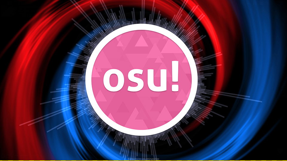
Main menu
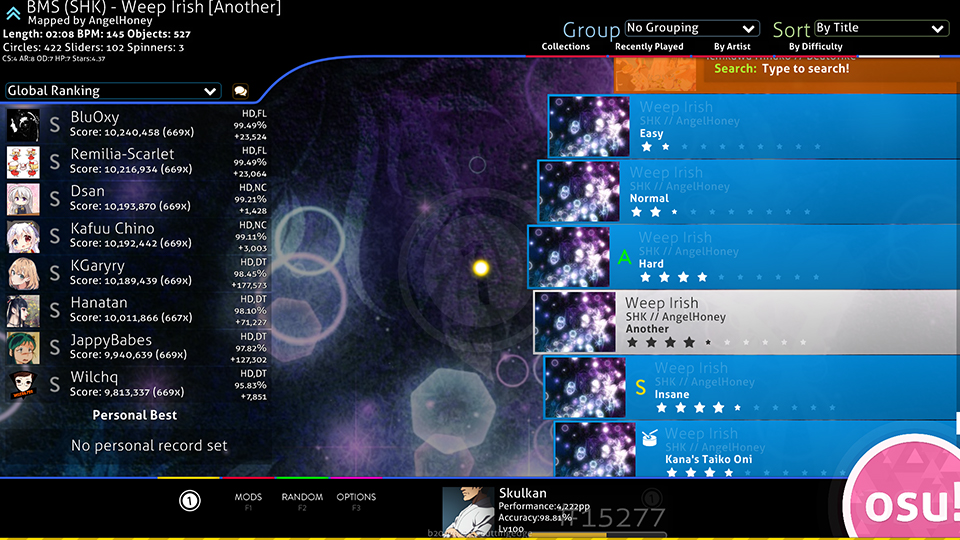
Song select
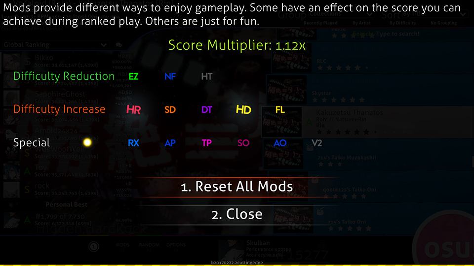
Mod select
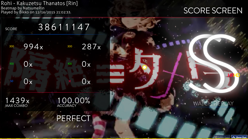
Ranking
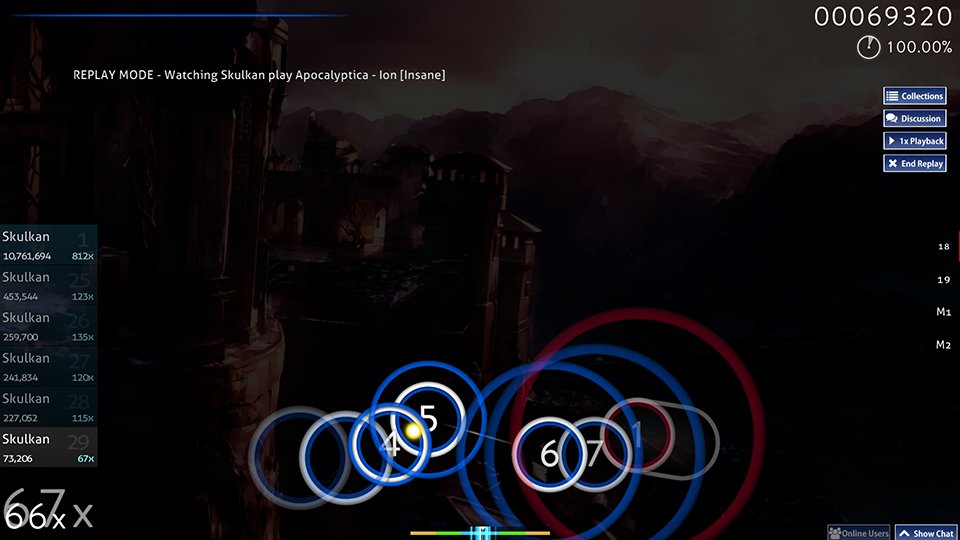
Gameplay
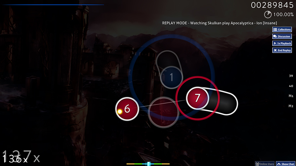
Spinner
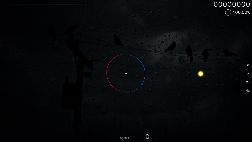
Hitcircle style 2
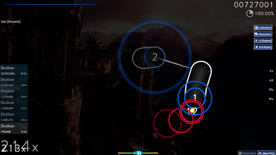
Hitcircle style 3
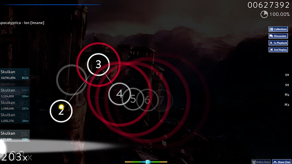
Hitcircle style 4
Song select
Mod select
Ranking
Gameplay
Spinner
Hitcircle style 2
Hitcircle style 3
Hitcircle style 4
Customizations
Elixir includes 4 different hitcircle styles and various other customizations. They are located in the "Customizations" folder. Most of them can be enabled by copy-pasting the files into the main folder. Each customizable element has the default element in a separate folder, so that you don't have to worry about creating backups.
Here is a list of all the customizations and instructions for enabling them.
cursor
Long trail
A long, yellow, dotted cursortrail. Enable by copy-pasting files into the main folder.
No trail (default)
No cursor trail. Enable by copy-pasting files into the main folder.
Short trail
A short, yellow cursortrail. Enable by copy-pasting files into the main folder and deleting "cursormiddle.png".
followpoint
Animated (default)
A followpoint that starts out thick and quickly becomes thin before fading out. Enable by copy-pasting files into the main folder.
No trail (default)
A basic line followpoint that doesn't change thickness. Enable by copy-pasting the files into the main folder and deleting files between "followpoint-9.png" and "followpoint-23.png". To make the followpoint thicker or thinner, you can replace files between "followpoint-3.png" and followpoint-8.png" with a different frame from the animated followpoint.
hit300
Off (default)
No hitbursts on perfect hits. Enable by first deleting all files starting with "hit300" except "hit300.png", "hit300g.png" and "hit300k.png" (these show up in the ranking screen). After deleting the files, copy-paste the new files into the main folder.
No trail (default)
Hitbursts on perfect hits. Enable by copy-pasting files into the main folder.
hitcircle
Style 1 (default)
Colored hitcircle with a white ring. Enable by copy-pasting files into the main folder. Also includes 2 different opacity levels for the middle part (30% and 100%, default is 60%). These can be enabled the same way.
Style 2
Colored ring with fully transparent middle. Enable by copy-pasting files into the main folder. It is recommended that you enable "Use combo color as tint for slider ball" in the options for this style.
Style 3
White ring with fully transparent middle. Enable by copy-pasting files into the main folder. If you want to also make the approach circles white, you need to open "skin.ini" in a text editor (like notepad) and replace these lines:
Colored ring inside a white ring. Fully transparent middle. Enable by copy-pasting files into the main folder.
reversearrow
Centered
Centered reversearrow. Recommended if you want to use sliderendcircles. Enable by copy-pasting files into the main folder. Sliderendcircles can be enabled by deleting the files "sliderendcircle.png" and "sliderendcircleoverlay.png" from the main folder.
Offset (default)
The arrow is positioned closer to the end of the sliderend. Enable by copy-pasting files into the main folder.
scorebar
Blue (default)
Blue scorebar. Enable by copy-pasting files into the main folder.
Red
Red scorebar. Enable by copy-pasting files into the main folder.
sliderfollowcircle
Off (default)
No sliderfollowcircles. Enable by copy-pasting files into the main folder.
On
Sliderfollowcircle visible. Enable by copy-pasting files into the main folder.
spinner-approachcircle
Off (default)
No spinner-approachcircle. Enable by copy-pasting files into the main folder.
On
Spinner-approachcircle visible. Enable by copy-pasting files into the main folder.
Here is a list of all the customizations and instructions for enabling them.
cursor
Long trail
A long, yellow, dotted cursortrail. Enable by copy-pasting files into the main folder.
No trail (default)
No cursor trail. Enable by copy-pasting files into the main folder.
Short trail
A short, yellow cursortrail. Enable by copy-pasting files into the main folder and deleting "cursormiddle.png".
followpoint
Animated (default)
A followpoint that starts out thick and quickly becomes thin before fading out. Enable by copy-pasting files into the main folder.
No trail (default)
A basic line followpoint that doesn't change thickness. Enable by copy-pasting the files into the main folder and deleting files between "followpoint-9.png" and "followpoint-23.png". To make the followpoint thicker or thinner, you can replace files between "followpoint-3.png" and followpoint-8.png" with a different frame from the animated followpoint.
hit300
Off (default)
No hitbursts on perfect hits. Enable by first deleting all files starting with "hit300" except "hit300.png", "hit300g.png" and "hit300k.png" (these show up in the ranking screen). After deleting the files, copy-paste the new files into the main folder.
No trail (default)
Hitbursts on perfect hits. Enable by copy-pasting files into the main folder.
hitcircle
Style 1 (default)
Colored hitcircle with a white ring. Enable by copy-pasting files into the main folder. Also includes 2 different opacity levels for the middle part (30% and 100%, default is 60%). These can be enabled the same way.
Style 2
Colored ring with fully transparent middle. Enable by copy-pasting files into the main folder. It is recommended that you enable "Use combo color as tint for slider ball" in the options for this style.
Style 3
White ring with fully transparent middle. Enable by copy-pasting files into the main folder. If you want to also make the approach circles white, you need to open "skin.ini" in a text editor (like notepad) and replace these lines:
Combo1: 0,102,255With this:
Combo2: 255,0,51
Combo1: 255,255,255Style 4
Colored ring inside a white ring. Fully transparent middle. Enable by copy-pasting files into the main folder.
reversearrow
Centered
Centered reversearrow. Recommended if you want to use sliderendcircles. Enable by copy-pasting files into the main folder. Sliderendcircles can be enabled by deleting the files "sliderendcircle.png" and "sliderendcircleoverlay.png" from the main folder.
Offset (default)
The arrow is positioned closer to the end of the sliderend. Enable by copy-pasting files into the main folder.
scorebar
Blue (default)
Blue scorebar. Enable by copy-pasting files into the main folder.
Red
Red scorebar. Enable by copy-pasting files into the main folder.
sliderfollowcircle
Off (default)
No sliderfollowcircles. Enable by copy-pasting files into the main folder.
On
Sliderfollowcircle visible. Enable by copy-pasting files into the main folder.
spinner-approachcircle
Off (default)
No spinner-approachcircle. Enable by copy-pasting files into the main folder.
On
Spinner-approachcircle visible. Enable by copy-pasting files into the main folder.
Scorebar nameplate
A template for a scorebar with your name and country flag. Here's what it looks like:

If you have Adobe Illustrator, you can create your own nameplate with this .ai file. The font used for the name is Lato Bold, which you can get for free here. The "Choose flag here" -layer contains every country flag in alphabetical order. Just toggle the visibility on the one that you want to use.
You should see something like this:
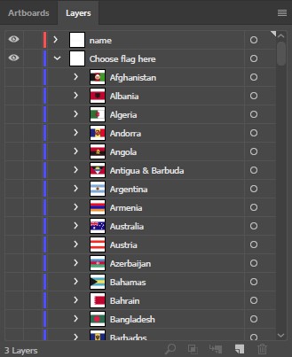
The "scorebar-colour" -layer includes a blue and a red scorebar.
Export both artboards as transparent .png files with filenames being the artboard names at 1x scale. For HD graphics, also export at 2x scale with "@2x" at the end of the filenames.
If you have Illustrator CC, use Export for screens with these settings:
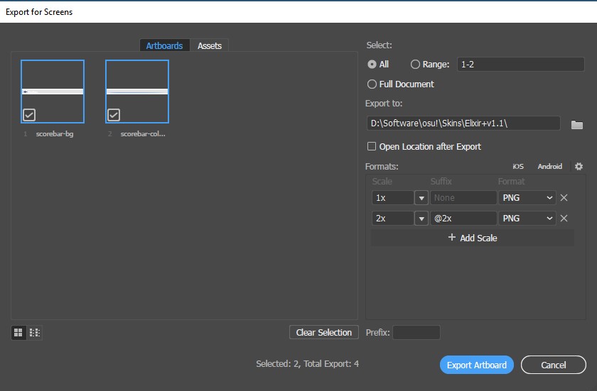
If you don't have Adobe Illustrator, you can send me a PM with your desired name, flag, and the color of the scorebar (red or blue only) and I'll send you the .png files that you can just place into the skin folder.
If you have Adobe Illustrator, you can create your own nameplate with this .ai file. The font used for the name is Lato Bold, which you can get for free here. The "Choose flag here" -layer contains every country flag in alphabetical order. Just toggle the visibility on the one that you want to use.
You should see something like this:
The "scorebar-colour" -layer includes a blue and a red scorebar.
Export both artboards as transparent .png files with filenames being the artboard names at 1x scale. For HD graphics, also export at 2x scale with "@2x" at the end of the filenames.
If you have Illustrator CC, use Export for screens with these settings:
If you don't have Adobe Illustrator, you can send me a PM with your desired name, flag, and the color of the scorebar (red or blue only) and I'll send you the .png files that you can just place into the skin folder.
Changelog
23.4.2017 - v1.1
Functionality
Initial release.
Functionality
- Fixed slider circle alignment issues on Stable (Fallback) release.
- Added readme.txt to the customizations folder with instructions.
- Removed spinner-warning.png (it's a Taiko element that I accidentally made blank.)
- Added mode icons from osu!new.
- Adjusted the position of "max combo" and "accuracy" texts in the ranking panel.
- Added scoreentry elements. (The score numbers in the in-game scoreboard and in the numbers in the input counter.)
- Adjusted the size and thickness of bunch of gameplay elements (arrow-warning, arrow-pause, spinner-clear, section fail, section-clear, ready, count1, count2, count3, go).
- Added a light drop shadow to small ranking letters and mod icons.
- Made small silver S and SS icons brighter.
- Slightly reduced shadows on the approach circle
- Made a very slight change to the scorebar. Here's a comparision, since it's hard to explain with words.
- Made the combobreak sound a bit quieter.
Initial release.
Future plans
Other gamemodes
Since I myself only play osu!standard, I feel that I wouldn't be able to provide the same level of attention-to-detail if I were to skin the other gamemodes. But if there is enough interest, I will consider doing it.
New customizations
If you have an idea for a new customization that you would like to see included, feel free to leave a message and I will consider it. Just remember that I won't be adding customizations that thematically alter the skin, which means no anime girls.
 Nice post btw!
