Both red bars are the same length. Element is clearly not screen centered. If you're playing on anything but 1080p, it will get even more off centered. I would probably just not bother making a center aligned skip image.
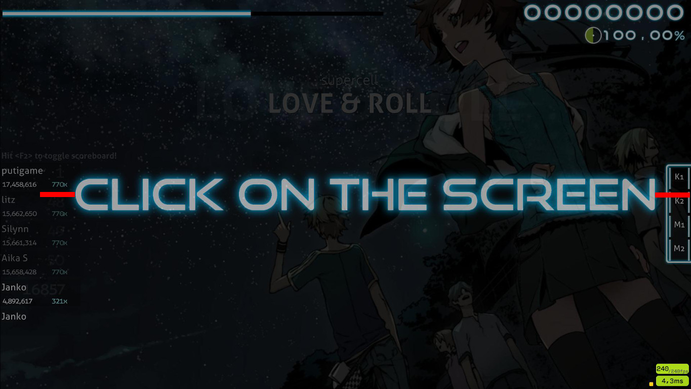
The ranking image is huge for the allotted space. Anything over 50px IMO is too wide, and even that is pushing it.

Why is the ranking image so far over to the left, when nothing else has been moved? It looks odd.

Reduce the width of your "character-comma@2x" and "character-comma@2x" because it's making your accuracy percent text awkwardly close to the song progress pie chart.

The ranking image is huge for the allotted space. Anything over 50px IMO is too wide, and even that is pushing it.
Why is the ranking image so far over to the left, when nothing else has been moved? It looks odd.
Reduce the width of your "character-comma@2x" and "character-comma@2x" because it's making your accuracy percent text awkwardly close to the song progress pie chart.
 Thanks
