forum

Last play style used to show in game (mo, kb, tablet, touch)

posted
Total Posts
9
This is a feature request. Feature requests can be voted up by supporters.
Current Priority: +0
Topic Starter
AX3M
Though we can see how a user plays by visiting his/her profile, I believe it would be of everyone's convenience to know what each player used to play during his last game. It can be either shown when hovering with the mouse (the same for lvl, accuracy and location) or just like below. Any icons will do, just that they clearly indicate what they used. I'm not sure about the dual mouse though, it might be hard to implement for that play style.
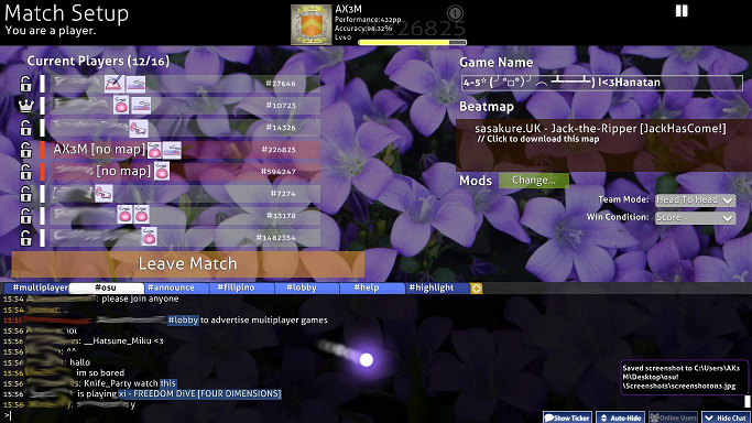


But sadly as per feature request guideline #7, I'm thinking if we could show the keys used:
  1. for moving the catcher in ctb, when a room is a ctb,
  2. for hitting the notes in mania, when a room is mania, and
  3. for hitting the drums in taiko, when a room is a taiko,
in a similar manner as above.
Pawsu
This has already been requested, but instead of it being multiplayer limited, it's shown on your userpanel: t/238375/start=0
Nathanael
Why censor names at the screenshot? lol
Anyway, the feature seems just similar to each other, but have different purposes. This one is for multiplayer while the other thread is for the user panel.

Regardless, both of them are good to be add to let other users know what they're using for playing (inb4 tablet users always getting kicked out).
Topic Starter
AX3M

Nathanael wrote:

Why censor names at the screenshot? lol
I feel like I'm violating rules so.. yeah I'm like paranoid.

Nathanael wrote:

Anyway, the feature seems just similar to each other, but have different purposes. This one is for multiplayer while the other thread is for the user panel.
Does that mean this won't be marked as duplicate?

Nathanael wrote:

Regardless, both of them are good to be add to let other users know what they're using for playing (inb4 tablet users always getting kicked out).
Exactly!
Sandy Hoey
Maybe this is just my opinion, but I have never actually cared how people are playing the game, tablet or mouse, so this feature isn't super appealing to me. But i'm all for it as long as it doesn't clutter up the screen to much. Besides, in your screenshot you put the indicators where the mods normally are. What would be the plan for that?
Topic Starter
AX3M

Sandy Hoey wrote:

Maybe this is just my opinion, but I have never actually cared how people are playing the game, tablet or mouse, so this feature isn't super appealing to me. But i'm all for it as long as it doesn't clutter up the screen to much. Besides, in your screenshot you put the indicators where the mods normally are. What would be the plan for that?
You're right. I'm thinking, just put the mods next to the play style icons. I don't think it would take too much space on the name bar.
Seijiro
Or just make it that once you hover someone's name (in the multiplayer list, not in chat) you get, besides the rank and stuff, also that thing.
Bara-
I don't see a need for it
I think it'll be much better if it appears on the 'dropover' menu, where the country and such is also places
Topic Starter
AX3M

MrSergio wrote:

Or just make it that once you hover someone's name (in the multiplayer list, not in chat) you get, besides the rank and stuff, also that thing.

Bara- wrote:

I think it'll be much better if it appears on the 'dropover' menu, where the country and such is also places
Exactly like I said:

AX3M wrote:

It can be either shown when hovering with the mouse (the same for lvl, accuracy and location)...
Please sign in to reply.

New reply