I don't know but I use a Keyblade (Kingdom Key) as my actual windows cursor so you can always do that.
forum
Kingdom Hearts: Chain of Memories Skin
posted
Total Posts
68
Topic Starter
Well, I got a lot of it done:
reversearrow
meter
spinner
and more
but I'm still getting more of it done.


reversearrow
meter
spinner
and more
but I'm still getting more of it done.
. uh
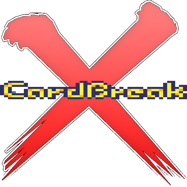
the pixellation on the Card Break looks really sloppy to be honest, as does the x behind it. And the cursor is pointing down? That'd fuck with your head. Mine works like a mouse cursor; points up and left.
Lifebar is workable, but in my opinion unimaginitive. Also, random. I mean, there are lifebars in KH. Why not use that to give it an actual KH feel, and not just an eclectic mix of KH graphics?
Topic Starter
Okay, you got me in a pickle, but here's my thoughs:awp wrote:
. uh
the pixellation on the Card Break looks really sloppy to be honest, as does the x behind it. And the cursor is pointing down? That'd fuck with your head. Mine works like a mouse cursor; points up and left.
Lifebar is workable, but in my opinion unimaginitive. Also, random. I mean, there are lifebars in KH. Why not use that to give it an actual KH feel, and not just an eclectic mix of KH graphics?
1. The X behind the Cardbreak is the same one that I used from the template skin, in fact, that IS the X from the template skin, only the black outline is gone. And maybe I should tell you that: It's not Pixleated, it's enlarged. But you CAN help me out on that.
2. No matter which direction the cursor will point down, I really don't know...
3. I decided to use the KH: Com lifebar and since I have to, I created the background myself...
Well, maybe I'll just drop off a few more pic and then I'll get back to work on the skin.
/threadDark Deception wrote:
It's not Pixleated, it's enlarged.
equip the Scan ability imo
Topic Starter
This map has been deleted on the request of its creator. It is no longer available.


Topic Starter
More stuff on deck!


Topic Starter
Thrown in skinned mods!
These below are the examples, but I'll tell you what they mean:
Feeble Darkness=Easy
Almighty Darkness=Hardrock
Moment's Reprieve=Nofail
Key to Truth=Sudden Death
Moogle Room=Relax *Kupo*
False Bounty=Hidden
Sleeping Darkness=Halftime
Looming Darkness=Doubletime
Wadadon card=Taiko *Do I have to ask?*
That's all of them, 'cept the No video one...
True furthermore, the enlarger items are not in the right proportion [makes my eyes water imho] You could re pixelate it [trace] so it wont look blurry on the edge and try adjusting it not to wide not to long but on the right proportion.Saturos wrote:
/threadDark Deception wrote:
It's not Pixleated, it's enlarged.

Topic Starter
Can anyone tell Devkit4384 to create the Ranking letters from the Kingdom Hearts 2's gummi ship missions for me? Even make an X, XH and SH rank from scratch?
Can you? =x Either make or tellDark Deception wrote:
Can anyone tell Devkit4384 to create the Ranking letters from the Kingdom Hearts 2's gummi ship missions for me? Even make an X, XH and SH rank from scratch?
Topic Starter
Well, I decided to use the Kingdom Hearts text I downloaded and place with the other text files, but I'm going to show you one of them as a teaser.
Topic Starter
I done some revamping.


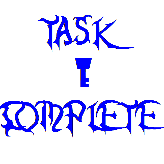
Task complete? I don't recall there being tasks in CoM =x
Also for the 100Beat, 300Beat and 300Elite Beat you should use the Key to __________ cards???
Also for the 100Beat, 300Beat and 300Elite Beat you should use the Key to __________ cards???
Topic Starter
For the pass and fail sprites, I thought that I would use the whole call the sections 'tasks' in this skin.awp wrote:
Task complete? I don't recall there being tasks in CoM =x
Also for the 100Beat, 300Beat and 300Elite Beat you should use the Key to __________ cards???
And yeah. I'm using cards as hit sprites.
the hit300g you posted, imo, is not optimal - it's just the 300, but filled in, basically. That's why I mentioned the "Key To __________" cards (I forget their actual names, but they're something like Key To Beginning, Key To Heart, Key to Something - idk, there's also Key to Treasure but that's not necessary as you have the other 3).
Topic Starter
You mean:
Key of beginnings, key of Guidence and Key to the truth?
Key of beginnings, key of Guidence and Key to the truth?
That sounds about right. Haven't played CoM in a few years and couldn't read the japanese when I played ReCoM so it's been a while for me.
Topic Starter
About the 300g, I type in 'Critical hit' and left the 100k and 300k unedited... Maybe typing in 'hit' is suffice?
That seemed kind of unimaginative imo when there are better alternativesDark Deception wrote:
About the 300g, I type in 'Critical hit'
Topic Starter
Skin launched! Go to the first post.
What i like about this skin is the song selection screen, the background. Ranking screen, and the cursor is alright too. Coundown, beats and the slider look okay.
Topic Starter
Why? It looks great...Vic wrote:
But...Bu-but-but its pixelated =(

But its pixelated ;<Dark Deception wrote:
Why? It looks great...Vic wrote:
But...Bu-but-but its pixelated =(
Topic Starter
Look! The word, 'pixleated', is the only word that you heard coming out of 31Gabe's mouth. Since he's not there, the word that is to be said is enlarged.Vic wrote:
But its pixelated ;<Dark Deception wrote:
Why? It looks great...Vic wrote:
But...Bu-but-but its pixelated =(
Also, I don't think a single thing on this skin is wrong.
Pixelated is a term other users were calling Gabe's skins, because they were. As is yours. It's a result of enlarging small sprites. It's looks bad.
An example of a work-around can be seen in the TWEWY skin. awp redrew Neku for the results screen by hand even though he had the sprites. He did this because enlarging the sprite would have resulted in a pixelated look.
An example of a work-around can be seen in the TWEWY skin. awp redrew Neku for the results screen by hand even though he had the sprites. He did this because enlarging the sprite would have resulted in a pixelated look.
Of course you don't, because you made it. It's an eclectic mix of your inability to see your own flaws (this is human nature), in addition to both pride and stubbornness that prevents you from being able to see your own mistakes. That's what critiques are for - other people will see flaws you have missed.Dark Deception wrote:
Also, I don't think a single thing on this skin is wrong.
The aforementioned Neku that Saturos mentioned has been through at least eleven revisions. Granted I KNEW the first posted version was not perfect but I thought eh, whatever, it's close enough - of course, I was dead wrong. The second wasn't good, the third wasn't good, the tenth wasn't good enough - the purpose of posting things is not just to showcase it, but for others to help you improve it. Version 12 of TWEWY's ranking panel is way the hell better than Version 1, and I have osu! community to thank for that (in addition to strings of profanity and hours of frustration and labour).
I can not offer much criticism on this skin as I have not personally tried it out, but the presence of pixellation gives it an ugly sort of feel. General rule of thumb, I think, is that anything above 200% resize is too much.
Also, using sprites (exclusively) to make a skin generally does not yield good results.
Topic Starter
Well, like I said back at the first page, sprites are my thing. What do you think of the hitcircle?
it looks a bit rough, to be honest
The slider and score font look pretty awesome, but other than that, there isn't a lot I'm keen on. I'm still not too sure why you didn't go with the standard KH-CoM lifebar for the, er, lifebar. Too boring?
The slider and score font look pretty awesome, but other than that, there isn't a lot I'm keen on. I'm still not too sure why you didn't go with the standard KH-CoM lifebar for the, er, lifebar. Too boring?
Topic Starter
Nah! It's not boring to me.awp wrote:
it looks a bit rough, to be honest
The slider and score font look pretty awesome, but other than that, there isn't a lot I'm keen on. I'm still not too sure why you didn't go with the standard KH-CoM lifebar for the, er, lifebar. Too boring?
Well, since you said that the card hitcircle looks rough, maybe you could ask MaxwellDemon to Vectorize some of the sprites, make a hitcircle with the Organization XIII icon, and other stuff that he could fix up? Vic said it "Pixleated", so maybe he could help out with this skin, just like he does for your TWEWY skin.
Speaking of TWEWY, is your skin close to finished? Because the partner system, to my thought, could also be used for the Kingdom Hearts skin, if I could give credit.
TWEWY Skin's done - of course, it will be upgraded, and tweaks need to be made as new features become available (eg multiplayer), but it's not compatible with the current public build (found that out the hard way) so it's not available yet.
As for rendering rough pixellations - why not try google search, first? The card logo is not overly complicated, and I'm sure there are plenty of Re:CoM resources you could use.
As for rendering rough pixellations - why not try google search, first? The card logo is not overly complicated, and I'm sure there are plenty of Re:CoM resources you could use.
Topic Starter
Soooo, can you give me some site examples?awp wrote:
TWEWY Skin's done - of course, it will be upgraded, and tweaks need to be made as new features become available (eg multiplayer), but it's not compatible with the current public build (found that out the hard way) so it's not available yet.
As for rendering rough pixellations - why not try google search, first? The card logo is not overly complicated, and I'm sure there are plenty of Re:CoM resources you could use.
google.ca
Topic Starter
I've checked, RemmyX25, but no luck...RemmyX25 wrote:
Try this, hope it helps!
http://www.gsarchives.net/index2.php?category=all&system=gameboyadvance&game=kingdom_hearts_chain_of_memories&type=sprites
Any other locations?
thanks for making this! now...(waits for Simple and Clean Beatmap to be made)
Topic Starter
Thanks!DiZ1881 wrote:
thanks for making this! now...(waits for Simple and Clean Beatmap to be made)

I have the PS2 version of Chain of Memories, I could probably take screenshots of parts of the game if you'd like. Though it'd be a bit blurry since I only have S-Video connection from my PS2. Cut pieces out and vectorize them and I'm sure they'd look pretty awesome if done right.
This map has been deleted on the request of its creator. It is no longer available.
Topic Starter
Well, I have no I dea how to vectorize stuff, but yeah! Go ahead and send me some screenshot!Boxed_Slug wrote:
I have the PS2 version of Chain of Memories, I could probably take screenshots of parts of the game if you'd like. Though it'd be a bit blurry since I only have S-Video connection from my PS2. Cut pieces out and vectorize them and I'm sure they'd look pretty awesome if done right.
Well, I'm kinda slow right about now, but you supply me with some of your edits on them, and I'll think of it. Besides, I really appreciate some help anyways.awp wrote:
I mentioned this once but I think the skin would need to be completely rehauled if that were to be done otherwise it'd just look sloppy to be half and half.
this is the worst skin ever
Topic Starter
Well excuse me, LuigiHann! I haven't played osu! or made any upgrades to my skins for about a month now and your calling my skin The WORST? I haven't touched osu! for a month and someone kinda liked this skin!LuigiHann wrote:
this is the worst skin ever
I'm sorry...

Dude... you don't get the joke.
Look at the other recent skins with new posts to them.
Look at the other recent skins with new posts to them.
Expected response was expected. Test results favor Luigi's theory.
PS. It's not a joke.
PS. It's not a joke.
Can I see LH's theory exactly?
This map has been deleted on the request of its creator. It is no longer available.
I kinda knew what he was doing, I just wanna know his exact theory... >_>
...Unless that is the theory. O.o
...Unless that is the theory. O.o
Expected response was expected. Test results favor Luigi's theory.YoshiKart wrote:
...Unless that is the theory. O.o
At first I thought he was being lulzy but after a minute it clicked and I knew EXACTLY what he was doing.
Topic Starter
This map has been deleted on the request of its creator. It is no longer available.
There was a purpose to what he did. To call that a joke is not entirely correct.
This map has been deleted on the request of its creator. It is no longer available.
Nope. But they were all chosen for a reason, you got that right.xerxes_oli wrote:
maybe he was bumping the skins he actually liked but he didnt want people to kno he liek them so he said they were bad it all makes sense now......which leaves to me arrive at the conclusion that I LIEK CHOCOLATE MILK
>.> You guys are killing me.Saturos wrote:
Nope. But they were all chosen for a reason, you got that right.xerxes_oli wrote:
maybe he was bumping the skins he actually liked but he didnt want people to kno he liek them so he said they were bad it all makes sense now......which leaves to me arrive at the conclusion that I LIEK CHOCOLATE MILK
He has actually stated in irc what his motive was, but tbqh it's kind of obvious.
Awesome!!!
I love kingdom hearts but better is version on PS2 but its good job
PS Sorry for my bad english
I love kingdom hearts but better is version on PS2 but its good job
PS Sorry for my bad english
because this thread isn't 2 years old or anythingbokser98 wrote:
Awesome!!!
I love kingdom hearts but better is version on PS2 but its good job
PS Sorry for my bad english
This skin fucking sucks ass.
gj dig up an old skin and voice a negative opinion with painfully accurate punctuation does that make you feel better about yourselfqueen lorelei wrote:
This skin fucking sucks ass.