the nose repeat is kinda creepy
forum
WarioWare Skinned! v1.5
posted
Total Posts
74
Topic Starter
I felt the same way about the nose as you guys, so I replaced it with a garlic clove.
Aw, I liked the nose ={ if it were tilted to be blowing Wario back and forth
Topic Starter
Which is why I'm planning alternate skins.awp wrote:
Aw, I liked the nose ={ if it were tilted to be blowing Wario back and forth
Topic Starter
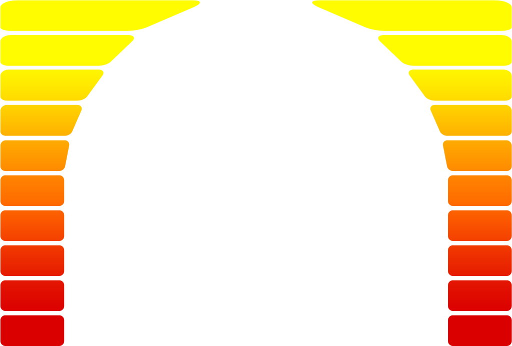
Time for some suggestions. What would be a good idea for the spinner meter?
There are tons. There's just the problem of choosing one and implementing it. (Of course, you did say there's going to be alternates. More work, though)
Take the Wario hands twisting the GBA SP.

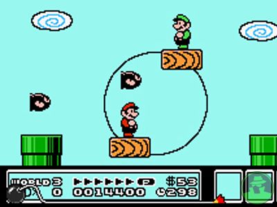
You can't go wrong with SMB3 and the fun minigame of spinning the trailed platform.
Weird guy throwing the weight.

And tons more....
Maybe even a stylus spinning some minigame as the spinner. That's pretty good, too.
Take the Wario hands twisting the GBA SP.
You can't go wrong with SMB3 and the fun minigame of spinning the trailed platform.
Weird guy throwing the weight.
And tons more....
Maybe even a stylus spinning some minigame as the spinner. That's pretty good, too.
Topic Starter
No, the spinner itself was shown in the first post. I'm talking about this.
Whoops.
I got nothin' so far. Good night.
I can try to think of something after my finals.
I got nothin' so far. Good night.

I can try to think of something after my finals.
For your spinner meter, you can use the SMB3 "P" meter which goes up when you run.
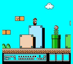
that thing at the bottom of the screen.
That's my 2 cents.
that thing at the bottom of the screen.
That's my 2 cents.
To be honest,
http://images.eurogamer.net/assets/arti ... _med_1.jpg
is the perfect spinner. It has the meter on the left, the dude that spins, the background. It's a complete package.
http://images.eurogamer.net/assets/arti ... _med_1.jpg
is the perfect spinner. It has the meter on the left, the dude that spins, the background. It's a complete package.
Topic Starter
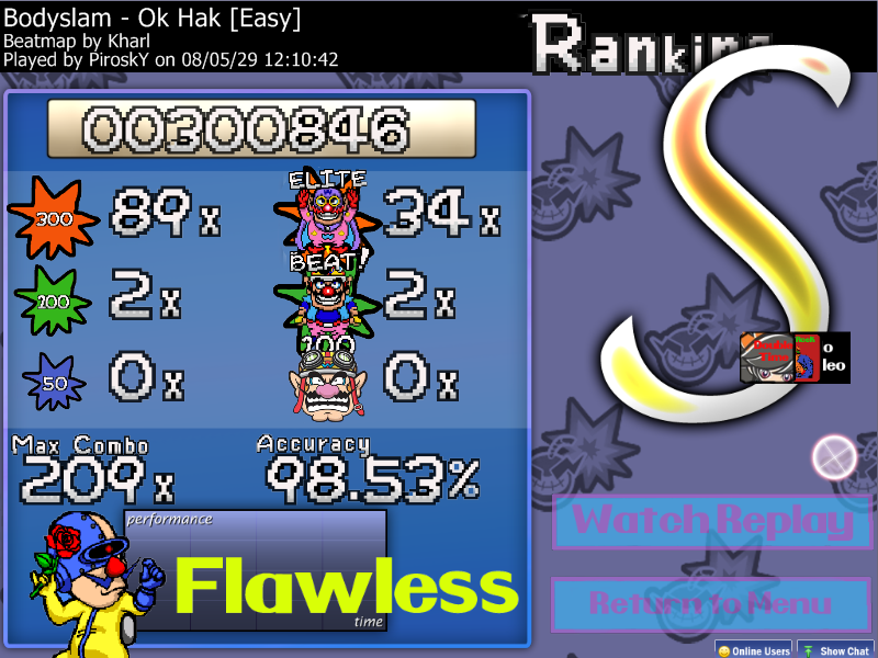
It's almost done! I still need to figure out the ranking grade letters, though.
(Oh, and the white sticking out of the spinner was fixed after I took this shot.)
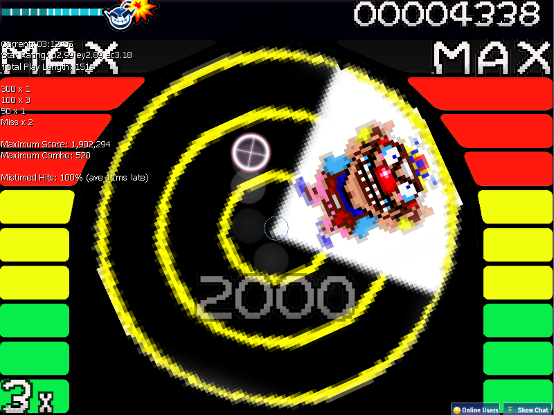

(Oh, and the white sticking out of the spinner was fixed after I took this shot.)
I still don't like how pixelly the spinner is. Use awp's idea!!awp wrote:
To be honest,
http://images.eurogamer.net/assets/arti ... _med_1.jpg
is the perfect spinner. It has the meter on the left, the dude that spins, the background. It's a complete package.
i agreeYoshiKart wrote:
I still don't like how pixelly the spinner is. Use awp's idea!!awp wrote:
To be honest,
http://images.eurogamer.net/assets/arti ... _med_1.jpg
is the perfect spinner. It has the meter on the left, the dude that spins, the background. It's a complete package.
Wario being pixely on the spinner is okay, but smooth out the spinner itself....looks awkward having jagged edges on what's supposed to be a circle.
that could work too....Boxed_Slug wrote:
Wario being pixely on the spinner is okay, but smooth out the spinner itself....looks awkward having jagged edges on what's supposed to be a circle.
This looks nice.
Good job !
Good job !

I totally agree here.awp wrote:
To be honest,
http://images.eurogamer.net/assets/arti ... _med_1.jpg
is the perfect spinner. It has the meter on the left, the dude that spins, the background. It's a complete package.
Topic Starter
First preview build is available to all!
http://www.megaupload.com/?d=JXXNH7F3
I'll replace the spinner since everyone is fond of the hammer thrower, but it'll take a little while since I'll have to vectorize it.
http://www.megaupload.com/?d=JXXNH7F3
I'll replace the spinner since everyone is fond of the hammer thrower, but it'll take a little while since I'll have to vectorize it.
Topic Starter
Didn't get any replies for the original release, but here's version 1.1:
http://www.megaupload.com/?d=1IIFPX64
Changes include soft sounds and a custom sound for missing notes, the hammer throw spinner by popular demand, and a few cleaned-up graphics.
http://www.megaupload.com/?d=1IIFPX64
Changes include soft sounds and a custom sound for missing notes, the hammer throw spinner by popular demand, and a few cleaned-up graphics.
I was so excited about the spinner. It's a little dissapointing now. =/
Topic Starter
This map has been deleted on the request of its creator. It is no longer available.
Topic Starter
Just letting people know that this skin is NOT dead! I was away on vacation for two weeks without a computer, now I'm back and ready to work.
Since the only post regarding the new spinner seems lukewarm, what are some other thoughts? I still prefer the old one but want to go with the majority opinion. (I'm thinking about changing the sprites for beats and Elite Beats as well, but am not sure what to replace the Wario sprites with.)
Since the only post regarding the new spinner seems lukewarm, what are some other thoughts? I still prefer the old one but want to go with the majority opinion. (I'm thinking about changing the sprites for beats and Elite Beats as well, but am not sure what to replace the Wario sprites with.)
well some of the sound effects are annoying like the farts or motor sounds
Topic Starter
Back with a vengeance, and version 1.1!
http://www.megaupload.com/?d=A5QRKAEF
Changes include:
-Actual voice samples from the game used for multiple combo bursts and misses.
-Miss pictures changed from Wario faces to red Xs.
-Applause changed to end of level music.
-Custom accuracy picture added.
-Several pictures cleaned up.
-Fart and burp noises removed, custom slider tick kept.
omg yes !!! your getting somewhere!
Your Reverse arrow sould be facing TOWARDS Wario's path! Not off to the left's side!
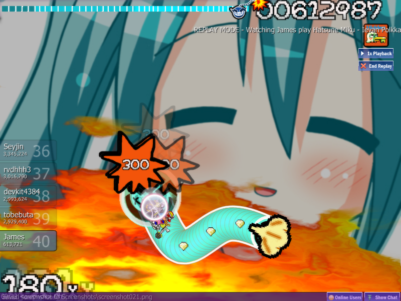
Topic Starter
This map has been deleted on the request of its creator. It is no longer available.
Topic Starter
1.2!
The garlic has been tilted sideways (Never thought I'd type that), and the hit markers have gotten spiced up color-wise, and they and several other graphics have been given fancy shadow effects.
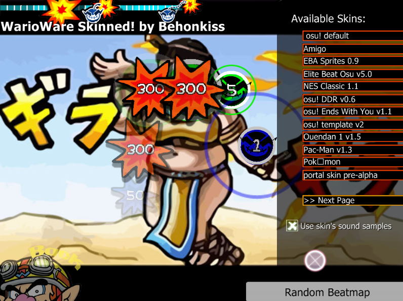
The garlic has been tilted sideways (Never thought I'd type that), and the hit markers have gotten spiced up color-wise, and they and several other graphics have been given fancy shadow effects.
ill try it out as soon as i have time 

That's what I mean. In the original, It's not.Vic wrote:
Ummm... It IS facing toward Wario`s (slider's) path...
EDIT: Wha--? How did a lot of ya has posted? when I'm typing?
Download: Tada Aoi - Doll (Mafiamaster) [stress].osu
you is a slow typer lolzdtnc21 wrote:
Wha--? How did a lot of ya has posted? when I'm typing?

Topic Starter
1.3, baby!
http://www.megaupload.com/?d=5KCDP45B
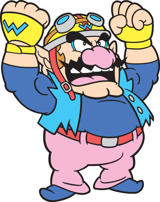
This one's all about sound. I've added menu sounds from Smooth Moves, and custom sounds for most hitcircle noises. I've also taken the white overlay off the hitcircles so that fashionable mustache is more visible, and find it looks better and plays just as well. A custom color scheme has been added to go with the colors of Wario's outfits- both his Ware and classic costumes.
Topic Starter
This map has been deleted on the request of its creator. It is no longer available.
This map has been deleted on the request of its creator. It is no longer available.
I'm not sure how large comboburst.png will officially be, but I'd suggest keeping it down to about a third of the screen, about the size of one of the countdown blocks.
Topic Starter
Updating soon when Peppy makes the newest editable icons available. In the meantime, combo burst ahoy!
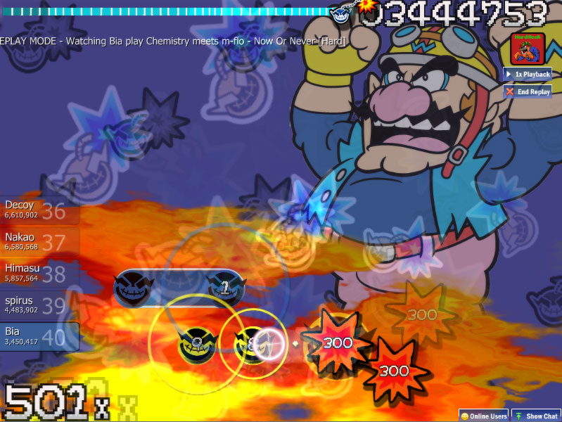
Topic Starter
1.4, including:
- Slider tick 10s and 30s
- Icons for Taiko, Flashlight, and Selection Options
- The return of the cursor
- The much-hyped combo burst
- Several cleaned-up graphics
http://www.megaupload.com/?d=9WLGGE6Y
I think I'm about done with the base skin, but I want it to get approved first before I focus on the character expansions.
Topic Starter
Okay, I lied. Here's 1.5 with a bunch of cleaned-up text and improved cursor.
http://www.megaupload.com/?d=ZFV8EI6Z
http://www.megaupload.com/?d=ZFV8EI6Z
Topic Starter
I've pretty much put in all I planned. Can I get this added to the updater, or is there something I need to fix or add?
Topic Starter
Bump.
Couple technical things, first off:
1. Make sure you remove all the files that are not skinned. The template skin files are just taking up space and making the download bigger
2. Upload to up.ppy.sh instead of megaupload, please
1. Make sure you remove all the files that are not skinned. The template skin files are just taking up space and making the download bigger
2. Upload to up.ppy.sh instead of megaupload, please
Topic Starter
I notice that your cursor is centered, and shouldn't be. Make the canvas a bit bigger, and move the finger to the bottom right so the center of the image is the center of the finger print on the index finger.
Most people prefer a cursor that is centered, but that can't be done with a finger.

I did this in about 5 seconds, so the center may not be exactly where you want it.
Most people prefer a cursor that is centered, but that can't be done with a finger.
I did this in about 5 seconds, so the center may not be exactly where you want it.
Topic Starter
I tried something like that before but found it very awkward to play with, because I'm so used to using the center of the cursor. This is what led me to can the hand for a while in the first place.
Can anyone else provide feedback on what they think should be done with the cursor?
Can anyone else provide feedback on what they think should be done with the cursor?
You could combine dumpster's version with the default cursor, which would result in a hand that points properly overlayed with a crosshair that would be intuitive for you. Maybe.
Topic Starter
Well, it took me long enough, but I fixed the cursor and managed to get upppy working, so here's 1.6 ready for osume:
http://up.ppy.sh/files/warioware.rar
http://up.ppy.sh/files/warioware.rar
You didn't include the auto mod icon
Topic Starter
Okay, it's included here in what is hopefully the last version:
http://up.ppy.sh/files/warioware.rar
And here's the icon for everyone who already has the skin:

http://up.ppy.sh/files/warioware.rar
And here's the icon for everyone who already has the skin:
Topic Starter
I got a message recently to let me know that the upload link for the current version of the skin is dead, so I made an .osk file and reuploaded it.
https://www.mediafire.com/?6locq8l0h64m4gx
Please let me know if the file doesn't work (This was my first time doing anything like that) or if a site other than Mediafire would be preferable.
https://www.mediafire.com/?6locq8l0h64m4gx
Please let me know if the file doesn't work (This was my first time doing anything like that) or if a site other than Mediafire would be preferable.