@-Iz, what you have wrote amaze me! Yeah, you do look at the details and i appreciate this very much. I will take into consideration most of what you wrote, but still there are a few thins i would love to leave as they are. And one of them is the darker menu line, because it gives more contrast to the page. More contrast means less problems navigating (simply visually speaking)
"What width are you going for?"Its currently a design for 1920x1080px monitors, but its not problem to make it responsive if its being developed. For 2 years now, all my designs are responsive, so this is not an exception. Its just my workflow to do the fullsized desktop one first, so i know all elements there can be.
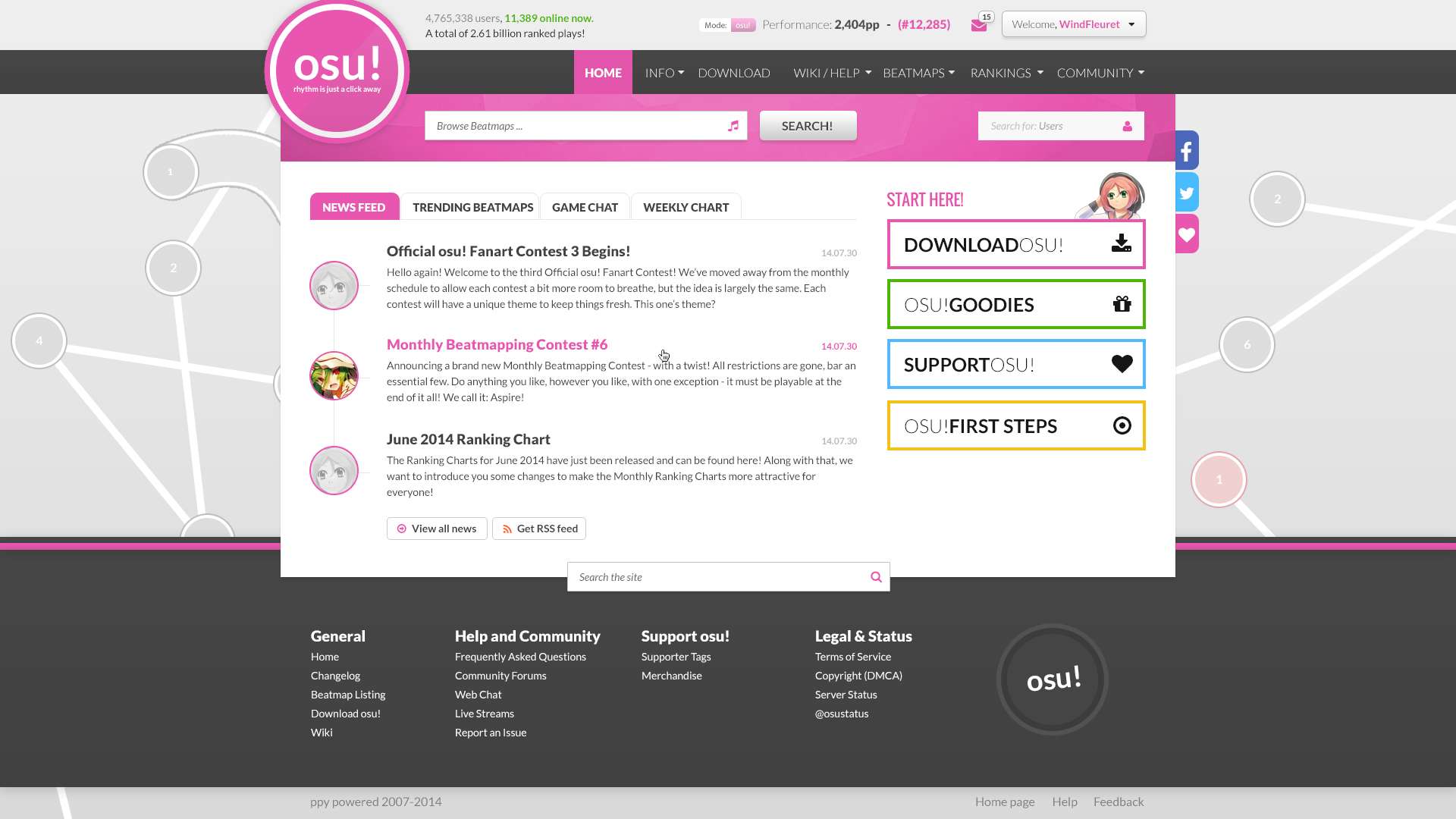
Facebook side-button's background isn't well hidden, unless it's intendedThanks for bringing it to my attention. Acrually the button is placed ok, but as i see it it doenst add much contrast with the pink area on the left. I will probably swap them with twitter.
Site search looks really, really awkwardHahaha, probably yes

Well, the best solution i think of is one mixed search field, which is rather harder for implementation. If you have used spotify, there is exactly one like that. It searches Authors, Songs, Playlists all at once and presents them pretty neat. I wanted to make it simpler and leave more inoput fields The other solution is to make one only field and have a dropdown on the right side of it where the user can select what to search for.
Tagline looks weird, and off-place in the logo.hmm ... i dont see it all that awkward. I will agree that this is NOT the logo of osu!, so its a problem, but i do like how it fits. What you sugested will only make it look like its glued there and its not quite readavle when its vertical.
pp on every page might strain the server depending on what's used.Every piece of information is requrested every time from the server. So this one is not an exception and wont impact on it, dont worry about that
------------
Date of news are all the sameyes they are, i am lazy from time to time

they are not important in any functional way, so i dont have to write diferent ones.
Honestly, honestly if I have to have that top left section, I would never ever see the top beatmaps and the other tabs.AS you said it, its your personal way of browsing, nothing i can do here
As long as its not making your browsing harder its not an issue.
In my opinion, on the home page people want information at a glance. As of your 3rd edit it's slightly too cramped for my liking with not much scrolling roomThis is the problem im mostly focused on and not doing much about it. What i feel from inside is to flush it all and do it again, but i blieve its possible to fix it somehow. I should think more on it.
------------
Keep avatar size to 128x128 or smaller Good idea, will try it out.
About the rest you wrote .. um ... yeah, i didnt get much
:D
Would the header and navbar be frozen as the user scrolls down throughout the site?It can be, it can be not. I will have to decide. When i add more content and i can test it i will post you screenshot to see for yourself ^^
For your footer, taking Senritsu's idea, but instead of the mascots themselves fully-coloured, how about silhouettes of osu! mascots/symbols? Simple grey outline of their silhouette, not too distracting and would blend in well with your background. Grey on black silhouettes are also nice.Well, if they are only silluets new users will have no idea what they are. Even i could have hard time getting them ;/ I will say its not worth trying.
Little support thingy floating at the left for non-supporters?Define left please ^^ (and not just "left, dont you know directions")
What page, what region?
I'd find it weird if my pp/ranks are separated from the graph. I might be interpreting your sentence wrongly though so don't mind it.yes, its weird, and just a suggestion. When i try things out i will know.
What about the video playlist at home page? That would greatly help people who have no idea what osu! is to let them know what osu! is.Ahh that lovley playlist

Ok, i will make a few more thoughts on it ^^
------------
Thanks for the long post, its really helpful. Please have a little patience for the next update, because im actually quite full of stuff to work on, and as i said im doing this in my spare time while relaxing the day ^^

