This map has been deleted on the request of its creator. It is no longer available.


forum
Ranking screen overhaul
posted
Total Posts
7
Topic Starter
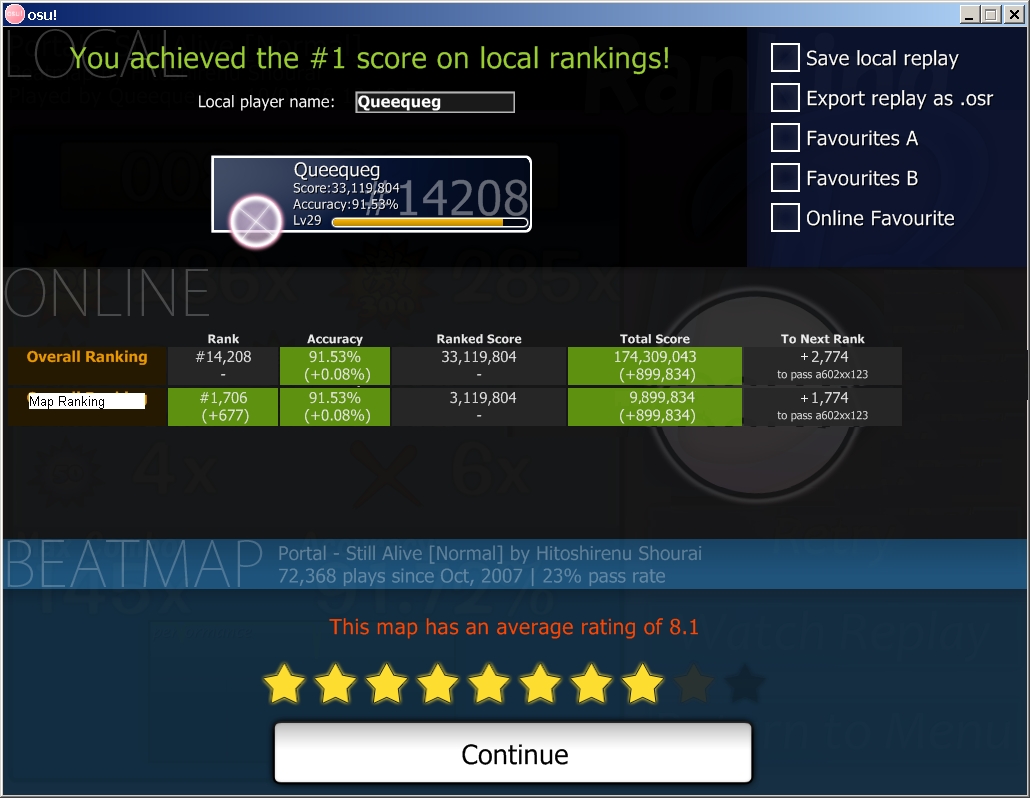
that "map ranking" column doesn't say much more from what you can see on the actual page. your rank/accuracy/total score is already displayed.
you have 2 accuracys that are the same, feels uneccesary.
the ranked and total score, does that mean the current score you have on the map (ranked score) and the total score you achieved on THIS run? (total score)
i can agree with you on the "to next rank" column it should be "+" and not "@" unless "@" is something special
Topic Starter
Well, doing stuff in mspaint isnt fun, so the mockup isnt complete. The accuracy column would display both the overall acc (and +/- change) and the acc on the current map, and also the differences from the previous best try. So if your current score is 120k/98% acc and you get 130k/97% acc on the next try, the table would read
The basic idea is to have one row that refers to the current map only, and another row that refers to the overall stats.
               ...          Score        Acc       ...
...            ...           ...
Map Ranking    ...        130k(+10k)   97%(-1%)
The basic idea is to have one row that refers to the current map only, and another row that refers to the overall stats.
ah i get it now, my bad.
well it looks somewhat nice then
well it looks somewhat nice then

I sometimes get confused by "to next rank" too. =S
I support splitting the current row into two. (Great idea!)
I support splitting the current row into two. (Great idea!)
I don't see there being a problem with this (and it does make sense), although the topic of this thread is very misleading. I wouldn't call this an overhaul  .
.
 .
.This map has been deleted on the request of its creator. It is no longer available.