I'll take the siggie if you don't mind, just change text to "Merry Christmas"Miyu wrote:
Oh and~ for my requesters ~
satriobp: nu idm hunni go for it ~
i got confirmed that tenri's got banned so i am giving out the edits she requested to me
so if anyone wants the userpage and the siggie just tell me so.
forum
✿ Miyu's GFX ✿
posted
Total Posts
4,582
Topic Starter
ZunGeTa
Avatar
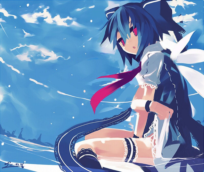
Img link : http://puu.sh/1QSdb
Text : ZunGeTa
extra : something who make the picture darker o_o
Thanks if you can do it
Img link : http://puu.sh/1QSdb
Text : ZunGeTa
extra : something who make the picture darker o_o
Thanks if you can do it
Hi again Miyu ~ it's been a while since my last request xD
Love your works.. i hope i can request again ~
• Userpage Signature
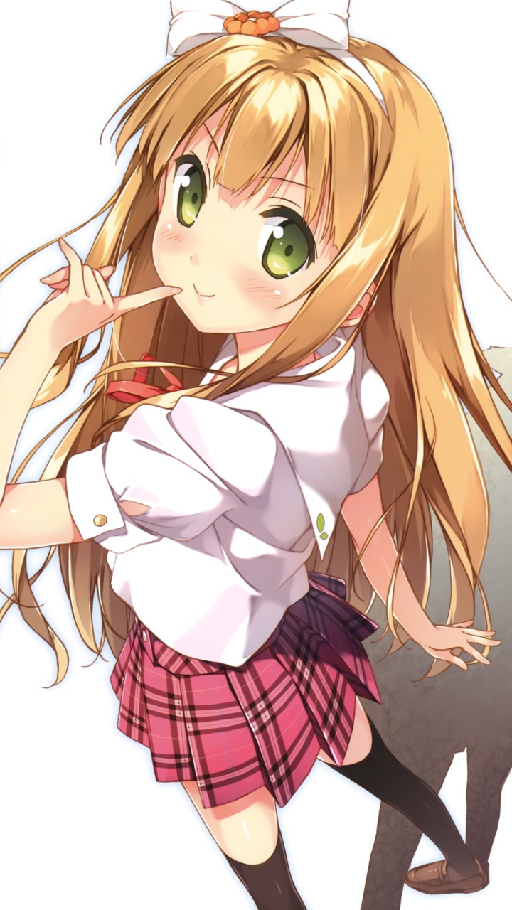
Image: http://puu.sh/5Rs7u.jpg
Text/Phrases: Mochi's Userpage
Size: 600 x 206
theme/colors you would like: anything that you think fits the picture :3
Border type: Round Border
Extra: Something sparkling www
Thankyou very much !
Love your works.. i hope i can request again ~
• Userpage Signature
Image: http://puu.sh/5Rs7u.jpg
Text/Phrases: Mochi's Userpage
Size: 600 x 206
theme/colors you would like: anything that you think fits the picture :3
Border type: Round Border
Extra: Something sparkling www
Thankyou very much !
miyu i need your help again.. xP
Can you make a group ava for me..?? xD
• Avatar
Image Link: https://fbcdn-sphotos-c-a.akamaihd.net/ ... 5112_n.jpg
Text:
-Number 0 :
-Number 1 :
-Number 2 : RyuukiX
-Number 3 : Reborn513
-Number 4 : kumakichiP4
-Number 5 :
-Number 6 : Rivaillenz
-Number 7 : ProAkira
-Number 8 : - Male : P4aran
- Female : AfizAja
-Number 9 :
Background: -
Size: Normal Size..
Extra : i don't know.. xP
Hi Miyu ♥
please can you a avatar and a userpage banner?
USERPAGE:
IMAGE: http://www.google.it/url?sa=i&rct=j&q=& ... 5580690820
WRITTEN: Welcome to userpage of MrSmooooch!
SIZE: i don't now.... do you :3
AVATAR
IMAGE: http://www.google.it/imgres?sa=X&hl=it& ... =205&ty=96
WRIITEN: MrSmooooch!! · ∀ ·
SIZE: 128x128
Powered by Traduttore
again a great work from you
thanks a lot and merry christmas Miyu <3
thanks a lot and merry christmas Miyu <3
Hy Miyu! It's Me again.. 
This time, i want to request an Userpage Signature & Wallpaper
• Userpage Signature
Image: http://puu.sh/5RK8Q.jpg
Text/Phrases: Welcome to My Userpage
Size: 622x193
theme/colors you would like: whatever color matches the picture
Border type: Border
Extra: Just put my name "Sansica Kim TaeNy" with small font size and make the banner very cute.
• Wallpaper
Image: http://puu.sh/57j1O
Text/Phrases: "Sarifah Yusuf Bidin" please put the name on the right buttom in the picture
Size: Just like the picture 1920x1200
theme/colors you would like: Pink i think
Border type: no border
Extra: Just make the wallpaper very cute. I want to use the wallpaper in osu! menu background.
Thank you , and
sorry because the request was too much.
Hello!
I'd like to request an Avatar
Image Link: http://gndynames.files.wordpress.com/20 ... ka_rin.jpg
Text: If you can write " Madd <3 "
Extra/Any effect/anything else :
I know that in the image appears three girls, but I'd like you to focus on saber (the blonde girl)
If I can ask for a more customized avatar:
Thanks in advance for taking your time to do this
By the way, Nice work!
I'd like to request an Avatar
Image Link: http://gndynames.files.wordpress.com/20 ... ka_rin.jpg
Text: If you can write " Madd <3 "
SPOILER
Background: Deep blue .w.I'd be thankfull for that
Extra/Any effect/anything else :
I know that in the image appears three girls, but I'd like you to focus on saber (the blonde girl)
If I can ask for a more customized avatar:
SPOILER
I'd like you to use Saber's pose and just make a few changes (It's okay If you can't, You can just draw Saber too:3):
I'd like her hair to be black and waved until the shoulders as her eyes to be almond brown. If you can... add glasses too .w.
I'd like her hair to be black and waved until the shoulders as her eyes to be almond brown. If you can... add glasses too .w.
Thanks in advance for taking your time to do this
By the way, Nice work!
Topic Starter
This isnt exactly a drawing thread lols
My GIMP have just broke, so let me post here.
________________________________________
Type: Userpage banner
Image: click!
Size: 620*190.
Text: "rEdo's Userpage", font similar to CXu's banner. A bit darker colour, though.
Border: Border, just like in CXu's thing: two rectangles, white inside dark, 2px thick both.
Theme: Them legs in the foreground. However, if you've got some more spare time to make a second experimental banner, I'd like you to give a try at getting the best possible angle on the head. Besides that, nothing in particular. You could just add a little contrast, so the colours are vividier.
Thank you very much in advance.
@edit: Yes, just the legs with some extra contrast.
Sorry Miyu ;_; use that picture, ignore the guy with the cyan hat then. I'm ok with Edgeworth only (the one in red suit)
Avatar Request
Image : https://fbcdn-sphotos-g-a.akamaihd.net/ ... 8431_n.jpg
Text : Hyou
Background : Yes
Extra : Give Glasses
Thanks
Merry Cristmas >w<
Image : https://fbcdn-sphotos-g-a.akamaihd.net/ ... 8431_n.jpg
Text : Hyou
Background : Yes
Extra : Give Glasses
Thanks
Merry Cristmas >w<
It looks great ><Miyu wrote:
・ COMPLETED REQUESTS FOR ・
[-Rinzler-]
Completed reqs in previous pageNono your image is fine you just didnt used my forms or either read my rules i believe but the image is okay ^^;ZunGeTa wrote:
Sorry for the quality , then can I request my nickname on my actual avatar ?
Thanks if you can do it no problem and sorry if you don't have time =) have a good day
Thanks Miyu :3
• Avatar
Image Link: https://www.dropbox.com/sh/hkb3n286k624 ... olicia.jpg
Text: Holicia
Background: Yes
Border : Round Border & No Border
Extra/Any effect: don't change the text please, i just want that xmas hat XD , and the others is up to you
Thanks Miyu~!

Merry Christmas Everyone~
Image Link: https://www.dropbox.com/sh/hkb3n286k624 ... olicia.jpg
Text: Holicia
Background: Yes
Border : Round Border & No Border
Extra/Any effect: don't change the text please, i just want that xmas hat XD , and the others is up to you
Thanks Miyu~!
Merry Christmas Everyone~
Really great job as always ! <3Miyu wrote:
・ COMPLETED REQUESTS FOR
Momochikun
Completed reqs in previous page
Thank you so much ~
Topic Starter
updt
Topic Starter
ahah ty xD! >3<rEdo wrote:
...yes, just the legs.
Sigh, the language barrier. >_>"
Nice, thank you once again~
Size: 128x128 for an Avatar
Image Link:http://kawaii-mobile.com/wp-content/uploads/2013/07/Hentai-Ouji-to-Warawanai-Neko.Azusa-Azuki-Huawei-U9500-1-Ascend-D1-wallpaper.720x1280.jpg
Text: BoxesLoL
Background: Transparent please.
Extra/Any effect/anything else: Nice font please. Whatever else you think would look good.
Thanks! :>
Hi there Miyu... I would like to request again (sorry If I request too fast after My previous request, but It's only userpage change)
• Userpage Signature
Image: here
Text/Phrases: Welcome to satriobp's Userpage (and add some heartwarming quote)
Size: 620x210
theme/colors you would like: Perhaps makes It more heartwarm-looking, but still looks pretty cool
Border type: Border
Extra:
And also I think I kinda feel to donate some Avatars for You, since You did A nice job lately... Feel free to accept this
Album Link, will be updated everytime I have time
*Sorry If I didn't follow the rules
Oh... And Merry Christmas!~
Miyu sorry I'm requesting again, want to make christmas avatar too~
Image Link: http://puu.sh/5UHTr.jpg
Text: Yes ( Joker )
Background: Yes
Extra/Any effect: resize it so my avatar will be her full body and use various font colors so it can match her diamond wing if it's not look weird
thanks again Miyu~
Image Link: http://puu.sh/5UHTr.jpg
Text: Yes ( Joker )
Background: Yes
Extra/Any effect: resize it so my avatar will be her full body and use various font colors so it can match her diamond wing if it's not look weird
thanks again Miyu~
Hi Miyu ~
i want to request Userpage banner here
Image Link : http://puu.sh/5UWYh.jpg
Text : Xinely's Userpage
Size : 622x200
theme : make it cute >3<
Border type : Round Border
Thank you and Merry Christmas Miyu ~
i want to request Userpage banner here
Image Link : http://puu.sh/5UWYh.jpg
Text : Xinely's Userpage
Size : 622x200
theme : make it cute >3<
Border type : Round Border
Thank you and Merry Christmas Miyu ~
Avatar pls
Image Link: http://i1330.photobucket.com/albums/w57 ... 231243.jpg
Text: Tadaneko
Background: Transparent
Image Link: http://i1330.photobucket.com/albums/w57 ... 231243.jpg
Text: Tadaneko
Background: Transparent
Topic Starter
Im sorry for the delays..wasnt really in the best mood to edit this past two days,i'll do it today tho ^_^
Hurray happy 200th page ^u^
Hurray happy 200th page ^u^