forum

Shingeki no Kyojin/ Attack on Titan Skin V4.8 FinalX (HD&SD)

posted
Total Posts
270
Topic Starter
RA272Nirvash

The Extra Icons are for those, who don't like the normal Mod Icons with pictures in them.
they are located in a special folder in the Skin folder.


This is my 3rd Skin
now contains some Taiko elements


Downloads
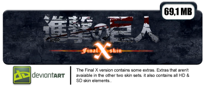
This Skin Contains HD Skin elements (with @2x at the end),
and all SD skin Elements as well (for players who can't use the HD skin elements)


HD Mediafire is now version 4.8
HD Push is now version 4.8
HD DeviantART still version 4.0


SD Mediafire is now version 4.8
SD Push is now version 4.8
SD DeviantART Still version 4.0


isn't on DeviantART at the momment, is a puu.sh link for the momment as well.

EDIT: I don't play OSU! anylonger. Parts in my computer broke down long ago, making it uncapable to play this game without any problems anylonger. But this only one of the reasons for me to quit. This skin stil should be partly useable. But the defaults and settings for skins changed, i've read coments about problems with the @2x HD elements, i guess they ain't used anylonger. (?)

eiher way, the skin works. I hope you will keep enjoying playing with it.
Topic Starter
RA272Nirvash
well that was it for the BETA time, sadly i only got a few critiques so far.

therfore i haven't made many changes.

the biggest one would be that i changed the normal OSU! part o.o
the hit-circles etc.

it should be way easier to play now,

i left the other files in a seperated folder for the players who didn't had any problems to play with the skin, as he was


I hope you can give me a bit Critique now, because there still is room to improve this skin.
I hope somone will reply on this thread =D


Critique so far
First Critique (on DeviantART)

- circels Merge with BG and other things merge as well = bad concentration

I will work on this ^^

- how Would be adding colors to the ranks ?

Why.... ? o.o

- larger variety of colors

okkay !?
that isn't a problem

- Different Combo Colors For Mania

if other people complain, okkay, i might do it anyway

______________________________________________________________________________
Colors .... colors and even more colors, Color Adict @.@ `? xD


______________________________________________________________________________


Second Critique (on DeviantART)


I love the menu, the cursor etc. are just amazing
thanks =D


But I don't like the beatmap style.
___________________________________________
- It looks good but it's hard to play.
- The hitcircles should be in my opinion normal line, not with this 'texture' or whatever.
- Same goes for the hit circles.

- The spinner is a liitle bit too... messy? There too many colours for me...
-- And it makes playing uncomfortable for me to play.


- So yeah, I love the appearance but I can't play well with it due to these dirstractions.

__________________________________________________________________________________________________________

thanks for the critique =D
i already know some of those things,
a friend told me about them. ^^

i don't see there any problem,
and i will work on these problems as soon as possible =D


@ all the others
Please, give me your critique,
tell me whats bad, what you dislike,
i don't can make this into a great skin without your help ?=D
deadbeat
you know, a better subject title would be Shingeki no Kyojin/Attack on Titan V2, not
[Skin][Shingeki no Kyojin][Attack on Titan][V2.0]
Topic Starter
RA272Nirvash
Hmmm o,o
that gives me to think,
till now it worked out acceptable,
but well,
i will try for this and my other skins. ^^

thanks for the tipp and the comment =D
sheiko_old
deberias cambiar eso de la dificultad esa cosas no me gusto (estrellas) x.x
Topic Starter
RA272Nirvash

sheiko wrote:

deberias cambiar eso de la dificultad esa cosas no me gusto (estrellas) x.x

when i try to translate this with google translator it doesn't make much sense,
because i don't speak spanish

could you be so nice to translate this in english >_<


i checked it again, do you wanna say smth. like
you would like stars more for the difficulty then the crest (coat of arms) ? o.o
Aka
nice :)
Topic Starter
RA272Nirvash

Aka- wrote:

nice :)
Thank you very much ^^
yamgloria
:D Beautiful skin !
_FreestyleBeats
wow. Such a nice skin <3
[Maid] NekoRyo
OwO this is so awesome!~ :OOOO
Topic Starter
RA272Nirvash

yamgloria wrote:

:D Beautiful skin !
.

[Maid] NekoRyo wrote:

OwO this is so awesome!~ :OOOO
.

_FreestyleBeats wrote:

wow. Such a nice skin <3
.
Thank you very much TwT
ExBia
I think you should improve this, it can be good
Topic Starter
RA272Nirvash

RainBowTR wrote:

I think you should improve this, it can be good
it would be realy nice,
if you could be so free, to tell me what to improve. ^^
i can't improve things i don't know about =D
Catninja
Nice ;)
Topic Starter
RA272Nirvash

Catninja wrote:

Nice ;)
Thx =D
zerod
Nice :D
Topic Starter
RA272Nirvash

zerod555 wrote:

Nice :D

thx <3 ^^
Eita
Nice skin :)
Topic Starter
RA272Nirvash

Raingan wrote:

Nice skin :)

Thank you very much xD =D <3


but i do know that it is a nice skin,
thats what peple always say.

i'm realy glad that people think it is nice =D
but i also do want to improve this skin,
so i need critique.
even the tiniest detail would be enough. ^^

that for all the others ho are going to comment =D <3
Scarlet237

RA272Nirvash wrote:


This is my 3rd Skin
Except for Taiko All should be Skinned.


I think the cursor is too plain and too small. It almost hard to find the cursor in white area. You should try with another color.
Topic Starter
RA272Nirvash

Scarlet237 wrote:

RA272Nirvash wrote:


This is my 3rd Skin
Except for Taiko All should be Skinned.


I think the cursor is too plain and too small. It almost hard to find the cursor in white area. You should try with another color.

Thank you very much for the critique,
i have been waiting for somone to give critique instead of "Nice skin" =D
"Nice Skin", what the hell bring these words me ? nothing i can't improve a skin with nice words . ^^
so thanks. ^^ <3

i will change it. ^^
cyberarrow
Nice :)
deadbeat
for some reason i'm having trouble getting ctb and o!m to work :<
no idea why it won't work though
Topic Starter
RA272Nirvash

cyberarrow wrote:

Nice :)
Thanks ^^'


deadbeat wrote:

for some reason i'm having trouble getting ctb and o!m to work :<
no idea why it won't work though
how, "it won't work" ? o.o

does it Look like Standardt CTB and O!M ?,
what exactly do you mean with that........ ?
mysteries.......
deadbeat


;___;
Topic Starter
RA272Nirvash

deadbeat wrote:


;___;

ahh~ i can tell you the reason =D
you are using the wrong skin xDDDDD

the Shingeki no kyojin skin you are using in this screenshot, is the Shingeki no kyojin Skin from _Rivaille_
if you want to use my skin you have to change the skin in options to my skin o.o
or it isn't working exactly because you got the other shingeki no kyojin skin in your skin folder
deadbeat
i should pay more attention >_>
76 skins ftw

ok, how about adding
  1. ranking-replay.png?
  2. fruit-banana.png
  3. fruit-banana-overlay.png
Topic Starter
RA272Nirvash

deadbeat wrote:

i should pay more attention >_>
don't be so hard with yourself xD

comment here if you have any other problems.

if you Don't like something in the skin,
if you have Critique on somethin.

i will be here , listening to your words.

taking them in and change the things in the skin xD


I'd die to hear some critique xD
druidxd

sheiko wrote:

deberias cambiar eso de la dificultad esa cosas no me gusto (estrellas) x.x
Since he didn't answer I'm going to translate it myself.

"You should change the "things" from the difficulty, I didn't like them (Stars)"

He's probably refering to the "Stars difficulty rankin" where instead of stars you used shields.

Topic Starter
RA272Nirvash

deadbeat wrote:

i should pay more attention >_>
76 skins ftw

ok, how about adding
  1. ranking-replay.png?
  2. fruit-banana.png
  3. fruit-banana-overlay.png

Theoreticaly there should be a ranking-replay.png o.o at least there is on in my folder,
i might have forgotten to put it in the raw.archive o.o
hmm


yeahh ... fruit-banana, till to my latest skin i have thought about it xD
but well....

if you wish for it i add it, i don't have a problem with it xD
deadbeat
if you add those 3, i'd have no problems adding this to completed \:D/
Topic Starter
RA272Nirvash

deadbeat wrote:

if you add those 3, i'd have no problems adding this to completed \:D/

ahh, now i remember you are the guy from The Completed Skin Compendium =D

no, i will make a comment when the time is ripe.
or to be more accurate when this skin is V3.0? xD

like My K-project Skin which is 3.0 ?

the "?" for unclearness if i will make further ubdates xD

so yeah, i will work tommorow on all of my 4 skins to bring them all to 3.0 ?

only my Spice and Wolf Skin won't make it tommorow ^^
deadbeat
well, let me know when you're ready, or if you want me to check any other skins
Topic Starter
RA272Nirvash

deadbeat wrote:

well, let me know when you're ready, or if you want me to check any other skins
i will, maybee already today afternoon ^^
Suave_old_1
the song tabs ( 6th picture) should be alot more simpler and cleaner, same goes with the mod pictures. IMO :) Overall you just need to polish it up, and make it more cleaner/sharper quality with images. gj tho
ahmedhaziq
Nice :)
Topic Starter
RA272Nirvash

MnMz wrote:

the song tabs ( 6th picture) should be alot more simpler and cleaner, same goes with the mod pictures. IMO :) Overall you just need to polish it up, and make it more cleaner/sharper quality with images. gj tho
Thanks ;D
Now i am going to make all of my Skins into HD Skins, all thanks to you,
you stole my time, give it back xD
i await full critique, what is good and bad, after i am finished xD

- - - - - -

ahmedhaziq wrote:

Nice :)
Thanks <3
Koko Ban
disclaimer: i'm basing on my first impression after seeing that screenshot. haven't tried the skin myself so i can't comment on "readability" yet)

holy shit this skin is actually very good!

my only gripe about it though is the use of pics of characters for mod icons. it really looks off and i have issues regarding "pic slideshow" skins which plagues 90% of all anime-themed skins. everything else looks solid and spot on (i'm really digging that pause screen).
Topic Starter
RA272Nirvash

Koko Ban wrote:

disclaimer: i'm basing on my first impression after seeing that screenshot. haven't tried the skin myself so i can't comment on "readability" yet)

holy shit this skin is actually very good!

my only gripe about it though is the use of pics of characters for mod icons. it really looks off and i have issues regarding "pic slideshow" skins which plagues 90% of all anime-themed skins. everything else looks solid and spot on (i'm really digging that pause screen).

thank you very much ^^
hmm yeah ........ puhh
i personaly like the mod icons.
but if you dislike them i might change them, or add a additional set of other icons.
what would you think off ? how would you make the mods better, what else would you do for the mods ? O_O

well yeahh, the skin will change a bit anyway, because i will release the HD version very soon ^^
Evanaire
Didn't liked some sounds, but that skin is good. There's some kind of magic here because I can't see the cursor 85% of the time but still could play pretty well!
Topic Starter
RA272Nirvash

Evanaire wrote:

Didn't liked some sounds, but that skin is good. There's some kind of magic here because I can't see the cursor 85% of the time but still could play pretty well!

thanks =D

if you like the cursor, copy it xD
because in the HD version the magical cursor will be removed, and changed against a better visible one xD
Aleksart
wow
very nice skin~
I like
download~ :)
Koko Ban

RA272Nirvash wrote:

what would you think off ? how would you make the mods better, what else would you do for the mods ? O_O

well yeahh, the skin will change a bit anyway, because i will release the HD version very soon ^^
i would like use SnK-related symbols as icons. or if there isn't any, modify the exisiting icons to make it fit with SnK's grungy theme (like a clock carved on a grungy wall for doubletime, etc.)

if you really like to stick with the "slideshow" ones, at least make sure it's RELEVANT to the mod and you're not just slapping random images and calling it a day.

a good example would be using the multiple image animation of the character tumbling on the OP as an icon for DoubleTime, Eren's mom almost getting eaten by a titan for SuddenDeath, Eren fighting collosal titan as HardRock, etc.
Topic Starter
RA272Nirvash

Koko Ban wrote:

RA272Nirvash wrote:

what would you think off ? how would you make the mods better, what else would you do for the mods ? O_O

well yeahh, the skin will change a bit anyway, because i will release the HD version very soon ^^
i would like use SnK-related symbols as icons. or if there isn't any, modify the exisiting icons to make it fit with SnK's grungy theme (like a clock carved on a grungy wall for doubletime, etc.)

if you really like to stick with the "slideshow" ones, at least make sure it's RELEVANT to the mod and you're not just slapping random images and calling it a day.

a good example would be using the multiple image animation of the character tumbling on the OP as an icon for DoubleTime, Eren's mom almost getting eaten by a titan for SuddenDeath, Eren fighting collosal titan as HardRock, etc.

well, i am going with 2. icon sets now =D
one normal in HD with pictures,
and one similiar to this ones (offyourse also in HD)


they are named selection-mod-key4-8@2x

therfore they only will be shown half the size from the here visible. ^^

therfore if you like, i will add your idea for double time. ^^

Aleksart wrote:

wow
very nice skin~
I like
download~ :)

thank you very much. <3 ^^
kazumi-san95
Nice ^_^
Topic Starter
RA272Nirvash

kazumi-san95 wrote:

Nice ^_^
thanks ^^
jinnoshots
how to download?
Topic Starter
RA272Nirvash

jinnoshots wrote:

how to download?

http://dermaertyrer.deviantart.com/art/OSU-Skin-Shingeki-no-Kyojin-V2-0-375060924

this link leads to deviantART

right beside the picture should be a download button that looks like this


just click on it and the download will start ^^
Topic Starter
RA272Nirvash
The HD Version is out =D
and men, it is kind of big xD

if there are any problems, please tell me =D
Kotatsu_old
I really like the skin, especially the overall feeling of SnK which this skin brings :) the HD version is also really great.

But I had to adjust the skin a little so I can play with it. First of all, I really dislike the cursor. This is probably just my taste, but it kinda destroys the the skin in my opinion, the colour doesn't fit well, and the shape isn't that good looking either.
Furthermore, while the style of the hits (miss, 100, 300) are quite cool and fitting, I had to remove the 300hit, because I couldn't see when there was something like a stream and everywhere were big 300hits. This is just something I want to mention, it's not negative at all, but maybe you could do some alternatives or something?
Oh, and I think the approach circle is somehow ...big. I didn't changed it, because it bothers me not too much, but I have to say, it's really big. ^^

Overall: Chapeau! I don't think someone can make a SnK skin which will be manifestly better than this. There are some things bothering me here and there, but you can't make it perfect for everyone. Great skin! (^. ^)

I don't know if you will work on this skin again, but nevertheless I hope I could help you to improve it.
Topic Starter
RA272Nirvash

Kotatsu wrote:

I really like the skin, especially the overall feeling of SnK which this skin brings :) the HD version is also really great.

But I had to adjust the skin a little so I can play with it. First of all, I really dislike the cursor. This is probably just my taste, but it kinda destroys the the skin in my opinion, the colour doesn't fit well, and the shape isn't that good looking either.
Furthermore, while the style of the hits (miss, 100, 300) are quite cool and fitting, I had to remove the 300hit, because I couldn't see when there was something like a stream and everywhere were big 300hits. This is just something I want to mention, it's not negative at all, but maybe you could do some alternatives or something?
Oh, and I think the approach circle is somehow ...big. I didn't changed it, because it bothers me not too much, but I have to say, it's really big. ^^

Overall: Chapeau! I don't think someone can make a SnK skin which will be manifestly better than this. There are some things bothering me here and there, but you can't make it perfect for everyone. Great skin! (^. ^)

I don't know if you will work on this skin again, but nevertheless I hope I could help you to improve it.
Offcourse i will work on it agan =D
if there are thinks that cause problems i will work on them =D

Danke vielmals für das Ausfürliche feedback xD =D
da waren eh noch einige dinge die ich ändern wollte . ^^
Kotatsu_old

RA272Nirvash wrote:

Offcourse i will work on it agan =D
if there are thinks that cause problems i will work on them =D

Danke vielmals für das Ausfürliche feedback xD =D
da waren eh noch einige dinge die ich ändern wollte . ^^
Kein Ding, außerdem ist mir gerade noch aufgefallen, dass es ja gar keine custom hitsounds gibt. Wenn du da was großartiges draus machen könntest, würde das dem Skin bestimmt sehr gut tun ;D
Topic Starter
RA272Nirvash

Kotatsu wrote:

Kein Ding, außerdem ist mir gerade noch aufgefallen, dass es ja gar keine custom hitsounds gibt. Wenn du da was großartiges draus machen könntest, würde das dem Skin bestimmt sehr gut tun ;D

lol ja xD
Die Hitsounds werden kommen xD
wann ? ... das steht in den sternen xD

ich lach mich grad über meinen neuen cursor versuch schlapp xD
er sieht gut aus, aber ich glaub ich werd das drehen auschalten müssen xD


das sieht voll lustig aus wie das ding sich dreht xD

aber ich glaub ich werd jetzt wohl oder übel sehr viele cursor machen xD
und jeder wählt einfach den den er mag xD

und ich hab bedenken das der da oben genau ist xD
Kotatsu_old

RA272Nirvash wrote:

lol ja xD
Die Hitsounds werden kommen xD
wann ? ... das steht in den sternen xD

ich lach mich grad über meinen neuen cursor versuch schlapp xD
er sieht gut aus, aber ich glaub ich werd das drehen auschalten müssen xD


das sieht voll lustig aus wie das ding sich dreht xD

aber ich glaub ich werd jetzt wohl oder übel sehr viele cursor machen xD
und jeder wählt einfach den den er mag xD

und ich hab bedenken das der da oben genau ist xD

Ja, Alternativen zu basteln ist imme ne gute Entscheidung. Am besten wäre als Standard Cursor einfach was ganz simples, was ins Fabrschema passt, man aber trotzdem noch gut sehen kann. Vielleicht irgendwas weißes oder violettes? ^^

Außerdem sind mir noch weitere Sachen aufgefallen:

Bei der life-bar kann man leider nicht lesen, um welche Mauer es sich handelt, da die Embleme der Mauern so weit oben sind, dass der Name der Mauer nicht mehr im Bildschirm/Fenster ist.

Beim Spinner ist der Spinner-Circle sichtbar nicht mittig. Die"spins per minute"-Anzeige sieht gequetscht aus und die blaue Farbe passt auch nicht wirklich zum schwarz/grau/braunen Farbstil SnK's.
Topic Starter
RA272Nirvash

Kotatsu wrote:

Mir sind noch weitere Sachen aufgefallen:

Bei der life-bar kann man leider nicht lesen, um welche Mauer es sich handelt, da die Embleme der Mauern so weit oben sind, dass der Name der Mauer nicht mehr im Bildschirm/Fenster ist.

Beim Spinner ist der Spinner-Circle sichtbar nicht mittig. Die"spins per minute"-Anzeige sieht gequetscht aus und die blaue Farbe passt auch nicht wirklich zum schwarz/grau/braunen Farbstil SnK's.
das mit den mauern weiß ich, daran sitz ich grade =D xD

der spinner ist mir vorhin auch aufgefallen, ist schon auf meiner liste =D

und wenn der spin meter so stört ändere ich ihn =D ^^

und zum cursor, ja ich bin jetzt auch fleißig am basteln xD
was simples, okkay =D
also mach ich auch einige simple. =D
Kotatsu_old
Freut mich, dass du an allem arbeitest! (n _ n ) Fight-o~!
Topic Starter
RA272Nirvash

Kotatsu wrote:

Freut mich, dass du an allem arbeitest! (n _ n ) Fight-o~!

nicht an allem xD
gestern abend ist mir aufgefallen das ich beim großen xh ranking, anstatt SS nur ein S stehen habe xD
das hab ich bisher noch nciht behoben, und mach es erst wenn die wichtigeren dinge getan sind xD
Kotatsu_old

RA272Nirvash wrote:

nicht an allem xD
Das war auch mehr übertragend gemeint. :3
Topic Starter
RA272Nirvash

Kotatsu wrote:

RA272Nirvash wrote:

nicht an allem xD
Das war auch mehr übertragend gemeint. :3
und ich hab mich versehen xD bei xh ist doch ein ss xD

+ ich glaub ich übertreib grade xD

wie sieht das aus >_< ?
gut ...... schlecht ..... besser als vorher ? xD

Kotatsu_old
Also den Cursor fonde ich von der Farbe ja schon mal passender. ^.^

Grad eben ist mir noch was zu den approach circles der circles und slider aufgefallen. Bei Streams kann man oft nicht erkennen, wie viele es nun sind, weil der schwarze Streifen durch den approach c. es wie 2 erscheinen lässt.
Das war vor allem bei mir so, wenn die Combo-Farbe etwas dunkles, wie Blau, ist.
Topic Starter
RA272Nirvash

Kotatsu wrote:

Also den Cursor fonde ich von der Farbe ja schon mal passender. ^.^

Grad eben ist mir noch was zu den approach circles der circles und slider aufgefallen. Bei Streams kann man oft nicht erkennen, wie viele es nun sind, weil der schwarze Streifen durch den approach c. es wie 2 erscheinen lässt.
Das war vor allem bei mir so, wenn die Combo-Farbe etwas dunkles, wie Blau, ist.

keine sorge =D
es ist schon ein viel dünnerer approach cirkel und slider cirkel drin xD
und auch so besser xD


und die anderen sachen ?= xD
Kotatsu_old
Ja, jetzt fiel auch zum ersten mal auf, dass die zahlen der Zusammenfassung am Ende eines Lieds auch bläulich sind. x)
Also, die weißen Zahlen mit der feuerroten Hinterlegung sieht auch defintiv besser aus. ;3
Ansonsten sehe ich nichts, was sich verändert hat? Falls noch was dabei ist, weise mich mal drauf hin. ;D

Mir ist gerade voll die Idee eingefallen! :D Wenn man ne Pause hat in einem Lied, dann kommen ja am Ende dieser Pause die 4 Pfeile, die dir zeigen, dass es weitergeht. Wär doch sehr passend, wenn das "feuerrote Pfeile" wären! (wegen "Guren no Yumiya") :D? Nur ne Idee. :)
Topic Starter
RA272Nirvash

Kotatsu wrote:

Ja, jetzt fiel auch zum ersten mal auf, dass die zahlen der Zusammenfassung am Ende eines Lieds auch bläulich sind. x)
Also, die weißen Zahlen mit der feuerroten Hinterlegung sieht auch defintiv besser aus. ;3
Ansonsten sehe ich nichts, was sich verändert hat? Falls noch was dabei ist, weise mich mal drauf hin. ;D

Mir ist gerade voll die Idee eingefallen! :D Wenn man ne Pause hat in einem Lied, dann kommen ja am Ende dieser Pause die 4 Pfeile, die dir zeigen, dass es weitergeht. Wär doch sehr passend, wenn das "feuerrote Pfeile" wären! (wegen "Guren no Yumiya") :D? Nur ne Idee. :)

lol xD so achtest du auf den ranking bildschirm xD

hmm, keine schlächte idee =D
für gewähnlich skinne ich die feile eigendlich nciht,
aber warum denn nicht xD

die werd ich dan wohl jetzt machen xD
thx
Kotatsu_old
Kein Problem :D liegt auch in meinem Interesse den Skin so gut wie möglich zu machen. :)
Topic Starter
RA272Nirvash

Kotatsu wrote:

Kein Problem :D liegt auch in meinem Interesse den Skin so gut wie möglich zu machen. :)

hmmm ..... ich kann ihn rot machen, OSU! zeigt ihn aber blau an xD
warum ?? xDD
Kotatsu_old
xD Nicht sicher. wirklich ... nicht sicher. :D
Topic Starter
RA272Nirvash

Kotatsu wrote:

xD Nicht sicher. wirklich ... nicht sicher. :D

hmm xD, ich werde schon nen weg finden xD


SO Version 3.5 FINAL HD is out =D
some changes, added some things,

there are now alternative cursor in the skin ordner, for those who don't like the actual cursor.

some taiko parts added.


problem with the skinner solved and alot more. =D
Kotatsu_old
Ja, sieht im gesamten jetzt wirklich besser aus. :) Vor allem die "Guren no Yumiya" hast du, finde ich, sehr gut hinbekommen.
Topic Starter
RA272Nirvash

Kotatsu wrote:

Ja, sieht im gesamten jetzt wirklich besser aus. :) Vor allem die "Guren no Yumiya" hast du, finde ich, sehr gut hinbekommen.

da kommt noch mehr xD
aber langsam denk ich drüber nach die HD Elemente und SD elemente einzeln zu machen xD
wenn das so weitergeht geht das auf die 70mb+ zu xD
gut ohne SD wäre es dann immernoch ca 50mb+ xD

irgendwelche vorschläge was ich verbessern könnte ? xD


bisher gefält mir die alternative für die 300er auch nch nicht wirklich xD
show more
Please sign in to reply.

New reply