Revamped the theme completely, thus, completely updated Top Post.
It's still the Osu!loid theme, but I've revamped the crap out of it. It's now based of the rhythm game "Hatsune Miku -Project Diva-" which was just recently released. This makes the theme STILL a Vocaloid-based theme, just now I have a lot more ideas flowing since I'm just going to base it loosely off the game itself.
All imagery are from either Piapro or Crypton unless stated otherwise.
Latest Version
Version 1.31 upppy!
-Added widescreen scorebar option.
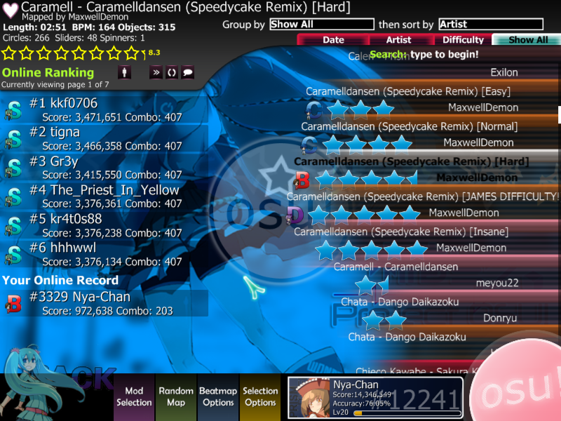
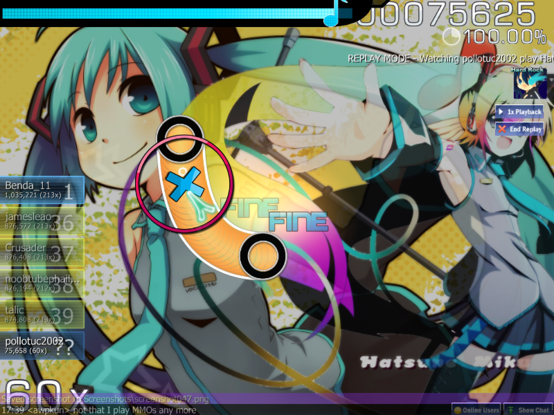
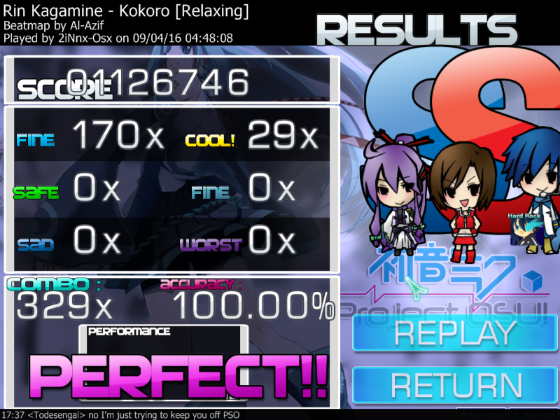
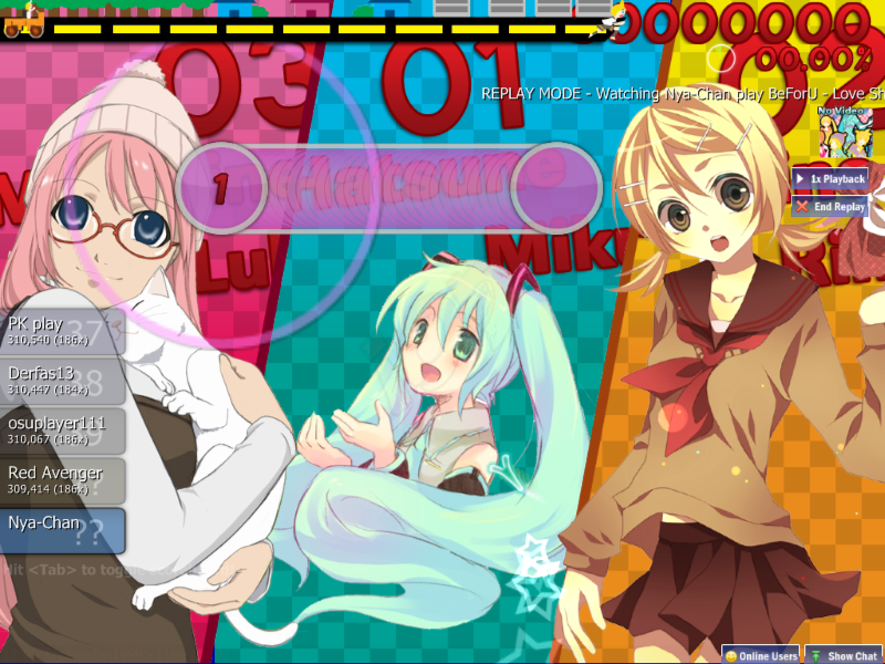
Sample Screencaps
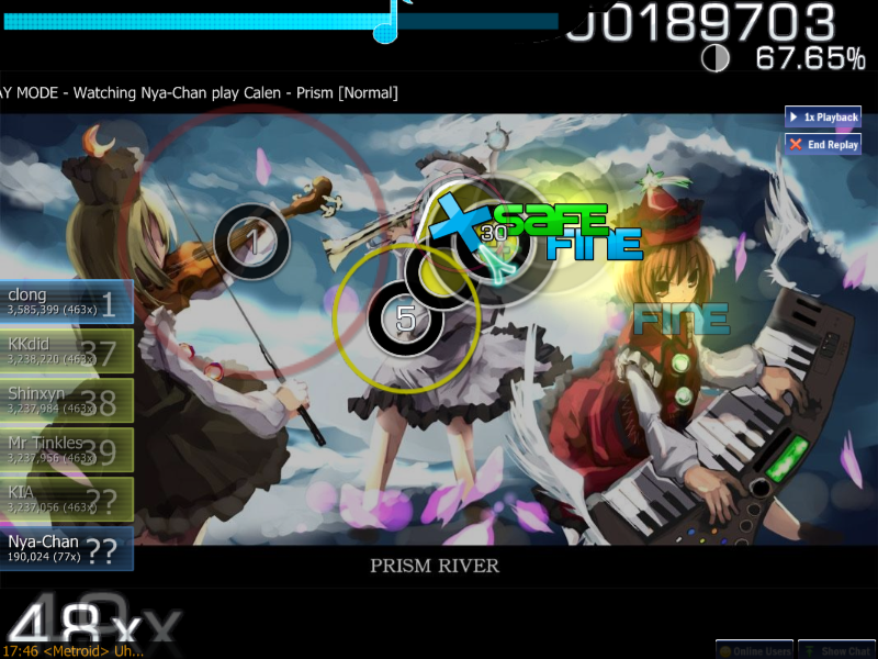
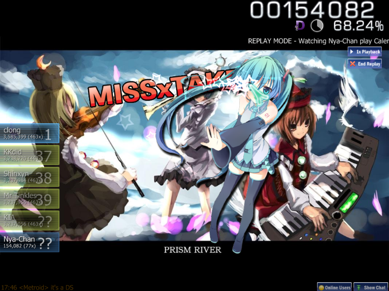
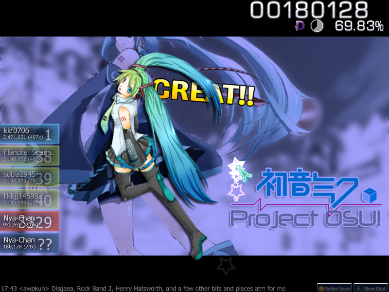
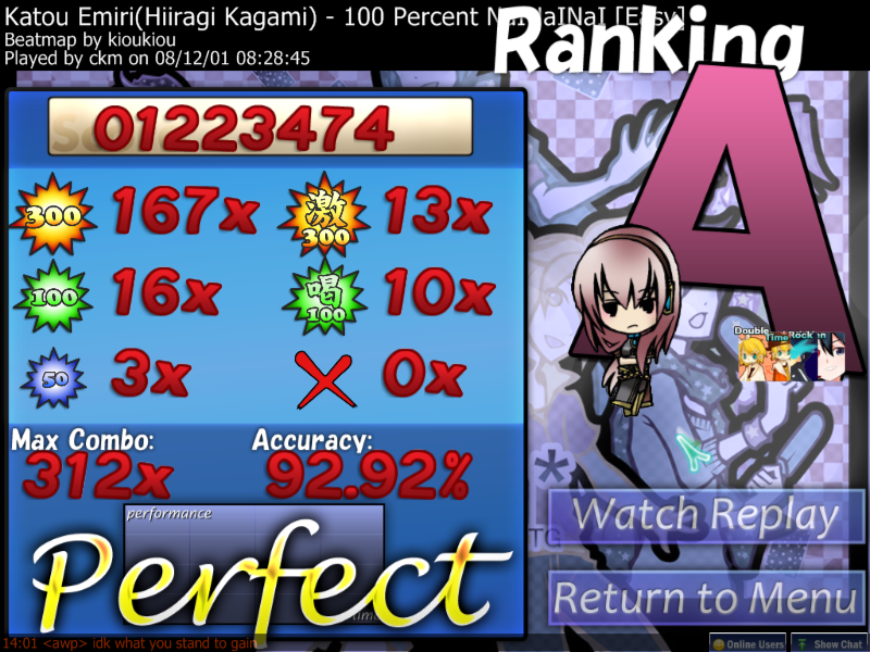
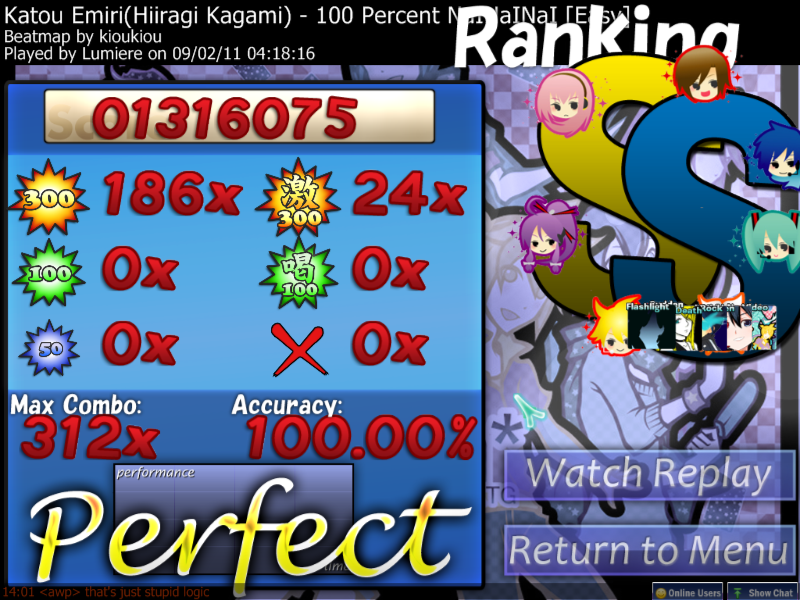
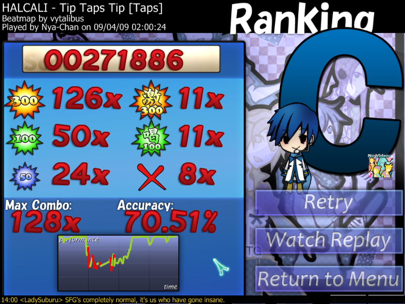
--Screencaps are from Version 0.5, see most recent post for newer screencaps--
SPOILER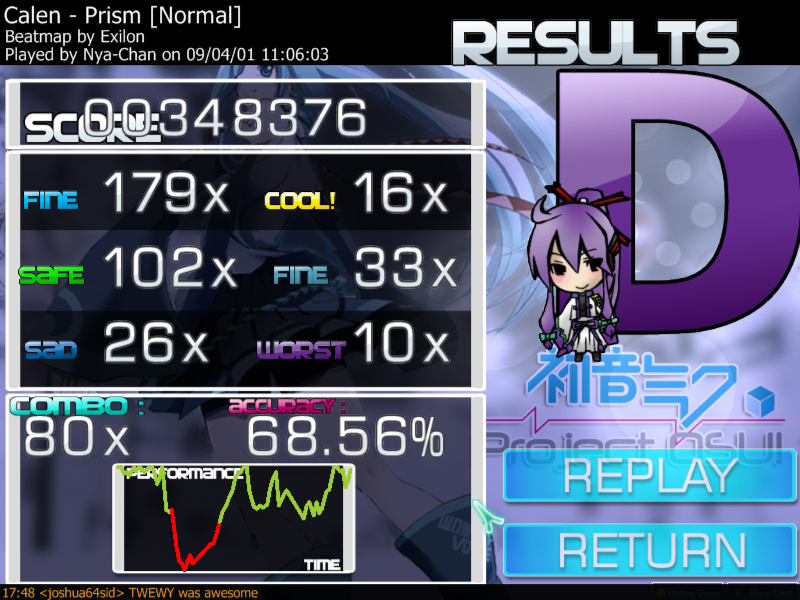
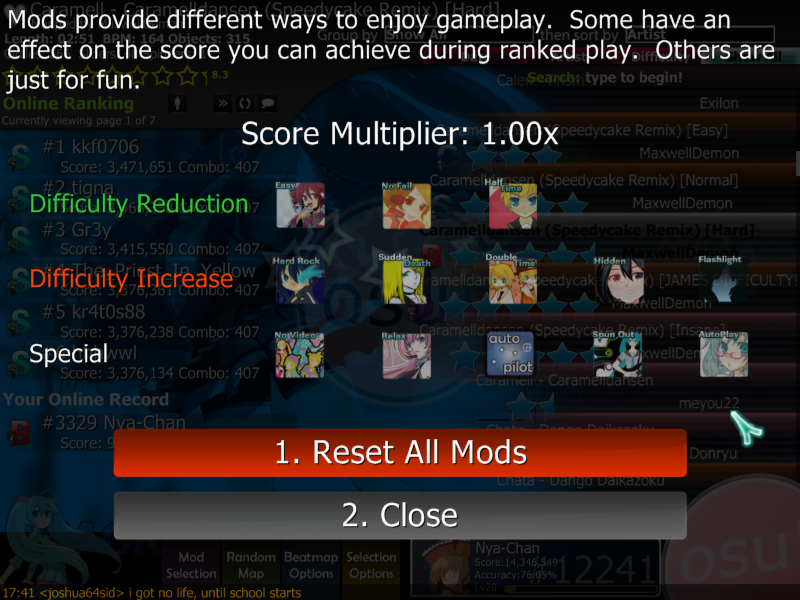
(can anyone tell me the image name to put for auto pilot? I have an image for it... but it's not the right file name. :/)
(can anyone tell me the image name to put for auto pilot? I have an image for it... but it's not the right file name. :/)
Past Versions
upppy!
-New Ranking Images
-Pause overlay added
-New combo bursts
-Changed 100k and 300 hit images
Version 1.2 upppy! || MegaUpload
-HP Bar made taller for score/pi chart area as well as opacity lightened in that area
-Score numbers overlap more
-Score breakdown BG fixed
-Performance chart image fixed
-Combo image fixed
-Other minor fixes
Version 1.1 upppy! || MegaUpload
-Cursor changed, hot spot is now the center.
-Hit circles made lighter to allow recoloring for combos.
-Removed pointless wrongly-named auto pilot file.
Version 1.0 upppy! || MegaUpload
-CtB Finished.
-Spinner Fixed.
-Health Bar made better.
-Revamped ki images.
-Better slider image.
-Combo colors added.
-"Ready" sound added.
-Ready and Go images changed.
Version 0.6 upppy! || MegaUpload
-CtB Partially Skinned.
-Spinner added.
-Selection Images added.
-Auto Pilot file name changed and now works.
Version 0.5 (new title) upppy! || MegaUpload
NOTE: To those who downloaded the previous incarnation of this theme, the folder's name IS NOT THE SAME. You will have to delete the old Osu!loid theme if you don't want it anymore.
-Countdown + Go sounds (Yes it's me attempting to imitate the characters again. xD)
-Hit Circles
-Updated Numbers (To duplicate PJD's)
-Combo/Point Bursts
-New playfield image
-Pause Menu/Results screen buttons
-Updated ranking images
-Ranking page images added
-New HP bar
-New theme logo (since I changed the name
 )
)-And probably a whole pile of crap I missed
OSU!LOID: Version 0.5 upppy! || MegaUpload
-Initial Release


 I love you're skin