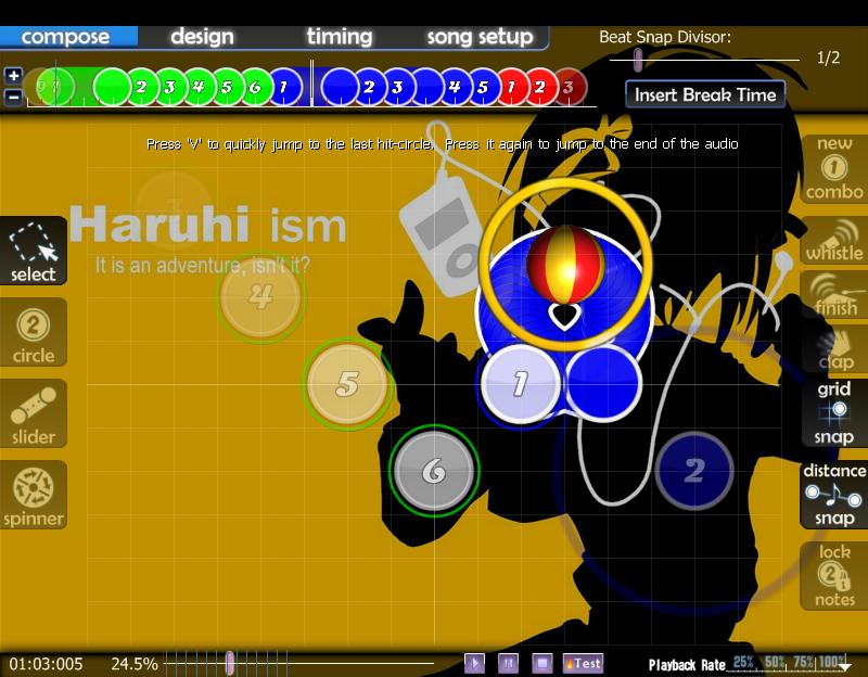
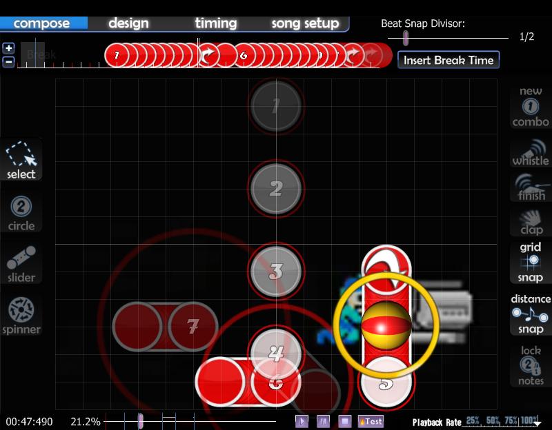
Slider approach circle? Is that what it's called? Whatever.
It really ruins a lot of creative sliders that the follow circle is so huge. You barely need to move the mouse at all, really. I searched with several terms. I found nothing. I request compatibility for size reduction.
Look at the screenshots. Note the sliders and the giant follow circles around them. This is problem enough for the first screenshot, barely requiring any movement from the mouse to complete the slider, but the second one is a crime against rhythm games. I don't even need to move my mouse at all to complete that.
I understand there would be visual issues for skins, seeing the giant follow circle when the 'real' follow circle is actually smaller, but if the default osu! skin can get a workable solution, I'll be happy. And by 'workable solution', I mean a bar in the song setup>difficulty menu.

