forum

Jigoku Shoujo Skin

posted
Total Posts
23

Which version do you prefer to ?

Japanese version
152
59.38%
English verssion
104
40.62%
Total votes: 256
Topic Starter
Vieroz
Hi all,
this is my first osu skin, and you're welcome to give me a lot of suggestions in this thread.
The theme is Jigoku Shoujo,
and I barely made them into two different versions. One is Japanese version, while other is English version.
The different between them is as follow :
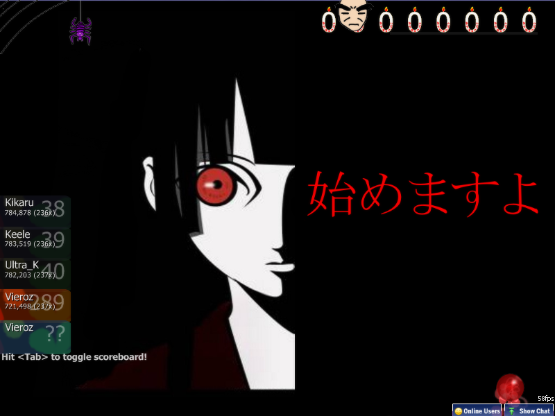
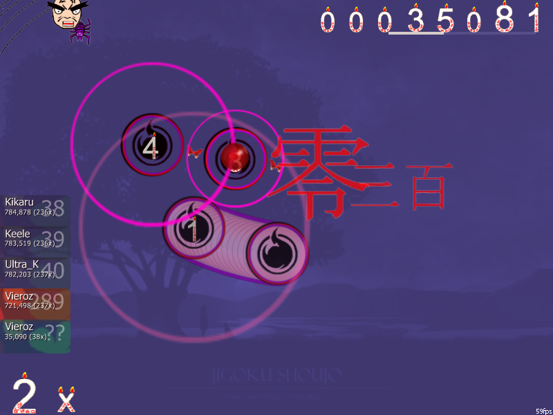
- On J-version, the hit-point were all been translated into kanji.
- On J-version, the menu and other character were translated into Japanese.
other than above, they exactly the same.
All of you can download it and give it a try, and don't forget to poll them up here. (so far, the Japanese version is at lead)

here's the screenshots :


well, i'm ready to upload it to upppy.
and.... uploaded

download the Japanese version here... http://up.ppy.sh/files/jigokushoujojapaneseversion.rar

download the English version here... http://up.ppy.sh/files/jigokushoujoenglishversion.rar

latest updated (06-01-2`9) :
- fixed the overlay issues, clean the jagged, and some other things that aren't too important.
- tweak the panel rank, fixed another overlay.
- releasing the japanese version, and starting the english version.
- fixed the bad renders.
- fixed the rank panel.
- fixed the reverse arrow.
- fixed cutted issues.

Latest updated (13-01-2`9) :
- Smooth the small rank.
- Smooth the marble cursor.
- Translated Japanese version.
- Fixed some not-too-important things.
- Releasing English version.

Latest updated (15-02-2`9) :
- Made the hit circle to look more glass-colored.
- Smooth the section-pass and ranking png.
- Fixed the slider position.
- Resized the section-fail.

more previews below...


Wizard Of Orz
looks creepy but smooth and good. I think this skin will be cool~
devkit4384
hooray hell girl skin!!
Topic Starter
Vieroz

supergarlic wrote:

looks creepy but smooth and good. I think this skin will be cool~
yes a bit creepy, but hey, we're talking about 'hell' girl here, and it supposed to be creepy one, right?

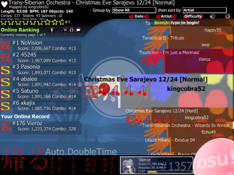
here's another screenshots :


don't forget to download it on the first post...


Wizard Of Orz
the hell girl holding the ss sign is blurry and half its body is cut off. Also are all the letter ranks gonna be her holding a letter sign because that would look plain and dull. The old man life bar has no bar abd looks a bit wierdD:
YoshiKart
Maybe some mist surrounding her to get rid of the "cut off" feeling?
devkit4384
This theme is ok, but has many problems. First of all, hit-50 - hit-300g is in japanese without any numbers which makes it hard to tell which is which. There are allot of bad renders (i.e. star2, ranks, everything else).

Suggestions:
"Redesign hit-50, 100 & 300 as well as reverse arrow
*translate the menu into english, maybe keep large japanese text in the background with 50% opacity like how osu's defualt skin.(btw keep mod selection, random ..etc.. -it looks cool )
*fix bad render
*keep the countdown (are you ready, go ,3,2,1 etc..)
*redesign everything on the life bar
*remove the flame from the #, but keep the design.

overall this theme lacks darkness
Hange
Love the spinner and slider ball :)

And here are the suggestions:
*Add selection-selectoptions.png and selection-selectoptions-over.png
*Make the background of ranking-A.png transparent

These are optional if you don't want to update the jp ver anymore:
ranking-retry.png
Change to "もう一度"
pause-continue.png
"続ける"
ranking-accuracy.png
"正確度"
ranking-perfect.png
"完璧"
ranking-maxcombo.png
"最大コンボ数"
pause-back.png
"依頼取消"

That's all so far.:)

supergarlic wrote:

Also are all the letter ranks gonna be her holding a letter sign because that would look plain and dull.
Er...I think you would find the answer by checking the skin folder.:?
Topic Starter
Vieroz

supergarlic wrote:

the hell girl holding the ss sign is blurry and half its body is cut off. Also are all the letter ranks gonna be her holding a letter sign because that would look plain and dull. The old man life bar has no bar abd looks a bit wierdD:
err... KnuckMew had already answered it,

the score is as follow :
SS-S-ss-s : Ai
A : Ren
B : Wanyuudo
C : Hone-onna
D : Kikkuri
Section-pass : Jigoku Logo
Section-failed : Kikkuri said baka to you

KnuckMew wrote:

*Add selection-selectoptions.png and selection-selectoptions-over.png
*Make the background of ranking-A.png transparent
...up-dated...thanks for remind me.

devkit4384 wrote:

This theme is ok, but has many problems. First of all, hit-50 - hit-300g is in japanese without any numbers which makes it hard to tell which is which. There are allot of bad renders (i.e. star2, ranks, everything else).

Suggestions:
"Redesign hit-50, 100 & 300 as well as reverse arrow
*translate the menu into english, maybe keep large japanese text in the background with 50% opacity like how osu's defualt skin.(btw keep mod selection, random ..etc.. -it looks cool )
*fix bad render
*keep the countdown (are you ready, go ,3,2,1 etc..)
*redesign everything on the life bar
*remove the flame from the #, but keep the design.

overall this theme lacks darkness
- errr... all the hit and all the menu was supposed to still in japanese because this is the jap ver., however, in the english version, things will be translated.
- bad render will be fixed
- life bar is something that i'm not too capable of, could you give me some idea (well, my idea is to draw wanyuudo as the jigoku kart wheel)
- the flame from the # ? (do you mean the font fire?)
...thanks for all advises... things will be up-dated soon...

YoshiKart wrote:

Maybe some mist surrounding her to get rid of the "cut off" feeling?
this sure is the hardest part, I'll see what I can do about this.
and thanks for the mist advice, that really help me out.

Download: that special - project (dkun) [Sakura pow!].osu
Topic Starter
Vieroz
....UPDATED... download link on the first post...
Topic Starter
Vieroz
Finally, the English version is finished.

Download link on the first post...
cyanberryio

devkit4384 wrote:

hooray hell girl skin!!
lol, I saw the emblem and I knew I recognized it.

I'll try this one later. :) Looks nice and clean.

Sorry if this a bump, but there is hardly any activity in the skin forum. :P and its only the second page.

And even though I know you don't mean it in any way, but be careful when shortening "Japan" or "Japanese" because I'm pretty sure jap was a racial slur during WWII.(or around that time period) Just a note. :) Some people are okay with it, but some people may find it offensive.

My comments on the skin:(not like if they matter but oh well)I like it in general. If only the slider track could be transparent then it would be even better. The hit lighting loks really nice with this skin since you can see it actually. :D It actually got me my first S on Hare Hare Yukai. Second overall. :P

I like it though, I'll use every once in a while.

^For the Japanese version. Didn't bother to try the English one yet.
Topic Starter
Vieroz
re Alex0686 :
wow, i didn't mean any harm with the shortening, really, and if someone got it too harsh then please receive my deep apologize. (i used the shortening because it simply simplify me, nothing more nothing less)
i'll keep shortening things in mind the next time i create them.
thanks for the warning suggestion.

re comment on my skin :
how do i made them to look more transparent ? (i tried the mask method but can't get it glass)
cyanberryio
This map has been deleted on the request of its creator. It is no longer available.
Topic Starter
Vieroz
re Alex0686 :
you're welcome to aid me suggestions anytime ;) , (i really need it, seriously)
- about adding some color on the hit circle may find it quite handy, it'll help users to see the hit circle more precise. I'll take your advice to make it colored.
- and about the session-pass, i'll give it my best shot to smooth them up.
- and about the glow in hit circle..... ... ... ... , well, not mean any offense, it is blurring the shape, is there some other way to glow it but not changing the shape ?
cyanberryio

Vieroz wrote:

re Alex0686 :
you're welcome to aid me suggestions anytime ;) , (i really need it, seriously)
- about adding some color on the hit circle may find it quite handy, it'll help users to see the hit circle more precise. I'll take your advice to make it colored.
- and about the session-pass, i'll give it my best shot to smooth them up.
- and about the glow in hit circle..... ... ... ... , well, not mean any offense, it is blurring the shape, is there some other way to glow it but not changing the shape ?
Yeah, after a while, I didn't notice it too much, so I didn't think the glow was necessary. So I kept the top one in there.

And the section-fail is just a top part of a person, so it doesn't fit in too well. Of you made it bigger without harming quality, so it reaches the bottom of the screen without quality stretching.(Okay, maybe not too possible, but you could try another image, or somehow pull what I said off, I kind of did it myself, but it wastes your time when you realized(for me at least)how horrible it turned out :P) Also the selection tab make the currently selected tab in black and hardly readable.

That's really all I have to say for now, some people may disagree with what I say though. :\
Topic Starter
Vieroz
This map has been deleted on the request of its creator. It is no longer available.
cyanberryio
Impressive! The only thing that bothers me(tiny things for some reason, just mini imperfections, even I have some of these in mine)is that the Japanese letters, the kanas(in general, mean both Hiragana and Katakana) and Kanji have a tiny white border where you can see the pixels. So does the section pass(still :P)and the section fail. And the scorebar's spider.

Also, you have chopped scorebar-kidanger2 a bit right?

Just some little notes. I would have made more, but I'm trying not to be picky.(I'm trying not to be, but I feel like I am) And after a while of thinking of them, I don't really see them as bad anymore.

But otherwise it is really good. And all that's not skinned(as far as i've seen)is the mod buttons, or the icons, it's better to call them that. Are you thinking of skinning those?
Topic Starter
Vieroz
This map has been deleted on the request of its creator. It is no longer available.
Metroid
Why not just do both? Just make a English ver. and compress it in a .zip or rar file in the Jap ver. then compress the full skin...

Awp does it with the partner thing in his OEWY skin...
Topic Starter
Vieroz

Metroid wrote:

Why not just do both? Just make a English ver. and compress it in a .zip or rar file in the Jap ver. then compress the full skin...
If i did that, the .rar size will be over than 10mb (i wonder if upppy can manage that size)
but, if upppy can successfully manage the size, i'll join them together. ;)
Abygall
None of the download links work :( :(
Daenerys_Aria
Thanks for this skin . I really like the japan version !
Please sign in to reply.

New reply