• 00:22:843 (3) -
offscreen• 00:28:655 (2) - This feels weird to click in between each vocal, theres no beat in between them so it feels kinda forced. consider removing. im starting to see you do a lot of this in the map too, 00:31:280 (2) - feels even more overmapped. 00:43:655 (2) - etc
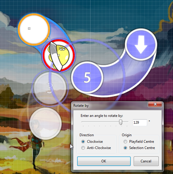
• 00:32:968 (3,4,1) - snapping errors, the beats land here on the timeline (+ the white tick)
• 00:41:968 (2,3,4,5) - the sucen increast in spacing at 4,5 feels sudden, it doesnt look like it makes much sense because there's just as much intensity here as there was teh start of the pattern
• 00:48:343 (6,7) - i dont think a clickable on 7 works as well as making 6 a slider or just removing the circle altogether. the bass note at 7 (if thats what youre trying to map to) fades into volume slowly, the actual note starts at 00:48:343 -
• 00:50:593 (1,2,3) - Feels better if you switched 2,3 and 1 in the timeline (or ctrl+g) because it puts 00:50:780 - on a clickable note and gets rid of an overmapped circle at 00:51:155 -
• 01:02:593 (8,1,2) - dont like the transition into this jump pattern, its perfectly linear and with the exact same spacing with different timeline gaps. readable but very awkward flow wise
• 01:08:218 - why is this impact on a slidertail? you mapped it at 00:50:218 (4) -00:53:218 (9) - etc. and it makes the long slider you already mapped to vocals feel kinda forced
• 01:11:218 - this note is objectively louder and stronger than 01:11:030 - , since its a downbeat and its louder. therefore, shouldnt 01:11:030 (8,1) - have bigger spacing than 01:10:843 (7,8) - ?


 please give me some time