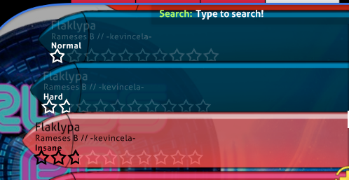
I'm making a skin at the moment and I don't want the text to go over the tip of the menu background button [aka the black line]. Is there a way to fix it?

forum
Make menu background button longer?
posted
Total Posts
10
Topic Starter
Just make it longer then? x)
I am bad at eng. U should make a screenshot of ur problem if u want help(imo).
Topic Starter
Tried, didn't work.Lyawi wrote:
Just make it longer then? x)
Topic Starter
Instead of just saying that can you maybe tell me how photoshop is going to help me? I usually use photoshop to do the skinning.yea wrote:
photoshop is your best friend
to move it more to the left? Nope, not possible
Topic Starter
Thanks. Is it because its size restricted?h3oCharles wrote:
to move it more to the left? Nope, not possible
because the way the texture is placed, it's position is fixed on the left. Basically if you stretch it out, it will just gonna stretch to the right.
Topic Starter
Got it. Thanks