forum

Meg & Dia - Agree to Disagree

posted
Total Posts
22
Topic Starter
Larto
This beatmap was submitted using in-game submission on Wednesday, November 16, 2011 at 7:24:30 PM

Artist: Meg & Dia
Title: Agree to Disagree
Tags: meg and dia here, here and here here and here
BPM: 200
Filesize: 5034kb
Play Time: 03:29
Difficulties Available:
  1. Easy (2.22 stars, 225 notes)
  2. Hard (4.82 stars, 366 notes)
  3. Insane (4.99 stars, 425 notes)
  4. Normal (3.65 stars, 267 notes)
Download: Meg & Dia - Agree to Disagree
Information: Scores/Beatmap Listing
---------------
Think I'll submit this map right now. But mapped it nice and neat!

AAAAAAALLLLLRIIIIIIGHT!
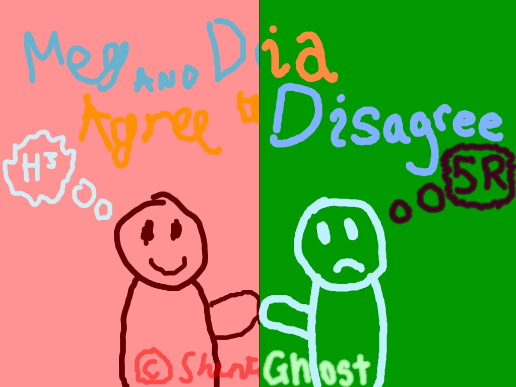
Alternative Background:

Copyright 2011 SapphireGhost

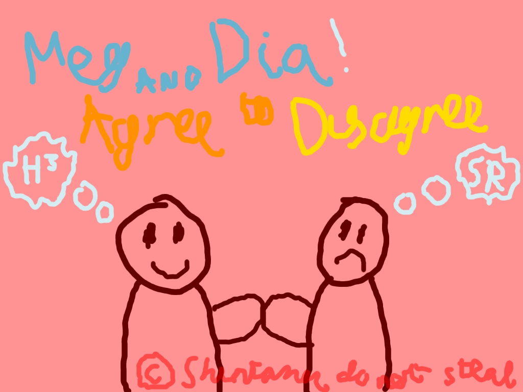
Alternative Background Shintamode:

Copyright 2011 NotShinta
SapphireGhost
Here you have my mod split into five clickable images, each with their own tinypaste. Each tinypaste requires a password to unlock. The password is the name of a female artist, for example "Britney Spears". You'll have a clue for each password, the clue being an anagram of the artist's name. Good luck!


Clues
General - PERKY TRAY
Insane - AS I
Hard - DELUGE GILL ION
Normal - ALL YELL IN
Easy - A DAMN PROFIT

Notice!

If you are a MAT/BAT evaluating my modding skill, you'd probably just like to see a regular mod. If that's so, please click here:
regular stuff
[General]
- I'd advise setting custom combo colours to avoid the same colour appearing twice in a row when a player plays with a skin that does not have four colours.
[Insane]
00:54:529 (1,2,3,4,5,6,7,8,9,10,11,12,13,14) - This combo is quite long. Put a new combo somewhere to split it up a bit.
01:09:829 (3,4,5,6) - Are these supposed to be snapped to 1/2? Also, (4) and (6) should be aligned better for a more visually pleasing effect.
02:16:129 (1,2,3,4,5,6,7,8,9,10,11,12,13) - Here's another combo that's getting too long like that other one.
03:09:829 (4) - The kiai begins here, so a new combo would fit.
03:24:229 (3,4) - Nice sliders!
[Hard]
- When I got to this difficulty I noticed that you might have been originally planning to have this as the Insane, I'm not sure if doing the switch worked as well here as with One Sail but it can pass.
00:44:029 (3,4) - As a small thing, this would look better with no overlap.
00:54:529 (1,2,3,4,5,6,7,8,9,10,11) - As I got to this point I realized that the long combos are a stylistic choice used in all four difficulties. Perhaps you could change them, or perhaps not.
03:03:829 (2,3,4,5) - These are spaced in an odd, slightly unintuitive way. I would suggest changing them up a bit.
[Normal]
00:45:829 (5) - This note is sort of isolated and comes at a bit of an unintuitive time, rework the pattern somehow?
02:32:029 (3,4,5) - These would look better aligned perfectly.
03:05:029 (1,2,3,4,5,1,2,3,4,5) - Possibly rearrange the pattern so that the (4)s are perfectly centered.
03:19:429 (3) - This is noticeably asymmetrical, I'd advise fixing it just a touch.
[Easy]
01:17:029 (1,2) - These sliders would look better without that small overlap.
02:11:029 (1,2,3,4,5) - This is possibly a bit too challenging for Easy?
02:38:629 (1,2) - Same thing about the overlapping sliders.
03:12:229 (1,2,3,4,5,6,7) - I'm quite sure this is a bit over the top for Easy, so I'd advise toning it down.
FINALLY
DONE
Appreciate my mods, peoples.
Shohei Ohtani
Overall:
01:24:229 - My anus meter is turning on and telling you to add a note here.
02:45:829 - ^

Insane:
Circle Size +1? I don't like how the small circles look in this map D:

Hard:
03:09:829 - THE CLAPS FOR THESE NEXT NOTES YOU FORGOT THEM. add them please :3.

Normal:
AR +1?
00:44:329 (3) - MR. CLAP WANTS YOU

yay
OzzyOzrock
I;n ' oir'ri.

[Easy]
- Well sheesh I'll disregard spacing then.
- Well sheesh I'll disregard sliders then.

Pish posh if I will.
01:05:029 (2) - Well this can be a nice blanket.
- 02:26:629 (2) - Maybe this one too. Maybe not!
01:23:629 (4) - Teea
- 02:45:229 (4) - heej
01:53:029 (1) - You call this a C THINGY!? Well ok then.
01:57:829 (1) - Put this and the copy of it nicely on the Y axis.
02:05:929 (3,4) - Huh. Move these up to snap RIGHT.
02:56:029 (3) - science

Or you could do nothin--NOT.
[Normal]
I see this and wonder how some are going to read some stuff.
Then I realize I wouldn't know.

Snow. Everything seems fine.
[Hard]
03:04:429 (4,5) - ughhguhdhfhaghuwa
- DGFSJDSDSDIYSSUIDGSDIO!

Nothing else wrong, so I think I'll give up modding this map.

_________________
Note: If I ever ask to make a taiko map, please PM me if you accept, or I may not check.

W.I.P. Maps Guest Maps Pending Maps (Help anyways)
- Kasane Territory +16 Usatei Remix +49

Current Goal: FC 2000 series without 999 combo. Progress: Missing Hataraku and Shimedore...


THAT WAS A JOKE.

[Insane]
02:07:429 (9) - HOLY BEHEMOTH THIS IS STACKED WRONG.
I bet there are more you scoundrel you

The rest is nine.
[Crazy!]
AHAHAHAHAHAHA

Wait... holy crap... I already had this map?
WHAT THE HELL

I ALMOST THOUGH THIS WAS
BUT THEN I... WHAT THE

Hi Larto, this mod is like dirt.
Not because I love you.
But because I suck.
Katsuri
[General stuff]
  1. Use tags is very recomended because it can make the process of find your Beatmap on the search better, and it can make your map best known. I suggest you to add Tags like the name of the album and things like that. It's not necessary, but is very recomended to add it.
  2. I don't like CountDown don't matter where, I suggest you to remove it from all diffs.
  3. What do you think about use custom combo colors? It's always good, estetical points are good to any map. You can use the combo color you want, but for these I made for you I have a code.
    1. [Colours]
      Combo1 : 186,215,119
      Combo2 : 255,102,28
      Combo3 : 30,187,69
      Combo4 : 251,203,132
  4. The folder is clean next modders.
    1. mp3 Bitrates are variated and totally rankable.
    2. All the preview points and Audio lead-in are the same on all diffs.
    3. All Combo colors, Tags and Sources the same at the moment.
    4. Background 1024x768, the recommended on the guidelines.
  5. I don't like this song very much. When I was modding the normal difficulty I enjoyed a lot the song.

[Easy]
  1. One thing I hate when modding your maps is: I can't find what to point out!
  2. I see you are very different of me with hitsounds, then I'll point out my suggestions, If you like apply it.
    1. 00:15:829 (3) - You start the song following the drums, then I suggest you to keep doing it on the end of this slider. Try adding a clap on it.
    2. 00:44:629 (2) - This clap makes no sense here. When you follow the drums clapping or beatboxing you see the real clap is on 00:45:229 (3) -. Suggest you to remove the clap of here and then add a clap on 00:45:229 (3) - .Don't forget to remove the clap from 00:45:229 (3) -
    3. 00:59:629 (7) - You followed constantly the drums for 1 minute and breaks the clap here? I think that keep the claps is better, add one here.
    4. 01:08:929 (1,2) - Permute the clap by these two notes, It will keep the drums rhythm here.
    5. 01:19:429 (1) - Add a clap on the end of this slider would be a lot better in my opinion. If you start working with the drums rhythm I think you have to follow it until the end of the song. You can make fill-ins, but I think that they are a lot batter on harder diffs.
    6. 02:30:529 (1,2) - Permute the clap by these two notes, It will keep the drums rhythm here.[copy/paste]
    7. 03:12:229 (1,2,3,4,5,6,7) - Nice fill-in here sir.
  3. Since Larto, you are probably the best Easy difficulty maker of this game, they are perfect and at the same time a lot funny.
[Normal]
  1. This diff looks very clean. Nice sliders and good use of hitsounds following the vocals. Some nice combos making the play experience a lot better, congratulations!
[Hard]

  1. I can't know exactly what you follow here, It looks a bit confuse when I play, because sometimes you use the objects following the Harmonica and other times following the vocals, sometimes just following the compass and other moments following the vocals. I don't want you remapping this because it's very rankable a funny the way it is now, but when you map other songs, I suggest you to make something better fixed. You are a very good and experienced mapper, and I know that my suggestions will look/are strange, than understand that it's just what I feel when play and watch the autoplay on this difficulty.
[Insane]

  1. Everything clean here, very good job Larto.
Katsuri
EDIT:

Stars Here, here and here here and here.
Armin
Ciaooo

*Why don't you add in tags Album's name? even if it's a bit...ugh repetitive

[Easy]

It is okay, but I don't really undestand why you used some patterns that are not reccomended for an easier difficulty (some stuff is a bit hard for a beginner like 01:51:829 (1,2,3,4,1) 'cause he has to make a rigid movement in a short time (consider that your bpm is 200)) . Some opinions about some parts:
01:04:729 (1,2) - I know that it's cool and that it is intentional to start chorus in this way but in this time I'd make vocal voice prevails on the instrumental one
01:17:029 (1,2) - A bit ugly in my opinion, I bet you can make it parallel or something
02:33:829 (1,2,3) - Make 2 and 3 closer pleaaase, I can notice that spacing difference during playing
same suggestions on the next copy/paste

[Normal]

Your Approach Rate seems a bit high for a normal, please consider to reduce it

00:13:429 (3) - This slider is weird to play if you don't know the main rhythm of the song (as I can see it's based on 1/3 partially). My suggestion is to follow the vocal voice here or to keep following the instrumental but in this way: http://puu.sh/7kwl (this one at least sounds fine to me)
00:42:079 (3) - I'd snap this on a red tick instead of a violet one
01:13:429 (5) - Why don't you add another repeat here? It would follow a better flow and rhythm in my opinion!

[Hard]

01:02:629 (1) - hmm, I dunno why I felt this out of place, maybe because it is silenced and make contrast with your hitsounds set all above the map (I'd add a SOFT whistle at the end at ~20% volume); same suggestion on Insane

[Insane]

03:17:629 (2) - this doesn't really follow the rhythm that you're using (and actually it's a pity since it's a symmetrical pattern). consider to move its position, please
03:24:229 (3,4) - I really hooope that bats won't bother anyone for this (actually someone was complaining overlapped parts of sliders in OpenGl mode: http://osu.ppy.sh/ss/167514) since it's funny to play

Well I guess this is a good map, so good luck Larto~
Katsuri
It's pure black magic, I can't stop playing.
RobotoRaccoon
o/ Mr. Larto, sir.
I have arrived here for a special occasion. You may pick up what it may be.

Easy
02:19:429 (5) - Oh hey, move this to x:144 y:248 aka down 1 grid
02:45:229 (4) - Placing 4 here looks better IMO. Or you can stack in on the 2 like: 02:59:629 (4) -
Pretty good.

Normal
HP -1 (Maybe? Take into consideration the 1/3 snap)
Y U SO GOOD?

Hard
Someone give this guy a medal.

Insane
I love you.
SapphireGhost
So I got bored and felt like making some of the sliders a tiny bit neater. Check to make sure I didn't wreck anything.
I also PM'd Larto some nazi prettiness fixes, I'll put them here for safekeeping.
Aha?
[Insane]
00:56:529 (3,4,5) - Fixed blanket
01:21:829 (1,2,3,4) - Made pattern neater
02:13:429 (3,4) - ^
02:31:429 (6,7) - Fixed HP bar overlap
03:11:029 (6,7) - Made pattern neater
03:15:529 (4) - Made slider prettier
03:17:929 (5) - ^

[Hard]
00:44:029 (3,4) - Removed overlap
00:58:429 (6,7) - ^
01:59:029 (3) - Fixed score overlap
02:18:829 (5,6,7) - Moved pattern down

[Normal]
00:54:229 (7,8,1) - Removed overlap
01:12:529 (2,3,4,5) - ^
01:39:829 (3,4,1) - ^
02:33:829 (1,2,3,4,5) - ^
02:59:629 (4,1,2) - ^
03:09:229 (4) - Centered object
03:09:829 (1,2,1,2) - Moved pattern down
03:12:229 (1,2,3,4,5) - Removed overlap

[Easy]
01:14:629 (1,2) - Fixed HP bar overlap
02:17:629 (2,3,4,5) - Removed overlap
02:28:729 (3) - Fixed HP bar overlap
02:38:629 (1,1) - Removed one new combo
02:45:829 - Fixed break drag
03:12:229 (1,2,3,4,5,6,7) - Discussed a pattern that might be too hard

Some of it may have gotten lost in translation due to me being me but this should give you an idea of what happened.

Download: Meg & Dia - Agree to Disagree (Larto) [sliderfixes].osu
NotShinta
I might as well mod this now, as I'm still not quite recovered from notmodding and you keep bugging me. Also, attempting to mod this depresses me for more than one reason.

General:
- Clever background, there. I didn't notice the relation to the lyrics until just now, I assumed you chose it because this is quite an autumny bittersweet song.

Insane:
- 01:01:729 (7,8,9,10) - The overlappiness and assymmetry could be avoided by doing this kind of generic Larot thang. Oops, I still have the stream skin enabled for personal use, drain my soul through your evil sieve.
- This was beautiful. Even with all the slider end stacking bwah

Hard:
- 03:05:929 (2,3,4,5) - It might be a good idea to make this spacing more even, like you managed in Normal. Knowing you, it was probably intentional, and that's cool. Like Christopher.

Normal:
- Maybe AR-1? It feels like a jump up after playing Easy as it currently stands.

Easy:
- 00:26:029 (3) - If you're going to go for a perfectly straight line here (presumed), you might want to move this a grid down, bruv. Only just noticeable, of course, but teehee.
- 01:23:629 (4) - This hitcircle, placement wise, feels like it's just 'left over' from the previous pattern. Some of your options are placing it back on 2 (may be difficult for easy on hidden), or 1, adjusting it so it's a kind of 5 pointed-star without a point, making a zig-zag thing, or rearranging it altogether. Those were a bit too many suggestions for what's a pretty harmless pattern. (+chorus copypaste).

This mod was short. You have already had some great modders on this map, but you see why I don't want to launch myself into public modding yet. Buy me a Mac
narakucrimson
Hello there! If you can, please answer to this mod with what you changed or what you didn't, and why~

[General]
  1. Just asking... Do you really need to have "here, here and here here and here" in the tags? Does the engine search by complete strings, or just by words? In case the answer is the second option, you should remove some heres :P (having something like "here, here here and here")
  2. Well, everything else looks good here!
[Easy]
  1. 00:18:829 (2) - Move this 3 grids down, please :3 The reduced spacing is fine, just saying to point out that I noticed :P
  2. 00:21:229 (2) - You could make spacing more consistent here, actually.
  3. 00:55:429 (2,3,4) - :(
  4. 01:07:129 (3,4) - There's a liittle jump here, but the problem is that it is combined with a kind of sharp direction change. Can you move 01:06:829 (2,3) just a bit so that the spacing is 1,0x here (or even less)?
  5. 01:17:029 (1) - Woot now this is a big jump! Though I can't really think of a way to fix this without killing the pattern. Try to flip it around to reduce the spacing.
  6. 01:35:929 (3) - (Ultra Nazi) Please move this one grid right~ It looks kind of inconsistent as it is, even if it plays fine.
  7. 02:04:729 (1,2) - Hmmm... I don't know, this pattern is weird. Try flipping these two horizontally, it creates a better flow imo.
  8. 02:28:129 (1,2,3) - Same as in 01:07:129 (3,4). Nevertheless, there are a lot of direction changes taht I didn't mention, so I can't say this is sooo important.
  9. 02:38:629 (1) - Again, this jump. Try to fix it in the same way you did before.
  10. 03:10:429 (5) - New combo, perhaps?
  11. 03:24:229 (1) - Colourhax :O
[Normal]
  1. Overall, I felt the spacing & slider velocity a little too high. I know that reducing them would force you to more or like rearrange the whole map, but at least keep that in mind. They feel waay too high for a Normal.
  2. Also, OD could use a -1
  3. Gonna ask since I don't know what this is: CurrentTime: 208210 in [Editor] in the .osu file... What is that? Is it needed? Well, anyway... It won't make any difference if you keep it, so don't worry.
[Hard]
  1. 00:30:729 (4) - How about inverting this?
  2. 00:49:929 (4) - (^)
[Insane]
  1. 00:17:029 (9) - Sounds like a new combo here (or in the previous circle), and you should remove the next one. Just an opinion though.
Ok, that would be all. Call me back later!
Topic Starter
Larto
http://pastebin.com/7swe2LsF SO RAISE YOUR
ddddddddd

Wait this wasn't meant to go into my own topic woops
narakucrimson
Some minor stuff fixed via irc aaaaaand bubbled!

And thanks for updating you Raise Your Glass difficulty :P
Katsuri
bub :D!
Topic Starter
Larto
Popped bubble to fix a little misalignment 02:03:729 (7,8) - . Hope to get this rebubbled soon.
narakucrimson
Okay
Mercurial
Yey, Bubbled! o/
Garven
Winnar of impromptu #mod request is you

IRC mod
SPOILER
10:56 <Garven> : 01:15:529 (2,1) - Nicely placed jump in an Easy. Kudos
10:57 <Larto> : Woo
10:59 <Garven> : 02:59:629 (4,1) - This one I worry a little. The motion wasn't quite as smooth as the last so it makes me fret a bit
11:00 <Larto> : I could move it a bit closer if needed
11:01 <Garven> : Eh, scooting it up doesn't really make any gameplay difference. I think it'll be okay. It just wasn't as cool as the chorus one for me ;)
11:02 <Larto> : Aw :P
11:02 <Larto> : alright
11:02 <Garven> : Holy distance snap/sv on Normal Batman
11:02 <Larto> : Yeah I guess Normal became a little harder than it was supposed to
11:03 <Garven> : 00:29:629 (1,2,3,4,5) - This is kinda questionable just with the velocity
11:03 <Larto> : Okay I'll scale it down a little
11:03 <Garven> : I wonder if bigger circles will help
11:04 <Larto> : Oh I could do that too. Maybe.
11:04 <Larto> : I'm not sure why I used circle size 3
11:04 <Garven> : There are a few overlaps that happen, but I'm sure you could adjust
11:04 <Garven> : Definitely makes things easier though
11:05 <Larto> : I'll take a look
11:05 <Garven> : Hm, though I think my main beef was with that 5-hit pattern with the smaller circles. Everything else was probably doable
11:06 <Larto> : Mhm
11:06 <Larto> : Alright I think I'll stay with the smallish circles then
11:06 <Larto> : It's just a bit of a big change and I think the map in general is hard enough to justify the small circles
11:06 <Garven> : Yeah, I think it's mostly that 5 hit pattern. Everything else glides pretty smoothly since you use sliders a lot
11:06 <Larto> : It's a Normal+! :D *shot*
11:06 <Garven> : bluh to that
11:07 <Garven> : 01:47:029 (3,4) - That might be a bit much too, hehe
11:07 <Garven> : 01:51:229 (1) - Normally I'd whine about notes soon after a spinner, but I think with how hard this is, it should be fine.
11:08 <Larto> : yeah that jump is a bit much woops.
11:08 <Garven> : 01:58:129 (2,3) - That overlap intended?
11:09 <Larto> : I don't know if it was intended
11:09 <Larto> : I think I was a little tired while mapping that
11:09 <Larto> : changing
11:09 <Garven> : 03:02:629 (1) - Love the pattern the points make
11:10 <Larto> : Teehee
11:13 <Garven> : There was another overlap like the one in Normal near the beginning of Hard though it looked more intentional. Dunno if you want to
11:13 <Garven> : keep it or not
11:13 <Garven> : 00:18:229 (3,4) -
11:14 <Garven> : This song really makes me wish there was a swing tick, hehe
11:15 <Larto> : Oh yeah I think I'll keep that one
11:15 <Garven> : k
11:15 <Larto> : Yeah for songs like this I'd love tick rate 1.5 or something :P
11:16 <Garven> : 03:26:629 (2) - Stacking makes this pattern look kinda goofy, but kinda not
11:16 <Garven> : I tried without stacking and I'm torn D:
11:18 <Larto> : I kinda like it with stacking
11:19 <Garven> : In insane: 01:47:029 (3) - This part was kind of weird since you changed up the presentation stylistically
11:19 <Garven> : I was used to stacks everywhere and plenty of wide open sapce
11:19 <Larto> : I guess I get what you mean
11:19 <Garven> : Then suddenly adjecent notes
11:19 <Garven> : I mean it still works fine
11:20 <Garven> : Was just kinda odd
11:21 <Larto> : Stacked the sliders~
11:22 <Garven> : 03:24:229 (3) - These sliders look pregnant in mm mode
11:22 <Larto> : lol
11:22 <Garven> : Only other thing really is: 01:09:829 (3,4,5,6) - I just didn't like the look of these sliders.
11:22 <Garven> : Otherwise a fine diff
Rebub~
ztrot
Ranked
mancuso_JM_
Another Meg & Dia Song by Larto
Congratz Sir :D
OzzyOzrock
YAAAY
Please sign in to reply.

New reply