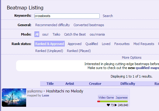
10/10 mod!!Lasse wrote:
cute bg
second crossbeats song I've seen so far in osu :eyes:
the thing that stood out most to me while playing:
01:33:353 - 03:44:020 - while these parts represent the same thing in the music they already seem a bit too similar, it felt like i played the same thing, just a bit flipped. I think it would be great if you varied jump patterns of either part a little bit since these are the highlights of the song, but the second one felt a bit disappointing cause of the extreme similarity. Ok i tried something
hitsounding: why don't you utilize some more whistles?
for example the 00:24:021 - part could use them to highlight the trumpet or whatever that is on spots like 00:25:520 (1,2) - (heads), or the emphasized vocals like 00:27:854 (1) - Fixed
other hitsounding: 00:18:186 (1,2) - would remove the drumwhistles here as they don't seem to fitting and it makes the one on 00:18:521 (3) - have more impact Ok
01:12:020 (1) - maybe finish // 02:42:687 (1) - Ok
01:14:186 - missing drum/kick/.. Fixed
01:16:687 (3) - probably same Fixed
01:19:520 - ^ // 01:21:853 - // 01:24:853 - and similar sliderends in this part Fixed
02:20:354 (2) - finish //03:33:353 (1) - // 04:42:687 (1) - Ok
02:22:020 (3) - no idea why most sliders in this part have softw on sliderbody, but it seems unfitting to me Fixed
02:44:853 - same kick stuff as before for many sliderends in this part Fixed
03:30:186 - again some missing slidertail kicks in this part Fixed
04:26:686 (1) - maybe finish // 04:48:021 (1) - Ok
05:03:103 - 10% volume here for less annoying sliderticks Ok
05:06:520 - 5% here Ok
mapping:
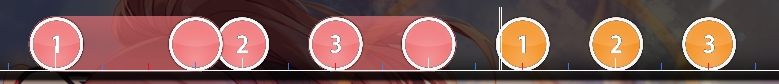
00:13:853 (2,3) - why the sudden switch to drum rhythm when you otherwise emphasized melody? => 00:14:186 - should be clickable (maybe a 1/2 slider there) // 00:16:521 (2,3,4) - same Fixed
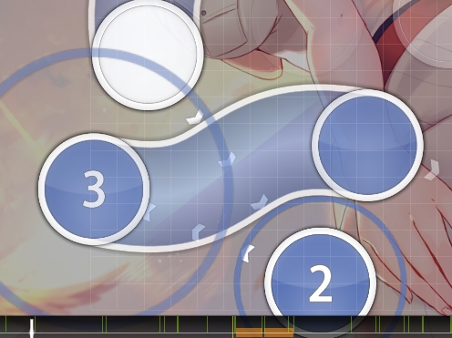
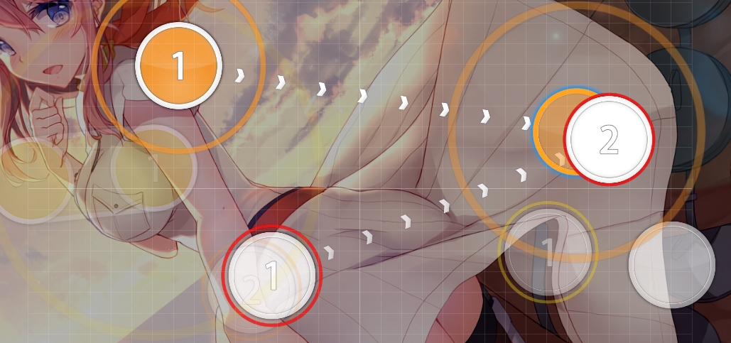
00:22:520 (1,2,3) - would look great if you polished the wave a bit and went for the same visual spacing on both sides http://lasse.s-ul.eu/38nxGIXb.jpg Fixed
00:24:021 (1,2) - could tone down spacing a little to introduce such spaced passive 1/4 gaps better. maybe something like http://lasse.s-ul.eu/l5ohGxo4.jpg Ok and I ctrl ged the slider
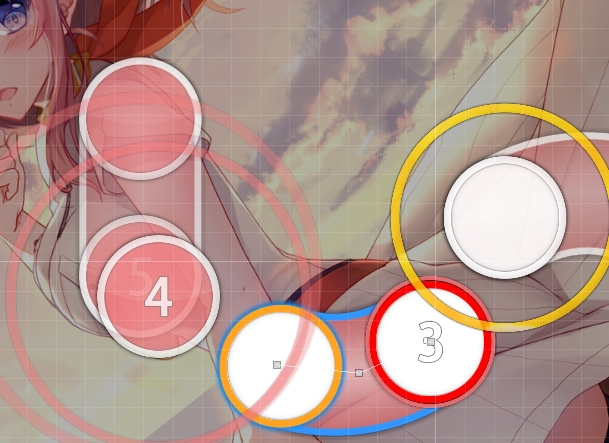
00:28:354 (2,3) - how about something like http://lasse.s-ul.eu/mQEWI8D1.jpg ? plays the same but cuter visually That's true
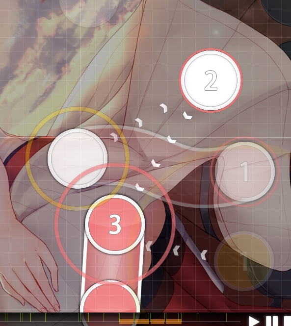
00:40:353 (2) - unlike other similar rhythm here you also have the melody on tail, so to differentiate them I think two circles would be better. something like http://lasse.s-ul.eu/mZlYbef7.jpg would greatly emphasize vocals and melody here Ok
00:46:521 (2,1,2) - no idea why these continue the jump pattern when melody stops here. you could at least tone down distance on 00:46:687 (1,2) - or something. maybe http://lasse.s-ul.eu/3NBumdWO.jpg The melody stop but the kicks continue so it make sense, i tone the DS on the jump to mark the stop of the melody as you said
00:47:854 (2) - movement into this seemed a bit unnatural compared to the other jumps here. would either stack on 00:47:021 (1) - head or continue overlap stuff like http://lasse.s-ul.eu/BWFP2NNn.jpg I changed it into circular flow so it should be ok, and i tone the jump a bit as there is a stop in the melody
00:57:021 (4,1) - stack doesn't make much sense when you usually space 1/2 vocals. also rhythm on 00:51:187 (2,3,4) - makes much more sense than 00:56:687 (3,4) - cause vocal stuff you did before but now suddenly on sliderend Ok
01:07:354 (3,4) - same here Fixed
01:11:687 (3,4,5) - triple feels really out of place with such strong 1/2 drums // 02:42:354 (3,4,5) - same here Fixed
01:38:021 (3) - equal spacing would look great here and play pretty much the same http://lasse.s-ul.eu/2bcUef4I.jpg Ok
01:43:687 (1) - 3/4 slider over clear 1/2 vocals pls no Changed into jumps
01:49:020 (2,1) - emphasis wise 01:49:353 (1) - should have the higher spacing. you could even reduce sv on 01:49:020 (2) - or maybe even 01:48:687 (1,2) - t o make the next one stand out more i just increased spacing
01:39:021 (2) - 01:49:687 (2) - 01:52:021 (4) - these are just a bit too much spacing wise, look extremely similar to your 1/2 gaps around them etc. I think you could tone these down a bit to make the map much more enjoyable to play instead of having to guess rhythm Fixed i think
01:58:021 (3) - shape/curve makes it look so disconnected from anything here, why not just something like http://lasse.s-ul.eu/slkQ06Z3.jpg ok
02:36:521 (1,2,3,4) - bit overspaced for this part in comparison to your other patterns fixed
03:20:687 (3) - nc on such stream changes usually fits really well and slightly helps reading imo ok
similar things from chorus 1 also apply for second yes
04:09:021 (2) - would reduce the jump on this to make vocals on 1+3 stand out more, like http://lasse.s-ul.eu/JECmjPbE.jpg Ok
04:14:521 (1) - rotation/angle of this makes it look so out of place, why not something like http://lasse.s-ul.eu/FQff9IuD.jpg Ok
[]
map seems nice overall, but hitsounding was a bit lacking and visuals could be more polished
feel free to call me back after you improved these things, shouldn't be too hard
maybe try to get one or two more mods from experienced modders or something Ok thanks for your mod!
or just poke me after you got bubbles
forum
Yamajet feat. Hiura Masako - Sunglow
posted
Total Posts
50
Topic Starter
Q
[General]
BG is too big, you used 1927x1080, the limit of rankable BG size is 1366x768
[adf]
00:19:020 (2) - Ctrl G for flow?
00:40:021 (1) - you can make better flow like this
00:47:687 (1,2) - suddenly made low intense? it can be little bit weird, jump more
01:17:020 (5,1) - make jump?
01:58:021 (3) - offscreen
02:13:354 (1,2) - try to avoid overlap for consistency
03:46:853 - only this part doesn't have clickable beat?
GL
Neoskylove wrote:
Q
[General]
BG is too big, you used 1927x1080, the limit of rankable BG size is 1366x768 information is outdated, 1920 x 1200 is the new maximum
GL
sup
i think sometimes you space things a little close, making visual spacing a bit inconsistent, imma list some stuff that could use a little distance to make it cleaner here
00:27:021 (2,3) -
00:40:520 (3,2,3) -
01:19:353 (3,4,5) - make this more even
01:58:521 (2,1,2) - same
02:04:521 (3,4) -
02:21:354 (1,3) -
02:24:687 (4,2) -
01:58:021 (3) - offscreen
00:29:021 (5,6,7,8,1) - imo wud look nicer with the last slider if u curved it this way
00:49:020 (1,2) - these should be a bit bigger i think
01:02:354 (4) - would look nicer around here imo?
01:29:687 (2,3) - why not copy paste here

03:40:354 (2,3) - ^
03:49:687 (2,3) - ^ honestly i think it wud look rly gud if u did that here
01:45:354 (1) - extended slider doesn't feel that fitting here, ur skipping over a thingy :S
01:56:021 (1) - ^
03:56:021 (1) - ya
04:06:687 (1) - 04:17:354 (1) - 04:28:021 (1) -
03:21:270 - the kick hitsound doesn't really fit well here, just a whistle wud be good imo
03:26:853 - u gunna skip this? i think having 2 1/2 sliders here would fit pretty well
ok this is the perfect example of a map thats good but just needs polishing. visual spacing wise, see if you can go through the map yourself and even them up a little. also maybe make some of your wave sliders more symmetrical, though i personally don't mind this part that much.
do go fix the spacing tho
i guess i can bubble since lasse is waiting
if u have metadata source, it wud b awesome
Topic Starter
Neoskylove wrote:
Q
[General]
BG is too big, you used 1927x1080, the limit of rankable BG size is 1366x768 as kibb said, does it mean that i have to redim the size to 1920x1200 or 1920x1080 is good?
[adf]
00:19:020 (2) - Ctrl G for flow? Mmh i think my patern flow better
00:40:021 (1) - you can make better flow like this Fixed
00:47:687 (1,2) - suddenly made low intense? it can be little bit weird, jump more Ok
01:17:020 (5,1) - make jump? no drums on 01:17:186 -
01:58:021 (3) - offscreen fixed
02:13:354 (1,2) - try to avoid overlap for consistency fixed
03:46:853 - only this part doesn't have clickable beat? ye but i wanted to emphasize the big sound on 03:46:686 -
GL Thx for mod!!
Thx for you mod! I guess I'll call you back when all the spacing problems are fixedKibbleru wrote:
sup
i think sometimes you space things a little close, making visual spacing a bit inconsistent, imma list some stuff that could use a little distance to make it cleaner here
00:27:021 (2,3) -
00:40:520 (3,2,3) -
01:19:353 (3,4,5) - make this more even
01:58:521 (2,1,2) - same
02:04:521 (3,4) -
02:21:354 (1,3) -
02:24:687 (4,2) -
fixed i think
01:58:021 (3) - offscreen Fixed
00:29:021 (5,6,7,8,1) - imo wud look nicer with the last slider if u curved it this way Fixed
00:49:020 (1,2) - these should be a bit bigger i think I think it's ok since the trumpet is very low on 00:49:020 (1) -
01:02:354 (4) - would look nicer around here imo? Ok
01:29:687 (2,3) - why not copy paste here
03:40:354 (2,3) - ^^
03:49:687 (2,3) - ^ honestly i think it wud look rly gud if u did that here ^
01:45:354 (1) - extended slider doesn't feel that fitting here, ur skipping over a thingy :S ok fixed
01:56:021 (1) - ^
03:56:021 (1) - ya
04:06:687 (1) - 04:17:354 (1) - 04:28:021 (1) - fixed everywhere
03:21:270 - the kick hitsound doesn't really fit well here, just a whistle wud be good imo i see
03:26:853 - u gunna skip this? i think having 2 1/2 sliders here would fit pretty well fixed everywhere
ok this is the perfect example of a map thats good but just needs polishing. visual spacing wise, see if you can go through the map yourself and even them up a little. also maybe make some of your wave sliders more symmetrical, though i personally don't mind this part that much.
do go fix the spacing tho
i guess i can bubble since lasse is waiting
if u have metadata source, it wud b awesome
https://yamajet.bandcamp.com/track/sunglow-feat http://crossbeatsrev.wiki.fc2.com/wiki/Sunglow
Oh, I didn't know that, Thanks for sayingKibbleru wrote:
Neoskylove wrote:
Q
[General]
BG is too big, you used 1927x1080, the limit of rankable BG size is 1366x768 information is outdated, 1920 x 1200 is the new maximum

HI! you requested mods on #modreqs like... 3 days ago, and im here to see if i can help you with that!
lets see if my mod Works for you, since a lot of professional mappers/modders already modded it x.x
Melody
1. 00:03:854 (1,2) - this is a suggestion, but try moving the secons slider to X:185-Y:131, so it can flow better with the curve of the first slider
2. 00:04:687 (1,2,3,4) - make this have a better shaped triangle
3. 00:13:854 (2,3,4) - move circle "2" a bit to the left, so the whole part can look like a cute triangle uwu
4. 00:14:521 (1,2,3) - the circles being separated from the slider doesnt really look good tho, why making them closer?
5. 00:17:187 (1,2,3) - same reason as #4
6. 00:26:187 (1,2,3) - make this circles have the same spacing between them
7. 00:27:521 (2) - move this circle more to the right, so it can flow a bit better (in my opinión :S)
8. 00:34:686 (1,2) - the second slider could look cooler if you make a curve on it https://osu.ppy.sh/ss/8223563 like that
9. 00:43:353 (1,2,3) - give this circles a similar spacing too
10. 01:41:021 (3,4) - make the second slider have a curve too, it will make it cooler http://osu.ppy.sh/ss/8223580 like that
11. 02:02:687 (1,2) - in this case, make a Little curve in the second slider too uwu
12. 02:10:687 (1,2) - move the second slider a bit more to the right, so it flows better with the first slider
13. 02:19:021 (2,3,1) - make this objects just a bit closer
14. 02:31:186 (3,4,5) - same reason as #13
15. 02:55:353 (3,4,5) - make something like this? https://osu.ppy.sh/ss/8223601
16. 03:05:687 (2,3,1) - make this objects a bit closer too
17. 03:14:187 (4,5,6) - rotate this triplet on a -11 angle and move it to X:254-Y:144, it could make it cooler, and it will have a pretty decent space from the slider at 03:14:687 (1)
18. 03:27:354 (3) - move this circle a bit more down, so the jump can have more pretty good spice
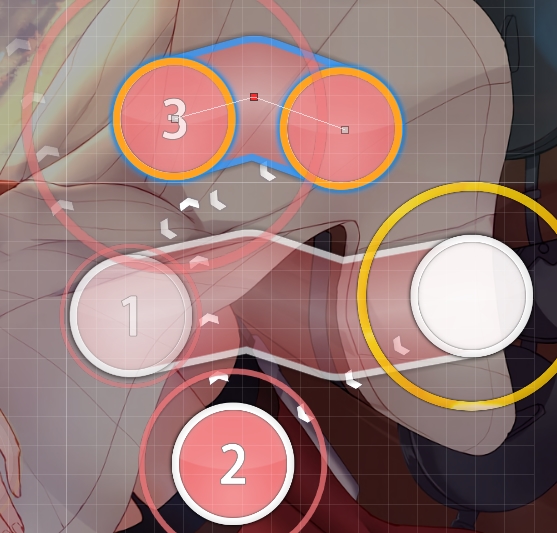
19. 03:30:020 (3) - kind of a problemo here, if the slider will be a line, should the second gray dot be in the middle? doesnt look good :S
20. 04:20:687 (1,2,1) - this objects should have the same spacing, or at least make some spacing between the first and second slider
Thats all, you have a very good map and the song is beautiful
also, nice and cute background uwu, good luck!
lets see if my mod Works for you, since a lot of professional mappers/modders already modded it x.x
1. 00:03:854 (1,2) - this is a suggestion, but try moving the secons slider to X:185-Y:131, so it can flow better with the curve of the first slider
2. 00:04:687 (1,2,3,4) - make this have a better shaped triangle
3. 00:13:854 (2,3,4) - move circle "2" a bit to the left, so the whole part can look like a cute triangle uwu
4. 00:14:521 (1,2,3) - the circles being separated from the slider doesnt really look good tho, why making them closer?
5. 00:17:187 (1,2,3) - same reason as #4
6. 00:26:187 (1,2,3) - make this circles have the same spacing between them
7. 00:27:521 (2) - move this circle more to the right, so it can flow a bit better (in my opinión :S)
8. 00:34:686 (1,2) - the second slider could look cooler if you make a curve on it https://osu.ppy.sh/ss/8223563 like that
9. 00:43:353 (1,2,3) - give this circles a similar spacing too
10. 01:41:021 (3,4) - make the second slider have a curve too, it will make it cooler http://osu.ppy.sh/ss/8223580 like that
11. 02:02:687 (1,2) - in this case, make a Little curve in the second slider too uwu
12. 02:10:687 (1,2) - move the second slider a bit more to the right, so it flows better with the first slider
13. 02:19:021 (2,3,1) - make this objects just a bit closer
14. 02:31:186 (3,4,5) - same reason as #13
15. 02:55:353 (3,4,5) - make something like this? https://osu.ppy.sh/ss/8223601
16. 03:05:687 (2,3,1) - make this objects a bit closer too
17. 03:14:187 (4,5,6) - rotate this triplet on a -11 angle and move it to X:254-Y:144, it could make it cooler, and it will have a pretty decent space from the slider at 03:14:687 (1)
18. 03:27:354 (3) - move this circle a bit more down, so the jump can have more pretty good spice
19. 03:30:020 (3) - kind of a problemo here, if the slider will be a line, should the second gray dot be in the middle? doesnt look good :S
20. 04:20:687 (1,2,1) - this objects should have the same spacing, or at least make some spacing between the first and second slider
Thats all, you have a very good map and the song is beautiful
also, nice and cute background uwu, good luck!
relevant news, marathons now only need 2 BNs, so once ur done with ur fixing, call me up for a bubble
Topic Starter
Thxx for mod!!!Joe Castle wrote:
HI! you requested mods on #modreqs like... 3 days ago, and im here to see if i can help you with that!
lets see if my mod Works for you, since a lot of professional mappers/modders already modded it x.xMelody
1. 00:03:854 (1,2) - this is a suggestion, but try moving the secons slider to X:185-Y:131, so it can flow better with the curve of the first slider I don't like the overlap
2. 00:04:687 (1,2,3,4) - make this have a better shaped triangle i prefer keep the overlap
3. 00:13:854 (2,3,4) - move circle "2" a bit to the left, so the whole part can look like a cute triangle uwu mmh no it would ruin the emphasize on 00:14:020 (3) -
4. 00:14:521 (1,2,3) - the circles being separated from the slider doesnt really look good tho, why making them closer? Ok
5. 00:17:187 (1,2,3) - same reason as #4 Ok
6. 00:26:187 (1,2,3) - make this circles have the same spacing between them no it would ruin the trumpet decreas
7. 00:27:521 (2) - move this circle more to the right, so it can flow a bit better (in my opinión :S) Ok
8. 00:34:686 (1,2) - the second slider could look cooler if you make a curve on it https://osu.ppy.sh/ss/8223563 like that Mmh i don't like it very much
9. 00:43:353 (1,2,3) - give this circles a similar spacing too i want to emphasize this clap 00:43:687 (3) -
10. 01:41:021 (3,4) - make the second slider have a curve too, it will make it cooler http://osu.ppy.sh/ss/8223580 like that i curved it a bit more
11. 02:02:687 (1,2) - in this case, make a Little curve in the second slider too uwu mmh i don't want to curve it too much because of the flow of the jump after
12. 02:10:687 (1,2) - move the second slider a bit more to the right, so it flows better with the first slider yes
13. 02:19:021 (2,3,1) - make this objects just a bit closer ok
14. 02:31:186 (3,4,5) - same reason as #13 ok
15. 02:55:353 (3,4,5) - make something like this? https://osu.ppy.sh/ss/8223601 i did something else
16. 03:05:687 (2,3,1) - make this objects a bit closer too ok
17. 03:14:187 (4,5,6) - rotate this triplet on a -11 angle and move it to X:254-Y:144, it could make it cooler, and it will have a pretty decent space from the slider at 03:14:687 (1) i rotate by -11 but i made a blanket with 03:13:854 (3) -
18. 03:27:354 (3) - move this circle a bit more down, so the jump can have more pretty good spice ok
19. 03:30:020 (3) - kind of a problemo here, if the slider will be a line, should the second gray dot be in the middle? doesnt look good :S oki
20. 04:20:687 (1,2,1) - this objects should have the same spacing, or at least make some spacing between the first and second slider no because i need to emphasize 04:21:354 (1) -
Thats all, you have a very good map and the song is beautiful thanks!
also, nice and cute background uwu, good luck!
alright, bubbled then! :d

03:22:354 (3) - is the spacing on this intentional?
rechecked and map looks fine, fix that thing if it's unintentional and let me know when I can qualify
rechecked and map looks fine, fix that thing if it's unintentional and let me know when I can qualify
Topic Starter
Yep that spacing was intentional to blanket with 03:21:271 (1) - curve but let me know if you think that it's not gudLasse wrote:
03:22:354 (3) - is the spacing on this intentional?
rechecked and map looks fine, fix that thing if it's unintentional and let me know when I can qualify
Let's wait the 24h i guess
spacing is fine, I was just wondering because you don't really use other 1/2 overlaps
but that makes sense and it fits there so just keep it
but that makes sense and it fits there so just keep it
qualified
as requested
Topic Starter
Ty!
Fixed unsnapped object, it should be ok now
Fixed unsnapped object, it should be ok now
k then
Why did you use "たのしいことだけ feat. ひうらまさこ" on artist field? I guess that is another song by Yamajet
たのしいことだけ : https://soundcloud.com/yamajet/preview_tanoshii-kotodake
Sunglow : https://soundcloud.com/yamajet/preview-sunglow

http://www.capcom.co.jp/arcade/rev/PC/music.html?page=5#l
So the artist should be
Artist : Yamajet feat. ひうらまさこ
Romanised : Yamajet feat. Hiura Masako
If you want to change it, Please send forum PM
たのしいことだけ : https://soundcloud.com/yamajet/preview_tanoshii-kotodake
Sunglow : https://soundcloud.com/yamajet/preview-sunglow
http://www.capcom.co.jp/arcade/rev/PC/music.html?page=5#l
So the artist should be
Artist : Yamajet feat. ひうらまさこ
Romanised : Yamajet feat. Hiura Masako
If you want to change it, Please send forum PM
Disqualify for change the artist.[ Sharuresu ] wrote:
Hey, no idea why i put たのしいことだけ instead of Yamajet so yes i would like to change it, thank you for pointing it out
Topic Starter
Sorry for the inconveniences, hope it's the last time i make stupid mistake with this map uwu
ok, Back~
congratz