forum

[confirmed] Ranking Panel Layering Issue

posted
Total Posts
10
Topic Starter
autoteleology
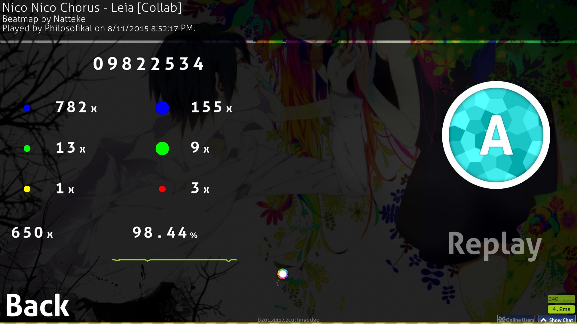
I don't see why the buttons on the right side of the page should be underneath the ranking panel when nothing else on the page is.

Back and Replay have the exact same color. Back is on top of the panel, but Replay is underneath.
peppy
Because the panel isn't supposed to extend that far to the right.
Topic Starter
autoteleology
Why not? I've seen a few skins that have full page art for the ranking panel background. Maybe I'd like my background to encompass more than just the score.

Even if it's not supposed to, that's still not really a good reason for it to not just be on the bottom layer of the overlay. A few months ago, sliders weren't supposed to be single ended. Even then, why isn't everything else, like the rank badge, underneath it too?

Is there something accomplished by the current layering I'm not aware of? It seems to only inhibit creativity the way it currently is.
Topic Starter
autoteleology
I just realized there is also this

this is broken how can this even happen

valve ppy plz fix

Bara-
Why is your ranking panel so big it also goes down?
Anyways, you can also add it to your skin, or make the back button darker
Oh, and don't double post please
Topic Starter
autoteleology

Baraatje123 wrote:

Why is your ranking panel so big it also goes down?
It's an image I used as a test. The better question is, why is it even possible for a background image to overlap half the screen?


Baraatje123 wrote:

Anyways, you can also add it to your skin, or make the back button darker
:?:
Bara-
Wait what did I type? O.o
Uhmmm
Jusrr ignore the 'Add it to skin'
Still wonderjng what I meant >>____>>
abraker
this prob belongs >> 5
Stefan
Yes, really looks more like a technical issue, moved to the Help forum.
VeilStar

Philosofikal wrote:

I don't see why the buttons on the right side of the page should be underneath the ranking panel when nothing else on the page is.
They're not under the ranking panel? The 'view replay' button is just slightly transparent and becomes more opaque when hovering over it.


The ranking-panel.png being drawn above the stuff when you scroll down after a play should probably be fixed/changed though.
Confirming for that.
Please sign in to reply.

New reply