First, you'll want to balance the visual of slider (1). The first half is slightly longer than the second half, and it doesn't look good. Increasing SV could be an option as well.
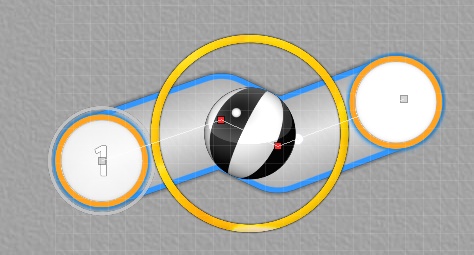
Placing the slider ball at the center of your slider rhythm will be a helpful mechanic to analysis if you slider is balanced enough.
The formation of (1,2,3) works logical enough, though seems you're confused where to place (4). Imo, visuals work best if objects are visually tied
together. The current position of (4) is rather working individually, so adding something more to visually connect with previous groups would work better.
The followings are some personal examples if it gives you some inspiration:
Slider Blanket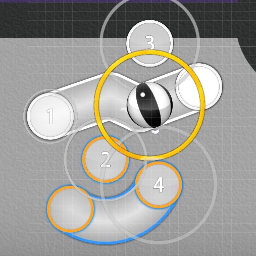
Made a slider blanket between (2,4) so objects are keep interacting each other to form a clean visual. Using approach circle to make a perfect blanket is a nice mechanic.
Square Formation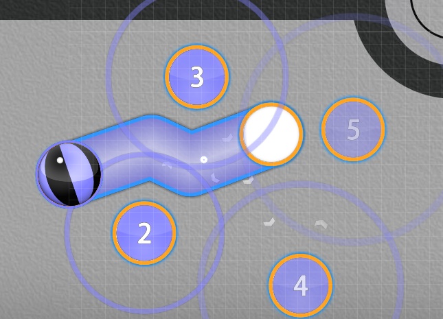
You can clone (2,3), and make them a square formation. It's a polygon based placement so objects correlate together well, and is also assuring visual spacing with slider (1). Could apply to other polygons as well.
Design a New Combo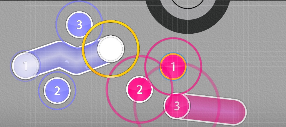
If you ran out of ideas on how to group (4), it's always an option to add a New Combo, and starting a completely new pattern.
Also note that
Visual Spacing is equally assured in all provided examples. Things will look really messy if multiple spacings are used.
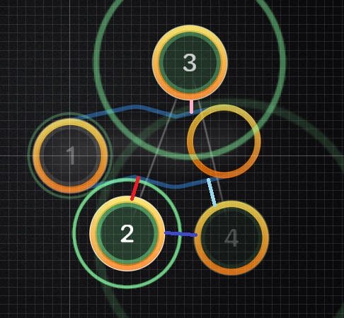
Your example image is having a lot of visual spacing than you may intended, as the spacing between (1,2), (1,3), (2,4), (1,4) are all different to a certain degree. You may think it's minor difference, but those minor difference are the reason why visuals become loose. Ironing the inconsistent visual spacing all the same alone will already give slight improvements.