forum

Play Count Graph per game mode

posted
Total Posts
19
This is a feature request. Feature requests can be voted up by supporters.
Current Priority: +77
Topic Starter
Azure_Kite
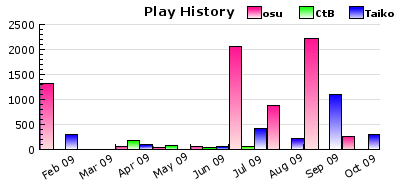
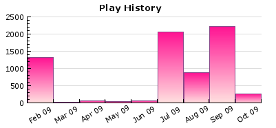
Since the recent implementation of further game specific stats in the user profile, I think it'd be cool to improve the play history graph in the historical statistics tab. Since at the moment there are three game modes, and only osu standard is counted towards the graph, it'd be nice to see three separate graphs, one for each game mode, or possibly a combination of the three.

From This:


To This?:


Feel free to discuss further how this could work, etc

Gemi
Agreed totally! I meant to suggest this a long time a go, but now realize that I forgot. :P Not sure if historical data currently exists, but I'd love to see this at least for future data.
Daru
I agree with the concept; the ability to see historical statistics per mode.

Though, I think the graph should change as you choose "taiko" or "CtB" from the top, instead of having them all combined into a single graph. It seems way to cluttered to have a single graph representing all three game modes.
Remco32
What about a stacked graph?

<3 paint
anonymous_old

Daru wrote:

Though, I think the graph should change as you choose "taiko" or "CtB" from the top, instead of having them all combined into a single graph. It seems way to cluttered to have a single graph representing all three game modes.
Agreed.

Each graph would show in its respective game mode section of the profile.

I'd definitely love the different colours, though. =D
Derekku
Either what Daru or Remco said would work nicely. I'd like to still see an overall graph of the three modes, so a stacked one like Remco suggested would be nicer imo.
LuigiHann
Yeah, a stacked graph would be perfect
Xgor
I like Azure_Kyte's example more but the stacked works too.....

+ tons of support :D
Kitsunemimi
This map has been deleted on the request of its creator. It is no longer available.

Gemi
I don't like the idea of having separate graphs for each game mode. I'd definitely want them in one graph, and the stacked version is the better one.
Topic Starter
Azure_Kite
How would stacked graphs work though? Sure they would look cool, but I'm thinking it would be harder to implement. The reason for this is simple: for it to have the visual effect you guys are imagining, Each gametype would need to work on a principle similar to layers, meaning one gametype would have to be dominant over the others. I was thinking long and hard about stacked graphs, since I agree, they would look cool. However, I'm sure a situation like this could arise: (Note that in Remco32's example, osu is the dominant play count, but the effect would only be more magnified in that case)
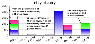


So, if this were to be the way to go, how could this be effectively implemented accurately? One thought I was thinking of was to make each gametype a different width, which would solve the potential problem of masking.
Using the above example, with Taiko as the top layer, CtB as the middle and osu standard as the bottom layer imagine osu standard is the same width it is now. CtB (the middle layer) could be 1/3 less wide, centred or positioned to the left, and Taiko could be reduced by 1/3 again, in the centre or positioned to the left.

I think it would look similar to this:
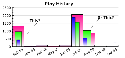


Personally, I think it would look a lot cleaner if they were displayed separately, however, this example demonstates the possibility of a stacked graph.

Feel free to discuss whether this is more suitable or not, any more ideas are welcome
anonymous_old
Azure_Kyte, you're missing the point about stacked graphs.

The bars aren't layered above each other on the Z-axis; they are layered above each other on the Y-axis. Thus, the height of all the bars is the sum of all their values, giving you the total play count. You can look at the graph and estimate the percentages of each mode's plays.
Topic Starter
Azure_Kite
I see *faceplants*
ShaggoN
I support way that Azure suggested in first post. But in my opinion, bars should be a little thicker, and able to scroll horizontally. That would be awesome imo.
GabrielRKF
Hum... Suport
It's a nice idea from the beggining :]
Derekku

ShaggoN wrote:

But in my opinion, bars should be a little thicker, and able to scroll horizontally. That would be awesome imo.
For older players, the chart is getting so squished together that it'll have to be extended/redesigned somehow soon. XP
mikhe
Revive :P

I think this idea is good too------> http://osu.ppy.sh/forum/viewtopic.php?f=4&t=31108 (my own idea)

SPOILER
This image explain all ^^

Edit: this idea maybe isn't to this post, because you were speaking about a "graph game mode" and i speak about how long is the graph, how tiny are the letters, months hid.. etc (graph problems)

Wassaaaa
Revive lol, i support =D
theowest
Now that the play history graph changed, different colours could be implemented to display the different game modes.
Please sign in to reply.

New reply