I’m not sure if “Inconsistent Menu Layout” is the best way of phrasing it, but every time I accidentally open the Editor and I try to quit, I always end up making the same mistake.
I click “Oops, continue editing” Instead of “Forget all changes”.
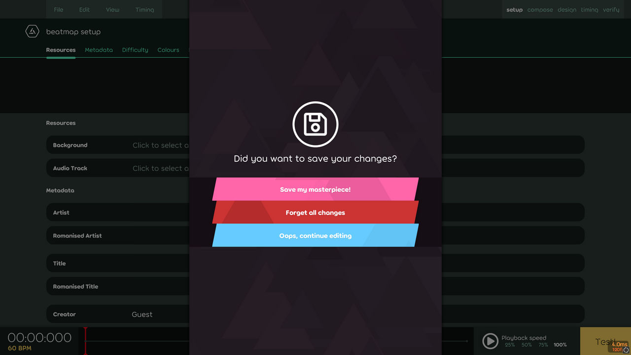
When I try to quit something in a game or a program and I am prompted with a list, I am going to assume “Quit” at the bottom, Hence why I keep clicking “Oops, continue editing”.
In most games quit is at the bottom and resume is on top, or at least above quit, and this includes Osu! Lazer.
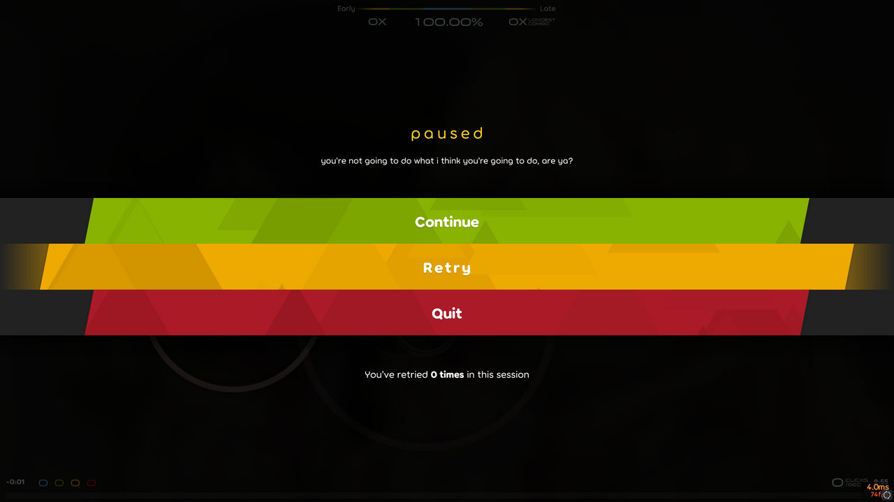
If you play a map and pause, you'll see “Quit” is at the bottom and “Continue” is at the top. But if you go to the Editor, the order is reversed. “Continue” is bottom and “Quit” is both in the middle and at the top.
Which doesn’t seem very consistent or intuitive.
If you were to click “esc” on your keyboard, or navigate your way to [Setting → Exit], you’re probably trying to quit the Editor. And I think it would be cleaner and clearer if you were just prompted with two options: “Forget all changes”, and “Save my masterpiece!”.
If you didn’t intend to quit the Editor you could either click “esc”, or just click off the Selection screen. I don’t think that “Oops, continue editing” needs to be there, but if you really want to keep it, you should at least make it clearly separated from the other two options. Or at least put it on top of the list.
I click “Oops, continue editing” Instead of “Forget all changes”.
When I try to quit something in a game or a program and I am prompted with a list, I am going to assume “Quit” at the bottom, Hence why I keep clicking “Oops, continue editing”.
In most games quit is at the bottom and resume is on top, or at least above quit, and this includes Osu! Lazer.
If you play a map and pause, you'll see “Quit” is at the bottom and “Continue” is at the top. But if you go to the Editor, the order is reversed. “Continue” is bottom and “Quit” is both in the middle and at the top.
Which doesn’t seem very consistent or intuitive.
If you were to click “esc” on your keyboard, or navigate your way to [Setting → Exit], you’re probably trying to quit the Editor. And I think it would be cleaner and clearer if you were just prompted with two options: “Forget all changes”, and “Save my masterpiece!”.
If you didn’t intend to quit the Editor you could either click “esc”, or just click off the Selection screen. I don’t think that “Oops, continue editing” needs to be there, but if you really want to keep it, you should at least make it clearly separated from the other two options. Or at least put it on top of the list.