forum

Mania holds in Argon aren't great. What looks better to you?

posted
Total Posts
7
Topic Starter
itsMapleLeaf
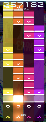
I'm trying to move forward on making mania holds more playable in lazer's Argon skin. I want more opinions on what looks best. The current hold tail in mania looks too much like a tap note, making LNs confusing to read, especially in LN-dense maps. The triangles skin and the stable default both have the same issue.


Here are some idea I drew up Figma, with the original for comparison, and my personal favorites, which I think are the most readable while staying in line with Argon's aesthetic.
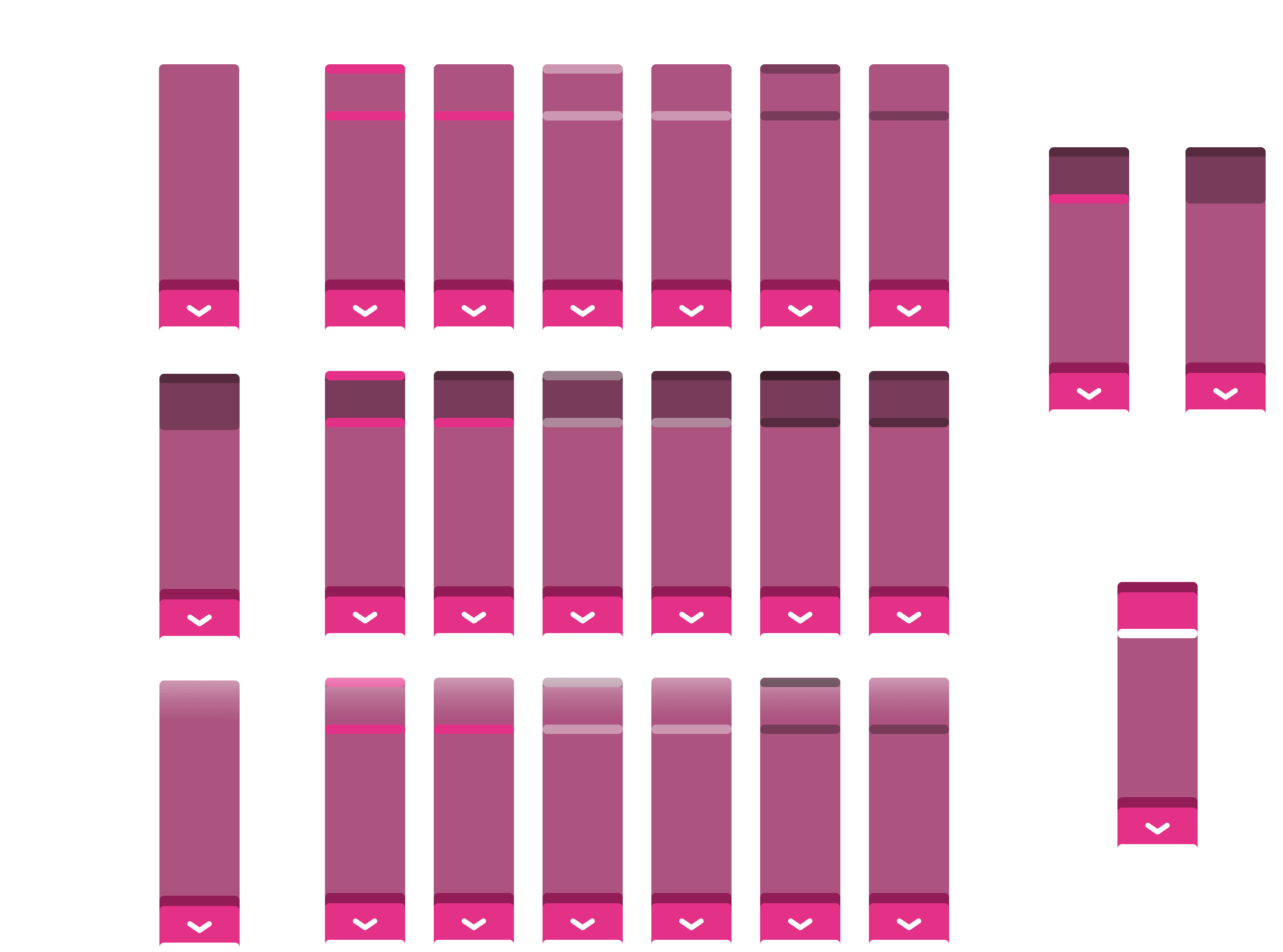


For mania players, which of these do you prefer? Or maybe you have an idea for something else entirely!

Note: For clarity, the team likely wants a tail that mimics the structure of the head in some way, so it's clear when to release the hold tail. So a simple line for the tail probably wouldn't work

Here's the original discussion thread on GitHub if you want to chime in there: https://github.com/ppy/osu/discussions/21996#discussioncomment-4753711
Gamesnake7
Idea looks great
Pckables
I like the look of this skin, maybe i'll finally have to let go of Midnight Bloom.

I've edited the LN notes in my current skin in a similar manner for readability.
And while I like the look of Shade #1 the best, I found that darker tones just made it harder to see when actually playing a map, especially when you're putting dark on a dark background.
So in the end I went with something like Gradient #2. While it looks a little less clean, the bright lines make it significantly easier to read.

Most important thing I found was for it to be easily visible and instantly distinguishable as an LN release point at a glance; which for me was bright colors that contrasted the tap/hold colors.
Topic Starter
itsMapleLeaf

Pckables wrote:

I like the look of this skin, maybe i'll finally have to let go of Midnight Bloom.

I've edited the LN notes in my current skin in a similar manner for readability.
And while I like the look of Shade #1 the best, I found that darker tones just made it harder to see when actually playing a map, especially when you're putting dark on a dark background.
So in the end I went with something like Gradient #2. While it looks a little less clean, the bright lines make it significantly easier to read.

Most important thing I found was for it to be easily visible and instantly distinguishable as an LN release point at a glance; which for me was bright colors that contrasted the tap/hold colors.
The gradient versions are my least favorite, so this is interesting feedback 😅 helpful though!
UltraBlack
Imo no fade is the best, or maybe doing a gradient but darker and not "brighter". Shaded also looks not bad tho, it would make hard things maybe easier to read and possible to do accuracy without having to change the skin
LostCool
No Shade without hit line and gradient without hit line but LN tail should be darker not brighter
And if the LN tail should be released before the LN tail end, Why does it need a hit line mark?
Edit2: I just read the github discussion thread, the flat zero-length tail is the way to go for me.

Edit1: I removed my BASED opinion about argon skin since nobody cares and we'll most likely use our personal skin anyways.
Topic Starter
itsMapleLeaf
Might put another variant with a darkening gradient 🤔 didn't consider that

LostCool wrote:

And if the LN tail should be released before the LN tail end, Why does it need a hit line mark?
There were concerns w/ knowing when to release. AFAIK the idea was to make a hit line on the body that aligns with the receptor hit line, that being a clear signal that you release when they both line up

I can foresee ambiguity when there's not another note next to the tail for reference

LostCool wrote:

Edit1: I removed my BASED opinion about argon skin since nobody cares and we'll most likely use our personal skin anyways.
Hey, the more readable the default skin is, the better. Personally I love it, and the LN tail is the only thing holding me back from using it
Please sign in to reply.

New reply