with the main focus being on readability for different mods/maps.
clean, cool but unobtrusive interface that doesn't demand your attention.
but the skins include alternative elements that you can change to for a more normal reading-experience.
I've spent a great deal of brainpower trying to optimise this, so I'd love to get feedback on what you think can be improved.
How to Use
Last updated: Nov 8, 2021.This is how I use them, but feel free to tweak to suit your needs.
• The HD skin for everything with HD above AR6 (including HDHR and HDDT).
• The EZ skin for everything below AR6, including EZ and EZHD. Basically whenever I think it's useful to see actual numbers.
• The HR skin for everything without HD at AR9.6 or above, or with DT above AR10.5. These numbers are so specific because it has to do with the timing of the hitcircleoverlay animation which is 1.5x faster when you put DT on.
• The NM skin for everything except HD between AR6 and 9.6. Or DT up to AR10.5.
• The High-Contrast skins (HD / NM) for when you want to lower gamma a whole bunch while skin elements are still visible. See explanation below.
• The Darkslider skins (HD / NM) for extremely sliderheavy maps. I actually use these quite often.
• The HR Small Circle skin for extremely small circles with high AR. I don't often use this skin, as it does mess up rhythm-reading some, but I'd probably use them for CS9 or above. I don't use it for CS8.
• The AR-jutsu skin for an alternative EZ playstyle. It's extremely overpowered for reading EZ and EZDT, so I don't use it in competitive settings just because some people feel like it's cheaty. Skin element innovations are fair game, though, so if you want use it, go ahead until peppy decides to nerf it.
Switching Skins During a Match
When you're in multi lobby, it should also be easy to see which of the skins you're using, so that you don't accidentally start the map with the wrong skin. In the image you can see that I'm using the "HD" skin, and this changes to "NM", "NM*", "HR", "EZ" or whatever depending on which skin you're using.Key gameplay design choices
Cursor very easy to spot even among clutter
After having tried playing with an invisible cursor, I've realised just how essential it is for aim to know precisely where the cursor is. So I've made the cursor bright red, and made sure that no other gameplay elements have anywhere near the same colour. This way it should always be easy for your eyes to pick it out no matter how cluttered the screen gets.
I've also hollowed out the centre of the cursor so that you can see what's directly under it, which becomes especially important for reading perfectly overlapping circles on HD, with the windmill solution I use for the HD skin.
And finally I stuck the cursor into the middle of a giant transparent crosshair in order to maximise the number of ways your brain has to infer the exact location of the cursor. It can take some getting used to, but there's also an alternative without the crosshair located in the folders. It works better if your monitor runs at 144hz or more, otherwise the tearing might be a little too much.
Windmill solution for reading overlapping circles
I've noticed that even top players sometimes misread perfectly overlapping stacks, especially on HD when you can't see approach circles. I've tried many different solutions to this, but I think the rotating bars maximises how easy they are to read.
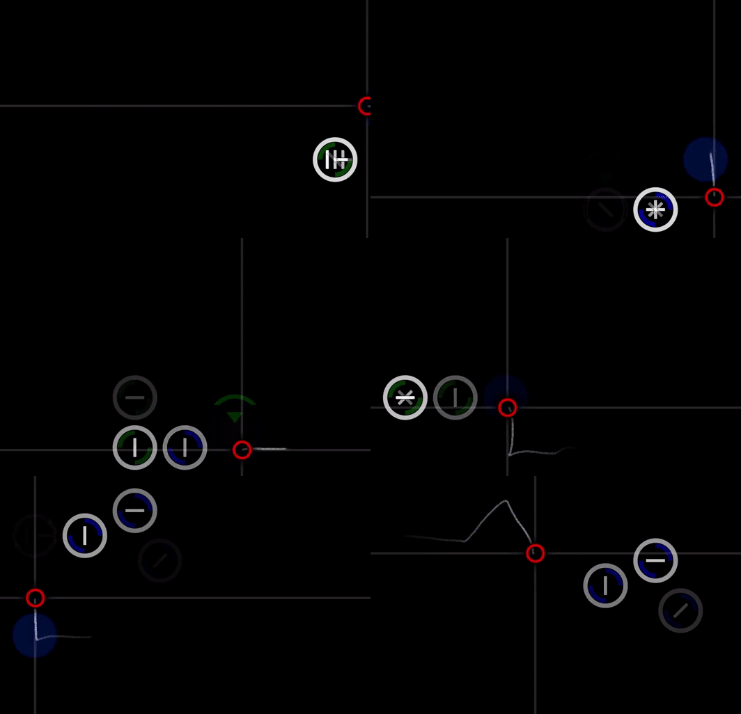
And here's how you can tell the difference between a perfect-overlap triple and quadruple. This gets much easier to read after getting used to it.

And here's how you can tell the difference between a perfect-overlap triple and quadruple. This gets much easier to read after getting used to it.
Combo colours for reading same-number perfect overlaps on HD
Sometimes mappers are cruel and decide to put circles perfectly on top of each other and have them each start a new combo, which means that they'll have the same number. This means that when you're on HD, the only way you can see that there are multiple circles there are if you have at least two combo colours. The Otonashi HD skin uses this solution.
Hitsplats for reading streams on HD, and for learning aim faster
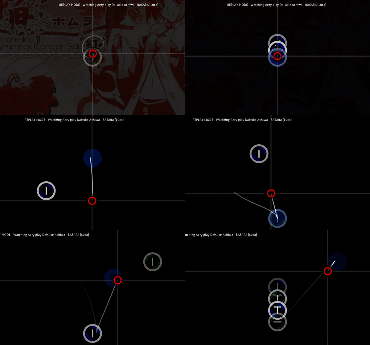
Playing HD can make it difficult to know whether you are leading the stream or lagging behind it a bit with your aim. Having circle-sized 300s, 100s, and 50s that appear immediately as you click the circles help with learning where on the stream you are. They also give you slightly better feedback on where you hit the circle during jumps too, which should theoretically help your brain learn aim faster.
Here's an example with AR8HD:
Here's an example with AR8HD:
Clear hitcircles, dark slider borders, and high contrast for gamma adjustments
The hitcircles should be as easy to see as possible, even during cluttered tech maps. So they should be white, and contrast highly with the rest of whatever's on the screen. For the same reason, I've made the slider borders fairly dark, and the approach circles fairly transparent but still readable enough. The contrast should be great enough that you are able to comfortably increase gamma for HR/DT and lower gamma for low-AR and EZ. (This btw is a very underutilised trick for how effective it is.)

The dark slider borders can take some getting used to, but I think it's worth it. The idea is that you want to be able to clearly see the circle first, and then see where the slider goes. Hitting a sliderstartcircle should be as easy as hitting a normal hitcircle. For this reason, I often actually play with completely dark slider borders, especially on sliderspam maps, and they're easy to read once you get used to it. But I've not set this as the default since you should still be able to see the sliders when you lower gamma a lot for low AR.
There are numerous other design choices that go into this, but I'll elaborate if I'm asked questions.
Reducing circle remnants for nomod and HR
An annoying feature of playing without HD is that when you hit a circle, the circle briefly expands and fades out, obscuring visibility for longer than necessary. This can be a fairly big deal for extremely cluttered tech maps.
One way to deal with this is to have empty hitcircle.png and hitcircleoverlay.png, and simply replace the numbers with hitcircles like in rustbell's skin. The major drawback is that it's harder to see overlapping circles with this. But the nomod skin includes the files for implementing this as an alternative if wanted.
However, for AR above 9.5, there is a rather unique solution to the problem of circle remnants by taking advantage of the fact that hitcircleoverlays can be animated. There are limited options here, so the best you can do is set the circle on a timer before it disappears. This means that for AR9.6, it's perfectly timed to disappear exactly when you should be tapping it, and it feels really smooth. The effect is really great for AR10 as well, which is why I call the skin that uses this feature the HR skin.
Followpoint use cases and timing
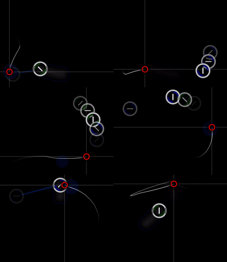
Followpoints should have a balance between being visible enough to be useful, but dark enough to not distract from the more important game elements such as the cursor and the circles. Kinda like slider borders. So they share similar darkness.

For almost all situations, I think it's really important to have followpoints fading in after or at the same time as the hitcircle fades in. If you see the followpoint first, your aim hand gets confused (it has to partition its path to the circle into several chunks) and it adds visual complexity to the rhythm reading. I used to play with a skin that had constant followpoints (like rrtyui's), and once I disabled followpoints my aim increased massively. rrtyui made it work like a god, but if you don't have to play with a handicap, well then why bother. I have also timed the followpoints to fade out quite precisely to when you move the cursor to the circle.
Followpoints can also help with reducing the reading strain of playing HD, because they can stick around after the circle has faded out. This effectively gives you a longer-lasting clue about where the circle was, even after it has disappeared, because the followpoints point to it. Especially helpful for lower AR.
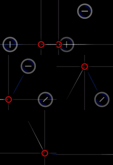
One case where it can be useful to have followpoints earlier than the hitcircle is for extremely small circles on high AR. If you're on AR10 and you have to react to a CS9 fullscreen jump, that's going to be really hard. But if a followpoint can give you a clue as early as possible about where to move next, that can give you an advantage. I've therefore included a Small Circle skin in the selection.
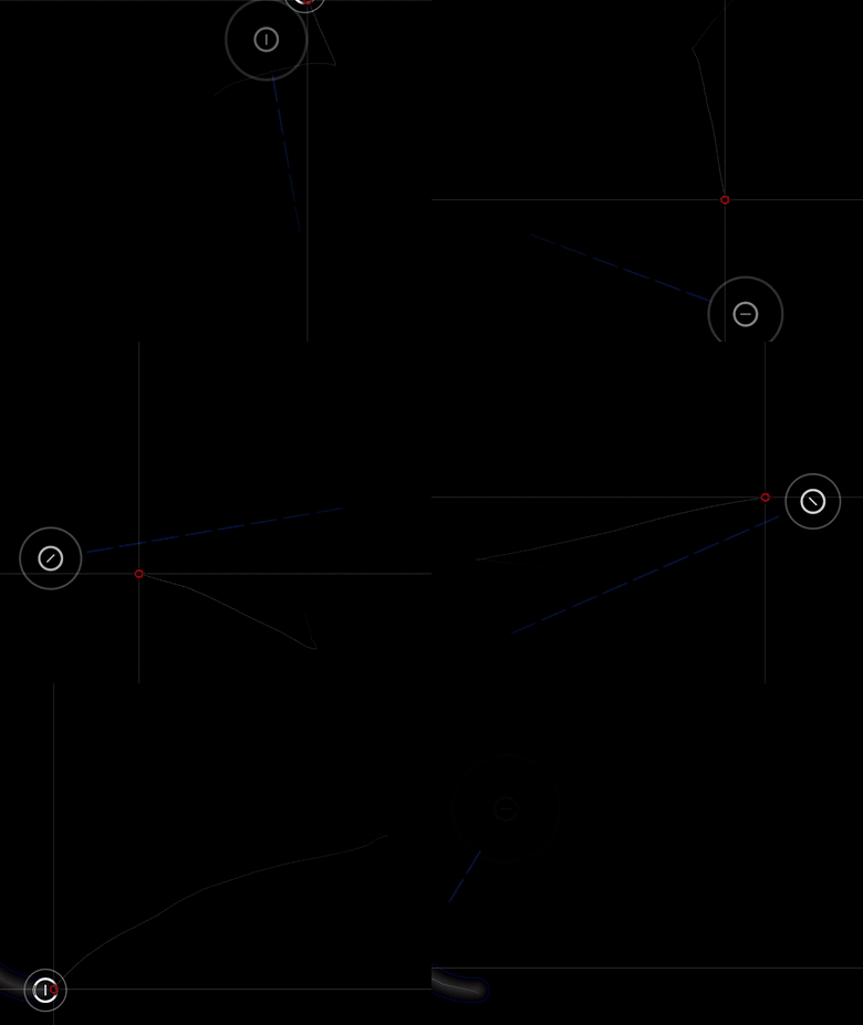
I also use followpoints timed in a way to point me in the direction of the very next circle I need to tap while playing EZ/EZHD. This can greatly reduce complexity for some pattern, but can be hard to get used to reading. Aery, a really strong EZHD player, uses a similar trick with a different kind of skin.
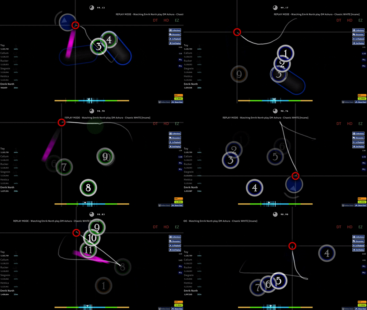
You can also use very early followpoints in order to see where circles are going to appear on high AR, but I don't recommend getting used to it. If you're using it to read AR10.3, my guess is that it's better to learn AR10.3 properly without adding in the aim and rhythm-reading complexity from having early followpoints. It might handicap your learning.
For almost all situations, I think it's really important to have followpoints fading in after or at the same time as the hitcircle fades in. If you see the followpoint first, your aim hand gets confused (it has to partition its path to the circle into several chunks) and it adds visual complexity to the rhythm reading. I used to play with a skin that had constant followpoints (like rrtyui's), and once I disabled followpoints my aim increased massively. rrtyui made it work like a god, but if you don't have to play with a handicap, well then why bother. I have also timed the followpoints to fade out quite precisely to when you move the cursor to the circle.
Followpoints can also help with reducing the reading strain of playing HD, because they can stick around after the circle has faded out. This effectively gives you a longer-lasting clue about where the circle was, even after it has disappeared, because the followpoints point to it. Especially helpful for lower AR.
One case where it can be useful to have followpoints earlier than the hitcircle is for extremely small circles on high AR. If you're on AR10 and you have to react to a CS9 fullscreen jump, that's going to be really hard. But if a followpoint can give you a clue as early as possible about where to move next, that can give you an advantage. I've therefore included a Small Circle skin in the selection.
I also use followpoints timed in a way to point me in the direction of the very next circle I need to tap while playing EZ/EZHD. This can greatly reduce complexity for some pattern, but can be hard to get used to reading. Aery, a really strong EZHD player, uses a similar trick with a different kind of skin.
You can also use very early followpoints in order to see where circles are going to appear on high AR, but I don't recommend getting used to it. If you're using it to read AR10.3, my guess is that it's better to learn AR10.3 properly without adding in the aim and rhythm-reading complexity from having early followpoints. It might handicap your learning.
Extremely-low-gamma optimised skin
For turning gamma up to the max in order to see objects earlier, you don't need to make any changes as long as the hitcircle is white. But for reading lower ARs, you might wish to increase contrast and digital vibrancy to the max as well, in which case it really helps to have all the elements' colour levels optimised for that.
Here's -GN playing Maid of Fire AR8 HD, edited to have low gamma and default gamma.
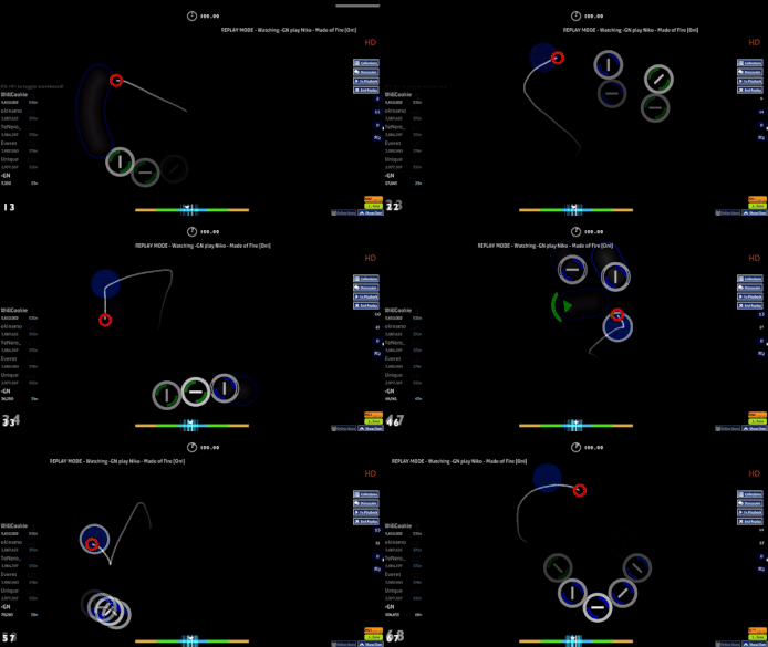
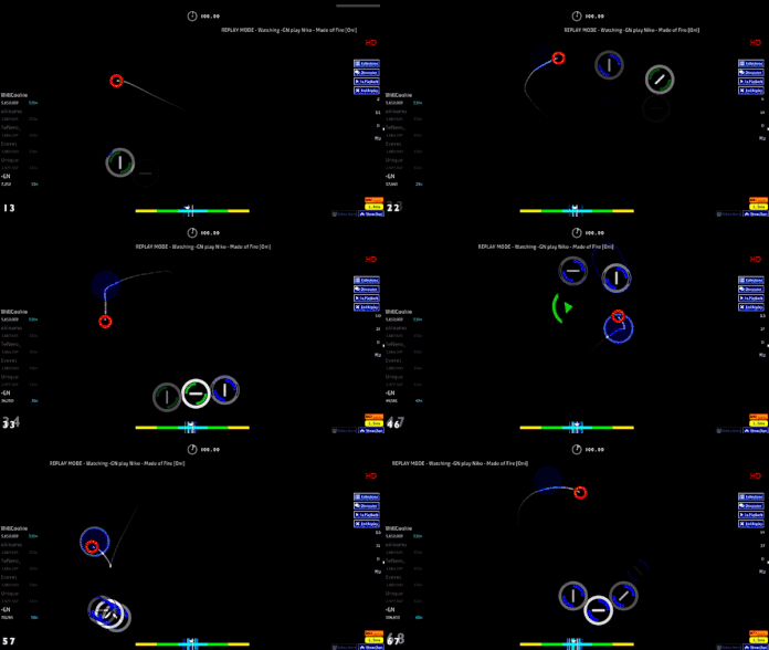
These are the settings in NVIDIA Control Panel I use for dense HD reading when it really matters. (I usually play without gamma changes, though, for practicing reading harder stuff.)
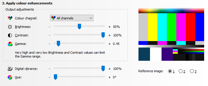
Contrast: 100%
Gamma: 0.45
Digital vibrancy: 100%
And again, for comparison:
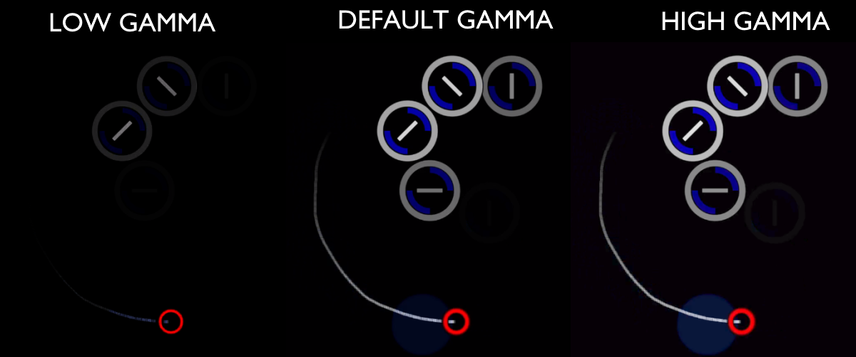
Here's -GN playing Maid of Fire AR8 HD, edited to have low gamma and default gamma.
These are the settings in NVIDIA Control Panel I use for dense HD reading when it really matters. (I usually play without gamma changes, though, for practicing reading harder stuff.)
Contrast: 100%
Gamma: 0.45
Digital vibrancy: 100%
And again, for comparison:
AR-jutsu for EZ
Finally, and this will be controversial... there is a way to use animated hitcircleoverlay to basically hack EZ and make it a lot easier to read. Maybe the best way to show what I mean is with a video. Keep in mind that I'm really not an EZHD player. There's no way I could have done this without using this skin.
Now, should you use it? Well, skinning is fair game, and if the game offers you a way to legally just do something with much less effort, you could chalk it up to the wonders of innovation and be happy about it. But others I've talked to really dislike it, and feel like it's icky and cheaty, and I get where they're coming from. Honestly, I don't want this feature to exist in the game, but it's a fun playstyle to use when you can. I don't personally want to use it in a competitive setting unless everyone involved knows what I'm doing, otherwise feels deceptive. But I'll leave it up here, so that people can decide what to do with it. Don't shoot the messenger!
Now, should you use it? Well, skinning is fair game, and if the game offers you a way to legally just do something with much less effort, you could chalk it up to the wonders of innovation and be happy about it. But others I've talked to really dislike it, and feel like it's icky and cheaty, and I get where they're coming from. Honestly, I don't want this feature to exist in the game, but it's a fun playstyle to use when you can. I don't personally want to use it in a competitive setting unless everyone involved knows what I'm doing, otherwise feels deceptive. But I'll leave it up here, so that people can decide what to do with it. Don't shoot the messenger!
Interface
Copyright
I've made all the gameplay elements in the skins myself (excepting sound files which are free use), but feel free to do whatever you want with them. Copy them out, edit the skins, distribute, whatever. Just remember to enjoy game.Background image by Bouno Satoshi.
