forum

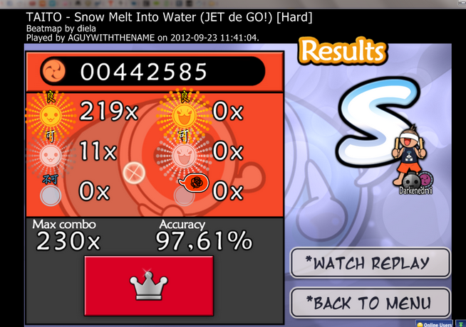
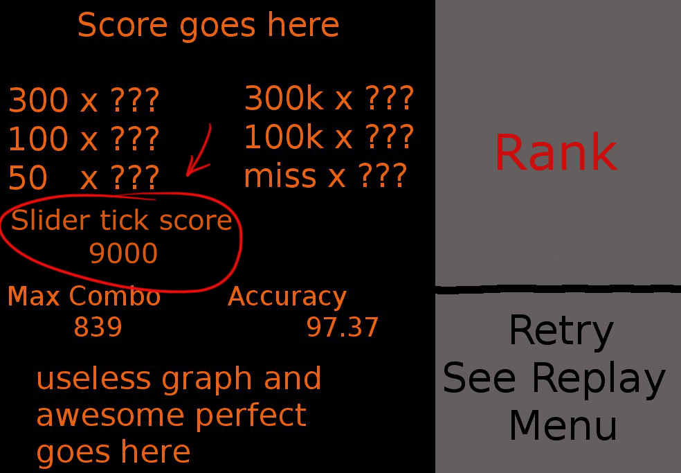
[result screen] Show your slider tick score (taiko)

posted
Total Posts
20
This is a feature request. Feature requests can be voted up by supporters.
Current Priority: +74
Topic Starter
theowest
shown on the taiko result screen.

The redesign I'm proposing:
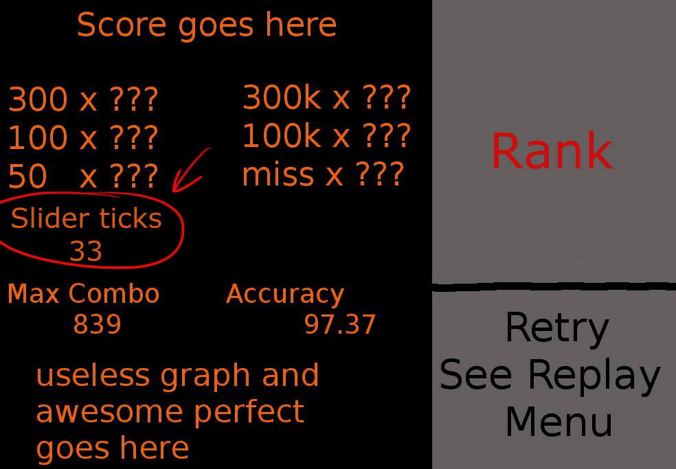

or..


bwross wrote:

Also, it would probably be better to group misses together and hits together. Ie, swap the spin bonus and the misses.
thanks for the help deadbeat

It would be interesting for taiko players to see how many slider ticks you and other hit. It'll be easier to compare close scores.

Flandre XKarlet wrote:

totally supporting. How about this:
looks neater for me.
Here's a related feature request about showing how much spinner bonus you got in osu!/ctb: http://osu.ppy.sh/forum/t/100578

or do you have a better suggestion on how to display this? Leave a reply!
Saten

theowest wrote:

It'll be easier to compare close scores.
I totally agree with this
roufou
Yeah this thing would be useful for knowing whether the 1st on some map is perfect or not and I whether I really missed that many ticks to get a miserable 2nd against a HR score while using FL+HR :v


also it would be nice if you could actually see how many slider ticks you missed or how many there is in the map, the above doesn't really apply if that isn't the case
Sakura
You know, how about we include every single detail in the results screen, 300, 300g, 300k, 100, 100k, 50, Miss, combo breaks, slider combo breaks, semi slider breaks, slider ticks, average spin per minute, max combo achieved, minimum combo achieved, Max spinner bonus, Min spinner bonus... you can probably see where i'm going with this right?

I've seen quite a lot of requests of add this, or that to the results screen and at the rate you're going it's going to be so cluttered it would be useless anyways.

In short... Not support
bwross
Almost all of those are pointless or meaningless for Taiko. Really, the only thing that needs to be up top is 300, 100, miss (50s, geki, and katu are all just taking up space and are meaningless (and always zero because of that)... if anything they're confusing to new players). Accuracy on sliders and dendens is critical knowledge, and isn't presented anywhere... in order to get it you need to watch replays extremely closely. At the very least it should be on the website like missed CtB droplets.

And really, "minimum combo achieved", "min/max spinner bonus"... you're padding your slippery slope with crap that would never be seriously considered because it adds almost nothing (really, one stat covering the overall spin situation is more than enough of a picture... if people start clamoring for spin specific information like max/min spinner bonus, they'll be quickly told to just watch replays which will give them how each spinner scored). I think it's possible to evaluate what's important and what can be fit... replacing things instead of adding where possible. With this, I'd accept 100s or the letter rank being removed (and just use the accuracy) to get Taiko either the total barrage/denden hits or the misses on that screen... that's how far above the slippery bit this is. But that's not required... there's a whole column of space available by tossing the junk and replacing it with meaningful things, and there's really nothing more important that could be put there.
Sakura
I just realized this was a taiko request my bad >_> although still my argument stands, the information given at the result screen is enough there's no need to go into so much detail.
Topic Starter
theowest
I'd be super cool if we could at least have a button for more information. I always want to know more.
Saten
This is one of the reasons why I want this:


theowest wrote:

SPOILER
The redesign I'm proposing:


or..

or..


No point in having an empty space if something useful can be shown instead.
Sakura
Except there's no empty space (unless you mean theowest screenshot, in which case i agree)
bwross

Sakura wrote:

I just realized this was a taiko request my bad >_> although still my argument stands, the information given at the result screen is enough there's no need to go into so much detail.
The thing is that with Taiko's largely linear scoring, these aren't that insignificant when compared with circles. Slider/denden hits aren't "so much detail", they're really more of the same detail (number and type of hits) that's already there. If this were CtB and we were talking about the" add missed droplets" request, then that could be said to be getting finicky with minor details (it's easy to calculate or hit the website for it if you really want to know)... but in Taiko, this information is major (and not easy to calculate). To say it's too much information isn't far from saying that the screen should just show max combo and accuracy, because that gives you the big picture without getting into the small details on exactly how much stuff you hit.

Plus, as I pointed out... there's lots of room on the Taiko screen, without expanding it to a fourth row like in the mockups. Only three of the top stats have actual meaning, leaving three spots in the standard 2x3 array that can be replaced or left blank. And there's nothing better than this information to fill that space. It's certainly more useful than stats that just clutter up the screen to tell you that you got zero of something that you can't ever get any of. I don't think there's much need for the score, though... but both hits and misses should be available, because knowing that you hit "33" ticks doesn't mean as much without some measure of how many total there were (which knowing misses does).
Kuro
bump, bump, no bump, bump, three vertical bumps, four bumps and a square

Bumping this thread /o/
DarkStoorM
Replace 50s with Slider Ticks.
XK2238
totally supporting. How about this:
looks neater for me.
Topic Starter
theowest
sure, and I agree. it's all suggestions to peppy anyway :)
Yuzeyun
TAKE ALL MY VOTES
karterfreak
As long as it shows how many you hit compared to how many you missed, I'd be happy with it (example: 50 / 60 slider ticks), with how much useless information there is for Taiko (the extra 300, extra 100, and 50 are completely unused) I'm sure there could be space made for this.

Upvoting.
Topic Starter
theowest

Tasha wrote:

As long as it shows how many you hit compared to how many you missed, I'd be happy with it (example: 50 / 60 slider ticks), with how much useless information there is for Taiko (the extra 300, extra 100, and 50 are completely unused) I'm sure there could be space made for this.

Upvoting.
that could be a request itself, for all other stats too.
AnFace

Flandre XKarlet wrote:

totally supporting. How about this:
looks neater for me.
this one
Jerry
Supporting this \:D/
tetsutaro
Was thinking of making a new thread, and then I found this.

Supporting, and providing authentic result screens (in more recent releases) for reference

The most common elements to be included are
  1. score (already yes)
  2. passing gauge (partially yes, from the chart thingy)
  3. the distribution of the three kinds of hit (already yes)
  4. max combo (already yes)
  5. accuracy (already yes)
  6. total number of hits on yellow drumrolls (= "slider tick" you speak of)
  7. total hit number (= notes + hits on yellow drumrolls + hits on denden notes)
So I guess:

Score              Rank
300s      drumroll
100s      hit number
Xs
Max Combo   Accuracy

Chart thingy + Perfect message    Buttons
Slider tick score looks a bit useless to me. Seeing the large vs small and Go-go time, it is less indicative than the actual number.
Please sign in to reply.

New reply