SO hai guys. The following skin may be completely terrible, as i haven't had much experience, and you may as a result not enjoy playing with it. However, i do hope you try it and give me some feedback. =D
DOWNLOAD: http://puu.sh/3RvK
To install, simply double click the .osk file.
Skin name: Accuracy
Latest version: 1.2
Creator: tyrael6192
Size: 1.29mb
Idea:The basic point of the skin was to to attempt to fix some of the things which have been clawing at my back for the past few months that i've been playing osu!. It's not intended as eye-candy or themed around a character, it just aims to focus your attention on the actual gameplay. Sounds aren't altered.
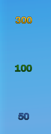
SCREENSHOTS:
All of this combines to give the following play experience:
http://www.youtube.com/watch?v=DApWvW0-QGY
If you have any comments or criticisms, please don't hesitate to post them: your input will be extremely valuable. =]
Future changes will go here:
DOWNLOAD: http://puu.sh/3RvK
To install, simply double click the .osk file.
Skin name: Accuracy
Latest version: 1.2
Creator: tyrael6192
Size: 1.29mb
Idea:The basic point of the skin was to to attempt to fix some of the things which have been clawing at my back for the past few months that i've been playing osu!. It's not intended as eye-candy or themed around a character, it just aims to focus your attention on the actual gameplay. Sounds aren't altered.
SCREENSHOTS:
SPOILER
- a more readily visible cursor, so you don't lose your position on the screen. This rarely happened to me anyway, but i imagine it could potentially be of angst to people who aren't used to the game.

- a slightly more accurate 'health' bar , with the ki pointers replaced by lines to better define the amount of 'health' you have.

- a purely stylistic touch. The font for the score and the hitcircle numbers has been replaced with a slightly less curvy one. Doesn't really improve gameplay, but i quite like it. xD

- new sliders and hitcircles

- new slider circle, so your focus doesn't start to lapse on the pretty spinning beach ball. Also new slider follow.

- reverse arrow =D

- new spinner...
- hitbursts have been made somewhat more subtle and offset upwards slightly, so that they don't appear right in the middle and block out streams.

- sleek blue menu... xD

- buttons...

- mods...

- Skip button... oh yeah XD
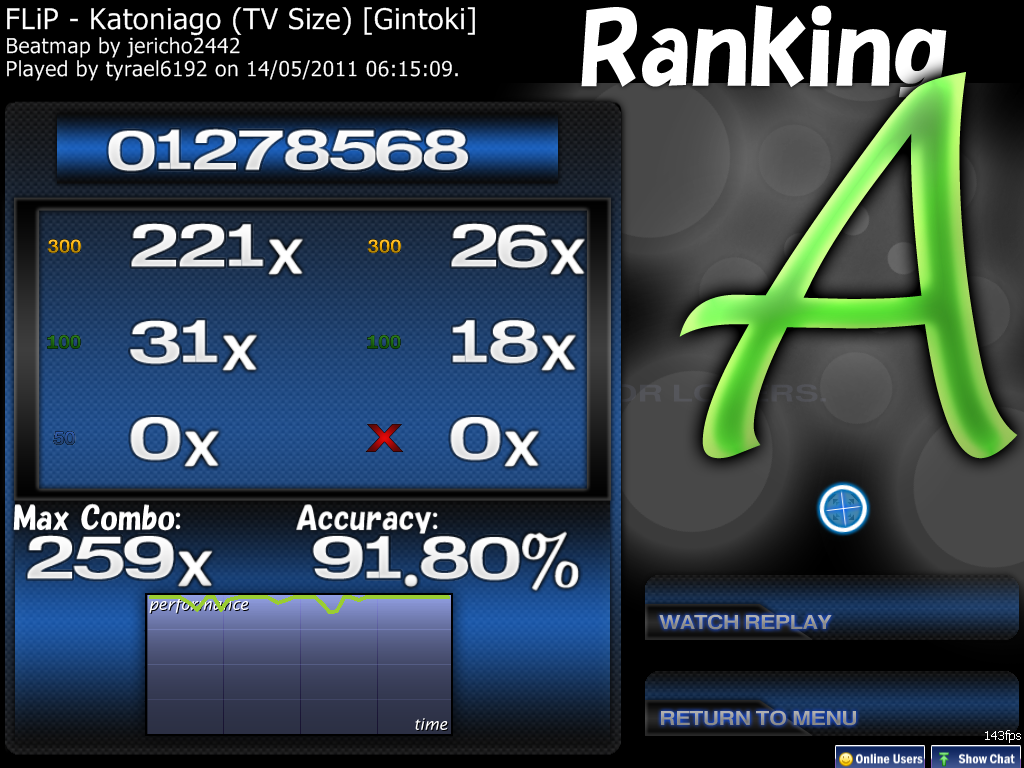
- results screen...

- moar buttons...
- a more readily visible cursor, so you don't lose your position on the screen. This rarely happened to me anyway, but i imagine it could potentially be of angst to people who aren't used to the game.
- a slightly more accurate 'health' bar , with the ki pointers replaced by lines to better define the amount of 'health' you have.
- a purely stylistic touch. The font for the score and the hitcircle numbers has been replaced with a slightly less curvy one. Doesn't really improve gameplay, but i quite like it. xD
- new sliders and hitcircles
- new slider circle, so your focus doesn't start to lapse on the pretty spinning beach ball. Also new slider follow.
- reverse arrow =D
- new spinner...
- hitbursts have been made somewhat more subtle and offset upwards slightly, so that they don't appear right in the middle and block out streams.
- sleek blue menu... xD
- buttons...
- mods...
- Skip button... oh yeah XD
- results screen...
- moar buttons...
All of this combines to give the following play experience:
http://www.youtube.com/watch?v=DApWvW0-QGY
If you have any comments or criticisms, please don't hesitate to post them: your input will be extremely valuable. =]
Future changes will go here:
SPOILER
v1.0
- Lift off.
v1.0a
- Fixed oblong-looking hitcircle overlay
v1.0b
- Introduced experimental spinner
- Temporarily removed over9k because of no spinner variation
v1.1
- Menu elements skinned in the same style as the spinner, attempting to retain consistency. This includes:
+ Menu buttons
+ In-game buttons (Pause buttons & skip)
+ Ranking panel
+ Mod icons
+ Stars
- Slider border made blue (lol) to keep the blue menu theme.
v1.2
- hitcircle and hitcircleoverlay changed - texture added
- followpoints, slider points and slider follow points all changed to fit the theme.
- finally figured out how to change the slider style in the skin.ini xD
- made an awesome reverse arrow (lol)
- slightly changed the hue of the slider border
- sectionpass and sectionfail changed also
- lack of transparency in mod icons fixed
- 'spun out' and 'no video' icons changed to be more suitable


