Can you tell me when the updated day version comes out? I'm a noob and i dont really know how to change the skin.ini things to have a nice day version..

show more
-----
Edit: Update out.
"ranking-X.png" files are not supported pass version 2.
Which SD and HD files don't match?
I also tried that on my skin and changed it to a larger transparent image at 309x158. After that it showed the textbox with the textbox more reliably. I had a panel with a pre-attached graph and that transparent pixel, but later with a larger transparent pixel and a detached graph at the end because of the textbox.


This is on SD mode resolution. 1366x768
Last two weeks have not been really good since personal stuff came up.

Also, are you considering skinning the new UI sounds?
Peppy's video on new UI sounds: http://www.youtube.com/watch?v=bzc9DZG8QUI
Mega Link

I do plan on making another skin that focus on looking good, but that has nothing to do with Luminance.
Which circle? The whole thing? They are combined on top of each other.

I can do both or the pink one which is the outline.
Got some fancy PSDs this time after comparing my GIMP exports and PS exports (PS much smoother edges). I also made sure that I don't see any particles on them in both resolutions. It maybe has to do with the compression when exporting it to png-format. I chose the lossless option.
I also remade the approachcircle to fit 256px and the hitcircle to have the set complete.
As a claim I don't force you to change them, they are just suggestions or extras depending on your view.
@Aggrox: If you check the dimensions of the approachcircle it gets more obvious. The normal size should be like the 256x256 where as the luminace one is 250x250. If you like you can check my remake and how it plays in comparison.
Dark Hitcircles can be found on certain maps with a dark color choice, such as on this map http://puu.sh/aKV7c/11eed4e8ab.png (song is Yousei Teikoku - Kuusou Mesorogiwi with background 100% dimmed)
show more
This reminds me fractal or glitch style graphics.Uruoki wrote:
Edit: Because I got a lot of support in the past, here is a peak at what the new menu-background will look like. I may edit it later, but at least it gives the skin more personality.Agrrox wrote:
So when will new update come out ?
http://a.pomf.se/ubpikg.jpg
Topic Starter
To be honest, I am looking at a month. I started on it, and it is mostly finished, however I will have to play test it and I am still updating Planckian Locus because osu gets updated quite a lot recently. If there is no errors and no major skin update, I will work on it again next weekend. I'm aiming for July, but at this moment, I can't be 100% for sure.TheNoobseeker wrote:
Can you tell me when the updated day version comes out? I'm a noob and i dont really know how to change the skin.ini things to have a nice day version..
I haven't forgotten about this. I just ran out of supporter that was gifted to me. So it will have to be addressed at another time.Comet wrote:
I liked the dusty "MenuGlow" alot, can't believe it got removed from this amazing skin ;s Luckily I have a backup of the color
Just to let you know, I am still looking into solutions for this. I have a few ideas though.Yuukidesuu wrote:
Can you make a folder or a package where its different to each mods.
What i mean is, have the skin only for Standard, Taiko, CTB, or Mania.
-----
Edit: Update out.
Do you plan to uniform (fix/replace some outdated files on) Standard, Planckian Locus and Day Time ?
Topic Starter
Standard is done. It was a good start, however it did not fill the purpose that I wanted it to. Planckian Locus and the Day Time skins will be the only two that gets updated once I am finished. Planckian Locus shouldn't have any outdated files in it unless I am missing something.Agrrox wrote:
Do you plan to uniform (fix/replace some outdated files on) Standard, Planckian Locus and Day Time ?
what do you think about to remove count1.png count2.png and count3.png ?
And even the Aesthetic skin is using the 1x1 transparent images.
And even the Aesthetic skin is using the 1x1 transparent images.
Topic Starter
It is going to stay there. There is a blank.png in the extra folder for people that want to remove it.Agrrox wrote:
what do you think about to remove count1.png count2.png and count3.png ?
And even the Aesthetic skin is using the 1x1 transparent images.
Topic Starter
Status of what? Changelog is always updated to what is upcoming. Updates will most likely return to a weekly schedule like when I first started the project.Agrrox wrote:
so whats the status ?
this is probably already mentioned, but in the .osk file you're missing the 4,5,6,(?7) in the default format (not score)
Is it me or I can't see my unstable rate at the end of a song with this skin
Occurs with me as well, not sure if its the skin or osu though since I only use this skin v.v

- not sure if related, but is the retry button supposed to be like that o.O?
- not sure if related, but is the retry button supposed to be like that o.O?
Topic Starter
I will return in a week to address any postings. I had something very important come up that needs to be attend to.
I guess it's a bug with the skin because it is visible with other skinsTCLCNiche wrote:
Occurs with me as well, not sure if its the skin or osu though since I only use this skin v.v
- not sure if related, but is the retry button supposed to be like that o.O?
i think that whole screen of ranking screen should be overlayed with that transparent black
to prevent the anoying glow of those shiny background images
I think be default if the following files are not present in the skin:
ranking-replay.png
ranking-retry.png
ranking-back.png
osu use files with prefix pause- instead for ranking buttons.
Reason why the retry and replay buttons are diferent is that they are not in same style.
Also i want to notice that some SD and HD files dont match, could be replaced.
Topic Starter
Not sure why. I used the osk file maker in the skin selection. I'll make the osk file by hand for now one.Haagentii wrote:
this is probably already mentioned, but in the .osk file you're missing the 4,5,6,(?7) in the default format (not score)
Don't know, I don't have a problem and 98% of the elements are cropped to the smallest size possible.Raniemi wrote:
Is it me or I can't see my unstable rate at the end of a song with this skin
Yes, but no. I forgot that "Retry" shows up on the result screen. I'll change that in next patch.TCLCNiche wrote:
Occurs with me as well, not sure if its the skin or osu though since I only use this skin v.v
- not sure if related, but is the retry button supposed to be like that o.O?
I'll think about making a transparent black overlay.Agrrox wrote:
i think that whole screen of ranking screen should be overlayed with that transparent black
to prevent the anoying glow of those shiny background images
I think be default if the following files are not present in the skin:
ranking-replay.png
ranking-retry.png
ranking-back.png
osu use files with prefix pause- instead for ranking buttons.
Reason why the retry and replay buttons are diferent is that they are not in same style.
Also i want to notice that some SD and HD files dont match, could be replaced.
"ranking-X.png" files are not supported pass version 2.
Which SD and HD files don't match?
Main reason for that is that 1x1 pixels can't be hovered over. The textbox with the rate won't show up since some textboxes are rather dependent on the element size.Raniemi wrote:
Is it me or I can't see my unstable rate at the end of a song with this skin
I also tried that on my skin and changed it to a larger transparent image at 309x158. After that it showed the textbox with the textbox more reliably. I had a panel with a pre-attached graph and that transparent pixel, but later with a larger transparent pixel and a detached graph at the end because of the textbox.
igoryuske
TheBetterRed wrote:
Now thinking about it, I think I understand what you mean. The colour red, along with other lower frequency EMR have a big wavelength. Respectively they also have a low frequency. Frequency can be defined (as you have mentioned) as the number of cycles per second, and it is measured in hertz. However, having a low frequency doesn't mean that the wave is travelling any slower than, for example gamma ray. The cycle is the region from one peak to another. Also , wavelength is measured in meters.
As for the cell related stuff, I honestly don't know much about it. I'll need to do my homework on it ;D
not sure if it's just me but the hp bar always looked like this for me

edit:
just tried it happens because I've set my resolution to 1366x768.
If I run osu on full screen it fits perfectly.
edit:
just tried it happens because I've set my resolution to 1366x768.
If I run osu on full screen it fits perfectly.
Topic Starter
Working on the new update now, hopefully it will be out tonight.
p/3116648/techbot wrote:
not sure if it's just me but the hp bar always looked like this for me
I am trying to avoid fat fonts. Mainly because they cover up too much for stacks.Agrrox wrote:
I have made a HD rework of Lewa numbers.
You forgot to fix the SD scorebar-bg for scorebar-marker. HD one is fine.Uruoki wrote:
Working on the new update now, hopefully it will be out tonight.p/3116648/techbot wrote:
not sure if it's just me but the hp bar always looked like this for me
Topic Starter
Works for me.ReddScorn wrote:
You forgot to fix the SD scorebar-bg for scorebar-marker. HD one is fine.
1280x960 is an HD mode resolution. Everything above 1000x800 is HD mode resolution.Uruoki wrote:
Works for me.ReddScorn wrote:
You forgot to fix the SD scorebar-bg for scorebar-marker. HD one is fine.
This is on SD mode resolution. 1366x768
Topic Starter
I just got done with an update, so I will work on it next week. It will take some time because I can't just simply resize it.ReddScorn wrote:
This is on SD mode resolution. 1366x768
Raniemi wrote:
Is it me or I can't see my unstable rate at the end of a song with this skin
I'll fix this next update.TCLCNiche wrote:
Occurs with me as well, not sure if its the skin or osu though since I only use this skin v.v
- not sure if related, but is the retry button supposed to be like that o.O?
Syrus wrote:
Wow, this is very interesting, I never thought that a colour of a skin actually even mattered. Keep up the good work.
This is a temp patch for anyone out there that uses Luminance: Planckian Locus and get's some errors.
(This is not the best fix but it will do for now)
Now there is currently a visual glitch in osu! when in skin selector.
Once you've installed the patch it will still show your health bar being in the wrong location.
But when your actually playing your health bar is in the right position.
Fixes for SD:
scorebar-bg
scorebar-colour
ranking-panel
Fixes for HD:
ranking-panel@2x
This link will be removed when Uruoki releases the proper fix.
Link: Removed, official patch here: Click Here
Just replace old files with new files and your set
This hopefully isn't the wrong thing to do and I don't get in trouble for helping
Topic Starter
Nope. I just been busy and this week is a holiday, so I may or may not get to it this week.TheOmyNomy wrote:
This hopefully isn't the wrong thing to do and I don't get in trouble for helping
Last two weeks have not been really good since personal stuff came up.
All good then. Hope your enjoying your holidaysUruoki wrote:
Nope. I just been busy and this week is a holiday, so I may or may not get to it this week.
Last two weeks have not been really good since personal stuff came up.
Also, are you considering skinning the new UI sounds?
Peppy's video on new UI sounds: http://www.youtube.com/watch?v=bzc9DZG8QUI
Can some one post a mirror for me for the Luminance skin plz i cant download it of Media fire for some weird reason would be much apprecaited
Topic Starter
Yep.TheOmyNomy wrote:
Also, are you considering skinning the new UI sounds?
Does Mega work for you?Undeniable1 wrote:
Can some one post a mirror for me for the Luminance skin plz i cant download it of Media fire for some weird reason would be much apprecaited
Yh Mega would work 
Rise_old_1
Topic Starter
Uploading now. I'll edit this post with the mega upload.Undeniable1 wrote:
Yh Mega would work
Mega Link
The day time one? It is far off. A lot of stuff has come up recently. So it is getting pushed back, plus Planckian Locus is still needing updated. The Planckian Locus skin should be updated next week.Agrrox wrote:
So when will be the skin released? I can't wait
Ive seen your skin and im so pissed that it took me till now to find such an awesome skin  . Dude your skin is a masterpiece not only is it clear but the fonts looks so sexy, Awesome skin keep up the good work and thanks fore giving me the link
Topic Starter
Update is out. You can download the full or just the files that was updated via the Skin Database.
I'm not entirely sure if this is the intention for this skin, but you've still got the ranking-panel to large and it's overlapping the information below. I'm using 1366x768 (SD) resolution. I'm not sure if it happens with HD resolution aswell. If someone can confirm that would be great.
I'm using the latest version of the skin: [7.5.14] Luminance: Planckian Locus
I'm using the latest version of the skin: [7.5.14] Luminance: Planckian Locus
Topic Starter
That is actually intended. I could make a regular ranking panel in the extra downloads though.TheOmyNomy wrote:
I'm not interiorly sure if this is the intention for this skin, but you've still got the ranking-panel to large and it's overlapping the information below. I'm using 1366x768 (SD) resolution. I'm not sure if it happens with HD resolution aswell. If someone can confirm that would be great.
I'm using the latest version of the skin: [7.5.14] Luminance: Planckian Locus
Uruoki wrote:
How about now?
Uruoki wrote:
How about now?
Uruoki wrote:
Most replied skin thread in only six months.
If you are new to the Luminance series, please read the information under "Luminance Standard". The current recommended skin is the "Planckian Locus" update. Thank you.
[--------------------]
[ Planckian Locus! ]
[--------------------]
Download: Download from Skin Database
Download Extras from Skin Database
Please download from the Skin Database. It is currently in beta, and needs to be tested. If you see any issue, please report them here.
Special thanks to Redon for allowing me to include Aesthetic's hitsounds.
Luminance started out as a personal project in October of 2013. It had three major goals that sets itself apart from other skins. Look clean enough so it can be used for high level play, please as many people as possibly and the main point, be very well suited for night time playing. The skin started out using -Ryosuke (-Kamui-) skin as a base and a slight color edit for night time. Over time the skin grew more unique characters. One major update that help push this skin was the HD update. Not only did this update make all the elements in HD, but they were also completely redesigned. Another noticeable update was the April 2th. This update reduced the size of a lot of elements to try to compress the file size. It didn't do much, however the skin had a template and could be updated without guess checking now. Over time Luminance became something. With over thousands of downloads, it was becoming popular, and for good reasons. It removed a lot of distractions and had simple elements to make the skin easy to play with. The skin also had a lot of options to fit many different styles. It was being true to all of the goals that was set. All, but one major goal. It was slightly lacking for night time play. It made playing in the dark more bearable, however it was not doing that good of a job. The skin was researched and tested for many months, but it was still failing.
Welcome Planckian Locus. Planckian Locus is a major update for Luminance that aims to improve that current night time experience. Planckian Locus is the path that color temperature travels. Unlike Luminance, where low contrast colors were used, color temperature is the main focus of this update. Color temperature is the measurement of how much radiation is used to deliver the hues of colors to our eyes. Blue/Purple are known as cool colors, they are measured up to 5000k (kelvin is the measurement used). Lower colors such are red/yellow are known as warm colors.
The sun produces around 6500k. When people view their monitors (6500k) they are basically looking into the sun. This is bad for our eyes for long periods of time and can harm us. Whereas we are able to look at a candle light (1850k)for much longer with little damage. Even though the sun looks red/yellow, it actually produces more blue lights than red lights. That is why it is hard to stare at the sun for long periods of time. Around sunrise/sunset the sky turns red for the night. At this moment is sun is producing 1850k (candle light). This is why people are able to view the sunrise/sunset. This also ties in with the other information that Luminance was crafted with.
Since Planckian Locus is mainly focus on color temperature, the skin will seem quite weird. It is mainly hues of red, orange and yellow. However the combo colors are still very much different from each other. Within a few minutes of playing with the skin, our eyes quickly adjust for the lower temperatures, creating a more smoothing osu experience. Taiko and Mania may need a lot of work/feedback for these new changes. This is a new update, and it will still be tested and changed based on feedback. The Luminance series strives to the best night time experience for osu!
Change LogsUpcomingNothing yet.7.6.14ranking-panel@2x, ranking-panel: Made them a bit more transparent.7.5.14Starting this update, all downloads will be on the Skin Database
Thanks TheOmyNomy for fixing SD scorebar.
- scorebar-colour, scorebar-bg: Fixed SD scorebar.
- ranking-graph, ranking-graph@2x: Fix ranking-graph.
- ranking-panel, ranking-panel@2x: Resize ranking-panel.
6.25.14DL: OSK File ZIP File
- Change font for pause menus.
- Change font for back and skip.
- Made ranking text transparent and moved the old one into extra folder.
- SD version of menu-background and fail-background.
- Removed larger and small cursor in extra folder.
- Version 2.3 to future proof the skin.
- Changed fruits mascot to work with new update.
- Transparent fruit combo burst.
- Changed ranking panel. A bit off, but I can't fix that.
- Added 00 - Readme.txt to main folder.
- Secret.
6.14.14OSK File ZIP File
- Redesigned menu-button-background.
- Redesigned menu-background to add more personality. Everything else in the skin is still pretty simple though.
- volume-bg-effect slightly redesigned.
- Ranking panel slightly redesigned. Just don't scroll down or you break it.
- Ranking graph is transparent.
- Replaced hit sounds with Redon's. Custom made sound effects are still in place but Redon's are still in extra folder.
- Redesigned pause buttons.
- Redesigned slider tick.
- Fixed/Redesigned Pause-overlay and fail-overlay. They was jpg for some reason.
- Finally skinned cursor-smoke.
5.23.14DL: OSK File ZIP File
- Fixed Score/HP Bar to use the new marker. Still looks the same, just future proofing the skin.
- Skinned multiplayer-skip.
- Redesigned mania-hit. Waiting for feedback.
- Redesigned fruit-ryuuta. Waiting for feedback.
- Redesigned menu-background. I think.
- Redesigned menu-snow. I think.
- Changed mania-hit300 to display 320 score instead of 300.
- Changed menu-glow back to transparent.
- Added 4k-7k.ini
- Added large cursor in extra folder.
5.17.14DL: OSK File ZIP File
- Change hitcircle to be slightly less transparent and match red sliders. Should still be a bit transparent though.
- Fixed ranking-winner size.
- Changed menu/pause/fail background, menus, star and snow to fit in better with the skin. Redesigned and recolor.
- Hid the gamemode icons in the background.
- Added Shinobu sound in extra folder.
- Fixed menu-button-background being too small for displaying top scores.
5.12.14DL: OSK File ZIP File
- Changes all the colors to a lower color temperature.
- Selection icons redesigned.
- Taiko Mascot removed.
- Pass, Fail and Unranked redesigned.
- Removed dust.ini
- Changed pause and fail background.
- Replaced Kamui's sounds with Redon.
- Removed Brighter Whites folder. Doesn't fit skin anymore.
- Redesigned mode symbols.
[-------------------------]
[ Luminance Standard ]
[-------------------------]
This post is going to be long, so for those that don't feel like reading, I will get straight to it.
Change log is at bottom if you wish to read that.
I made this skin to be used for playing in the dark. Don't forget to check the extra folder for a lot of different options. I tried to make it fit everyone's playstyle.
Download: OSK File ZIP File
Spruce is the default color scheme. It is named skin.ini by default. If you want to use a more brown and red theme, rename skin - dust.ini to skin.ini
Thanks to Kanna for the hitcircle font inspiration and -Ryosuke (-Kamui-) for the sounds and other inspiration.
Everything is made from scratch. Feel free to use this skin however you want.
This mean you can use this skin and release it without asking me first or without giving me credit.
Thank you for using my skin. I hope you enjoy it.
For the people that don't mind reading, the next few paragraphs is the history, reason, science and goal of this theme.
History
You can skip this if you want to, it has nothing to do with the skin.
I started playing OSU back in October of 2013. Even though my profile says longer, I didn't really get into it until recently. Before OSU I graduated college and I am currently interning, working on computers. I sit at computers pretty much all day looking at a bright screen, then go home and want to play OSU, but lose focus due to my eyes being tired. So I done some research about how colors and lights effect the human eyes and went out to design a skin that would work for long stress on the eyes. The following is what I found.
Science
The human eye. It is made of two main cells. The cone and the rod cell. The cone cell is what makes us see all the pretty colors. It is most active during the day time when we see purple, blue and green shades. The problem with this, is that it takes a lot of energy to use. This will be explained later in the thread. The rod cell helps us see light. Basically if you have a light dimmer, it helps us see in different light settings. The bad thing about the rod cell, is that these lights get processed slower in our eyes than the cone cell. However they take less energy. If you notice that you turn on the lights in a dark room, your eyes adapt very fast to the lights. However if you turn off the lights, it takes longer for your eyes to adjust to the new light settings. Within some time, you can see a table in the dark that is sitting right in front of you. This is thanks to our rod cells.
So now that we know what they are, this is how they work.
The frequency is what we are wanting to take a look at. The higher the frequency the more energy is needed to produce those colors in our brain. This is known as the visible spectrum. Since red travels the slowest, it takes less energy. You would think that since OSU can be a pretty fast game, you would want everything to be purple. That way you can detect the circles quickly. This is true, in a way. Think of it like this. If I was to toss you a balloon and a fastball. It would take more energy to catch the baseball than it would to catch the balloon. You would get the baseball faster though. However if I was to toss those items to you a thousand times, you would be more worn out after catching the baseball than the balloon. This would also cause you to start missing the baseball due to all the energy you burned. Same could be said for OSU. You could play about 10 songs with all purple, but your eyes would grow sick of it, and start making mistake. Whereas with a red theme, you could go longer. That is the focus of this skin, to allow long play time, and in the dark.
So there is another factor that goes into this skin. In the screenshots you may notice that there is blue and green. A complete red skin would be better for long game play. That would be a bit bland though. This is where light comes into play. Each color has a certain degree of light it produces.
The bar with the red and black at the very bottom is the bar that shows how much light is being added into that color. The rod cell is what produces light and not color. A low light blue or green color should have the same benefit as a high light red color. Since less light is produced faster than a lot of light. This allows the rod to finish it's job faster so the cone and begin to produce the colors. If that makes any sense. You may also hear the term, low contrast. This should be the same concept.
Some examples of what I mention above is as follows.
Pilots use red lights in their cockpit. The reason is so they can look down at the gauge and look back up into the sky while driving at night so they won't mess up their vision. Since red light are more slower to travel (uses the least energy), they can quickly look back into the night sky and adjust their eyes.
Our cars uses red brake lights for the same reason.
Police also use red lights in their cars so they can adjust their vision.
Some more reading material via Wikipedia. If anyone finds anymore, feel free to share.
Rod Cell
Cone Cell
Purkinje effect
Eye Adaptation
Scotopic Vision
Photopic Vision
Mesopic Vision
Visible Spectrum
Electromagnetic Spectrum
Wavelength
Hertz
Afterimage
Goal
I designed this skin to be used at night time or for long period of gameplay. I have had a lot of feedback about this skin. Since this skin cuts back on a lot of flashy elements and uses a flat and clean design, I have also tried to design it for high level playing.
It is unhealthy to stare at a monitor for too long. Please remember to take breaks. It is important.
FeaturesChange Logs
- Low contrast, low energy consuming colors design for night time playing.
- Serif font for easy to read and less distractions.
- Most flashy elements reduced.
- Minimalistic and clean design.
- Transparent middles for hitcircles for easy reading of stacked notes.
- Transparent reverse slider arrow for easy reading of stacked notes.
- All game modes supported.
For download links after Final release, please use the current download.4.10.14
- Change slider ball to support the new tint option. Please enable this, otherwise it will look bad.
- Changed volume slider. I thought I did that already, but looks like I forgot to upload it.
- Took Shavit-sama suggest to make hit300 appear in scoreboard, but not playfield.
4.4.14Fixed the big Taiko hitcircles and reduced the brightness of the extra sliderfollowcircle.4.2.14
- Removed 33 files.
- A lot of elements have been reduced in size. (Not all, but most)
- Star has been redesigned to fit in better.
- Spinner layout/design changed a bit, but it should work the same.
- Taiko-hit has been removed of blur. They are not clear and noticeable.
- Added a brighter sliderfollowcircle in the extra folder that fits the theme. Some people was using a really bright one that did not fit, so I decided to help them out with that.
3.6.14Skinned icon for cinema mod.2.20.14 - Final - Fixed
- Fixed ranking-X, ranking-XH and ranking-XH@2x.
- Added "Dimmer White" folder in extra. Should help with white elements being too bright. Only did the ones that show up on the playing field.
- volume-bg-effect skiinned.
2.21.2014- Changed hitcircleselect and hitcircleselect@2x around.
- Added a quick fix for Taiko glow being too bright. May not be the correct size, but it works.
2.10.14 - Final
- counts 1, 2 and 3 now skinned. Just noticed that new skin behaviour doesn't make them appear from the sides.
- taiko-bar-right removed. Until skins get better documentations, this will be unskinned. The dimensions is just too much of a pain to mess with.
- Mode icons removed. It uses defaults anyway. Just save space.
- Fruits and followpoints now in HD. Not tested, but should work. If not, then at least SD does.
- hit50k removed, never used.
- count1s, count2s, count3s, gos, readys, and spinnerbonus sounds have now been designed.
- Easter and Halloween icons added for menusnow.
- Ranking panel wider for huge scores.
- SD selection random fixed. Was missing F2.
- hitsounds removed. Read this post to find out why.
2.5.14I left the sound I use personally in by mistake. The old ones are in the default folder in the extra folder. I think this also overwrites the new ones I left in by mistake.
DL: OSK File ZIP File
- button-middle, button-right, button-left, fail-background, menu-back, menu-button-background, menu-button, pause-back, pause-continue, pause-replay, pause-retry, play-skip, ranking-graph, ranking-panel, ranking-winner, and spinner-rpm have all been redesign to match the skin better.
- Removed selection-mod-fadeout, and 3 other elements. (They were something to do with ranking-replay, ranking-menu, but they are not used)
- LightingL animation frames reduced. Cuts down on distraction and filesize.
- ranking-accuracy and ranking-maxcombo has been replaced with blank.png. The old ones are in the extra folder if you want them.
- Mania keys are now brighter. To me the blue (middle/special key) was way too dark. Not sure why no one complained.
- Think I left in two new sounds. Opps.
1.18.14DL:OSK File ZIP File
- Changed taiko hits.
May change later if they are not noticeable. I like them though.Hated them, remade them with an additional download link.- Changed selection buttons on song selection to reflect hotkeys. Random and Maps are the ones that changed.
- I forgot to remove a sound that I was working on. So there is a preview of an unfinished spinnerspin sound. This should also give you a sense of speed that Neroh made a point about. Enjoy.
- Someone pointed that spinner was unplayable with hidden mod. Download this spinner to fix it.
1.17.14DL: OSK File ZIP File
- Slidertick, mania-notekeys, mania-keys, taiko-rollend, selectiontab, inputoverlay-background, taiko-bar-right-glow, taiko-bar-right, taiko-glow, lighting for mania, and score font all redesigned.
- Extra cursors are bigger and more even.
- Added more icons for snow-menu. Dodenherdenki, Doningsdag,Fall, Summer, Snow, Spring, St. Patrick's and Valentine's symbols are in the extra folder.
- Fadein, Random, Nightcore, Perfect mod icons has been recolor. Missed those last update.
- menu-glow added to skin.ini (and dust). Not sure how it will look since I don't have supporter.
Feedback?
- Selection-mod-taiko.png removed
1.10.14DL:OSK File ZIP File
I forgot to change the sounds back to the default. If you want them they are in the extra folder.
- Remove old spinner circle. It is not used in the new skin behavior.
- Reduced some file dimensions to make file size smaller.
- Spinner-middle@2x has been changed to reduce file size.
- Removed spinner-circle and star2 from extra folder. I really see them pointless. If you want them back in, fight me in real life tell me.
- Color code mod icons so it is easier to tell them apart.
- Ranking-Perfect changed to fit inside the graph now.
- Ranking-Title position changed to fit in better.
- Menu-Snow changed to get ready for Valentine.
- Brighter hitscores and approachcircles in the extra folder. Preview of hitscores.
- New hitscores folder in extra folder. It includes the hit300 set and the brighter ones.
- Fix unranked.
- Readme updated.
12.29.13DL: OSK File ZIP File
- New hitcircle. It has a transparent middle. Old hitcircle moved into extra folder.
- Changed reverse arrow. It is now inside the circle and design has been changed also. This will work well with the transparent hitcircle.
- I did something with the old hitcircle, but I forgot. One thing I did do was change the shade to a brighter one so it is easier to see the colors.
- Changed drum-slidertick and drum-sliderslide in soundset "CLICK CLICK BANG BANG". They were using the wrong sound.
- Added a 7 new cursors in the extra folder.
- Deleted cursor_bright and cursor_dark. The colors should be fine now that you don't need those. If you want them, tell me and I will add them back.
- Made Snow less of an annoyance.
- Removed spinner-metre and two spinner-circles in extra folder. Meter is not used in the new skin behaviour. Not sure about spinner-circles will test later.
- Readme.txt has been changed.
- Extra folder has been reorganized. Any kind of element that has more than 4 elements will now have it's own folder.
- Taiko-drum-inner, Taiko-bar-left, Taikohitcircleoverlay, Taikobigcircleoverlay, Taiko-slider, Taiko-slider-fail has been redesigned.
12.17.13DL: OSK File ZIP File
- New soundset in the extra folder. It is just clicks so it is more noticeable when playing.
- 4k, 5k, 6k, 7k, 8k, random mod icons skinned.
- Mania keys skinned.
- selection-mod-perfect@2x skinned.
- Lightingn and lightingl skinned (modified OSU)
- Pause background now has a subtle pattern.
- Selection icons on main menu has been skinned. Preview here.
- Forced new skin behaviour in skin.ini. This is mainly so I don't have to fix the scoreboard.
- play-warningarrow has been changed to a dark black. In the play field it will be a dark red and on menus it will be a dark blue. OSU forces this, but it shouldn't be blinding and it should fit with the skin.
- Fruits changed to a circle.
- Fruit-Ryuuta changed to Pong bar. Preview of fruits here.
menu-snow.png changed to add more snow. Preview here.- menu-snow.png has been changed to a huge blizzard Preview here.
- Changed scorebar design.
12.11.13
DL: OSK File ZIP File
I forgot to do selection-mod-perfect@2x. I will add that in a bigger update.
- All current skinned elements should now have HD support. (Unless I missed one.) (This does not include the extra folder. Hit300 is skinned though)
- New skin behavior supported. A few colors may be off because OSU forces those. Nothing I can do about it. Main colors should be fine though.
- Button-left,right,middle is now darker.
- Hitcircle design has been changed to a flat design. I like flat designs. I'm an minimalistic.
- Hitcircleselect has been changed. I am not a mapper, so I am not sure how this will work. Will change later.
- Hitcircles and approachcircle are also brighter, but not blinding.
- Hitcircle, approachcircle, hitcircleoverlay, sliderb, sliderfollowcircle are now more crisp instead of being blurry. This may effect eye strain. Not sure yet.
- Hitcircleoverlay no longer has a transparent fill in the middle.
- Inputoverlay-background has now been recolor.
- Inputoverlay-key has been redesigned.
- Menu-back is no longer animated. This is only as a temp though.
- Menu-button-background redesigned.
- Ranking letters has been redesign. (I think, I don't remember what they were before.)
- Ranking small letters redesigned. May redesign again.
- Ranking-perfect has been recolor.
- Ready has been changed to just say "Ready?"
- Spinner-middle2 and Volume-bg redesigned.
- Spinner-middle redesigned to look like Spinner-middle2 if you are using old skin behavior. This should be good enough so you don't need a hand now.
I think that is all.12.7.13DL: OSK File ZIP File
- default-dot, default-percent, default-x, default-comma changed to match the other default fonts.
- play-warningarrow redesign. Fits better with circle2 or circle 3 color. Also looks nicer.
- All large rankings have been redesign to a more simple flat design.
- All small rankings have been clean up. They are a bit more sharp now.
- ranking-maxcombo and ranking-accuracy has been resized to not overlap.
- ranking-title changed to fit the skin better.
12.6.13DL: OSK File ZIP File
- hitcircleoverlay has been slightly changed. There was a minor error. May redesign completely later.
- hit50, hit100, hit100k has been redesign. May resize or tone down later. Haven't play tested these, but font choice is staying. Picture.
- hit300, hit300k, hit300g extras has been added to the extra folder for those that want to use that. Also may redesign due to same reasons. Picture.
- Readme in extra folder has been updated.
- cursor_naturaldark.png has been rename to cursor_dark.png now. It is more simple.
- pause-back, pause-continue, pause-retry has been redesign to match with ranking menu buttons. Buttons in general may get a redesign later.
- All the ranking small icons have been redesign. Noticed that they are a bit messy in spots, will clean up later.
- followpoint has been added to extra folder. Let me know if it is choppy and I will add more frames. I personally don't use it. Also, it may be shown through the circles. This is because they are semi-transparent. For the people that actually use followpoints, please let me know if this is a hassle, and I will include extra circles that are not transparent.
12.1.13DL: OSK File ZIP File
- sliderfollowcircle, spinner-approachcircle, [extra] sliderfollowcircle, spinner-approachcircle, spinner-circle, spinner-circle1, spinner-circle2 has been tone down. Not as bright so they don't look out of place.
- cursor_natural has been replace as the default cursor now. It is easier on the eyes. The old cursor has been move to extra folder and named "cursor_bright".
- Resized hit300, hit300g, hit300k, cursortail, fruit-pear-overlay, playfield, spinner-background, spinner-metre and star2. Now 1x1 to save size. Reduced by 2mb.
11.30.13DL: OSK File ZIP File
- blank.wav, cursor_natural.png, cursor_naturaldark.png, readme.txt, sliderfollowcircle.png, spinner-approachcircle.png added to extra folder.
- Default spinner-approachcircle.png redesign. Circle is thicker now. Old one moved to extra folder.
- spinner-circle.png in extra folder redesign. Added an extra hand for an offset. Hopefully this will reduce afterimaging.
- ranking-back.png, ranking-replay.png and ranking-retry.png redesign for English text. May redesign again later.
- Changed SliderBorder to 200,200,200 in skin.ini and skin - dust.ini. This should match better with the hitcircles now.
- Added SongSelectActiveText and SongSelectInactiveText to skin - dust.ini. It was missing before. Not sure how I didn't see that.
11.29.13DL: OSK File ZIP File
- Changed version number to reflect the date of update.
- Added extra folder to include misc. items that others may want.
- Made Star2.png transparent. It was annoying and a distraction.
- Added star2.png, spinner-metre.png, and 3 spinner-circle.png to extra folder.
- Not sure how OSU handle sounds, but some of them was low. Added a 4.5db brickwall compression to applause.wav, combobreak.wav and failsound.wav
- Redesign hit-0.png to make it more minimalistic and match the color to fit better with the overall theme.
- Redesign scorebar for the same reason as hit-0.png This is what it looks like.
- Replaced pause-overlay.png to completely black. The current one was blue and it ruined night vision. This was due to it being too bright. Will redesign later.
- Skin - Spruce.ini is now the default color scheme. Renamed to skin.ini
- Removed 4k.ini, 8k.ini and so on. Won't be doing those for a long time.
v0.1DL: http://puu.sh/5w6eA
Released
Much better, thank-youUruoki wrote:
How about now?
Topic Starter
If there is no more complaints or concerns about the current status of Planckian Locus, then I will start working full force on the day time version.
agree and can't wait!Uruoki wrote:
If there is no more complaints or concerns about the current status of Planckian Locus, then I will start working full force on the day time version.
Sorry, but can you upload it somewhere?
I'm getting this error:
I've been using your skin since April. Great work.
I'm getting this error:
I've been using your skin since April. Great work.
I also have the same error.
The download link is working now, but I suggest you post a mirror just in case.
Topic Starter
Luminance Fluorescence is out.
If it happens again I will.gintoki147 wrote:
The download link is working now, but I suggest you post a mirror just in case.
Hell yes. Luminance in color!!! I'm loving the new look and will be switching between this and placikan
Topic Starter
I plan on redoing those anyway, and yes there will be an extra folder.techbot wrote:
not sure if just me but the score numbers are way too dark.
will there be an extra folder for this skin as well in the future? (for followlines etc)
Nice new variation on that skin, but some things could need a make-over. All are personal suggestions and don't necessarily need to be changed.
Most of my previous posts on here were rather help on fixes and not really judging comments, so with this update it was time for that.
This is a great project you worked on with detailed reasoning behind your design choices which lead to the success of this skin series.
Let this success grow even more.
I personally find the mod icons hard to read. The contrast is too low between the two colors.
To the mod icons on all versions: I don't really like the colour categorization into vertical lines instead of horizontal lines. With the horizontal lines you can display the difficulty level of the mods (easy/harder/unranked) additionally to the information at the left more clearly like that.
The hitscores are too dark to be noticed due to the gradient going to black at the bottom.
I also strongly dislike your standard spinnerspin.wav. This high squarish saw sound is rather annoying.
The other thing is the thickness of the hitcircleoverlay. It is 14 pixel (the HD one) wide between outer and inner border. Due to this a part of the slider shows beneath the inner edge. I would make it 16 pixel wide to hide the sliderborder completely behind the overlay. This wasn't noticable since your old hitcircle went all the way to the edge and hid the sliderborder.
Last is a personal review on all versions up to Fluorescence:To the mod icons on all versions: I don't really like the colour categorization into vertical lines instead of horizontal lines. With the horizontal lines you can display the difficulty level of the mods (easy/harder/unranked) additionally to the information at the left more clearly like that.
The hitscores are too dark to be noticed due to the gradient going to black at the bottom.
I also strongly dislike your standard spinnerspin.wav. This high squarish saw sound is rather annoying.
The other thing is the thickness of the hitcircleoverlay. It is 14 pixel (the HD one) wide between outer and inner border. Due to this a part of the slider shows beneath the inner edge. I would make it 16 pixel wide to hide the sliderborder completely behind the overlay. This wasn't noticable since your old hitcircle went all the way to the edge and hid the sliderborder.
I wasn't really there in the beginnings of the skin, but it made a long way comparing all the old versions. I was hooked on this after the HD release that made this skin an true original one. I liked the non-intrusive color scheme being easy on the eyes and considered it making a skin I would play with often. Having worse skill than now I dropped it because it was somehow difficult to read on. I just later really read the text and liked the concept at first. It is nice seeing a skin themed with so much research and thought going into it. But with the following Planckian Locus update it became more unreadable for me.
With this update I came to a conclusion; your skins are very hard to read for me and don't really fit into my gameplay completely. Your UI was always eye catching but the gameplay is rather distracting after the Pl. Locus update, atleast for standard mode.
I for myself also like to play with a cursortrail and always found it missing in the extras since you also provided followpoints as additional elements. Also hitscores in a plain colour without the gradient would have been a nice addition.
The personally best looking version would be the standard version of your skin with some brighter colours for the combos with maybe your circle design for Fluorescence.
In short: Standard is great and easier to play, after Locus it went too crazy for me personally.
Most of my previous posts on here were rather help on fixes and not really judging comments, so with this update it was time for that.
This is a great project you worked on with detailed reasoning behind your design choices which lead to the success of this skin series.
Let this success grow even more.
Topic Starter
Mod icons are getting a redesigned in both versions. Hitscores are also getting a redesigned. I'll see what I can do about the spinnerspin.wav. It was mainly used as a speed indication. It changes pitches depending on how fast the user speed was. However with the new redesign of the spinner in Fluorescence, this may change to something else. I'll look into the hitcircleoverlay. Cursortrail was not planned at all because at the very beginning it would create an after image effect. It should be fine now if I make it fit Planckian Locus.
As for readability, I can read it just fine. However not everyone has the same monitor that I do. Since this skin is heavily designed around the lighting of colors, it would be really hard to get it perfect for everyone. The only way I could think of how to make it work is to make a contrast meter for people to use that adjusts their contrast to the same amount that I set mine on my monitor. Second note, Planckian Locus was not designed to be read as a top focus. It was mainly made for late nights. Fluorescence will hopefully fix that. If you would go more into details on how it is distracting or unreadable, I will work on. I am pretty sure I am the only person that searches for post that mention my skin, just so I can track down comments and complaints so I can fix them.
Thanks for the review.
It has arrived!
Personally I normally play at night time so It's best for me to use f.lux and Planckian Locus.
I'm also not the 'fluro colour person' so fluro turns me away.
In this case though the fluro is not over powering but isn't too mild, so I'm enjoying it.
Lets get over the negative junk, the skin overall is doing amazingly, It has a long way to go, but once it's finish I reckon that it's going to be amazing.
Also I've noticed the original Luminance skin is no longer up on main thread, why is that?
Overall so far so good! Keep up the work Uruoki.
Personally I normally play at night time so It's best for me to use f.lux and Planckian Locus.
I'm also not the 'fluro colour person' so fluro turns me away.
In this case though the fluro is not over powering but isn't too mild, so I'm enjoying it.
I'm Agreeing with you ReddScorn. My monitor is old and terrible so the mod icons are insanely hard to read.ReddScorn wrote:
I personally find the mod icons hard to read. The contrast is too low between the two colors.
Lets get over the negative junk, the skin overall is doing amazingly, It has a long way to go, but once it's finish I reckon that it's going to be amazing.
Also I've noticed the original Luminance skin is no longer up on main thread, why is that?
Overall so far so good! Keep up the work Uruoki.
Topic Starter
It failed to be Planckian Locus.TheOmyNomy wrote:
Also I've noticed the original Luminance skin is no longer up on main thread, why is that?
I do plan on making another skin that focus on looking good, but that has nothing to do with Luminance.
Is the Fluoriscence just a beta? Because i think at the moment it doesnt look as professional as the old luminance 
Topic Starter
Yes. Feel free to leave any comments about it though.TheNoobseeker wrote:
Is the Fluoriscence just a beta?
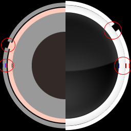
So on the edge of the hit circles there are little white texture mistakes ( http://postimg.org/image/7zfo1p473/ ). And maybe you could make the little circle in the middle of the spin a bit smaller, just my opinion.
Topic Starter
1st problem. That is an issue with osu. The element is completely red. Both HD and SD.TheNoobseeker wrote:
So on the edge of the hit circles there are little white texture mistakes ( http://postimg.org/image/7zfo1p473/ ). And maybe you could make the little circle in the middle of the spin a bit smaller, just my opinion.
Which circle? The whole thing? They are combined on top of each other.
I can do both or the pink one which is the outline.
The circle is no problem, I just thought that it should be smaller but its ok at the moment.
When does the update come out for Fluorescence
i gotta say im impressed by the amount off work you have put into this skin.. in my honest opinion this is one off the best skins made from scratch.. everything in the skin itself fits perfectly and it's an easy skin to play with overall. keep up the good work and keep the updates coming!
regarding the score numbers.
maybe you can replace them with colored dots or something similar? (I've seen a video of someone using a different skin which uses this method)
maybe you can replace them with colored dots or something similar? (I've seen a video of someone using a different skin which uses this method)
Topic Starter
Minor update is out.
I'll think about adding it to extras.techbot wrote:
regarding the score numbers.
maybe you can replace them with colored dots or something similar? (I've seen a video of someone using a different skin which uses this method)
I personally like the theory behind the skin ;3 and read it all Uruoki.
But it could be hidden by default into spoiler boxes, because the update spoiler boxes already take so much space D:
Its easy to get lost there, When i browse all of it.
Also could be better to add more clarity. So newcomers wont get lost.
Example of Main Page
But it could be hidden by default into spoiler boxes, because the update spoiler boxes already take so much space D:
Its easy to get lost there, When i browse all of it.
Also could be better to add more clarity. So newcomers wont get lost.
Example of Main Page
Topic Starter
I plan on rewriting the main post sometime. So when I do that, I will make things easier to read.
Syrus wrote:
Wow, this is very interesting, I never thought that a colour of a skin actually even mattered. Keep up the good work.
The reason I'm not doing that well with Standard right now is because a lot of things distract me, I have a small attention span. The bright colors in this skin help me focus and actually helped me improve slightly!
I love this skin so far, and I loved the other one too. Hope this turns out great! ^^
I love this skin so far, and I loved the other one too. Hope this turns out great! ^^
Wanna say that I started playing with Fluorescence a bit more and seeing a slight improvement on my reading.
The mod icon redesign made them clearly readable. Sadly you forgot to change selection-mod-suddendeath.png (SD and HD), and selection-mod-spunout.png (also SD and HD)
While playing I saw that the hitcircleoverlay has small white particles at the edges that aren't visible in GIMP when checking on black background.
If you allow it I made a small fix for the hitcircleoverlay and the forgotten mod icons that you can apply if you want to save some time eventually (simple recolour from the updated mod icons from Locus, you didn't forget them there).
Small Fix + Suggestion on Hitcircleoverlay
I also included a hitcircleoverlay that has a marginal thicker edge on the inner side. This was my suggestion regarding the slidertracks being visible by a small margin.
The mod icon redesign made them clearly readable. Sadly you forgot to change selection-mod-suddendeath.png (SD and HD), and selection-mod-spunout.png (also SD and HD)
While playing I saw that the hitcircleoverlay has small white particles at the edges that aren't visible in GIMP when checking on black background.
If you allow it I made a small fix for the hitcircleoverlay and the forgotten mod icons that you can apply if you want to save some time eventually (simple recolour from the updated mod icons from Locus, you didn't forget them there).
I also included a hitcircleoverlay that has a marginal thicker edge on the inner side. This was my suggestion regarding the slidertracks being visible by a small margin.
Topic Starter
Mod icons was skin, just forgot to upload. They are uploaded now.
Hitcircles (16x) still show the white on them.
Hitcircles (16x) still show the white on them.
On my end it didn't show any white particles, SD and HD.
http://puu.sh/++.zip (look at the new one)
Maybe better? Included the XCF-file (GIMP project) using a different method (layer masks).
Maybe better? Included the XCF-file (GIMP project) using a different method (layer masks).
[ Pingu ] wrote:
Wow, this is a skin that actually works for me, THANKS! <3
Topic Starter
I don't use GIMP and refuse to download it. I'll mess with it later. This week I am on call at work, so I don't want to get too involved into anything, then get called it.ReddScorn wrote:
Included the XCF-file (GIMP project).
Love it so far. Have been using the night version and it feels really soft on the eyes in a similar way that f.lux works. The spinner sound is dreadful though.
First skin I've ever used
First skin I've ever used
Just a suggestion for CTB.
I think it will be better to make bananas look different than other fruits because its hard to distinguish normal fruits from bananas.
The thing is when you play a map with circles or sliders that have really fast spinners going after/before them, you don't know what are normal fruits and what are bananas. That can mess up and break combo.
Beside that CTB catcher could be more "organic looking to please eyes" but i dont think this is necessary.
I will really like to make one, if they will be good i will sent you them so you can use them.
Don't bother with this thing, just suggestion.
- to hutbursts. They look very similar to default numbers when you hit 100s or 50s its hard to read normal numbers. I think the old ones was better because of their were more compart and were different
I think it will be better to make bananas look different than other fruits because its hard to distinguish normal fruits from bananas.
The thing is when you play a map with circles or sliders that have really fast spinners going after/before them, you don't know what are normal fruits and what are bananas. That can mess up and break combo.
Beside that CTB catcher could be more "organic looking to please eyes" but i dont think this is necessary.
I will really like to make one, if they will be good i will sent you them so you can use them.
Don't bother with this thing, just suggestion.
yeah the spinner spin sound is tearing so much the ears but you can replace it with one extra folder.MrLolrus wrote:
Love it so far. Have been using the night version and it feels really soft on the eyes in a similar way that f.lux works. The spinner sound is dreadful though.
First skin I've ever used
- to hutbursts. They look very similar to default numbers when you hit 100s or 50s its hard to read normal numbers. I think the old ones was better because of their were more compart and were different
Topic Starter
Spinner sound is getting changed.MrLolrus wrote:
Love it so far. Have been using the night version and it feels really soft on the eyes in a similar way that f.lux works. The spinner sound is dreadful though.
First skin I've ever used
Bananas is changed in the next update. If that doesn't work, let me know. I have another idea. As for the catcher, what is considered "organic"? Hitburts should be transparent. I think you meant hitscore though, I noticed that too and still working on it.Agrrox wrote:
Just a suggestion for CTB.
I think it will be better to make bananas look different than other fruits because its hard to distinguish normal fruits from bananas.
The thing is when you play a map with circles or sliders that have really fast spinners going after/before them, you don't know what are normal fruits and what are bananas. That can mess up and break combo.
Beside that CTB catcher could be more "organic looking to please eyes" but i dont think this is necessary.
I will really like to make one, if they will be good i will sent you them so you can use them.
Don't bother with this thing, just suggestion.
- to hutbursts. They look very similar to default numbers when you hit 100s or 50s its hard to read normal numbers. I think the old ones was better because of their were more compart and were different
- Hitbursts
Hitbursts should look different than default1-9.pngs It is really hard to read very fast anti-jumps/difficult patterns when you get few inaccurate hits.
They look almost the same as default numbers with difference they use serif and are italic.
And when they are kinda similar and reading is so heavy dependant on numbers, THIS IS REALLY BAD.
I liked more the old ones because they dont take much attention and not making noise when they appeared over the default pngs.
And most important i NEVER confuse them with numbers.
And because numbers don't use any kind of outlining or don't have shadow drop the new hitburst just blends with numbers LOL.
But i think outlining as Aestetic skin has should be a good experiment, maybe it will improve reading who knows..
And yeah hitburst have file name with hit0 hit50 hit100 hit100k hit300 hit300g hit300k prefix.
As you can read here: https://osu.ppy.sh/wiki/Skinning
- particlex.png trick
Also a trick you can try to do. If you put a transparent particle50.png particle100.png particle100k.png, Hitburst will appear under the circle instead of top of it. But certain players actually like to see hitburst above circle so better put that into Extra folder.
- Ctb
Also I have made experiment with Ctb. This skin is suppose to show more accurate hitbox of elements. I made test to show their real hitbox which is 1x1 pixel also the ryuuta has much smaller collision box than seen on original files. I did test with 2x2 fruits and adjusted the ryuuta catcher plate for perfect collision size. Not only that but also fruit plate is in same height as the fruits hits the end of hitbox.
skin: http://puu.sh/aDoP8.zip
- Ryuuta
And to organic ryuuta. Im still working on it. The actual pretty good, looks like something Gothic or Renaissance style. But kinda sharp IMO.
- Spinner
Also idk why but with this skin its hard to keep spining because there is no good visual indicator how fast you are spining. The inside circle is kinda too small.
When i spin i kinda more focus on sound.
Mania and Taiko seems to be in good state. I will figure it out by playing more.
Damn, I've been using Luminance for a while now but I skipped the PL update because you know, kawaii skins are better and stuff but damn, downloaded it a day ago and I feel rested. I mean, like I didn't realize how my eyes suffered from this game until you provided us with this skin.
So yeah, basically just wanted to pop up and thank you for this :q.
So yeah, basically just wanted to pop up and thank you for this :q.
Also I always felt that approach circles are going a bit over hitcircles no matter how i hit..
I mean this:
I can see the approach circle is kinda a bit getting over hitcircle. Default skin approach circle is touching hitcircle.
I heard you talking about how is the plankian locus hitcircle producing new hues into hitcircleoverlay when expanded.
I think its because the actual hitcircle is a bit overlaping with hitcircleoverlay.
NOTE: I intentionally placed hitcircle on top of hitcircle overlay.
Not sure if this is part of design thou.
Also thx for Fluorescence , A best skin when your eyes are well rested and aiming for good rank ^^.
Fluorescence Hitcircle element remakeUruoki wrote:
I don't use GIMP and refuse to download it. I'll mess with it later. This week I am on call at work, so I don't want to get too involved into anything, then get called it.
Got some fancy PSDs this time after comparing my GIMP exports and PS exports (PS much smoother edges). I also made sure that I don't see any particles on them in both resolutions. It maybe has to do with the compression when exporting it to png-format. I chose the lossless option.
I also remade the approachcircle to fit 256px and the hitcircle to have the set complete.
As a claim I don't force you to change them, they are just suggestions or extras depending on your view.
@Aggrox: If you check the dimensions of the approachcircle it gets more obvious. The normal size should be like the 256x256 where as the luminace one is 250x250. If you like you can check my remake and how it plays in comparison.
yeah 250x250 i didnt noticed
EDIT: Whats better 16x or 14x ? Its just Antialiasing ?
EDIT: Whats better 16x or 14x ? Its just Antialiasing ?
Topic Starter
16x.
Check the bold parts.Agrrox wrote:
- Hitbursts
Hitbursts should look different than default1-9.pngs It is really hard to read very fast anti-jumps/difficult patterns when you get few inaccurate hits.
They look almost the same as default numbers with difference they use serif and are italic.
And when they are kinda similar and reading is so heavy dependant on numbers, THIS IS REALLY BAD.
I liked more the old ones because they dont take much attention and not making noise when they appeared over the default pngs.
And most important i NEVER confuse them with numbers.
And because numbers don't use any kind of outlining or don't have shadow drop the new hitburst just blends with numbers LOL.
But i think outlining as Aestetic skin has should be a good experiment, maybe it will improve reading who knows..
And yeah hitburst have file name with hit0 hit50 hit100 hit100k hit300 hit300g hit300k prefix.
As you can read here: https://osu.ppy.sh/wiki/Skinning
Think you misread what I said. Anyway, I am going to rework on these.
- particlex.png trick
Also a trick you can try to do. If you put a transparent particle50.png particle100.png particle100k.png, Hitburst will appear under the circle instead of top of it. But certain players actually like to see hitburst above circle so better put that into Extra folder.
Will add later.
- Ctb
Also I have made experiment with Ctb. This skin is suppose to show more accurate hitbox of elements. I made test to show their real hitbox which is 1x1 pixel also the ryuuta has much smaller collision box than seen on original files. I did test with 2x2 fruits and adjusted the ryuuta catcher plate for perfect collision size. Not only that but also fruit plate is in same height as the fruits hits the end of hitbox.
skin: http://puu.sh/aDoP8.zip
Haven't check, but will check in a later time.
- Ryuuta
And to organic ryuuta. Im still working on it. The actual pretty good, looks like something Gothic or Renaissance style. But kinda sharp IMO.
So something more rounded?
- Spinner
Also idk why but with this skin its hard to keep spining because there is no good visual indicator how fast you are spining. The inside circle is kinda too small.
When i spin i kinda more focus on sound.
Working on redesigning. It is off a bit, but no one knows because I hidden it. Still working on a new sound, but it will come later.
Mania and Taiko seems to be in good state. I will figure it out by playing more.
Redesigning this actually.Agrrox wrote:
Also I always felt that approach circles are going a bit over hitcircles no matter how i hit..
I mean this:
-snip-
I can see the approach circle is kinda a bit getting over hitcircle. Default skin approach circle is touching hitcircle.
-snip-
I heard you talking about how is the plankian locus hitcircle producing new hues into hitcircleoverlay when expanded.
I think its because the actual hitcircle is a bit overlaping with hitcircleoverlay.
NOTE: I intentionally placed hitcircle on top of hitcircle overlay.
Not sure if this is part of design thou.
Also thx for Fluorescence , A best skin when your eyes are well rested and aiming for good rank ^^.
Will look into in a bit.ReddScorn wrote:
Fluorescence Hitcircle element remakeUruoki wrote:
I don't use GIMP and refuse to download it. I'll mess with it later. This week I am on call at work, so I don't want to get too involved into anything, then get called it.
Got some fancy PSDs this time after comparing my GIMP exports and PS exports (PS much smoother edges). I also made sure that I don't see any particles on them in both resolutions. It maybe has to do with the compression when exporting it to png-format. I chose the lossless option.
I also remade the approachcircle to fit 256px and the hitcircle to have the set complete.
As a claim I don't force you to change them, they are just suggestions or extras depending on your view.
@Aggrox: If you check the dimensions of the approachcircle it gets more obvious. The normal size should be like the 256x256 where as the luminace one is 250x250. If you like you can check my remake and how it plays in comparison.
After around 1 week of using the FL skin, I can offer some quality feedback
I really like the *tick* sound the hit circles make. Also, the pass/fail visual and sounds after breaks in a song are satisfying.
(I replaced the spinner sound with the default one as a temporary fix)
The lifebar gets harder to see as it empties, fading from bright red to black. I personally like this feature. It gives more immersion to it.
The mod icons aren't very noob-friendly since they don't have any visual indicator as to what the mod does. They also look confusing when stacked, such as in a multiplayer lobby.
The cursor when clicked looks like it has jaggies.
It's hard to tell the difference between a silver and gold S rating.
Some dark colored hit circles are hard to see on dark/black backgrounds. Specifically dark blue and purple.
There are no hit circle chains, which can be a downer for people using the hidden mod.
Something that'd be pretty neat is having osu! auto-switch between FL and PL depending on the time of day, like f.lux. It'd save the trouble of switching to PL during those night gaming sessions.
Keep up the great work Uruoki!
Topic Starter
Mod icons: I noticed that too and I am still trying to think of a good solution.
Cursor: I'll look into it.
Rating: I may redesign those anyway.
Dark Hitcircles: Not sure why. Can you post a screenshot?
Hitcircle chain: I am assuming you mean the followpoints. I am going to add those to the extra folder.
Cursor: I'll look into it.
Rating: I may redesign those anyway.
Dark Hitcircles: Not sure why. Can you post a screenshot?
Hitcircle chain: I am assuming you mean the followpoints. I am going to add those to the extra folder.
Followpoints might be the correct term, I'm still new to osu! terminology.Uruoki wrote:
Mod icons: I noticed that too and I am still trying to think of a good solution.
Cursor: I'll look into it.
Rating: I may redesign those anyway.
Dark Hitcircles: Not sure why. Can you post a screenshot?
Hitcircle chain: I am assuming you mean the followpoints. I am going to add those to the extra folder.
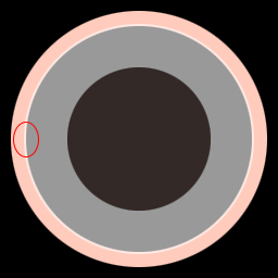
Dark Hitcircles can be found on certain maps with a dark color choice, such as on this map http://puu.sh/aKV7c/11eed4e8ab.png (song is Yousei Teikoku - Kuusou Mesorogiwi with background 100% dimmed)
MrLolrus wrote:
After around 1 week of using the FL skin, I can offer some quality feedback
I really like the *tick* sound the hit circles make. Also, the pass/fail visual and sounds after breaks in a song are satisfying.
(I replaced the spinner sound with the default one as a temporary fix)
*Default one seems to be the best, but im working to find some alternatives from my MASIVE skin collection, maybe Uruoki will use them
The lifebar gets harder to see as it empties, fading from bright red to black. I personally like this feature. It gives more immersion to it.
*Agree, but will be better to get at least that "peripheral feel" how much hp do you have before break starts.
The mod icons aren't very noob-friendly since they don't have any visual indicator as to what the mod does. They also look confusing when stacked, such as in a multiplayer lobby.
*Im working on vertical alignment icons so you will read mods from top to bottom.
like this:
D/H/F
T/D/L
Maybe Uruoki will like them, or he will make his own using this idea. Anyway I will use it for my own skin, if it will be ever released.
The cursor when clicked looks like it has jaggies.
It's hard to tell the difference between a silver and gold S rating.
*Agree, A new players may not notice there is difference
Some dark colored hit circles are hard to see on dark/black backgrounds. Specifically dark blue and purple.
*Best solution to achieve visibility is to use default Luminance skin's colors by either disabling globally "ignore beatmap skin" or you can do it by moving cursor at bottom of screen before song starts and tick "ignore beatmap skin". Unlike Plankian Locus, Fluorescence is using white approach circles so if color is too dark then its problem of beatmap colors, not skin.
There are no hit circle chains, which can be a downer for people using the hidden mod.
*Totally disagree, I know a lot of good HD players that dont use Followpoints. I think they are more important for FL mod. Ofc with longer animation.
I think that line/animated follow points are more for bad than good. They make some maps hard to read when you switch to different AR.
Also not sure if 5 frame followpoints that are included are accurate, i see a lot of people to switch to 9-frame followpoints lately.
Something that'd be pretty neat is having osu! auto-switch between FL and PL depending on the time of day, like f.lux. It'd save the trouble of switching to PL during those night gaming sessions.
* This is wrong thread to ask for skin auto-switching feature, you will have more success in Features Request here: 4
Also i don't see any trouble to just go to options and switch to different skin? It isn't that difficult.
Also make sure you are having breaks during "endless" night session, a little break to switch to different skin may help
Keep up the great work Uruoki!]
Topic Starter
Do you have "Ignore all beatmap skins" enable in settings? If not, enable that and see if that works.MrLolrus wrote:
Followpoints might be the correct term, I'm still new to osu! terminology.Uruoki wrote:
Mod icons: I noticed that too and I am still trying to think of a good solution.
Cursor: I'll look into it.
Rating: I may redesign those anyway.
Dark Hitcircles: Not sure why. Can you post a screenshot?
Hitcircle chain: I am assuming you mean the followpoints. I am going to add those to the extra folder.
Dark Hitcircles can be found on certain maps with a dark color choice, such as on this map http://puu.sh/aKV7c/11eed4e8ab.png (song is Yousei Teikoku - Kuusou Mesorogiwi with background 100% dimmed)
here are alternative spinner sounds i found useful
http://puu.sh/aO9Er.zip
http://puu.sh/aO9Er.zip