http://osu.ppy.sh/forum/p/1460621inverness wrote:
There's no rules and guidelines on the frontpage that stated we have to draw our own artwork here.
show more
k then

It would look weird shuffling cards backwards XD but I'll see what can be done to get a jack to be discernible.


I will vector the CTB and Taiko icons and see what I can do. The greys are probably a bit too light as well.
Yes I'll add colour once I decide on what doesn't look bad.
Also, the Taiko Jack is red, while others are black.

Edit: How about having them in order so that taiko is on top, behind is osu and ctb comes afterwards. Just so you can see all the Js on the top left side on all the three cards. The top left letter on the taiko card can't be seen for now.


I've been trying to do some art, but no matter how hard I try I still cannot draw, and I don't want it to look ugly, so I've decided to just stay off and stop trying to draw
ouchMillhioreF wrote:
http://osu.ppy.sh/forum/p/1460621inverness wrote:
There's no rules and guidelines on the frontpage that stated we have to draw our own artwork here.
k then
Ah lol, I'll give up thenMillhioreF wrote:
http://osu.ppy.sh/forum/p/1460621inverness wrote:
There's no rules and guidelines on the frontpage that stated we have to draw our own artwork here.
Topic Starter
Accepting Doodley's "Obsessed"
Accepting RBRat3's "Nonstop" (the pippi one, although the other is very usable too. i mostly chose the pippi one due to the anti-aliasing artifacts on the hard diagonals of the panel on the arrow one, for what it's worth. i know this could easily be fixed.)
Thinking Ballance's "Obsessed" works better for "dedication" from a conceptual perspective, and would like to use it still. Does anyone disagree with this move?
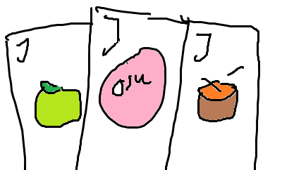
Really like RBRat3's "jack of all trades" except the cards have no jack showing, which makes it a bit weird. Are there enough pixels to show a "J" + suit on the top-most card or something?
Thanks for the awesome submissions guys. You are making this hard (to judge ).
).
Could the winning entries please send over the PSDs at earliest convenience.
Accepting RBRat3's "Nonstop" (the pippi one, although the other is very usable too. i mostly chose the pippi one due to the anti-aliasing artifacts on the hard diagonals of the panel on the arrow one, for what it's worth. i know this could easily be fixed.)
Thinking Ballance's "Obsessed" works better for "dedication" from a conceptual perspective, and would like to use it still. Does anyone disagree with this move?
Really like RBRat3's "jack of all trades" except the cards have no jack showing, which makes it a bit weird. Are there enough pixels to show a "J" + suit on the top-most card or something?
Thanks for the awesome submissions guys. You are making this hard (to judge
).Could the winning entries please send over the PSDs at earliest convenience.
I was really hoping for jamujamu to win.
Thanks, but I think mine looks quite bad scaled down. I feel peppy chose right. I will some of the other achievements though.theowest wrote:
I was really hoping for jamujamu to win.
Use what you like best, getting rid of the aliasing is no big deal before sending it offpeppy wrote:
Accepting Doodley's "Obsessed"
Accepting RBRat3's "Nonstop" (the pippi one, although the other is very usable too. i mostly chose the pippi one due to the anti-aliasing artifacts on the hard diagonals of the panel on the arrow one, for what it's worth. i know this could easily be fixed.)
Thinking Ballance's "Obsessed" works better for "dedication" from a conceptual perspective, and would like to use it still. Does anyone disagree with this move?
Really like RBRat3's "jack of all trades" except the cards have no jack showing, which makes it a bit weird. Are there enough pixels to show a "J" + suit on the top-most card or something?
Thanks for the awesome submissions guys. You are making this hard (to judge
Could the winning entries please send over the PSDs at earliest convenience.
It would look weird shuffling cards backwards XD but I'll see what can be done to get a jack to be discernible.
Topic Starter
I guess it's (the jack thing) kind of implied anyway, so not a big deal.
Me 2 :ctheowest wrote:
I was really hoping for jamujamu to win.
I think you should be able to see more than just the osu icon. More game modes.jamujamu wrote:
I threw a few cards together for the hell of it. If I can think of ideas for each number I might just finish the set.
A colourless proof of concept:
maybe just 3 cards with all game mode icons like theowest suggested?theowest wrote:
I think you should be able to see more than just the osu icon. More game modes.jamujamu wrote:
I threw a few cards together for the hell of it. If I can think of ideas for each number I might just finish the set.
A colourless proof of concept:
I felt the same way, but the size to detail ratio was bugging me. These are the other ideas I had.theowest wrote:
I think you should be able to see more than just the osu icon. More game modes.
I will vector the CTB and Taiko icons and see what I can do. The greys are probably a bit too light as well.
I will try it.bomber34 wrote:
maybe just 3 cards with all game mode icons like theowest suggested?
I don't see the point with 2 extra osu ones. Three or four would be enough (+ osu!mania?)
You are going to add more colour, right?
You are going to add more colour, right?
I was thinking of doing a full set of cards, and just the game modes wouldn't have covered that, but with the idea of the game modes in mind as the only cards it does render the idea of multiple in each useless, especially since they need to be smaller on the image.theowest wrote:
I don't see the point with 2 extra osu ones. Three or four would be enough (+ osu!mania?)
You are going to add more colour, right?
Yes I'll add colour once I decide on what doesn't look bad.
no doubt.
actually my achievement is "dedication" but i made a wrong type (hey!
actually my achievement is "dedication" but i made a wrong type (hey!
I can't find a place for much colour since these icons aren't very colourful to begin with, so it may not be the best choice in that respect. osu!mania currently has no icon (?) so I don't have anything to vector for that.

I'll have to come back to this since I'm out of time to work on it right now. I appreciate the advice.
I'll have to come back to this since I'm out of time to work on it right now. I appreciate the advice.
I like it colourless as it is now.jamujamu wrote:
I can't find a place for much colour since these icons aren't very colourful to begin with, so it may not be the best choice in that respect.
This is sweeeeeet! If only icons were coloured (like they are present in game) it'd be even more awesome.jamujamu wrote:
I can't find a place for much colour since these icons aren't very colourful to begin with, so it may not be the best choice in that respect. osu!mania currently has no icon (?) so I don't have anything to vector for that.
I'll have to come back to this since I'm out of time to work on it right now. I appreciate the advice.
Also, the Taiko Jack is red, while others are black.
How about you nudge the two cards on the side down a bit, so that they don't all blend together on the top.
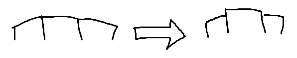
Like so.
I was thinking of having the original colours. Pink for osu, green or red apple and maybe an orange drum?
Like so.
I was thinking of having the original colours. Pink for osu, green or red apple and maybe an orange drum?
@jamujamu: I think the osu! logo can be left with red instead, along with either Jack of Heart or Jack of Diamond. You can leave the rest as black with Jack of Spade and Jack of Clubs.
Topic Starter
This is great.jamujamu wrote:
I can't find a place for much colour since these icons aren't very colourful to begin with, so it may not be the best choice in that respect. osu!mania currently has no icon (?) so I don't have anything to vector for that.
I'll have to come back to this since I'm out of time to work on it right now. I appreciate the advice.
I actually didn't realize they were coloured. I took them from the player cards and they all looked the same white to me. Hearts and Diamonds are generally red.Galkan wrote:
This is sweeeeeet! If only icons were coloured (like they are present in game) it'd be even more awesome.
Also, the Taiko Jack is red, while others are black.
theowest wrote:
How about you nudge the two cards on the side down a bit, so that they don't all blend together on the top.
I was thinking of having the original colours. Pink for osu, green or red apple and maybe an orange drum?
All suggestions into this one. I'm not sure about the saturation of these. Thoughts?Winshley wrote:
I think the osu! logo can be left with red instead, along with either Jack of Heart or Jack of Diamond. You can leave the rest as black with Jack of Spade and Jack of Clubs.
Thanks. You're great. (-;peppy wrote:
This is great.
That's it, it's perfect!
The colored one is perfect. Absolutely perfect.
EDIT: BUT, red might work a little nicer for Taiko than a brown. Green pink red.
EDIT: BUT, red might work a little nicer for Taiko than a brown. Green pink red.
I disagree. Red is too close in colour to pink. Taiko drums are orange/brown, right?Doodley wrote:
EDIT: BUT, red might work a little nicer for Taiko than a brown. Green pink red.
Edit: How about having them in order so that taiko is on top, behind is osu and ctb comes afterwards. Just so you can see all the Js on the top left side on all the three cards. The top left letter on the taiko card can't be seen for now.
Taiko having a brownish-orange colour looks fine. It's close enough to don-red without being too close to osu!'s pink and singling out CtB's green through contrast.
Here's a side by side comparison of the previous and the one with the new suggestions.

I thought the colour I had chosen was more orange than brown, but my eyes fooled me again.
I thought the colour I had chosen was more orange than brown, but my eyes fooled me again.
That looks great. The only thing I can think of doing is making the osu! text a tiny bit bigger so it matches the button (see the top left of your screen). It also helps define the center of the image better by emphasizing a centerpiece
too much art class critique stuff talking
It's perfect. Crazy how much input is going into this, but this is the beauty of constructive criticism. (also why we have the modding system)
Go with Mithost's input and it's perfect.
Go with Mithost's input and it's perfect.
I'm not sure what you mean by that. The osu! jack on top again? An addition that can be used to center the piece?Mithost wrote:
It also helps define the center of the image better by emphasizing a centerpiece
It's an achievement for everyone, after all. It shouldn't be decided on hastily and without additional input. Think of how far it's come since the first iteration! Think of how many times it's been perfect as well. (-;Doodley wrote:
It's perfect. Crazy how much input is going into this, but this is the beauty of constructive criticism. (also why we have the modding system)
Go with Mithost's input and it's perfect.
I don't mind if Taiko is on top (I actually perfer it) but the bigger osu! text makes it more prominent and makes a better centerpiece.
Topic Starter
This one: locked in!
Please PM me the psd when you can.
Please PM me the psd when you can
.On the note of using Ballance's artwork for Dedication, I'm cool with it if you are. There might be something out there that can better represent Dedication, but I can't think of anything good at the moment. Leave it to Ballance if you'd like, though. I'm just waiting on the next batch of names. 
@Doodley
i think that's enough,thx 4 your suggestion.
i'm also waiting for the next achevements
btw,i find i should use VPN to see @jamujamu's artwork ,perfect .
i love your "obsessed" and this kind of painting style.
really moe me away
i think that's enough,thx 4 your suggestion.
i'm also waiting for the next achevements
btw,i find i should use VPN to see @jamujamu's artwork ,perfect .
i love your "obsessed" and this kind of painting style.
really moe me away
plain:

blurred rays:

Taiko:

CTB
plain:

transparancy:

Seems I don't understand but oh well.. I tried something
blurred rays:
Taiko:
CTB
plain:
transparancy:
Seems I don't understand but oh well.. I tried something
Out of curiosity if I was allowed to, could I redo my past achievements and have them swapped if they're applicable? This isn't about error correcting its really about doing a totally different image.
smudgy
I can't view such images posted on the forums. So I have to quote your post and open up the link you used. Anyone else having this problem?
Working for me.
Edit: That Fruit Tower looks awesome. :3 But I think it will better if the plate will be seeable.
Edit: That Fruit Tower looks awesome. :3 But I think it will better if the plate will be seeable.
Works for me too (and normally I'm the one who has those issues, because I have a lot of weird settings and addons that interfere with websites).
I think that if we're going to have fourth level dedications for Taiko and CtB, they should have the same humour as the standard "injured hand". So something like a broken drum and Ryuuta buried under a mountain of fruit.
I think that if we're going to have fourth level dedications for Taiko and CtB, they should have the same humour as the standard "injured hand". So something like a broken drum and Ryuuta buried under a mountain of fruit.
Dedication isn't marked off in the top post, Unless it's actually still open?
I think it is since peppy didn't say "I'll take this one!" or something.
Same here, don't know why.theowest wrote:
I can't view such images posted on the forums. So I have to quote your post and open up the link you used. Anyone else having this problem?

I see all the achievements in the achievements section except for dedication... is it still getting worked on or...
1 month since last reply and dedication achievment still with no image u.u
here I think i am late >.>
I think i will take some time and try to make those 2 better <.<
Edit1
Edit2
here I think i am late >.>
I think i will take some time and try to make those 2 better <.<
Edit1
Edit2
I think you're a bit late too.
I'd like to take this time and let you guys know that there's this "General Achievement Request Thread" in feature requests in case you want to suggest ideas for achievements.
I'd like to take this time and let you guys know that there's this "General Achievement Request Thread" in feature requests in case you want to suggest ideas for achievements.
Thanks, I've been looking for a thread like that.theowest wrote:
I think you're a bit late too.
I'd like to take this time and let you guys know that there's this "General Achievement Request Thread" in feature requests in case you want to suggest ideas for achievements.
I've been trying to do some art, but no matter how hard I try I still cannot draw, and I don't want it to look ugly, so I've decided to just stay off and stop trying to draw
Is this thread still in the news? Just to know if it can be unsticked.
unless peppy still looks for the "Dedication" achievement graphic probaly not