forum

- 39 - feat. 初音ミク | All Modes | SD / HD | 16:9 / 16:10 / 21:9

posted
Total Posts
53
Topic Starter
XetThe


The Miku skin from the Miku lover himself.

Of course I would make a Miku skin one day.
I also made a Preview Video for once, probably a bit weird but just an idea I had.


Introducing Modules!

After a couple months thinking about the idea for alternate versions of the skin, I finally decided to create Modules for the skin! (the name is a reference to Project Diva)

The first Module available is the Non-Weeb Module, but more will be added in the future!

You can answer the Google Form below to decide which Modules I'll release next!

Google Form Link

List of Available Modules

Non-weeb

I also made a little tutorial on how to install them:


39 has a DAW-looking aesthetic, similar to that of software like FL Studio, along with other analog components, such as MIDI ports, Knobs, Dials and 7-Segment Displays.
I consider this skin to be special (guess why) and I'm very proud of it, so I hope you enjoy playing with it as much as i enjoyed making it!


Click Here
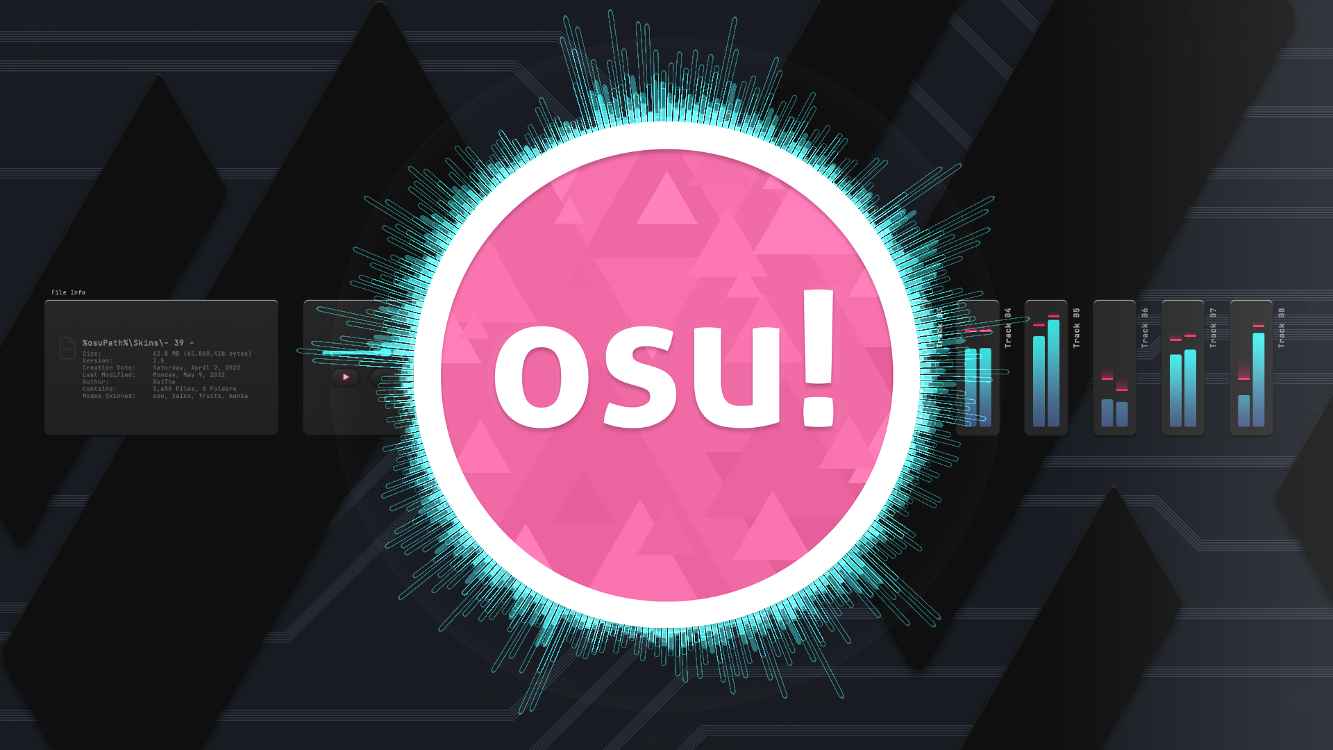
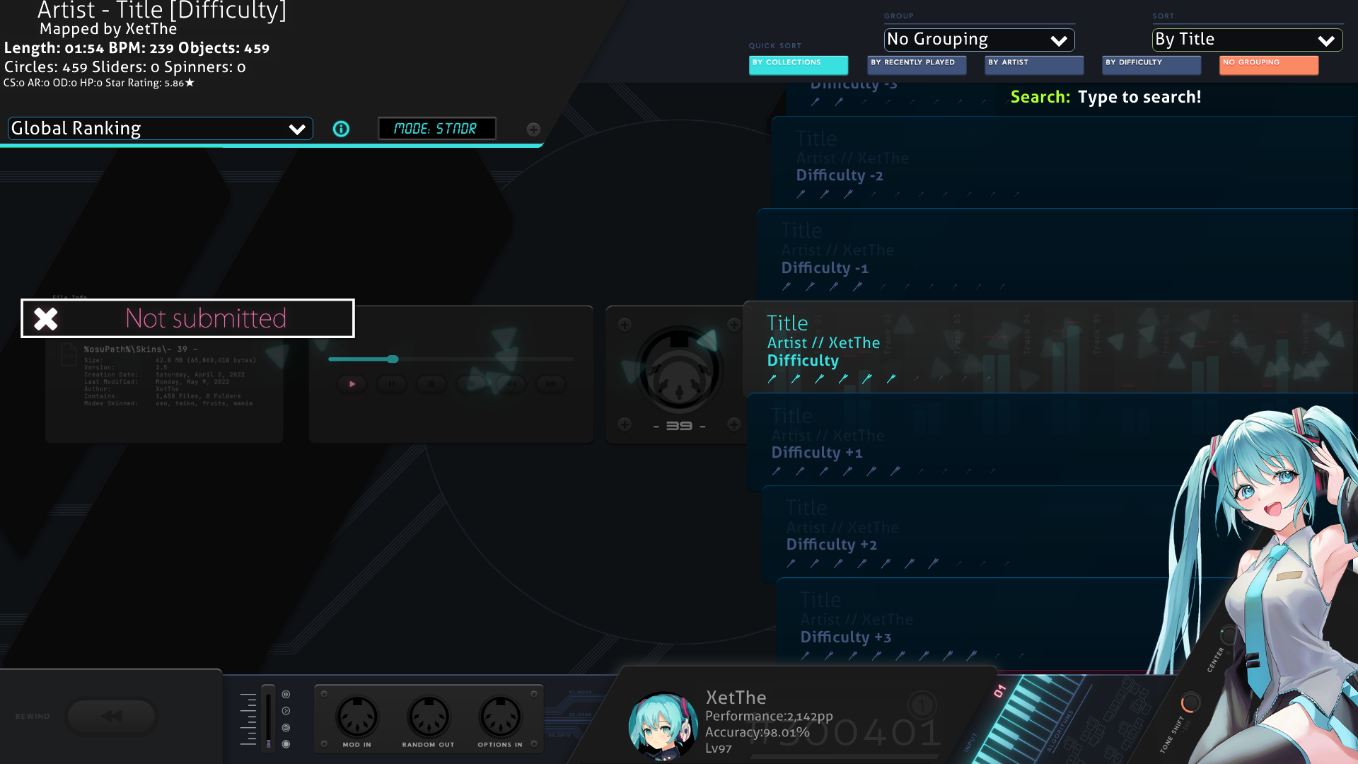
Main Menu


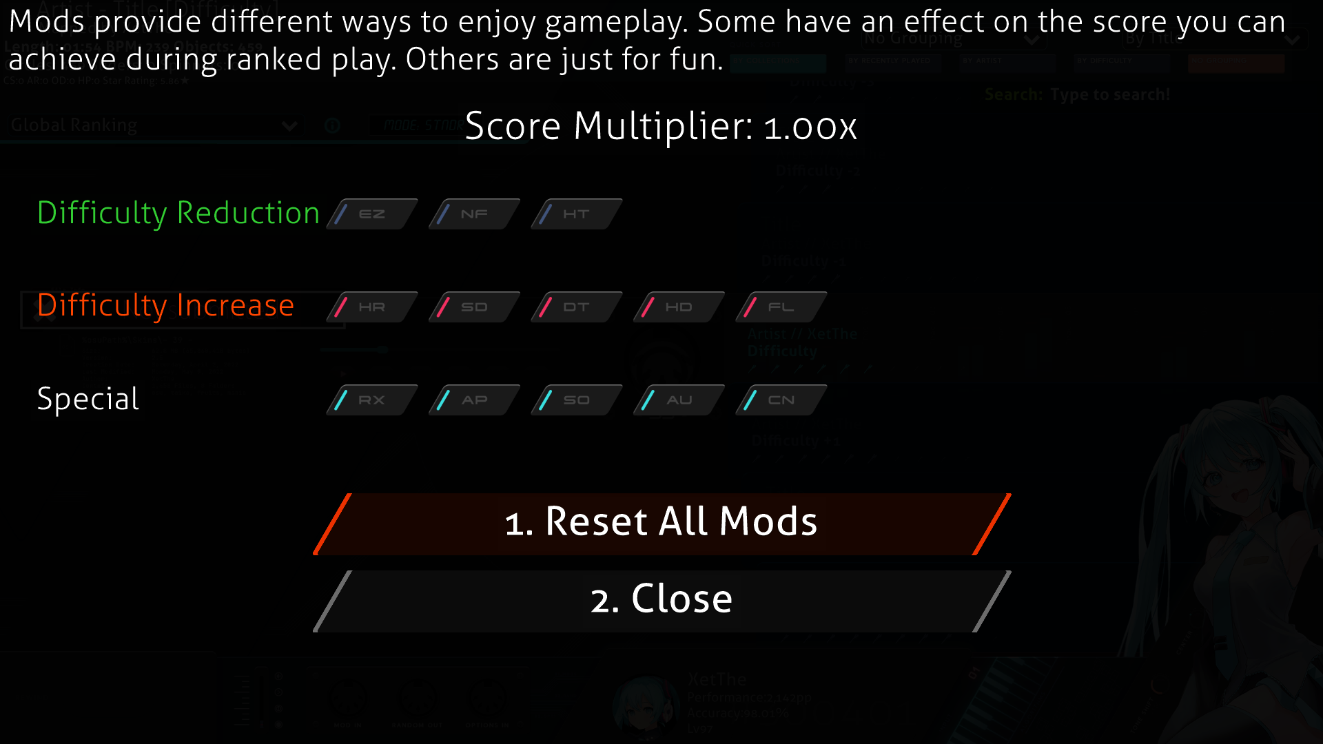
Song Select


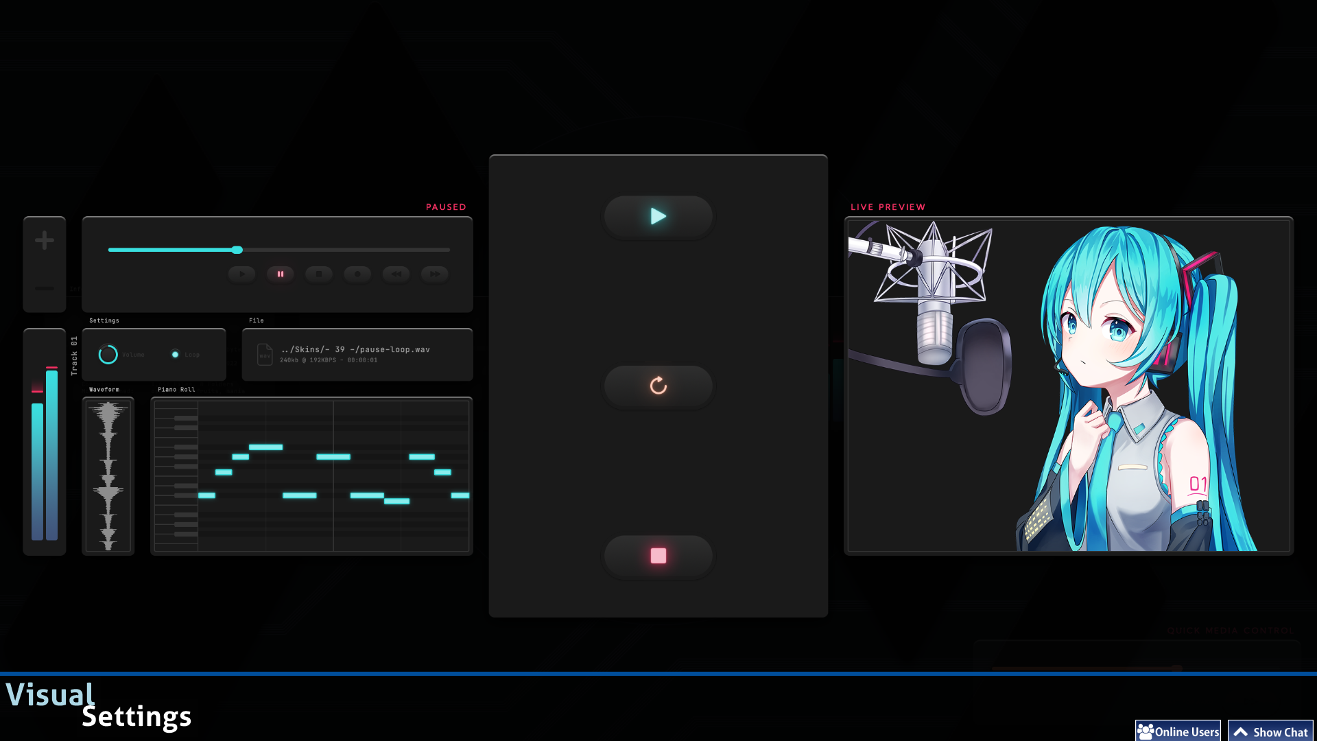
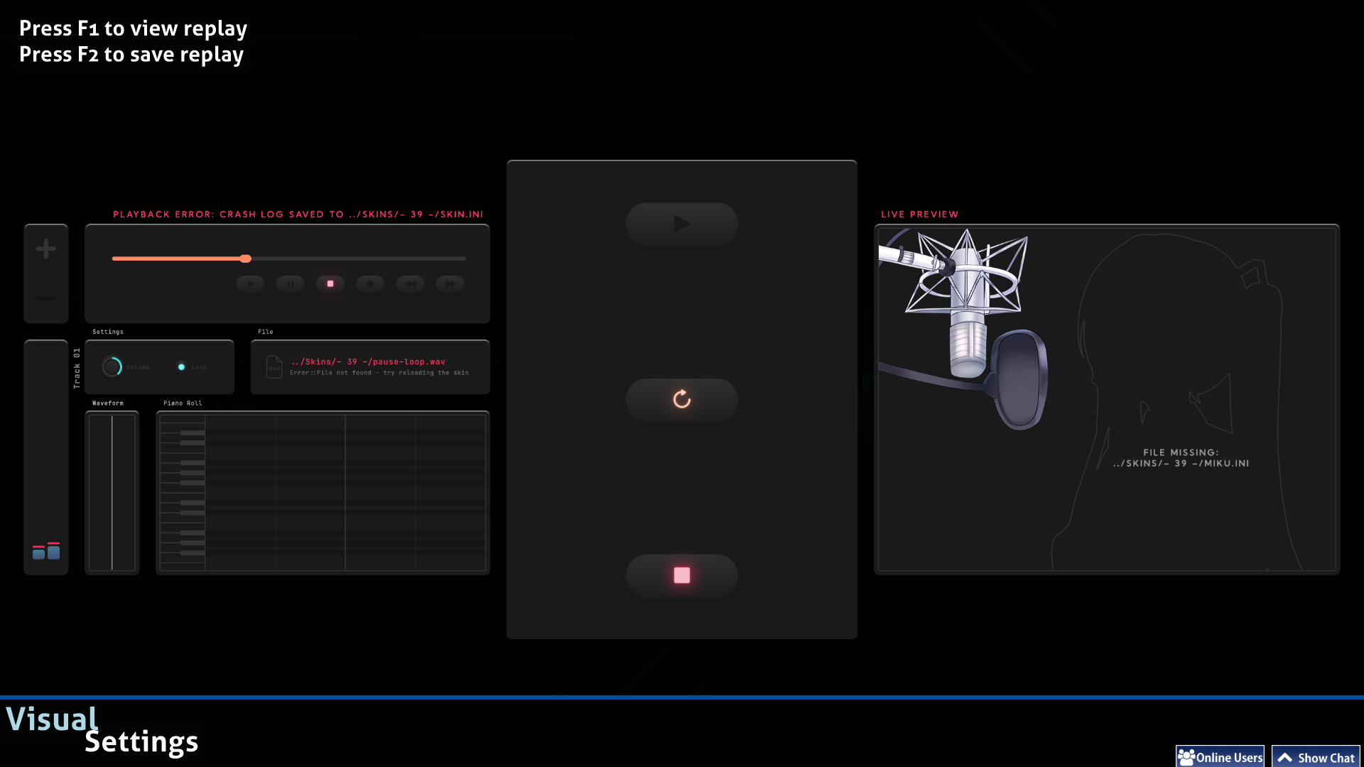
Pause / Fail


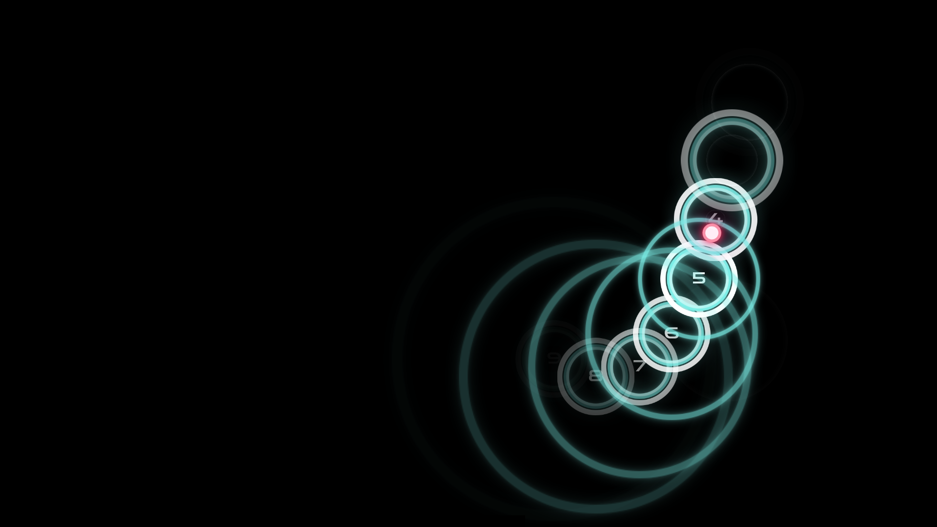
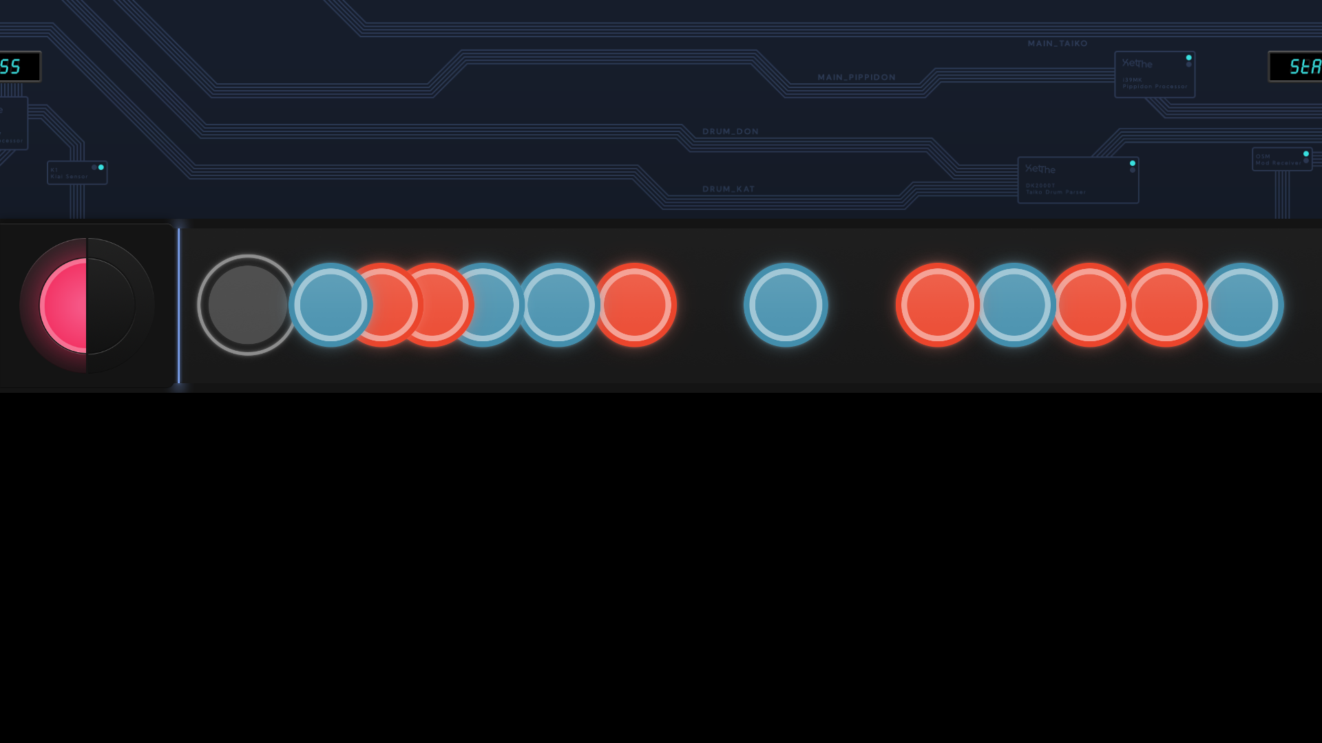
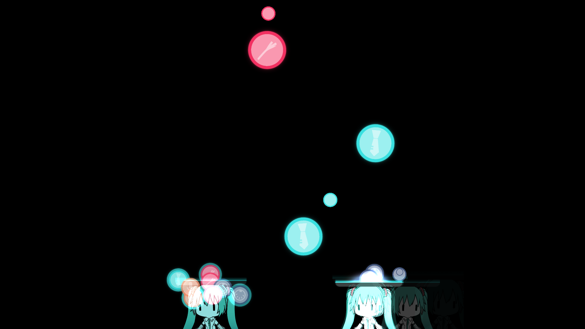
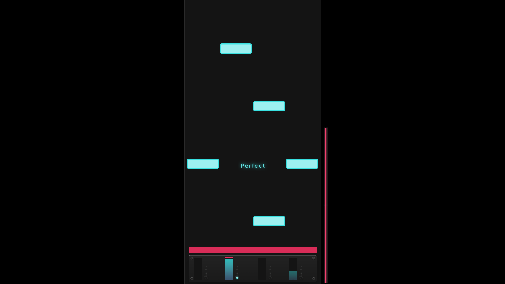
Gameplay


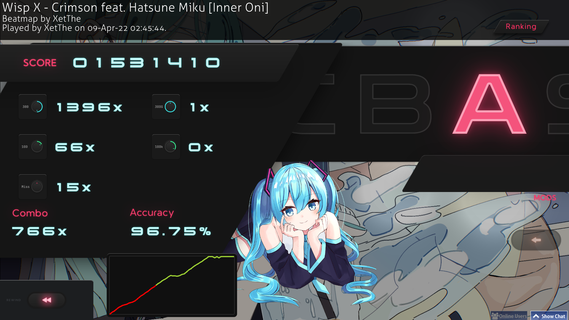
Ranking Panel


Download Here

Filesize (.osk): 53.71mb | Filesize (ingame): 74.3mb
Skin Version: 2.5
Animations: Back Button, Follow Point, Hit Bursts, Skip Button
Extras Folder Contains:
  1. 16:9, 16:10 and 21:9 Aspect Ratios as Modules
  2. Skewed & Normal Button Style
  3. Alternative Menu Background

Important Notice about using my Sounds

The sounds on this skin, as well as the sounds on my other skins were made by me, If you would like to use them on your skin, please ask for permission, and if you plan on releasing the skin, please give proper credit on your skins' post.

Frutey
BatuhanYtho
sheeesh
JN2002
I absolutely will be playing with this. I love it so much!
- Marco -
NICE
Arioto
Finally, a skin to surpass the fumo skin, it looks so cool, my favorite skin now :-DDDDDDD
QuestPlayz
Omfg, this is so good
I love it
And awesome preview video
Good job
Aeshma
this is soooo goood holy shit
5teven
Its here!!! Finally lets goooooo!
LolForest
nice skin, one of the best skins i've tried in recent memory :D
Topic Starter
XetThe

Thanks to everyone for the nice comments!


Update
  1. Fixed ScoreV2 Mod Icon having the "CN" Abbreviation
  2. Fixed 6K mania using the default Note in the last column (thanks Jianshyy)
Ssandi NImo
NICE!NICE!NICE!
extra_yeet
quick question, does this have mania skinning?
Topic Starter
XetThe

extra_yeet wrote:

quick question, does this have mania skinning?
Yes, it's got all modes :)
db2k
This is so clean...


(kinda wanting the PSDs for the menus now..)
wz_unknown
I love it !!!
rematyar
Just a suggestion, but please add gameplay screenshots somewhere
Topic Starter
XetThe

Thanks to everyone again for the comments!


Poll!
So I was wondering about making additional variants of the skin, and I want to hear everyone's opinion on that, so I made a Google Form anyone can answer to see if I'll make alternate variants of the skin in the future, personally I think it's a cool idea but I would like other opinions as well!

Google Form Link (you can also find this link in the main post)
Qvest
Absolute Banger
XTJT
I love this!
Punnet
pog
LightningIsPro
Question, How do I download it? I'm kinda new to osu mania? Btw epic design


I found it, It was just the litterly **Download** button!
Satenshi
Love the skin it's amazing
SelfishPunisher
I f*cking hate Mediafire, i was downloading this skin and then a pop up tab came up for me to download and i assumed it was the skin so i did, ZIP file on my PC, windows doesn't really like the file on the drives, check it out and its a f*ckin trojan horse type virus, holy sh*t people are not friendly

P.S good skin


sinscerely, a boy who can't spell
Topic Starter
XetThe

Thanks everyone again for the positive comments!


Introducing Modules!
After a couple months thinking about the idea for alternate versions of the skin, I finally decided to create Modules for the skin, More details in the main post!
justAnormalGuys
so cool skin, thats it lol
SaaiZ
Does the non-weeb version support 21:9? Also this skin is amazing!
Topic Starter
XetThe

SaaiZ wrote:

Does the non-weeb version support 21:9? Also this skin is amazing!
It does now (:
SaaiZ

XetThe wrote:

SaaiZ wrote:

Does the non-weeb version support 21:9? Also this skin is amazing!
It does now (:
<3
Gholin
Finally, a miku skin!!
Proximitynow
I use 21:9 (2560x1080) but there is a very small slice on the right that is not filled completely


overall, the skin is really well-made

* issue was solved
Topic Starter
XetThe

Proximitynow wrote:

I use 21:9 (2560x1080) but there is a very small slice on the right that is not filled completely

overall, the skin is really well-made
Oh, never noticed that when testing the 21:9 version, I'll make sure to fix it as soon as possible

Update: I figured what's causing this issue, apparently osu's definition of 21:9 is based on the 21:9 used in 1440p monitors (3440x1440 is technically 43:18), which is slightly longer, i'm working on fixing this issue, shouldn't take long
Iceotaku V2
Look nice skin
Vermeil-Chan
good
Stomiks
Tried it out and it's really fun to play. Goob job at the skin.
Vermeil-Chan
ohhhhhhhhhhhhh
Beast
Looks really good, will be using this!
Topic Starter
XetThe

Thanks everyone for the comments!, also, here's an Update!


  1. New Menu Background! The new menu background also shows you what Module you're currently using.
  2. Fixed some inconsistencies in the Non-Weeb module
  3. ???
mikatsu
You really outdid yourself with this one the module is incredibly well thought of the biggest problem in skin customizations
LordDex235
I love this skin!!, it is very beautiful
ayuurei
Really well-made skin! Unique ideas + The Modules are pretty smart as well, i noticed something while using the 16:10 weeb & default versions though

for the non-weeb version, mode-taiko/mania/fruits-small is a bit too far to the right excluding the display that says the mode
Screenshot Here
for the default version, the same problem occurs but this time the display that says the mode is too far left while the background is fine
Screenshot Here

mode-osu-small is fine for both, only the other modes have this problem


Still, This is still one of my favourite skins of all time.

Edit: Both were fixed! Looks great now :D
Bruh91
I like these skin..
Bars247
I fkin love it!
also make texture for key overlay pls
PrinzEugen00
Yooo, its rare to see miku fan in age like this :D
God Luminous
nice skin
Topic Starter
XetThe

Thanks to everyone for the continued support!


Update!

Bug Fixes:
  1. Fixed ranking panel having 16:10 aspect ratio by default, If the ranking panel looks too short, please redownload the skin for the fix.
NullPointerErr
Amazing skin! I made the keys in mania different colors so it's a tiny bit easier to read for me. I'm happy to see it included in Extras if you think it's useful. I modified just skins.ini and added the new key imgs

Link here

Topic Starter
XetThe

NullPointerErr wrote:

Amazing skin! I made the keys in mania different colors so it's a tiny bit easier to read for me. I'm happy to see it included in Extras if you think it's useful. I modified just skins.ini and added the new key imgs

Link here

[image]
Hi, thanks for the suggestion, I made a variant that adds more colors to the other keymodes so they're easier to read.
You can install this module over the skin and use the script to apply it
-Poka-
Nice skin! The only thing I have problem with is how the "100" numbers didnt appear while having only "great" notes, but overall the skin is looking good!

Edit: I'm also really proud how you actually use Miku's voice for pass there. most of many Miku osu skins I used, they just pick up some random anime girl's voice that is not even sounded close to her and thats it. you put an actual love to the skin and I like it as well.
Maro5714

XetThe wrote:

NullPointerErr wrote:

Amazing skin! I made the keys in mania different colors so it's a tiny bit easier to read for me. I'm happy to see it included in Extras if you think it's useful. I modified just skins.ini and added the new key imgs

Link here

[image]
Hi, thanks for the suggestion, I made a variant that adds more colors to the other keymodes so they're easier to read.
You can install this module over the skin and use the script to apply it
I tried this module, and in key mode with a different colour, it uses the default elements.
Is there any easy fix to this?

Also I'm pretty sure that "\- 39 -\Extras\Menu Background\Miku\menu-background.jpg" is corrupted, it won't open properly.

Thanks in advance
show more
Please sign in to reply.

New reply