forum

Windosu XP - [STD | 16:9 | HD/SD]

posted
Total Posts
40
Topic Starter
Miorine


Windosu XP (pronounced Wind-ose) is the latest development in computer operating systems by Miosoft Inc!

This skin aims to be as faithful as possible to a famous operating system from the early 2000s. If you've been around long enough to have fond memories of the original, congrats, we're both getting old...

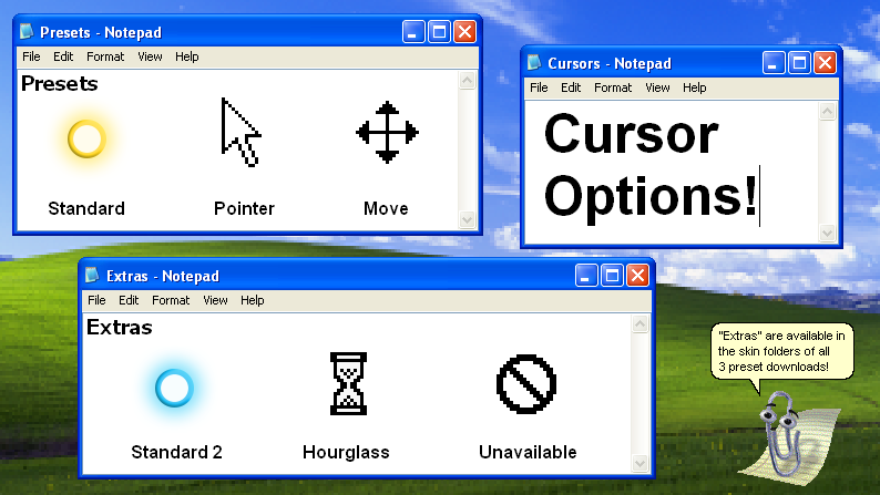
3 different cursor presets are available for download, and the "Standard" option should be your go-to if you're here for the best gameplay. For other options, refer to the cursor options image below!

A 16:9 resolution setting is required to use this skin. For best results, use 100% background dim, enable "Always Show Key Overlay," and use the pie progress display.

Hitsounds used with permission from cyperdark


Screenshots
Download


Playing on Lazer?
Stable will give you the best experience for this skin.

It is not recommended to use this skin on Lazer. Lazer currently lacks advanced skinning support, and this skin makes use of skinning mechanics that are not fully supported in Lazer and likely to break.

That being said, due to the increased popularity of the Lazer client, I've made an attempt to somewhat support this skin, with the limited tools currently available. This solution is far from perfect, and only gameplay is able to be skinned at this time, but if you're a Lazer user who is feeling adventurous, give it a shot!

Due to the current limitations, these prerequisites are required:
  1. You must be using 1.0x UI scale
  2. Your game must be set to a 16:9 aspect ratio, without any custom letterboxing or playfield edits
This won't be a perfect experience and things will break, but this skin will be properly updated for Lazer as the client receives updates to the skinning system/tools.

"Are you going to add other gamemodes?"
I would love to, but unfortunately the nature of this skin's gimmick makes it challenging to adapt to multiple gamemodes. This skin uses a lot of unintended "hacks" to work, and such tricks don't translate well when the other gamemodes expect "normal" usage of skin elements (for instance, part of the Taiko playfield gets cut-off, the window overlay appears sideways in Mania, and the combo number appears broken in Catch).

There are a couple potential solutions I've been experimenting with, but all make sacrifices to the quality of certain things in each gamemode, which I am not happy with. So between a quality experience that only supports standard, and a hacked-together compromise that supports more modes, I'd prefer the prior.

I could release separate versions of the skin for each separate gamemode, and that may happen eventually, but it's a bit clunky for my liking. But time will tell, and lazer skinning should (eventually) solve this conundrum anyways.

Changelog
Version 2.1
  1. Improved top bar on song select
  2. improved "standard" cursor that is more clear and better fits the theme
  3. Smaller tweaks to make element quality more consistent
  4. Changed hitsounds based on community feedback
Version 2.0
  1. Updated song select with the new songselect-top and songselect-bottom assets
  2. Improved gameplay elements
  3. Changed some elements to better fit the theme
  4. Improved pixel-accuracy and/or sharpness of certain elements
  5. Optimized filesize
  6. Added a couple missing audio files
Version 1.0
  1. Initial release
Ariizu
⠀⠀⠀⣤⣴⣾⣿⣿⣿⣿⣿⣶⡄⠀⠀⠀⠀⠀⠀⠀⠀⠀⣠⡄
⠀⠀⢀⣿⣿⣿⣿⣿⣿⣿⣿⣿⠀⠀⢰⣦⣄⣀⣀⣠⣴⣾⣿⠃
⠀⠀⢸⣿⣿⣿⣿⣿⣿⣿⣿⡏⠀⠀⣼⣿⣿⣿⣿⣿⣿⣿⣿⠀
⠀⠀⣼⣿⡿⠿⠛⠻⠿⣿⣿⡇⠀⠀⣿⣿⣿⣿⣿⣿⣿⣿⡿⠀
⠀⠀⠉⠀⠀⠀⢀⠀⠀⠀⠈⠁⠀⢰⣿⣿⣿⣿⣿⣿⣿⣿⠇⠀
⠀⠀⣠⣴⣶⣿⣿⣿⣷⣶⣤⠀⠀⠀⠈⠉⠛⠛⠛⠉⠉⠀⠀⠀
⠀⢸⣿⣿⣿⣿⣿⣿⣿⣿⡇⠀⠀⣶⣦⣄⣀⣀⣀⣤⣤⣶⠀⠀
⠀⣾⣿⣿⣿⣿⣿⣿⣿⣿⡇⠀⢀⣿⣿⣿⣿⣿⣿⣿⣿⡟⠀⠀
⠀⣿⣿⣿⣿⣿⣿⣿⣿⣿⠁⠀⢸⣿⣿⣿⣿⣿⣿⣿⣿⡇⠀⠀
⢠⣿⡿⠿⠛⠉⠉⠉⠛⠿⠀⠀⢸⣿⣿⣿⣿⣿⣿⣿⣿⠁⠀⠀
⠘⠉⠀⠀⠀⠀⠀⠀⠀⠀⠀⠀⠻⢿⣿⣿⣿⣿⣿⠿⠛⠀⠀⠀
sametdze
INCREDIBLE SKIN!! I honestly loved how you made it look like you were playing osu! in 2007. very cool. brought back so much nostalgia! i would love to see more skins from you !!
Ivanok
THIS IS SO FIRETRUCKING NICE. I LOVE THIS.
Aireunaeus

Ivanok wrote:

THIS IS SO FIRETRUCKING NICE. I LOVE THIS.
SAME, THIS GIVES ME CHILDHOOD MEMORIES 🥹
nousah
this is the coolest skin ive ever seen
Topic Starter
Miorine
Windosu XP is now updated to use the new songselect-bottom and songselect-top elements, as well as some other gameplay improvements and optimizations! You can redownload and check the more detailed changelog in the original post at the top of this thread.

If you still prefer the old version of the skin, it can be downloaded here.

Enjoy!
MeuhMeuh62
BTW use linux
Barrelhead
WINDOSU 7 WHEN???1/!??!?!??!?!??!
Srxply
Nah windows in osu is crazy ngl
Chromatiz
Amazing Skin!!
Atla
Great skin!
RubbishNubbish
This is amazing
DR3AMLiKE
wow... just wow
Elias
This MIGHT honestly br my new skin. This is so good wtf
xSid
11/10 skin instant favourite holy
_SallyCarrera
ez win for this
TatianaOrtiz
OMGGGGGGGGGG ME ENCANTÓ
XxANDYxX
it's so good wft :O ta melo
Fruitlolliez
excellent work so creative
PitFighter
This is very cool looking and funny skin, but for me it's unplayble on hard maps, just not enough visual feedback and a lot of elements that attracts attention while playing map
s0upy
is it just me or I'm unable to download this...? the skin looks STUNNING and I really want to play using it :(
Topic Starter
Miorine

s0upy wrote:

is it just me or I'm unable to download this...? the skin looks STUNNING and I really want to play using it :(
You can download the skin here!
Aigis
brings back memories from the good old days
arielif
please add bonzi buddy as a combo burst it'd be hilarious
asroelis
i really like this skin, but it covers my leaderboard.
Alkupz
it's indeed a very nice skin, but the cursor is bigger than its hitbox, which makes it harder to do faster maps because you have to click on the very point of the cursor
maybe make it smaller?
Topic Starter
Miorine

asroelis wrote:

i really like this skin, but it covers my leaderboard.
I can potentially add a "visible scoreboard" variant of the desktop overlay in the future. It won't be perfect due to the skin's gimmick, but it should be more than serviceable.

Alkupz wrote:

it's indeed a very nice skin, but the cursor is bigger than its hitbox, which makes it harder to do faster maps because you have to click on the very point of the cursor
maybe make it smaller?
This is intentional on the "pointer" cursor variant, as the hitbox on a real computer pointer cursor is also in the top left. For a more standard cursor, I suggest the "standard or "move" versions of this skin, or choosing your own preferred cursor option from the "extras" folder included in this skin.
asroelis

Miorine wrote:

asroelis wrote:

i really like this skin, but it covers my leaderboard.
I can potentially add a "visible scoreboard" variant of the desktop overlay in the future. It won't be perfect due to the skin's gimmick, but it should be more than serviceable.
yea, just a bit is fine. i'm only concerned because some notes are cut off. by the way, i'm not sure if it's just me, but the gray box behind the user's profile is misaligned with the actual profile. again, it is a wonderful skin nonetheless and i enjoy using it, so great work. ^^
Topic Starter
Miorine

asroelis wrote:

Miorine wrote:

asroelis wrote:

i really like this skin, but it covers my leaderboard.
I can potentially add a "visible scoreboard" variant of the desktop overlay in the future. It won't be perfect due to the skin's gimmick, but it should be more than serviceable.
yea, just a bit is fine. i'm only concerned because some notes are cut off. by the way, i'm not sure if it's just me, but the gray box behind the user's profile is misaligned with the actual profile. again, it is a wonderful skin nonetheless and i enjoy using it, so great work. ^^
Make sure you're using a resolution with a 16:9 aspect ratio! Anything else will cause certain things to appear misaligned/broken, which sounds like what you're experiencing.

Support for more aspect ratios is another thing I potentially want to add in the future, but we'll see. 16:10 is at least relatively easy to support compared to things like 4:3 and 21/32:9, so I'd at least like to support that.
helinatri
wow
Frooxr
This one looks amazing. Good job.
TooNakko
this is so insane
juney3008
This skin is very impressive! Its really cool that you made an skin that makes Osu look like Windows XP, Good job on it!
Retrokid_347
The google drive page keeps saying cant download file. Can someone please help me?
cornsnck
this is peak
uno99uno
Such a special skin, full of memories.
maksix111
can anyone make this an osk file please?
Topic Starter
Miorine

maksix111 wrote:

can anyone make this an osk file please?
The osk can be found via the download link in the original post.
erchosi
so cool :D
Please sign in to reply.

New reply