I like the style but the osu logo looks out of place and tacked on. You could probably just remove the osu logo altogether, perhaps replace it with just the name osu! as text, or recreate it with a non-glossy circle that more resembles the other circles
forum
Post your osu! fan art!
posted
Total Posts
2,108
i was trying to retain the original design so i really didn't change the logo that much. but since this osu! STREAM is meant to be a concept for a NEW osu! game, i guess making it very different would make sense. 
so...
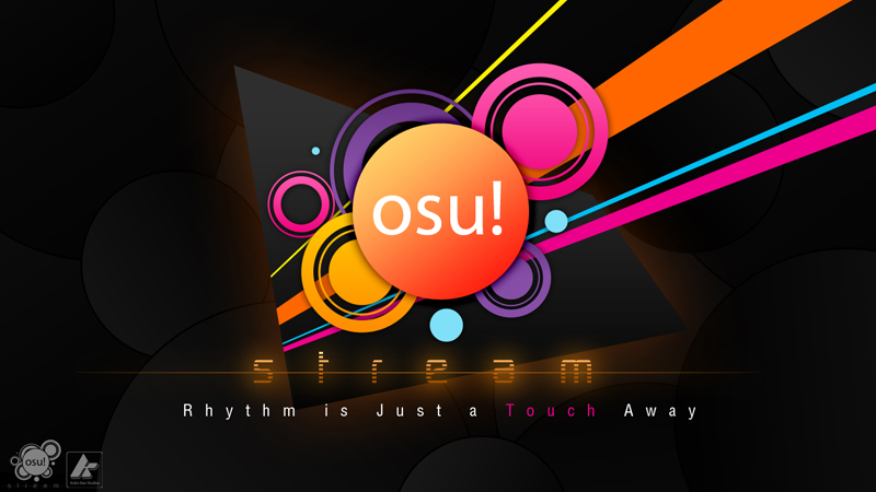
i always keep my works at reduced size for web viewing purposes, but if you want a high-res one:
http://up.ppy.sh/files/osustream.jpg < 1280 x 720 version
i removed most of the unnecessary things at the bottom and added a slogan. but i kept the logos since the "K" logo is my trademark.
@awp those "streams" are vector shapes/lines. and what do you mean by "looked too clean"?
so...
i always keep my works at reduced size for web viewing purposes, but if you want a high-res one:
http://up.ppy.sh/files/osustream.jpg < 1280 x 720 version
i removed most of the unnecessary things at the bottom and added a slogan. but i kept the logos since the "K" logo is my trademark.
@awp those "streams" are vector shapes/lines. and what do you mean by "looked too clean"?
I like that better
I did a "haha".Koko Ban wrote:
but if you want a high-res one:
http://up.ppy.sh/files/osustream.jpg < 1280 x 720 version
Looked too clean as in, feels out of place, feels like it isn't a part of what's behind it. Like it's not a part of the picture; it's a sticker stuck to a picture. Perhaps add some reflection of the background in the osu! logoKoko Ban wrote:
@awp those "streams" are vector shapes/lines. and what do you mean by "looked too clean"?
lol srsly, I was like, wait, that's the small res, where's the big now?strager wrote:
I did a "haha".Koko Ban wrote:
but if you want a high-res one:
http://up.ppy.sh/files/osustream.jpg < 1280 x 720 version
2048x1152 please~
Also, it's already way better but hmm
It's me being a perfectionist whore again but
-make the slogan slightly smaller and lower and the pink text italic maybe?
-both logos on bottom right instead
other than that, its amazing, just make a huge version and yea~
lol 1280 x 720 is already big for me. i really didn't know that it's still small for you guys. XD
Like I said, that barely covers 1/3 of my screen.
You seem to like peppy very much
I expected someone to say that.lesjuh wrote:
You seem to like peppy very much
All my other drawings of peppy aren't as accurate as the most recent one.
I tend to try again and again to make sure what I draw looks as close as possible to the original.
He looks 5 years younger in that drawing.
Most of my drawings either look aged, or too youthful.Ph0X wrote:
He looks 5 years younger in that drawing.
Like this one. Guess who.
It's TIPPY, right?
That was my reaction based on the facial expression/structure, though the hair is, well...Tippy doesn't have much hair, does he?Pokebis wrote:
It's TIPPY, right?
Oh my.
I tie my hair back now, not used to seeing myself with long hair again, lol
I tie my hair back now, not used to seeing myself with long hair again, lol
Tippy, really?awp wrote:
That was my reaction based on the facial expression/structure, though the hair is, well...Tippy doesn't have much hair, does he?Pokebis wrote:
It's TIPPY, right?
But well, it's actually Remmy, being my first take, it needs some touching up and tweaking here and there, chin too short etc. He looks a little too skinny.
That's why I thought it was TIPPY.OH-SHI- wrote:
He looks a little too skinny.
he also looks unpredictably dangerous, which is a bigger tip-off
Actually, I think he looks creepy. Whereas most people seem to think all my other drawings look creepy. And Tippy has a ponytail :/awp wrote:
he also looks unpredictably dangerous, which is a bigger tip-off
OH-SHI- wrote:
Actually, I think he looks creepy. Whereas most people seem to think all my other drawings look creepy. And Tippy has a ponytail :/awp wrote:
he also looks unpredictably dangerous, which is a bigger tip-off

Stop being creepy, Remmy
What is it supposed to be?
adam2046 wrote:
What is it supposed to be?
oh yeah
A wonderful piece by Larto. Don't Tippy and Pasonia look so glorious and full of life here?
I am impressed.OH-SHI- wrote:
Badass
I thought Office 2010 was already released doesn't it come with Windows 7Todesengal wrote:
TIPPY FOR OFFICE 2010
We're gonna retcon this shit.awp wrote:
I thought Office 2010 was already released doesn't it come with Windows 7Todesengal wrote:
TIPPY FOR OFFICE 2010
It was released last week, actually.awp wrote:
I thought Office 2010 was already released doesn't it come with Windows 7Todesengal wrote:
TIPPY FOR OFFICE 2010
Rena looks like Tippy's sister.
How cute~
How cute~
huh. Rena does look a little more feminine than he is.
trying to trick us
trying to trick us
This makes too much sense.strager wrote:
Rena looks like Tippy's sister.
How cute~
Where was the other angle that was posted on irc yesterday =<
http://up.ppy.sh/files/navyart202.jpg
found ya
http://up.ppy.sh/files/navyart202.jpg
found ya
Is that Rena or Tippy?awp wrote:
Where was the other angle that was posted on irc yesterday =<
http://up.ppy.sh/files/navyart202.jpg
found ya
navyart
but shhhh it's a secret
but shhhh it's a secret
Another random sketch.
I might color this one, too, once I sort out sketchy errors and whatnot.

I might color this one, too, once I sort out sketchy errors and whatnot.
That's awesome, by the way. Surprised nobody has commented here yet
You're awesome.OH-SHI- wrote:
Other version is here : http://up.ppy.sh/files/tippyart200-1.jpg
My fan art!

Is that a specific person?
Lol, its me. I'm a terrible drawer >< lol
you said in irc that you were making an awesome fanart though
Drawing an Iguana for 3 straight hours can be tiring, so I drew Pippi for a nice change.
Edit: TODE!


Edit: TODE!
They look pretty well, i'm just good enough to draw these things

Nice Pippi you got there.
(?)
(?)
:< So I whored up Pippi. But I'm sure we all still love her even though she's made some bad choices.

Also, before you even say it, I am already aware of the resemblance. And yes, I am ashamed.
Also, before you even say it, I am already aware of the resemblance. And yes, I am ashamed.
Lol I like the arm.Nekoroll wrote:
:< So I whored up Pippi. But I'm sure we all still love her even though she's made some bad choices.
[attachment=0:3dc9b]pippiwhorelawl.jpg[/attachment:3dc9b]
Also, before you even say it, I am already aware of the resemblance. And yes, I am ashamed.
Does it look too much like a penis?OH-SHI- wrote:
Lol I like the arm.
how does it look like a pe-Nekoroll wrote:
Does it look too much like a penis?OH-SHI- wrote:
Lol I like the arm.
ohhhhhhhhhhhhh...
The right-angled shoulderblade sticks out more than the colouring of the arm, imo
Lol, i was gonna go all crazy on it but once it looked terrible, i kept on going, lol! I'm no artist :pawp wrote:
you said in irc that you were making an awesome fanart though
I really like the--chains? dangling thing? I really like it, it's cute
Hey, I loli-fied Pippi.Nekoroll wrote:
:< So I whored up Pippi.

So, no big deal, really.
Isn't Pippi already a loli?Daru wrote:
Hey, I loli-fied Pippi.Nekoroll wrote:
:< So I whored up Pippi.
So, no big deal, really.
No, Pippi's a tramp.
Bump.

heh, peppy caricature sketch. Made me smile.
that is pretty great
At first I was like: oh, another peppy :V
Then I was like: d'awwwwww
Then I was like: d'awwwwww
Lena.

You drew Lena completely wrong.OH-SHI- wrote:
Lena.
WHO DARES CHALLENGE RICHTER BELMONT
Bagnogamer. Well I got lazy right after I sketched out the facial proportions, so it turned out like this.

Bagnogamer. Well I got lazy right after I sketched out the facial proportions, so it turned out like this.
I jumped when Bagno popped up.
Not enough hair.
strager wrote:
Not enough hair.
Not enough nose.
OH-SHI-, draw some penciled lineart for the VN and I'll ink them up. We gotta do stuff!
We gotta do stuff!bango
; ~; I figured I'd give it a shot..she's adorable (of course I exaggerated her greatly).
Her hair reminds me of Roses hair from FMA.

Her hair reminds me of Roses hair from FMA.
Nice job on the coloring. Did you do the lineart in Flash, btw?
I always try and do those subtle gradients on the shadows and skin, but I always forget to put them each in their own layer and end up putting shadows in the skin layer or something stupid like that.
I always try and do those subtle gradients on the shadows and skin, but I always forget to put them each in their own layer and end up putting shadows in the skin layer or something stupid like that.
wat.
something about her torso seems...off
but I love her face and the coloring
but I love her face and the coloring
Thanks people
Next time I'll draw her in my own style instead. I had a little trouble drawing her super anime desu.
Sketched in photoshop, transfered to Paint Tool Sai for the line-art, then back to photoshop for coloring.
Next time I'll draw her in my own style instead. I had a little trouble drawing her super anime desu.
Nekoroll wrote:
Nice job on the coloring. Did you do the lineart in Flash, btw?
I always try and do those subtle gradients on the shadows and skin, but I always forget to put them each in their own layer and end up putting shadows in the skin layer or something stupid like that.
Sketched in photoshop, transfered to Paint Tool Sai for the line-art, then back to photoshop for coloring.
I think it's the way that her belly button (and the line above) doesn't twist with the way her body is rotated and makes it look as if her body from shirt down is from a different body than her chest and shoulders.Todesengal wrote:
something about her torso seems...off
Also, that should totally be your avatar, SpiffyFox. Your current one is ...
I won't say.
I won't say.
; ~;strager wrote:
Also, that should totally be your avatar, SpiffyFox. Your current one is ...
I won't say.
Well her body is highly exaggerated in places. It's just a style really. Not trying to be to anatomical.Todesengal wrote:
something about her torso seems...off
but I love her face and the coloring
Plus, I'm not use to drawing super kawaii desu shiz D': So it came out kinda weird.
Next time it'll be better, I think.
But yeah. If anyone wants to look at my other art you can see it here http://foxdye.blogspot.com/
Your blog is amazing, and so is your artwork. It's on my Tabs now. Keep being awesome.SpiffyFox wrote:
; ~;strager wrote:
Also, that should totally be your avatar, SpiffyFox. Your current one is ...
I won't say.Well her body is highly exaggerated in places. It's just a style really. Not trying to be to anatomical.Todesengal wrote:
something about her torso seems...off
but I love her face and the coloring
Plus, I'm not use to drawing super kawaii desu shiz D': So it came out kinda weird.
Next time it'll be better, I think.
But yeah. If anyone wants to look at my other art you can see it here http://foxdye.blogspot.com/
oh wow yeah I really like your art
draw pippi in your style pwease~~
draw pippi in your style pwease~~
viewtopic.php?p=431772#p431772Todesengal wrote:
oh wow yeah I really like your art
draw pippi in your style pwease~~
SpiffyFox wrote:
Thanks people
Next time I'll draw her in my own style instead. I had a little trouble drawing her super anime desu.Nekoroll wrote:
Nice job on the coloring. Did you do the lineart in Flash, btw?
I always try and do those subtle gradients on the shadows and skin, but I always forget to put them each in their own layer and end up putting shadows in the skin layer or something stupid like that.
Sketched in photoshop, transfered to Paint Tool Sai for the line-art, then back to photoshop for coloring.
I was tired. =[
oh wow that is Pippi at her trampiest. The fullness of the lips gives her a mature, sexual look which caught me off guard tbqh. Maybe I'm too used to the sweeter, innocent side. Quite a good drawing though; and I really like the colouring. The darkness of the left glove feels unrealistic though, even given the location of the light source.
Oh god when I read that all I could think was "makin' me THIRSTY!"strager wrote:
Your current one is ...
Seinfeld ref
awp wrote:
oh wow that is Pippi at her trampiest. The fullness of the lips gives her a mature, sexual look which caught me off guard tbqh. Maybe I'm too used to the sweeter, innocent side. Quite a good drawing though; and I really like the colouring. The darkness of the left glove feels unrealistic though, even given the location of the light source.Oh god when I read that all I could think was "makin' me THIRSTY!"strager wrote:
Your current one is ...
Seinfeld ref
I admit I rushed the pic D': which inevitably ruined the quality.
Next time I'll take my time, but it's still pretty good for an hour scribble.
::Edit::
Hey, I could have gone all out like I wanted to and give her HUGE tah-tahs, with little to nothing on (like I wanted). But I mellowed it down.
Lame~SpiffyFox wrote:
But I mellowed it down.
Also, it looks like her belt was going to be the osu!logo but you forgot to finish it?