As requested by
GalkanSince I always throw fullmods, there we go.
(God I hate TF2, lol)
Because of the current level of this map, I can only give you general advises (especially in the standard diffs), unfortunately. Sorry for this.
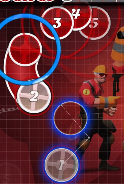
[Combat Mini-Sentry]
The spacing varies too much. on easiest diff, you should stay on a constant spacing level with only slight or maybe a few exceptions. But here, it varies from 0,83 to 1,21. This is inappropiate
Also the map looks very clustery too me. It overlaps way too much and the patterns are very inconsistent and unevenly shaped. You should work more on the details. I'll point up a few stuff but I won't be able to show you every single thing since this would possibly result in a remap.
No offense but it seems to me like you ran out of ideas over time. Sorry my friend.
Holy. Set OD on 3. How can you have OD6 on the easiest map? x__x
00:12:504 (2) - This slider is uneven. If you watch the sliderlines, you'll notice. Copypaste (1) for this to fix.
00:14:966 (1,2,3,4,1,2,3,4) - spacing issue (see beginning). Try resnapping with distance spacing x0.8.
00:22:351 (1,2,3,4) - this looks messy to me, especially because previous pattern is shaped so even. Just mirror 00:19:889 (1,2,3,4) -
00:29:736 (3) - this is also unevenly shaped. Try copypasting 00:27:274 (1) -
00:34:659 (3) - ^
00:38:352 (3,4) - spacing issue. (this mention will always refer to the beginning's text). Try resnapping with x0.8
00:39:582 (1,2,3,4) - shape the pattern like in 00:37:121 (1,2,3,4) -
00:42:044 (1) - this looks so clustery, everything overlaps like hell.
02:18:050 (3,4) - this kind of overlap is just ugly. Try to not make them overlap. Also this way of slidershape looks very odd to me.
Overall, the map needs a big overhaul with way more evenly shaped patterns and shapes. I'm sure if you redo every combo step by step and try to place and shape them more detailed, this diff can be way better.
[Teleporter level 2]
The clusterness issue remains here too. The patterns overlap too much and you should consider increasing the whole distance spacing to something else (like 1,2x)
Just stay constant with it.
Also keep in mind that you should map in a certain "track" you want to "lead the cursor along" (for the so-called 'flow'). This doesnt exist here.
AR 4, OD 4.
00:14:966 (1,2,3,4) - this is way too lined up and stacked together. Try to shape bows, zigzags or stars or some other geometric shapes with the patterns.
00:19:889 (1) - moving stuff like this more to the left would result in a higher flow because the bow of the slilder would give a good track for this movement.
00:59:276 (1,2,3) - & 01:01:738 (1,2,3) - this is considered as inconsistent spacing. I'd suggest that you redo the whole map with the spacing you used in 01:01:738 (1,2,3) -
01:11:584 (1,2) - if you shape (2) more around the right bow of (1) and make the bows of (1) more 'bowy', then this could look good.
01:48:510 (1,2,3,4,5,6,7) - these kind of patterns are almost not readable. especially at this kind of AR
02:04:511 (4) - this kind of bows are too sharp and non-symmetric that the whole slider looks messy. Reduce grid size and make the bows on those kind of sliders more even.
[Sentry level 3]
Same issue as in the previous diffs. The patterns and sliders are generally unevenly shaped and can be placed way more flowy. I'll bring up some examples, else I start pointing almost every hitobject up.
Also the spacing issue remains. You apparantly have no system behind your spacing and most stuff seems random to me.
00:07:581 (1,2) - flip (2) and place it more above the end of (1). This keeps the flow.
00:08:811 (3,4,5) - doing this in a bow shape would work pretty good:
00:12:196 (1) - why is this not in the centre of the spinner? It looks so displaced there.
00:15:889 (4,5,6,7,8) - this is way too inconsistent. Keep one distance spacing here. The closely put together objects look messy, anyways. I just noticed that the whole section is in this kind of cluster.
00:41:121 (7) - shaping this way more around (6) makes it look cooler.
02:00:818 (1,2,3) - line them up
[Distaikoneer]
00:09:735 (18,19,20,21,22) - this is overmapped. There is nothing in the song that reasons this pattern. Remove 00:09:811 (19,20,21) -.
00:17:427 (62,63,64,65,66,67,68,69,70,71,72) - this is inconsistent compared to 00:14:966 (47,48,49,50,51,52,53,54,55,56,57) -. I'd do the same instead of varying it.
00:19:889 (77,78,79,80,81,82,83,84,85,86,87,88,89,90,91,92,93) - this makes no sense. The first triplet is freely invented and don't fit. The doubles also are unreasonable:
Remove 00:20:274 (80) -
00:20:197 (79,81) - these are kats
00:20:812 (84) - kat here
00:21:120 (87,88,89,90,91) - do kdd k dk kd (with this weird 1/8 1/6 snapping x__x)
00:22:428 (96) - remove this one, because of overmapping.
00:29:197 (131) - ^
00:30:889 (140) - ^
00:33:813 (157) - ^
00:36:274 (172) - ^
00:41:736 - you forgot a kat here
00:44:660 (237) - this is a kat, apparantly.
00:45:275 (242) - ^
00:45:891 (247) - ^
00:46:660 - you forgot a kat here
00:47:352 (255) - overmapped.
00:49:813 (265) - overmapped.
01:32:447 - you forgot a don here
01:28:970 (514) - this sounds so offplaced. I don't even know where you placed this on.
01:30:201 (520) - ^
01:49:125 (11) - this is a kat.
01:51:125 (23) - this sounds so offplaced. I don't even know where you placed this on.
01:57:356 (56) - overmapped.
02:10:819 (134) - another weird offplacement.
The main problem here is, that you change the focus of the map way too often. It confused me a lot that you switched from the (I call it) "vocal" to the "piano" in the kiai. Some stuff felt very random and improvised.
Unfortunately I don't like this diff. Sorry that I can't help you more with it than pointing you up some general issues I saw. I would recheck the whole diff if you can find even more randomness on your own.
[klubek's Dispenser]
00:07:581 (1,2) - kill the overlap, it's not overlapping enough to look good and the slight one just look messy. Try this:
http://puu.sh/OyEC00:10:042 (1,2,3,4) - Nazi: perfect stack them! (no grid snap + distance snap 0,0x)
00:12:504 (1,2,3,4,5) - ^ Overall: Stack all the sliderstuff perfectly. Else it looks stupid. lol
00:29:120 (9,10) - increase spacing to 1,26x, too
00:31:428 (6,7) - another weird overlap that looks messy. Try this:
http://puu.sh/OyGL00:32:197 (1) - what is that? Bow them more beautiful, like this:
http://puu.sh/OyIZ248,256,32197,6,2,B|168:252|164:176,1,120.000004577637,2|0
240,176,32659,1,0
316,168,32813,2,2,B|308:100|232:96,1,120.000004577637,2|0
00:42:044 (1,2,3) - try this to make the pattern look better:
http://puu.sh/OyKy01:13:123 (7) - this is so unsymmetrical and messy. Try to place the slider points more symmetrical
01:32:509 (3) - this sliderpoints make me cry. Redo the slider. Maybe something wobby
01:35:586 (4) - ^ (god, lol)
01:39:586 (3) - the bow of this one looks imperfect. Make it symmetrical.
01:48:510 (1,2,3,4,5) - purely overmapped. This is unreasonable and doesnt even appear in the music.
01:49:894 (1,2,3,4,5,6) - ^
02:00:049 (1,2,3,4,5,6) - ^
02:07:434 (1,2,3,4,5,6,7,8,9,10,11) - ^
The best diff in this mapset. Yet, most patterns seem randomly shaped to me and need a lot of refinement.
-------
Overall, I didn't like the set very much. Most stuff just look so raw and random to me that I lost any ambitions to point everything up over time. Sorry, that I can't help you more. I hope you recognize the main issues I see in this map and can fix it somehow.
Good luck anyways, Galkan-dono~ )
)
 And kiai sections are already on proper places, there's no need in moving them!