Community Mentorship Program 2016 - Winter Cycle
Discussion 4: Flow & Aesthetics"Discussions" are Mentorship discord-internal events where Mentors host a public lesson and discussion about a certain topic. This guide is the result of said discussion.
________________________________________
Introduction
If you watch my videos, this discussion is going to be like a prequel to my next video, which will be on the same topic. Only here, it's a little more detailed, in fact I'll probably reference this discussion in that video.
Edit: Here is the video.
For this discussion you should ideally have some prior knowledge on flow and aesthetics on their own, though I'll go over it fairly briefly here aswell, plus there are enough resources out there too if for some reason you don't have that knowledge.
So most people who are getting into mapping at first may struggle with the concept of making a map play well and look nice at the same time. This is because these aspects of mapping on their own require you to place objects on the grid. And multitasking is hard for most people. I'm just going to talk about my personal observations of how mappers balance these two aspects in mapping.
Definitions
Chaos and disorder generally looks messy and most of the time is discouraged, although one should find some balance between order and disorder in visuals so as to not make a map look too mundane.
I will also mention emphasis very briefly:
- Flow is the physical part of a map, when considering flow you want to think about how the player will move their cursor and their hard to play a map. In a nutshell, sharp angles and circular flow feels comfortable.
- Aesthetics is the visual part of the map, and may possibly affect how the player will interpret your map during play. In a nutshell, symmetry and parallelism looks good.
Chaos and disorder generally looks messy and most of the time is discouraged, although one should find some balance between order and disorder in visuals so as to not make a map look too mundane.
I will also mention emphasis very briefly:
- Uncomfortable flow creates emphasis (if most of your flow is comfortable)
- Large spacing (jumps) creates emphasis on the spaced notes
- Sharp(er) angles, especially through sliders, can creates emphasis
- And finally, changing the theme or using unusual aesthetics can create some emphasis visually
Aesthetics
I keep saying everywhere that aesthetics is a visual response, because that's all it is. If something looks good, it doesn't necessarily change the flow, which is the physical aspect of the map. When patterns reach the player's eyes, you should understand that the player will respond to what they see, physically or mentally.
For example if they see circles spaced far apart on either ends of the screen, the player will be mentally preparing for the higher stress in gameplay and expect to hear stronger beats in the music to reflect such spacing. A closed pattern like a star will most likely follow circular flow, while a more open pattern like streams or zig-zag jumps will follow linear flow and will take the player across the playfield rather than staying in the same area. If something looks unusual compared to the rest of the song, like a weird slider, then one will expect the song to do something weird too.
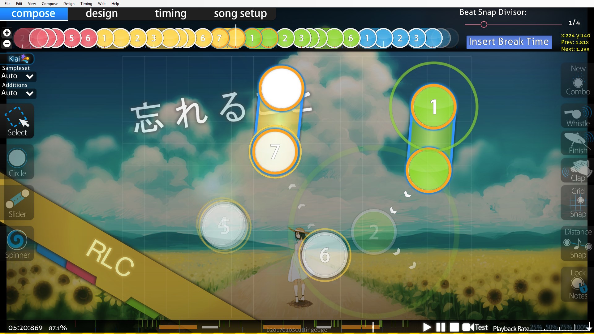
Example: USAO - Dynamite (Extended Mix) [pishi's Insane] 01:46:568 (1,2,3,4,5,1,2,3,1,2,3,1)
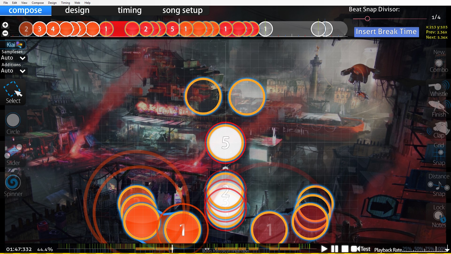
The theme of this map is that the player is confined to only half of the playfield at a time. However during certain parts the map breaks away from that theme like in Figure 1 where symmetrical patterns are used to emphasise the music changing and the ends of a section
Example: senya - Shissou Suru Kanashimi no Naka de [Catharsis] 00:50:071 (1,1,2)
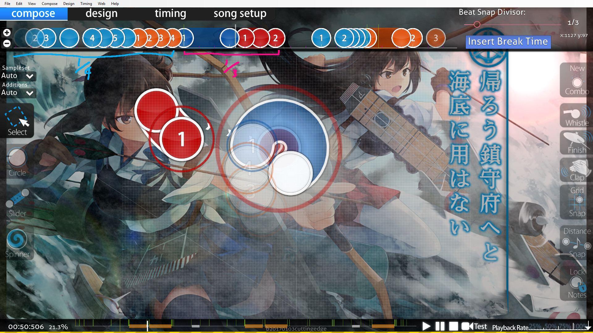
A more subtle approach I used in my own map where I used a circular slider and overlaps to highlight a part in the map where the rhythm goes to 1/3.
I keep saying everywhere that aesthetics is a visual response, because that's all it is. If something looks good, it doesn't necessarily change the flow, which is the physical aspect of the map. When patterns reach the player's eyes, you should understand that the player will respond to what they see, physically or mentally.
For example if they see circles spaced far apart on either ends of the screen, the player will be mentally preparing for the higher stress in gameplay and expect to hear stronger beats in the music to reflect such spacing. A closed pattern like a star will most likely follow circular flow, while a more open pattern like streams or zig-zag jumps will follow linear flow and will take the player across the playfield rather than staying in the same area. If something looks unusual compared to the rest of the song, like a weird slider, then one will expect the song to do something weird too.
Example: USAO - Dynamite (Extended Mix) [pishi's Insane] 01:46:568 (1,2,3,4,5,1,2,3,1,2,3,1)
The theme of this map is that the player is confined to only half of the playfield at a time. However during certain parts the map breaks away from that theme like in Figure 1 where symmetrical patterns are used to emphasise the music changing and the ends of a section
Example: senya - Shissou Suru Kanashimi no Naka de [Catharsis] 00:50:071 (1,1,2)
A more subtle approach I used in my own map where I used a circular slider and overlaps to highlight a part in the map where the rhythm goes to 1/3.
Flow vs Aesthetics
I'll talk about how one can balance flow and aesthetics depending on whether you prioritise flow or prioritise aesthetics. I'll talk about Flow>Aesthetics first since that's my personal ethos and the one I'm more comfortable with.
The way I go about this is by primarily thinking about flow when I place my notes, and then come back to adjust for aesthetics afterwards. I'll place notes so that strong notes are jumps, sliders start on the beginning of vocal beats or whatever. And most of the time, the aesthetical changes will just be minor polishes. When you think about note placement physically, i.e. as hand movements, things can be approximated. You can nudge a circle by a couple of units during a jump, and physically, it makes almost no difference. But aesthetically, this can make a difference.
Same thing with angles, rotating a slider by 2 or 3 degrees won't change the flow all that much, but it may improve the aesthetics significantly.
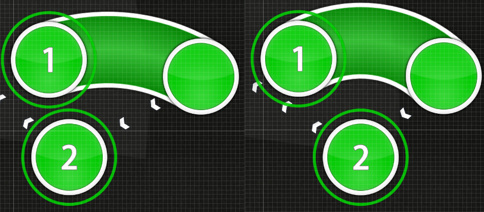
Example 1:
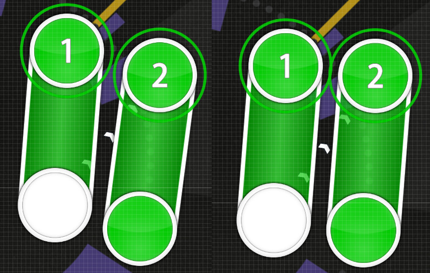
Moving your cursor through these two sliders is pretty much the same physically for both of these patterns, but the pattern on the right just looks neater; you could use the one on the left if you so wanted to and if it fitted with the theme of your map. The point still being that these small adjustments make a large different visually and less so physically.
________________________________________
Example 2:

Two examples of a typical curve slider + circle rhythm. The image on the right has these objects arranged to make a blanket, where the image on the left does not.
________________________________________
Example using a ranked map: HoneyWorks - Ima Suki ni Naru. ver.Capi [First Love] 01:13:809 (1,2)
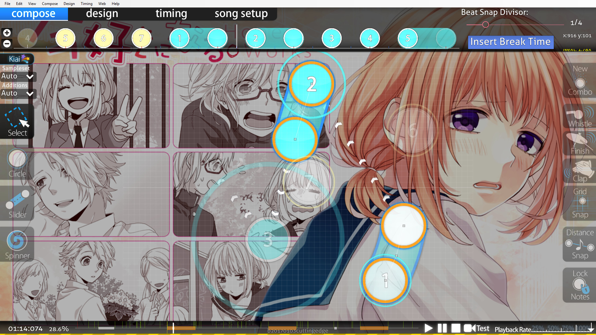
In my personal opinion, if the sliders 1 and 2 were couple so that they were both curves then it would improve the aesthetics of this pattern. Of course this is just a minor thing and there may be reasons for this pattern choice, but it's something that could be done if you wanted. I guess my example 2 isn't wasn't the most amazing example in the world, but if both sliders were like the one on the right then yes.
________________________________________
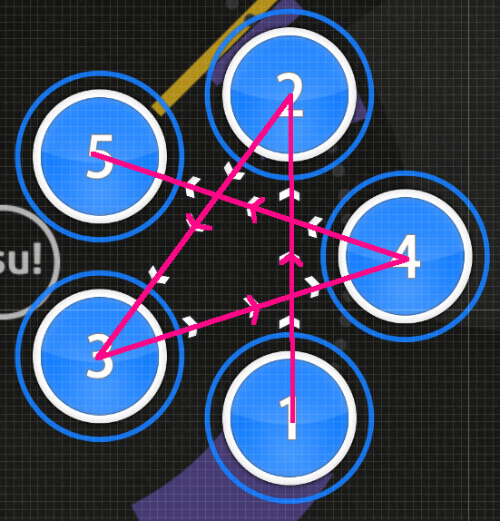
Example using a ranked map 2: Sakamoto Maaya - Okaerinasai (tomatomerde Remix) [Collab] 05:20:698 (7,1)
I will compare this figure with the pattern mentioned before, on Nara's map.
Both sliders are straight so that they are parallel, even though either of them could've been curved if RLC wanted them to be and it would still play pretty much the same. If you understand what patterns can look good, then someone who prioritises Flow>Aesthetics should be able to polish maps in this matter my recognising when these small adjustments can be made.
Aesthetics>Flow is not really my preferable way of mapping, but I still think understanding how one would go about this is something useful to know. So someone who prioritises aesthetics will make pretty patterns, and there are a few ways to do that depending on who you are. A staple being using regular polygon shapes.
But I think it is important to understand how the player would physically play these shapes before blindingly using as many triangles as possible. The main problem that can happen with polygon shapes (or shapes constructed from polygons) are a lack of emphasis from spacing, or wide angles causing uncomfortable flow (which is good or bad depending, uncomfortable flow != bad flow, etc.)
________________________________________
Example 3: typical star pattern using a regular pentagon.
Which you see pretty much almost anywhere in some form. It's comfortable to play, and it looks neat, but one should keep in mind that a pattern like this adds no emphasis to any particular note because they are all spaced equally.
________________________________________
Example 4: wide angled flow using a hexagon pattern.
This also looks neat, but the wide angles may possibly be too uncomfortable to play. Depending on what you want then this may or may not be desirable; though most of the time I would probably advise against doing that.
________________________________________
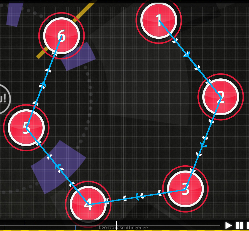
Example using a ranked map 3: Afilia Saga - S.M.L [Insane] 02:43:800 (3,4,5,6,1)
This is just a random example of what one could do to change up your typical star pattern.
You have your regular star for 3-4-5-6 which has fairly similar spacing. Then 1 sticks out where you would expect the star, so that visually this note stands out, and physically the spacing is larger, which is a good thing given that 1 is a downbeat, and is probably a stronger sound.
________________________________________
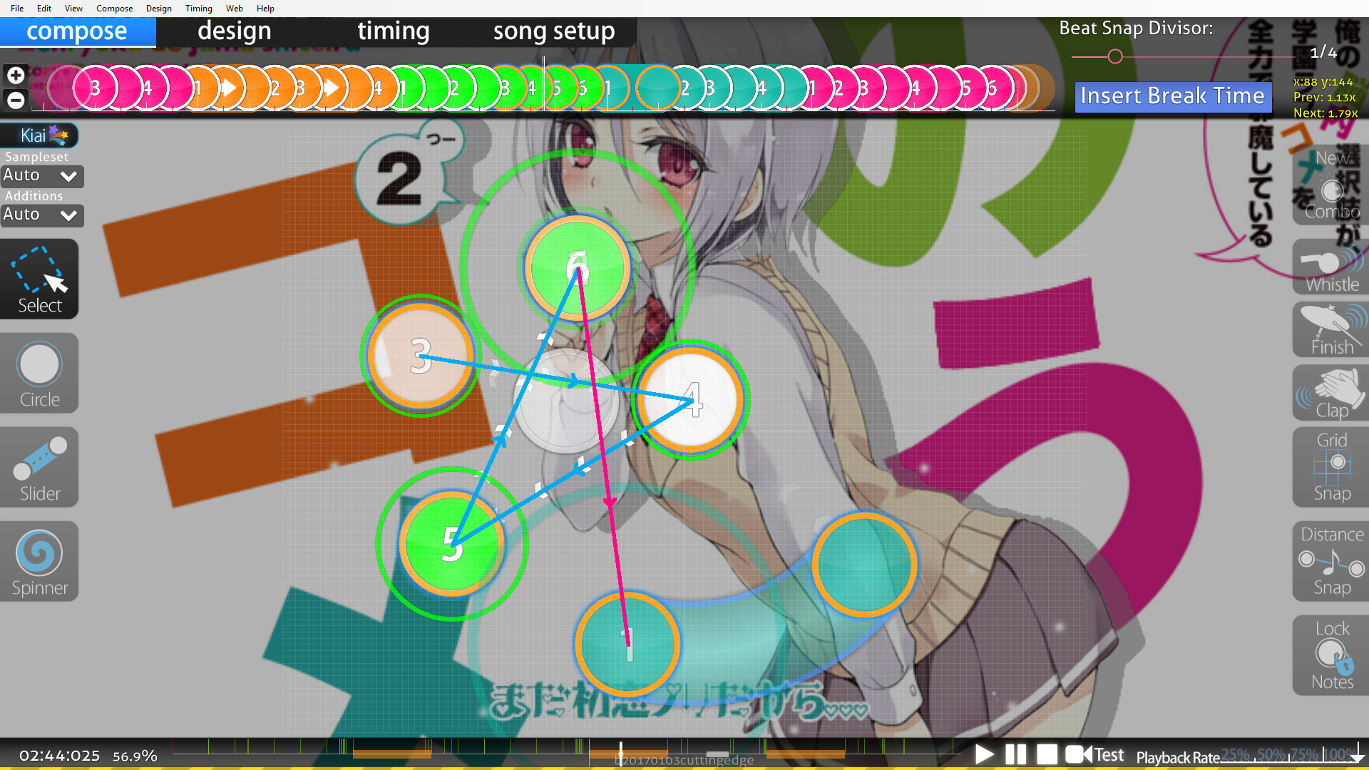
Example using a ranked map 4: Reol - MONSTER [FOREVER] 02:31:416 (1,2,3,4,1,2,3)
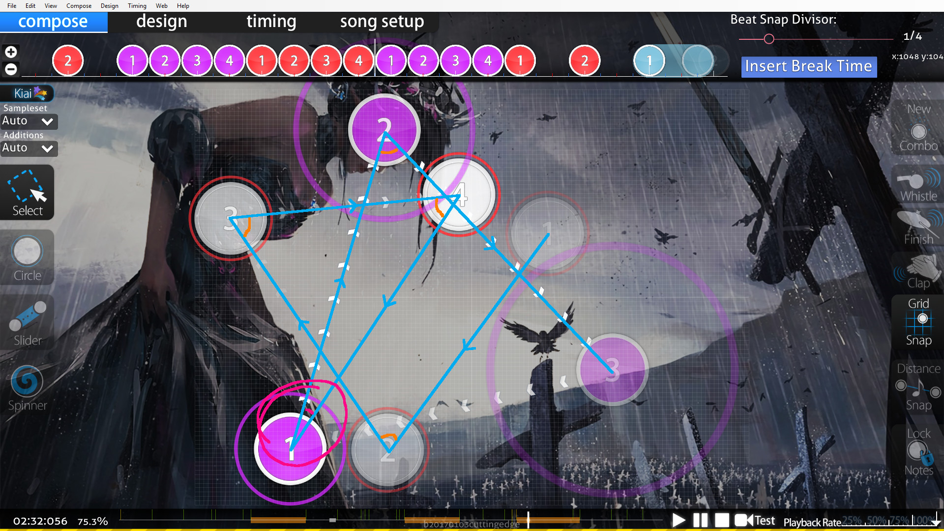
So this is an interesting example where all of the vocal beats in the chorus have similar strength. The pattern uses mostly triangles because, well they're triangles. They look neat and they play well. Spacing wise they are fairly far apart to highlight the stronger sounds (if you look at the whole map the spacing actually increases over time slightly but that's not the point). One interpretation that has been highlighted through this mapping is that the downbeats are slightly stronger than the other notes. Through the triangles, the angle for each just is around 60 degrees, but then the angle 4-1-2 is a much sharper angle than that to highlight this downbeat note.
________________________________________
Example using a ranked map 5: senya - Yureru Koi wa Nami no Gotoku [Catharsis] 02:26:531 (1,2,3,1,2,3,1,2,3)
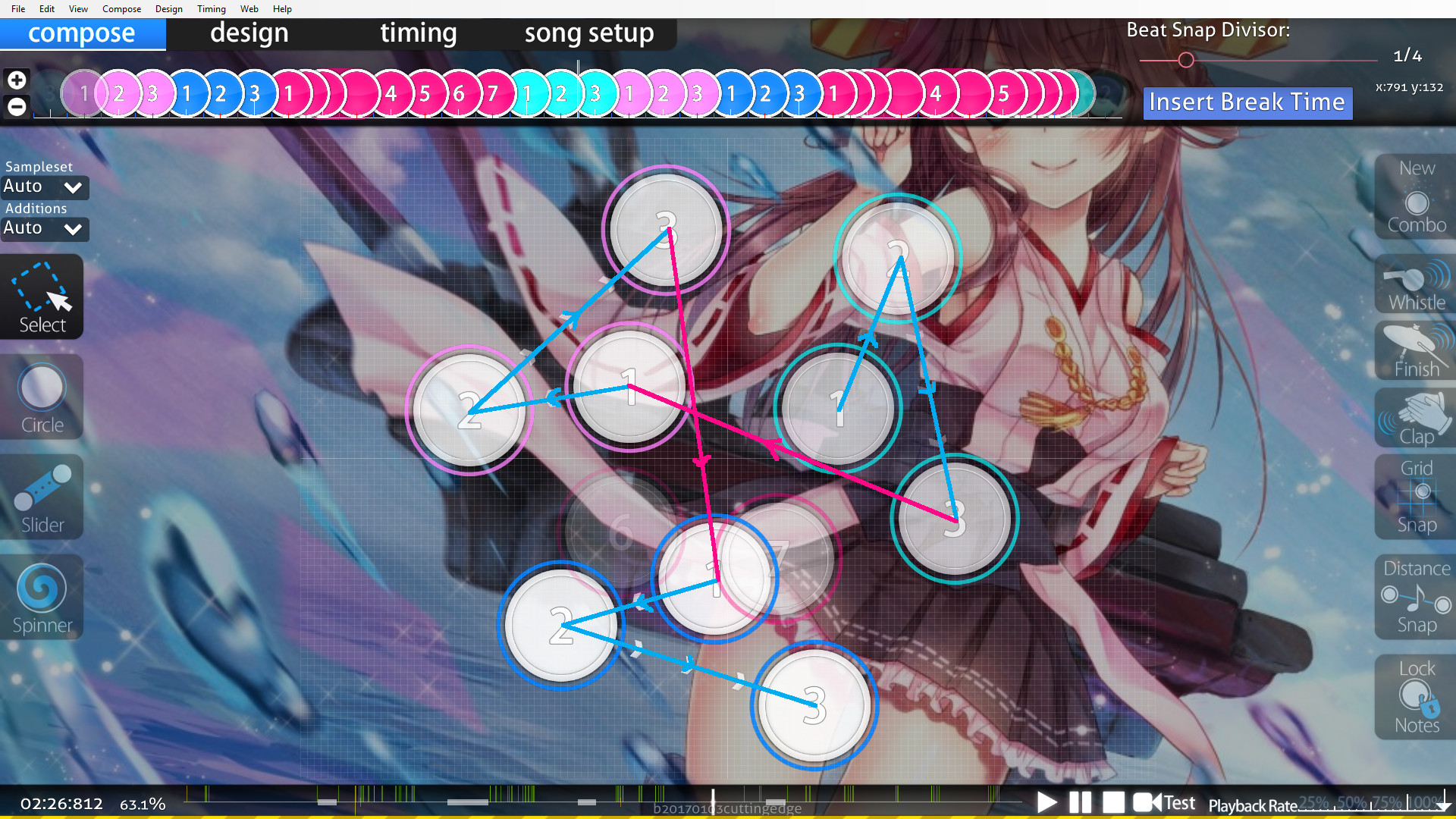
This pattern shows a good understanding of both flow and pleasing aesthetics in my opinion: symmetrical, ordered, pretty much like a hexagon. The notes are grouped in 3s to reflect the way the music is (probably makes more sense if you opened it in the editor rather than me attempt to explain this point). The spacing also reflects which notes are stronger and should be more emphasised.
________________________________________
Example using a ranked map 6 : Linkin Park - Guilty All The Same (feat. Rakim) 00:37:440 (5,6,7,8)
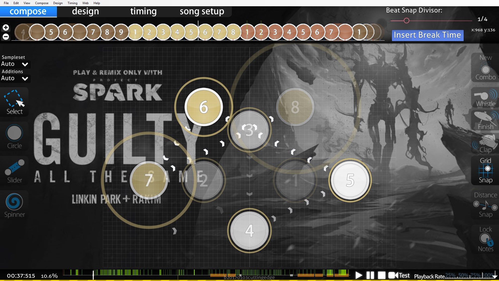
This is a pretty interesting map, it uses a lot of symmetrical patterns. Unfortunately, I feel this symmetry has sacrificed the quality of the map in terms of flow and emphasis. In the example timestamp in the picture, the beats on the latter half of that combo are actually relatively quiet. But the pattern here has large spacing betwee 5-6 and 7-8, which in my opinion adds unecessary emphasis.
There are a few examples of wide uncomfortable angles being created due to symmetry too in this map.
I'll talk about how one can balance flow and aesthetics depending on whether you prioritise flow or prioritise aesthetics. I'll talk about Flow>Aesthetics first since that's my personal ethos and the one I'm more comfortable with.
The way I go about this is by primarily thinking about flow when I place my notes, and then come back to adjust for aesthetics afterwards. I'll place notes so that strong notes are jumps, sliders start on the beginning of vocal beats or whatever. And most of the time, the aesthetical changes will just be minor polishes. When you think about note placement physically, i.e. as hand movements, things can be approximated. You can nudge a circle by a couple of units during a jump, and physically, it makes almost no difference. But aesthetically, this can make a difference.
Same thing with angles, rotating a slider by 2 or 3 degrees won't change the flow all that much, but it may improve the aesthetics significantly.
Example 1:
Moving your cursor through these two sliders is pretty much the same physically for both of these patterns, but the pattern on the right just looks neater; you could use the one on the left if you so wanted to and if it fitted with the theme of your map. The point still being that these small adjustments make a large different visually and less so physically.
Example 2:
Two examples of a typical curve slider + circle rhythm. The image on the right has these objects arranged to make a blanket, where the image on the left does not.
Example using a ranked map: HoneyWorks - Ima Suki ni Naru. ver.Capi [First Love] 01:13:809 (1,2)
In my personal opinion, if the sliders 1 and 2 were couple so that they were both curves then it would improve the aesthetics of this pattern. Of course this is just a minor thing and there may be reasons for this pattern choice, but it's something that could be done if you wanted. I guess my example 2 isn't wasn't the most amazing example in the world, but if both sliders were like the one on the right then yes.
Example using a ranked map 2: Sakamoto Maaya - Okaerinasai (tomatomerde Remix) [Collab] 05:20:698 (7,1)
I will compare this figure with the pattern mentioned before, on Nara's map.
Both sliders are straight so that they are parallel, even though either of them could've been curved if RLC wanted them to be and it would still play pretty much the same. If you understand what patterns can look good, then someone who prioritises Flow>Aesthetics should be able to polish maps in this matter my recognising when these small adjustments can be made.
Aesthetics>Flow is not really my preferable way of mapping, but I still think understanding how one would go about this is something useful to know. So someone who prioritises aesthetics will make pretty patterns, and there are a few ways to do that depending on who you are. A staple being using regular polygon shapes.
But I think it is important to understand how the player would physically play these shapes before blindingly using as many triangles as possible. The main problem that can happen with polygon shapes (or shapes constructed from polygons) are a lack of emphasis from spacing, or wide angles causing uncomfortable flow (which is good or bad depending, uncomfortable flow != bad flow, etc.)
Example 3: typical star pattern using a regular pentagon.
Which you see pretty much almost anywhere in some form. It's comfortable to play, and it looks neat, but one should keep in mind that a pattern like this adds no emphasis to any particular note because they are all spaced equally.
Example 4: wide angled flow using a hexagon pattern.
This also looks neat, but the wide angles may possibly be too uncomfortable to play. Depending on what you want then this may or may not be desirable; though most of the time I would probably advise against doing that.
Example using a ranked map 3: Afilia Saga - S.M.L [Insane] 02:43:800 (3,4,5,6,1)
This is just a random example of what one could do to change up your typical star pattern.
You have your regular star for 3-4-5-6 which has fairly similar spacing. Then 1 sticks out where you would expect the star, so that visually this note stands out, and physically the spacing is larger, which is a good thing given that 1 is a downbeat, and is probably a stronger sound.
Example using a ranked map 4: Reol - MONSTER [FOREVER] 02:31:416 (1,2,3,4,1,2,3)
So this is an interesting example where all of the vocal beats in the chorus have similar strength. The pattern uses mostly triangles because, well they're triangles. They look neat and they play well. Spacing wise they are fairly far apart to highlight the stronger sounds (if you look at the whole map the spacing actually increases over time slightly but that's not the point). One interpretation that has been highlighted through this mapping is that the downbeats are slightly stronger than the other notes. Through the triangles, the angle for each just is around 60 degrees, but then the angle 4-1-2 is a much sharper angle than that to highlight this downbeat note.
Example using a ranked map 5: senya - Yureru Koi wa Nami no Gotoku [Catharsis] 02:26:531 (1,2,3,1,2,3,1,2,3)
This pattern shows a good understanding of both flow and pleasing aesthetics in my opinion: symmetrical, ordered, pretty much like a hexagon. The notes are grouped in 3s to reflect the way the music is (probably makes more sense if you opened it in the editor rather than me attempt to explain this point). The spacing also reflects which notes are stronger and should be more emphasised.
Example using a ranked map 6 : Linkin Park - Guilty All The Same (feat. Rakim) 00:37:440 (5,6,7,8)
This is a pretty interesting map, it uses a lot of symmetrical patterns. Unfortunately, I feel this symmetry has sacrificed the quality of the map in terms of flow and emphasis. In the example timestamp in the picture, the beats on the latter half of that combo are actually relatively quiet. But the pattern here has large spacing betwee 5-6 and 7-8, which in my opinion adds unecessary emphasis.
There are a few examples of wide uncomfortable angles being created due to symmetry too in this map.
To sum it up!
- Aesthetics is a visual response, and players will have both a physical and mental response to different patterns.
- Mappers who prioritise Flow>Aesthetics can adjust their placements by approximation since small changes are insignificant physically compared to larger improvements visually.
- Mappers who prioritise Aesthetics>Flow should be careful to analyse the flow of their patterns and avoid letting pretty stuff sacrifice playability.
Questions and Answers during the discussion
Q: What means "nudge"?
A: Shifting a note very slightly, usually by Ctrl+Arrow keys.
Q: Is that sharper angle (the one from handsome's map) really that noticeable?
A: Well, it's going from sharp to sharper. It's probably not that noticable in play but it's there. It's probably better than the same triangle stacked ontop of itself 5 times.