I think I'll forever hate pippi cuz hair. oh well.
forum
osu! 2012 T-shirt Design Contest
posted
Total Posts
227
well this t-shirt should appeal to as many people as possible right? kids too yknow.
something I'm really against is geeking out too much about the game or having people on t-shirts. text/logos always work the best, no matter what.
something I'm really against is geeking out too much about the game or having people on t-shirts. text/logos always work the best, no matter what.
Actually I will agree with that 
it shouldn't be designed in such a way that you have to know what it is to appreciate it - I agree with that notion. I think that's the point of good design, anyway.theowest wrote:
well this t-shirt should appeal to as many people as possible right? kids too yknow.
something I'm really against is geeking out too much about the game or having people on t-shirts. text/logos always work the best, no matter what.
Her hair makes no sense - I don't particularly enjoy drawing that bit of it, and I've tried my hand at making it work more naturally while keeping it recognizable as "Pippi's". Generally speaking, I don't like hairstyles that require large amounts of styling to make it work in real life.YodaSnipe wrote:
I think I'll forever hate pippi cuz hair. oh well.
As can be evidenced by pretty much all of my posts in "Post your Desktop" thread, I like minimalism.
Thus:
I do think it's important to give a face to the game, though, and having an established mascot character like pippi is natural to put on a shirt. Thinking about an idolm@ster parody shirt as well.
EDIT:
I was also grappling with the idea of a "signature" item for Pippi to use as a focal point in the design, similar to the character symbols from HidaSketch. These simple symbols can be used to put together a design that's aesthetically pleasing to someone who doesn't know the series, but gives a bit of "extra" to those who do.
Also, darkened the pink.
I like that design, but I think the "click" should be more vibrant pink (looks pink to me anyways) ^^
I agree with this. Right now, it appears to be a slightly pinkish sort of salmon color. Needs more pink for the REAL men. lolYodaSnipe wrote:
I like that design, but I think the "click" should be more vibrant pink (looks pink to me anyways) ^^
On a side note, I have another design idea in mind. It's a lot more complex so I hope I can pull it off. D:
Real men wear pink.Nekoroll wrote:
Needs more pink for the REAL men.
Hmm I didnt find her hair all that bad. Her hair makes perfect sense cause its overly simplistic which leaves room for expansion, I dont know why you would try to make natural sense of something that was overly exaggerated in the first place. I just look at it like a penis head cause all you need is the dividing line and length then its skys the limit XD
The fact that you had to compare to a penis for this, imo proves our point lol.
Well its the practical shape of it all, what you do with it is up to you.
Yukki_old_1
^YodaSnipe wrote:
Real men wear pink.
This..
btw i like to participate in these contest, too
here's my crap desgin @@
[oldpic]http://puu.sh/Bubb
Front
Back
___________________________________
-Fix some Minor Thing (Typo,and so on) Thx Heatkai for the correction~~~
-Add 1 new Design
I think, it's better if there is a player's name on the back of the T-Shirt.. but if it isn't allowed just ignore it
holy shit. this was incredible. and not just because YodaSnipe is in there <3.Yukikaze Panettone wrote:
here's my crap desgin @@
Are those tiny names printable on a t-shirt o.o? and wtf where is Cookiezi o:
They don't have to be, just put mine in there and all will be well in the world <3
Edited my designs post on page 6 with a third design featuring Pippi.
I finally made use of my unfinished art that I previously posted in the fan art thread and redrew it so that it would be a more fitting style for a t-shirt.
I finally made use of my unfinished art that I previously posted in the fan art thread and redrew it so that it would be a more fitting style for a t-shirt.
actually looks pretty badass.Nekoroll wrote:
Edited my designs post on page 6 with a third design featuring Pippi.
I finally made use of my unfinished art that I previously posted in the fan art thread and redrew it so that it would be a more fitting style for a t-shirt.
think im gonna participate in this contest......already have some ideas but im not really good in editing and/or painting^^ well....lets see what it looks like when its finished
Can't wait to end this semmester, having a go at this as soon as I get some free time.
This thread is too burdensome to sort through so I've gone and added links to all the "submission posts" to date in the first post.
If I've missed anybody: idk go yell at me to add you to the OP. Or ask Skipper, he can do it too. He should also be on the ball.
To everyone linked in the OP: make sure all of your designs are in the linked post. If you've posted two designs in two separate posts, well, you shouldn'ta done that. Just edit the linked post to include all designs. It's for everyone's convenience, y'know?
I also can't seem to get BounceBabe's design to load. Is it like a gig in size or something?
Is this fine for an entry? or do i have to add colour onto it as well?

I approve : WHERE'S COOKIEZISnepif wrote:
Are those tiny names printable on a t-shirt o.o?and wtf where is Cookiezio:
idk man to be honest with you that looks like fanart to me, not a design for a t-shirtjedric wrote:
Is this fine for an entry? or do i have to add colour onto it as well?
Erm. You do know that those names won't mean a thing to non-osu players?Yukikaze Panettone wrote:
btw i like to participate in these contest, too
here's my crap desgin @@
Also, is that 'u' in "just" supposed to be solid black, unlike the rest of the lettering?
Then they should learn who those epic players are then ^^
romoka rin? I thought its tomoka rinYukikaze Panettone wrote:
^YodaSnipe wrote:
Real men wear pink.
This..
btw i like to participate in these contest, too
here's my crap desgin @@

I actually really like this one. I'd wear this if the osu! logo were a 9 lolNekoroll wrote:
Idea 2: simplistic with more colors
^ This one is probably my favourite
That's a great design, I love it ;w;//Yukikaze Panettone wrote:
here's my crap desgin @@
not sure if i'll have time to enter this contest orz
I am afraid i don't have time to complete it...

Here to download the material used:
http://115.com/file/e78p8lbk#
http://115.com/file/c2a0azay#
http://115.com/file/an0509zf#
and Click this icon in the download page:

and here is a sample display (as you can see it as the theme to MUG)

I published the original archive
Because i hope someone can make it look even better than i
: D
Here to download the material used:
http://115.com/file/e78p8lbk#
http://115.com/file/c2a0azay#
http://115.com/file/an0509zf#
and Click this icon in the download page:
and here is a sample display (as you can see it as the theme to MUG)
I published the original archive
Because i hope someone can make it look even better than i
: D
There goes my effort
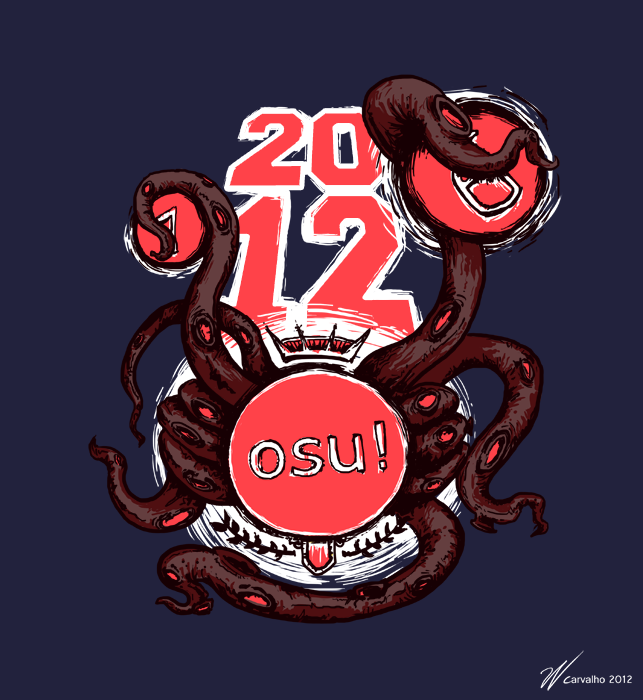
Osu, the game which you control an octopus and catch round things and the year is 2012.
Tried sticking with 4 or 5 colors at max, original file is 350dpi and 3000x3250px
Osu, the game which you control an octopus and catch round things and the year is 2012.
Tried sticking with 4 or 5 colors at max, original file is 350dpi and 3000x3250px
Yukikaze Panettone still best design.
If I were the one who would be spending money on t.shirts I still wouldn't be satisfied with any of the designs
Yukikaze Panettone's seems more suitable for a loading screen than a t-shirt to be honest
and I think jonnythatjonny's design has a way too heavy feel to it
other than these two no other seems nearly ok to be put on a shirt.
Eitherway the prizes don't seem worth competing for.
Yukikaze Panettone's seems more suitable for a loading screen than a t-shirt to be honest
and I think jonnythatjonny's design has a way too heavy feel to it
other than these two no other seems nearly ok to be put on a shirt.
Eitherway the prizes don't seem worth competing for.
I don't get the whole octopus motif (other than the insinuation of tentacle-rape as the majority of osu!'s music and influence is in Japanese culture/media) and why is it grabbing a 6 what happened to 2 through 5JonnyThatJonny wrote:
There goes my effort
Osu, the game which you control an octopus and catch round things and the year is 2012.
Tried sticking with 4 or 5 colors at max, original file is 350dpi and 3000x3250px
other than that I like it lol
awp wrote:
I don't get the whole octopus motif (other than the insinuation of tentacle-rape as the majority of osu!'s music and influence is in Japanese culture/media) and why is it grabbing a 6 what happened to 2 through 5JonnyThatJonny wrote:
There goes my effort
Osu, the game which you control an octopus and catch round things and the year is 2012.
Tried sticking with 4 or 5 colors at max, original file is 350dpi and 3000x3250px
other than that I like it lol
my guess it's that it is grabbing the hits, when you play if you miss the hits you lose , or soemthing like that
That's because I would need goddamn tentacles to play like a pro. I thought about making the tentacles hold wacom bamboo pens but it would get even more random.
my favorite one so farNekoroll wrote:
All images are 33% downsized @ 300dpi unless otherwise noted
Idea 1: simplistic with 2 colors; halftone for easy screenprinting process
-Image-
I could change it to a 9 if more people felt the same. I thought putting the osu! logo would make it more representative of the game and not look like just a bunch of numbers on circles. XDLesjuh wrote:
I actually really like this one. I'd wear this if the osu! logo were a 9 lolNekoroll wrote:
Idea 2: simplistic with more colors
I'm glad you and many others like my designs. I'd love more constructive criticism as well. Helps me tailor my designs to the community's wishes.
 <3
<3
Yukki_old_1
kyaaaaaaaaaa...... >m<YodaSnipe wrote:
Yukikaze Panettone still best design.
feels like i want to kiss you right now lol
if you wonder where's cookiezi, actually i put that name too (include WhiteWolf, and so on) but of course those name did not fit in size.
sorry xD xD xD
i think you could be true,Urukins wrote:
If I were the one who would be spending money on t.shirts I still wouldn't be satisfied with any of the designs
Yukikaze Panettone's seems more suitable for a loading screen than a t-shirt to be honest
and I think jonnythatjonny's design has a way too heavy feel to it
other than these two no other seems nearly ok to be put on a shirt.
Eitherway the prizes don't seem worth competing for.
because i usually make something like Walpp, Loading Screen (for online game), etc. so when i tried to make it i dont have any idea what would look good on T-shirt.
anyway thx for your criticism xD xD xD xD
It actually looks cute, simplistic, and stylish as a t-shirt could get... would wearNekoroll wrote:
Edit: 6/14/2012
Idea 2: simplistic with more colors
I get that a lot.Yukikaze Panettone wrote:
kyaaaaaaaaaa...... >m<
feels like i want to kiss you right now lol
Get rid of everything in the store currently and fill it up with the submissions in this thread. I'm serious there are so many cool designs, some that I thought were cool were Mirry, ManuXP, Lolicon Flandre, Endless957,Yukikaze Panettone, and JonnyThatJonny. I would buy any of those shirts!
This one! This one!Nekoroll wrote:
Edited my designs post on page 6 with a third design featuring Pippi.
I finally made use of my unfinished art that I previously posted in the fan art thread and redrew it so that it would be a more fitting style for a t-shirt.
I like the osu! logo being there instead of the 9. Mixes up the pattern/expectation a bit and drives curiosity. The design might work better if you add another row, counting up to 12 hitcircles (keeping the osu! overtop the 9) even though a 12-hit combo is dodgy in-game, as shirts have a larger y-dimension than x-dimensionNekoroll wrote:
I could change it to a 9 if more people felt the same.Lesjuh wrote:
I actually really like this one. I'd wear this if the osu! logo were a 9 lol
Yes! That will make my Chibi Pippi coffee mug even rarer and more specialblazen wrote:
Get rid of everything in the store currently and fill it up with the submissions in this thread.
Your point about the y and x-dimensions is true, especially about those kinds of shirt designs. I'd like to consider my designs a sort of rough draft. I don't know who the main decision-maker is for the contest but I'm fairly flexible about my submissions. If something needs to be changed around, I can do it.awp wrote:
I like the osu! logo being there instead of the 9. Mixes up the pattern/expectation a bit and drives curiosity. The design might work better if you add another row, counting up to 12 hitcircles (keeping the osu! overtop the 9) even though a 12-hit combo is dodgy in-game, as shirts have a larger y-dimension than x-dimensionLesjuh wrote:
I actually really like this one. I'd wear this if the osu! logo were a 9 lol
I figured 1-12 might be a little too long of a count though and having the osu! on the 9 would make the following 10-12 a little lengthy but I can do it anyway. Haha.http://puu.sh/CHx3
Current versions:
(thanks for the feedback thus far!)
http://puu.sh/DJFr
^"click" won't look quite so mangled if people actually like this version.
http://puu.sh/DK1z
Less contrast:
And softer, more pastel-y colors:
just out of curiosity does it really make sense to say "just a click away" on a non-digital format, ie a shirt
like, click what I don't get it
like, click what I don't get it
akrolsmir wrote:
Still needs tweaking (alignments were mostly eyeballed), but:
I'd totally get that on a shirt without the Rhythm is just a click away text.
I kinda wish this didn't have the 2012 on it, since that will go out of date. Very nice design otherwise.JonnyThatJonny wrote:
There goes my effort
Osu, the game which you control an octopus and catch round things and the year is 2012.
Tried sticking with 4 or 5 colors at max, original file is 350dpi and 3000x3250px
I may be colour blind but... MOAR PINK!
Oops. Unless I would just make the same model with 2013 in it for future reasons (in the remote case of being one of the winners) I'm not sure how to replace it. I'll think about it and try to come up with something until the deadline.peppy wrote:
I kinda wish this didn't have the 2012 on it, since that will go out of date. Very nice design otherwise.JonnyThatJonny wrote:
There goes my effort
Osu, the game which you control an octopus and catch round things and the year is 2012.
Tried sticking with 4 or 5 colors at max, original file is 350dpi and 3000x3250px
That... that is beautiful. Not exactly my taste in t-shirts, but still a really lovely design. So detailed.Ballance wrote:
how about this one
We're doing this next.rickyboi wrote:
I'd buy a "Big Big Yeah" shirt if anyone actually made it.
how about "osu!" or "go!" or something in kanji? that way it can look cool, be related to the source, and not have to mean anything to us folks what can't read them fancy moon runesJonnyThatJonny wrote:
Oops. Unless I would just make the same model with 2013 in it for future reasons (in the remote case of being one of the winners) I'm not sure how to replace it. I'll think about it and try to come up with something until the deadline.
Oh My Godness so EPIC i'd definitly buy this one !Ballance wrote:
how about this one
All hail Ballance !
just these.
full size are too big to upload and read so i do some cut to it.
too less time to do design aaaaaaaaaaaaaaaaaaaaaaaa
i hate final exam i hate essay
*o*Ballance wrote:
how about this one
Well. . . made some simple design
for the size. . . .since it's vector, you can enlarge it to super big banner size if you want
oh. . .by the way
just asking for clarification. . .
For the :
"winners must provide 300+ DPI proofs"
Does the winner must provide the test print (hard proof),
or the winner can just provide the soft proofed image?
or maybe (sorry), you mean PPI? (the winner just give you final .ai files with layers), from what i read on older posts, some people mistook DPI for PPI
since you say DPI, i think it might have something to do with the printer. . .
sorry for my bad Grammar. . .


Anyway. . thanks to those who remembering me about the "mistake" :p
Edit: centered, thicker border
PS: thanks to those who pointed the mistakes for me
for the size. . . .since it's vector, you can enlarge it to super big banner size if you want
oh. . .by the way
just asking for clarification. . .
For the :
"winners must provide 300+ DPI proofs"
Does the winner must provide the test print (hard proof),
or the winner can just provide the soft proofed image?
or maybe (sorry), you mean PPI? (the winner just give you final .ai files with layers), from what i read on older posts, some people mistook DPI for PPI
since you say DPI, i think it might have something to do with the printer. . .
sorry for my bad Grammar. . .
Anyway. . thanks to those who remembering me about the "mistake" :p
Edit: centered, thicker border
PS: thanks to those who pointed the mistakes for me
Index-San's centered "Osu!" is awesome too !
I think it's better on a T-shirt to have the logo centered + catch phrase just under it like on the picture.
Great design !
I think it's better on a T-shirt to have the logo centered + catch phrase just under it like on the picture.
Great design !
Rhythm Helps Your Two Hips MoveIndex-San wrote:
designs
The designs will be pretty nice once that's fixed, though
T-thanks for remembering me xDRandomJibberish wrote:
Rhythm Helps Your Two Hips MoveIndex-San wrote:
designs
The designs will be pretty nice once that's fixed, though
it's fixed now
Omg, good job Index-San. :3
It ticks me off how the "osu!" on the pink blob doesn't look centered tho.
The osu! looks a little bit off-centered... besides that slight detail, I think it looks very cool and nice. Would wear~
Im still waiting for someone to actually interlace/scanline the osu lettering like the originals. Am I the only one that caught that?
No, I'm aware of the scanlines on the osu lettering but considering this will be on a shirt, I'm not sure if scanlines would be too fine of lines to be captured properly after the silkscreen process.RBRat3 wrote:
Im still waiting for someone to actually interlace/scanline the osu lettering like the originals. Am I the only one that caught that?
I like Index-San's design and I can see it being more of like a banner-type design. Shouldn't the white border of the osu! logo be a little thicker though? o.o
Doesn't have to be 1:1 with the original just noticeable. You can screen anything as long as its no finer than the screen itself and the textile its being applied to which is both an unknown but being even close to the threshold is far from what I call noticeable.Nekoroll wrote:
No, I'm aware of the scanlines on the osu lettering but considering this will be on a shirt, I'm not sure if scanlines would be too fine of lines to be captured properly after the silkscreen process.RBRat3 wrote:
Im still waiting for someone to actually interlace/scanline the osu lettering like the originals. Am I the only one that caught that?
I like Index-San's design and I can see it being more of like a banner-type design. Shouldn't the white border of the osu! logo be a little thicker though? o.o
1 millimeter and up should be satisfactory, If not then they must be using burlap for screening these days XD
<3 shadow pippi. (There are enough great designs in this thread to fill my wardrobe completely with just osu! shirts xD)sherrie__fay wrote:
just these.
full size are too big to upload and read so i do some cut to it.
too less time to do design aaaaaaaaaaaaaaaaaaaaaaaa
i hate final exam i hate essay
Anyways, updated my post with some new/modified designs (also box'd here:)
http://puu.sh/DJFr
http://puu.sh/DK1z
Minty Gum's suggestion (feels like I'm stealing Daru's scheme xP):
And softer, more pastel-y colors:
Catch the beat shirts would be awesome too.- MAGiCAL - wrote:
Ya! Taiko shirts would be AWESOME!
working on that atmRuidoso wrote:
Catch the beat shirts would be awesome too.
Maybe this will sound strange, but I think there's too much contrast in your design. Try out using a dark grey background against the white instead of pitch black. It will look a bit softer~
you are not alone x.xsherrie__fay wrote:
i hate final exam i hate essay
I'm new to this forum x3 I have to say, I absolutely adore Osu!
I've been meaning to do some fanart for it for a while, so what better excuse then to enter this comp?
So, here's my entry:

and how it would look on a t-shirt! I know the colour top I've chosen is very bold, but I wanted it to match the colours of the site. I'm not even sure if it would be possible to get a t-shirt in that colour x3 If I am chosen then hopefully I can find out what colours are available and do any colour tweaks so it looks lovely on all of them~ (I've tried the picture on a darker top briefly and it worked, but I might need to change the blue text to a lighter shade to make it show up.)

Hope you like them!
I've been meaning to do some fanart for it for a while, so what better excuse then to enter this comp
? So, here's my entry:
and how it would look on a t-shirt! I know the colour top I've chosen is very bold, but I wanted it to match the colours of the site. I'm not even sure if it would be possible to get a t-shirt in that colour x3 If I am chosen then hopefully I can find out what colours are available and do any colour tweaks so it looks lovely on all of them~ (I've tried the picture on a darker top briefly and it worked, but I might need to change the blue text to a lighter shade to make it show up.)
Hope you like them!
That looks amazing. But I bet it won't be easy to print.
Edit: Why doesn't she have any boobs? Is she prepubertal? You disgust me.
Actually, this whole loli culture is quite harmful.
Edit: Why doesn't she have any boobs? Is she prepubertal? You disgust me.
Actually, this whole loli culture is quite harmful.
good concept. hate pippi's look.
@strawberrymoshi : You should put a fruit Ryuuta instead of pippi because many people don't like her look (I'm also part of those people ^^).
Plus it will put some CTB on the shirt because you already drawed some taiko + osu! logo but no CTB stuff...
Anyway great design but I won't buy it if there's pippi on it xD
Plus it will put some CTB on the shirt because you already drawed some taiko + osu! logo but no CTB stuff...
Anyway great design but I won't buy it if there's pippi on it xD
I'd still buy.Kynan383 wrote:
Anyway great design but I won't buy it if there's pippi on it xD
hopefully i can finish my designe until july 1st....nut sure
Not gonna lie, I actually kind of want that shirt
but she's so moe
Theowest: I didn't put boobs cause one of the official drawings I was using as ref didn't have any :3
I personally don't like Pippys look either, but it's the mascot, and there's a lot of entries already with just the logo, so I thought I'd opt for something a bit different.
I was going to put catch the beat stuff on as well, but I couldn't work out a way to incorporate it into the design, where it was as easy to recognise as the taiko's and didn't make the image look too cluttered. So I chose to leave it off :<
Also, who is Ryuuta? The only mascot I'm aware of is Pippy and her taiko form. ^^;
Rytta is the guy holding the basket that catches the fruits ^^strawberrymoshi wrote:
Also, who is Ryuuta? The only mascot I'm aware of is Pippy and her taiko form. ^^;
theowest wrote:
That looks amazing. But I bet it won't be easy to print.
Edit: Why doesn't she have any boobs? Is she prepubertal? You disgust me.
Actually, this whole loli culture is quite harmful.
I don't see any proper boobs here. Takes your loli complaints up with the original designer.
Oh right! Well, if I get time, then I might do up another entry with him on. Although it is getting rather close to the deadline ><;Kynan383 wrote:
Rytta is the guy holding the basket that catches the fruits ^^strawberrymoshi wrote:
Also, who is Ryuuta? The only mascot I'm aware of is Pippy and her taiko form. ^^;
Yeah submissions ends in 2 days ><strawberrymoshi wrote:
Oh right! Well, if I get time, then I might do up another entry with him on. Although it is getting rather close to the deadline ><;
I wasn't being too serious. I don't mind flat chested girls.
Pippi is flat when she's drawn as a 12 year old girl
because 12 year old girls are usually pretty flat
also, in some cases (like the chibi style used on the site, or in strawberry's design) it would just look awkward, because they are highly stylized and not anatomically accurate. Don't fret it too much.
because 12 year old girls are usually pretty flat
also, in some cases (like the chibi style used on the site, or in strawberry's design) it would just look awkward, because they are highly stylized and not anatomically accurate. Don't fret it too much.
as i said a lot of comments before im actually working on a ctb designe but im not sure if i can finish it until deadlineiMercurial wrote:
Not gonna lie, Where's Ryuuta and CtB mode?
here is mine each side click the link
[img]file:///C:/Users/Owner/Pictures/Arm%201.PNG[/img] [img]file:///C:/Users/Owner/Pictures/Arm%202.PNG[/img] [img]file:///C:/Users/Owner/Pictures/side%201.PNG[/img] [img]file:///C:/Users/Owner/Pictures/side%202.PNG[/img] or copy them and take a look and PEPPY ROCKS
[img]file:///C:/Users/Owner/Pictures/Arm%201.PNG[/img] [img]file:///C:/Users/Owner/Pictures/Arm%202.PNG[/img] [img]file:///C:/Users/Owner/Pictures/side%201.PNG[/img] [img]file:///C:/Users/Owner/Pictures/side%202.PNG[/img] or copy them and take a look and PEPPY ROCKS
Your going to need to upload the images to an image sharing site, like tinypic/photobucket/flickr etc and relink them. You've just literally copied the file path on your computer so no one's going to be able to see them unless they're actually on your computerrhythmheavo wrote:
here is mine each side click the link
[img]file:///C:/Users/Owner/Pictures/Arm%201.PNG[/img] [img]file:///C:/Users/Owner/Pictures/Arm%202.PNG[/img] [img]file:///C:/Users/Owner/Pictures/side%201.PNG[/img] [img]file:///C:/Users/Owner/Pictures/side%202.PNG[/img] or copy them and take a look and PEPPY ROCKS
lol k
here is all of my photo's http://www.flickr.com/photos/rhysclaffeyflickrcom/ of that wont work i will do it like http://www.flickr.com/photos/rhysclaffeyflickrcom/ and it says rhys claffey cause i am using my friends email he let me
..oh god