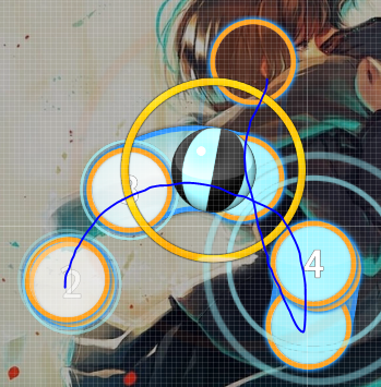
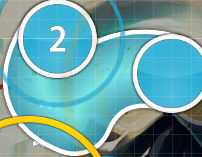
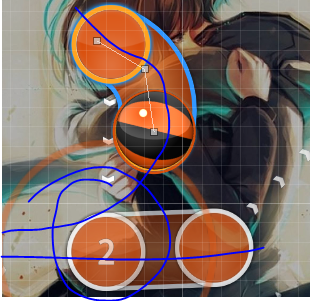
For the start, id do something like this to make it look more aesthetic, basically make the angles look lik ther close to bein perpendicular or linear to each other, and make th sliders look like they flow with each other. (shown in blu I think)
 ye fixed
00:01:344 (2) - , 00:01:963 (4,5) - , 00:04:437 (2,3,4) -, these parts hav kinda large spacing compared to the rest of th section even tho the song isn’t really that diffrnt here
think i fixed it00:11:396 (1) - , 00:37:684 (3) - ,^ make th spacing kinda like this part
think i did it00:02:426 (1) - thers a vocal on 00:03:045, which is also rathr noticeable, id map active for this (clickable),
yeah fixed 00:02:426 (1,1,1) - whats with th repeated ncs,
idk LUL 00:03:354 (1) - probs dusnt need a nc
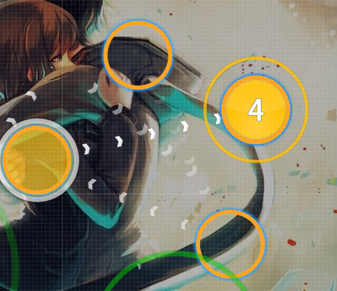
ye fixed00:07:375 (4) - slider is kinda overly fancy, music isn’t really like that, a simple curve would be fine. (lik shown below), if u really wanna make fancy sliders, ud have to make it consistent in that section (ie all sounds similar to that sound shud b fancy)
 fixed
fixed00:09:849 (4) - ^
fixed00:08:303 (5,6,1) - possibly make a pattern that looks less random (like a triangle/back and forth/etc)
wat00:11:859 (2) - ur missing the downbeat and the vocal, id suggest making one of them clickable
fixed mayb00:16:808 (3,4) - were u prioritizing guitar or vocal :L
oopx 00:18:818 (1,2) - consider changing dis into

, to emphisize vocals
yeah00:22:220 (2) - weird placement, cus offblanket with 00:20:983 (7) - and no visual flow
fixed00:28:097 (2,3) - gap is as big as the previous 1/2s, consider shrinking
fixed00:28:715 (3) - long vocal but ur ignoring all the things inside, id say u shud use 2 closely placed 1/1 sliders instead
 only changing this because the other slider looked ugly and idk how to slider xd
00:29:952 (5) - possibly repeat slider to show that thers a beat in the middle?
I like it better with the long slider00:31:189 (1,2) - spacing difference (large), 2 has a vocal on the sliderend btw
fixed00:34:591 (4) - this is fine but u cud make vocal clickable as a circl
ill keep it the way it is00:35:829 (5) - this is kinda weird cus the slider makes the playrs cursor go right, but 00:36:138 (1) - starts on the left
shhhhhhh00:37:066 (2) - new bar has a beat btw
wat00:37:684 (3) - slider looks random, keep it simpler like 00:32:117 (3) - or 00:17:272 (5) - maybe
ye00:39:849 (1) - end pls. (dat circle xd)
yesm00:43:561 (1) - this is faster than this sections speed, looks a bit sudden imo
cause song change00:42:015 (1,1,1,1,1) - blanket and make thes look like they flow more (btw 1st+2nd rhythm is jus 3rd+4th reversed)
idk i tried to fix00:44:025 (2,3,4,5,6,1) - make this 2 jump groups: 00:44:025 (2,3,4) -, 00:44:489 (5,6,1) - , cus thers a vocal starting 5 plus make these look less random by applying patterns (don’t jus put circles down after setting 1.6 ds)
I tried00:45:107 (2,3) - the curve on 2 is misleading aesthetically
NOT ANYMORE THANKS TO MAPPING00:45:417 (3,4,5) - organize jump pattern
fixed00:47:581 (3) - looks kinda random, maybe make a triangular slidr pattrn there
 fixed
fixed00:47:890 (4,5,6,7) - pattern jump pls
mayb fixed00:49:592 (1,2,3,4) - maybe make 3,4 1 slider, idk
nah00:50:365 (7) - slider is pretty random, try adjusting th angle + the curve
fixed mayb idk00:52:530 (2,3) - these 2 don’t look like they fit together in 1 part at all, try making a bak and forth/triangular pattern, or mayb jus adjusting the last slider wud work,
fixed00:52:530 (2,3) - spacing is really low
fixed00:53:458 (1) - this slider is kinda too un-smooth imo
fixed00:54:076 (3) - this blanket blankets pretty strangly onto the prev slider
fixed i think00:54:385 (4,5,1,2,3,4) - looks pretty random, shud structure this segment of jumps more (insert patterns)
s q u a r e s00:57:787 (3,4,5,6,1) - too close with objects frum b4 imo
mayb fixed ya00:58:407 (1) - previous slider makes this slider seem random, mayb add a red node to make it look more like the previous slidr leads to dis one
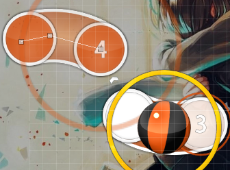
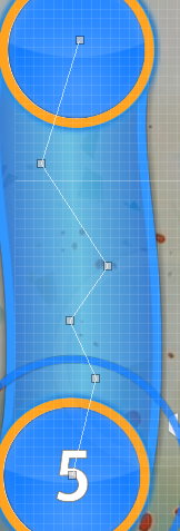
ye01:00:108 (2) - this slider is really weird lookin, base it off something circular, mayb use the slider belo for as an example
 I made my best attempt to make a slider like that plz help
01:00:572 (1,2,3,4,1) - probs move this a bit away from previous slider since its just a slider ¼ jump
yeah fixed01:02:426 (2,3,4,5) - ctrl g 01:02:426 (2,3,4,5) - , then ctrl g 01:02:735 (4,5) - , since logically this wud flow better
wow ctrl g, ty didnt know that hotkey oopx01:03:973 (4) - maybe overlap this with 01:03:201 (3) - , and move 01:03:664 (2) - since that pattern looks kinda bad
idk if fixed i gave it a go01:04:591 (1,2,3,4,1,2,3,4) - these jumps r really random, organize the circles to make patterns
 trapezoid
01:08:922 (4) - too, complex, messy
more simple now01:11:086 (5) - I don’t understand wat kinda slider u wer goin for lo
 sorry i had autism for a sec
01:12:015 (1,2) - rotate by ~15 degrees clockwise cus the parallel-nes of that pattern feels weird with that part
fixed01:12:324 (3,4,5,1) - slider placement is sorta random
made less weird i think 01:14:798 (2) - why is this longer if: a, the part sounds like it shud b 4 ½ sliders, and b, 01:15:417 (4) - is not a longer slidr
lol idke01:15:881 (2,3,4,1,2,3) - cool pattern, maybe fix it up a bit (cus it looks kinda off
fixed01:16:963 (1) - completely dusnt visually fit with previous slidr
dw hes straight now01:19:901 (4) - other than this part, that jump section was overall pretty gud, id suggest moving this to:
 fixed
fixed01:19:437 (1,2,3,4) - ok I lied this part is kinda weird cus the flows different, to fix, id do ctrl g for 01:19:591 (2,3,4) - , then after u do that, ctrl g 01:19:746 (3,4) -
fixed01:21:912 (1,2,3,4,1,2,3,4) - cool but maybe make the angles for the start of each 2 notes more consistent (ie same angls or flipped angls)
idk they are supposed to be pointing towards the next object idk elaborate plz 01:23:149 (1,2,3,4) - I don’t agree wit dis structuring, I think it shud b a back and forth or square pattrn, but I guess urs sorta works
im kepp it01:25:005 (1) - , 01:25:932 (3) - moving this right wud probs make it look more normal
fixed01:26:859 (3,4,5,1,2,3,4) - messy, clean it up more (01:26:859 (3,2) - these 2 overlap weirdly btw)
fixed01:30:262 (4) - imo shud look similar to previous slider
fixed01:37:221 (4) - overlaps weirdly wit 01:36:757 (1) - , mayb chang to overlapping completely
fixed mayb01:39:540 (1) - , 01:40:158 (1) - are these ncs rly that important lo
no ;_;01:40:932 (2) - I hav a feeling that this is gonna trigger lik 90k ppl
too bad 90k scrubs01:41:086 (1,2) - btw these shud b the exact same shap imo since sound is kinda identical
fixed01:41:550 (3,1) - even tho its like a slider to a slider, that distanc for a 1/8 jump is probs a bit big
fixed01:43:560 (4) - bad blanket, just a remindr to chek over ur blankets as I don’t rly wanna point out every one of thm and make this a blanket mod lo.
fixed01:45:725 (3,4,1) - these angles are kinda wide, which makes hittin thm harder than normal, also spacing is larger than rest of th jump groups in this section it seems
mayb fixed idk01:46:963 (2,3,4,5,6,7) - looks kinda weird imo, my suggestion is to make the square more, squar like and move 6 undr 3, then adjust the rest accordingly or something similar
fixed01:47:890 (1) - slider’s rednode makes it weird and diffrnt from the structure
fixed01:49:128 (1) - theres a vocal at the end of this slidr just like on 01:49:591 (2) - , yet u made 01:49:591 (2) - clickable and not the sliderend vocal
oopx fixed01:53:457 (3,4) - make these fit more onto 01:52:839 (1,2) - , looks kinda random atm
moved slightly01:59:644 (2) - probs move this up and right more to show the slight cresendoesk effect
lmao02:00:880 (1,2,3,4,5,6) - use ctrl d for the square xdddd
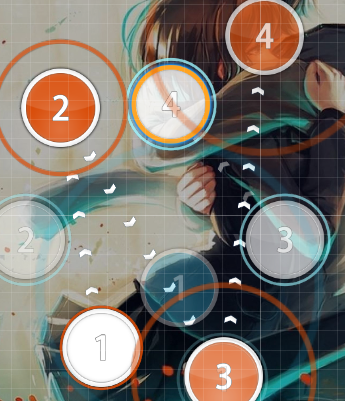
It just de-sele.... oh02:01:653 (1) - to 02:08:612 (10) - this section is a bit iffy, maybe use more similar angles (also how tf did u get to 10 combo, shud nc somewhere in ther)
nah02:14:488 (1) - I disagree wit the complexity of this slidr
;_; 02:15:108 (2) - that’s another sorta overlap issu, ill probs stop mentioning most overlap issues startin here
fix02:27:478 (1) - I swear that’s gonna confus someone
i think i missed placing a circle02:29:334 (1) - mayb make this a straight, cus (4) dusnt look like it goes into this
fixed02:31:189 (1) - theres a vocal on the end of this
ye02:39:541 (7) - that’s a pretty awkward plac for this slider, consider goin up mayb
goin up on a tuesday02:54:386 (5,6,1) - space more maybe
fixed02:55:778 (1,2,3) - probs make these all curved or all straight, thn rotate them for that same effect
fixed03:01:808 (6,7) - id make this a slider. (vocal)
ye03:09:231 (8) - yea that sliders pretty awkward, id make it go straight up
its straight now, not gay anymore (bad jokes are bad)03:11:550 (7) - shud overlap with (4) instead since that makes the nex slidr look more normal
ye03:13:407 (4,5,6) - shud be spaced further from 03:13:252 (3) - , 03:13:871 (8) - should be further from 03:13:716 (7,9) - cus everything else is more spacd than this in this section
ye03:14:180 (1,2,3,4,1) - that angl makes everything jus a little weirder, other than that its pretty gud to pla and looks pretty gud tbh
keppin it03:15:261 (4) - id move it up and to the right a bit cus spacing fits better
ye03:16:345 (1) - ^
ye03:16:499 (2,3,4,5,6,7,1) - rly weir strim, looks like its just a random curve, I suggest making th curve more consistent
mayb fixed03:19:437 (1,2) - I think these slidrs don’t rly look that grejt, and I cant think of any better way other than putting to spinners so ya, basically im sayin u might wanna try redoin the sliders
goin with spinner cause fuk sliders03:22:530 (1) - feels overmappd, mayb jus make the buzzslider hav more repeats
but the buzzslider is being used for a specific sound so no change03:23:149 (1) - slider looks random and outta place
made different 03:24:386 (1) - large jumps, by end kappa
heh03:26:783 (1,2) - weird ¼ jump into slidr, probs space more and make it ~170deg flip compard to prev slidr
idk what u talkin about03:27:788 (1) - curve is larg cus it makes it look like that slidr comes outta no wher
 fixed
fixed03:28:407 (3) - this slidr’s angle seems ‘outta context’
fixed03:29:334 (1) - 2 slider points makes this slidr’s curve look weird, generally makin curvs based around circls is ok
fixed03:33:046 (1) - , 03:34:283 (1) - pretty close to prev slidr, just keep in mind that slidr leniency is a thingy
ye03:34:283 (1,2) - repeats are not exactly used commonly in this part of the map, unless u rly feel like that part is diffrnt from the rest of th map, mayb try a different pattern
fixed03:35:211 (3,4,1,2,3,4) - pretty random jump pattrn, maybe move 1,2,3,4 so that it is symmetrical with the first 3,4 as the middl
idk ill keep it03:36:139 (5,6,1) - those r really large jumps compared to the rest
nerfed03:39:231 (1) - that blanket is weir cus the slider end goes into part of a slidr + the slidr is also really far from the circl that goes after, unlike all the other slidr>circl parts in that section
idk think i made it slightly better03:44:179 (1,2) - it looks weird since the red node makes th slider go inwards
fixed03:44:797 (3) - its probs ok but the angle sorta makes it feel weird
ye idk 03:47:582 (5) - slidr is weird lookin, sinc its not based off anything
ye03:50:675 (3) - slider position breaks th visual circular flow, cud be fixed by making the curve upsidedown (03:53:767 (5) - too)
fixed03:51:293 (1,2,3,4,1,2,3,4,5) - the intensity of th map, probs the most intense part of the song, they don’t really match up that well, mayb map more larger jumps here
fixed03:58:716 (4,5,6,7,1) - burst into slidr looks kinda weird since slidr and burst are the same length and the same angle
fixed04:00:262 (1,2,3,4,1,2,3,1,2,3,4,5,6,1,2,3) - pattern this, don’t spam in random flowish directions, mayb use rotating triangles that increase spacing
fixed04:02:118 (1,2,3) - angle is wide, makes th player not snap, which results in this part bein weird to pla compared to the rest
fixed04:04:591 (3,4,5) - angle is a bit wide, maybe change but lookin at the rest of the section, its probs just part of how that section is mappd
ye04:08:921 (1,2) - kinda weird how that plac is just right next to each other like that, mayb flip one of them
ye04:11:395 (1,2,3,4,5,6,7,8) - I would structure it like 1,2,3,4,5,6 then 7,8 instead of 1,2,3,4 then 5,6,7,8 since lyric starts at 7
i think i did it04:14:179 (2,3,4) - looks weird since 3 is in an awkward position, mayb rotate 2,3 clockwise a bit and then readjust
ye04:16:035 (6) - slider leniency makes dis slidr rly weird since the slider hed is right next to the prev slidr hed
fixed04:24:385 (3) - sudden change in flow, no sudden chang in music
yes change in music04:28:406 (5,6,7,8,1) - stack confuses me cus thers a lotta stacked single taps there, might jus be me sucking at reading tho
idk mayb04:27:478 (1) - prev slider doesn’t flow into this
huh04:31:189 (1) - this looks like u made it far jus cus symmetry, and disregarded the spacing a bit
ye04:33:199 (4,5) - these 2 circls are like just there
made them neater kinda04:36:756 (3,4,5,6) - these hav rly large ds, and they don’t rly look that gud
made into star04:42:014 (6,7,1,2,3,4,5,6,7,8) - kinda just looks like random crisscross jumps with no structure behind it
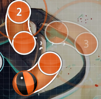
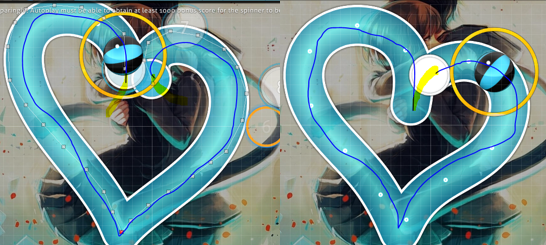
fixed04:43:560 (9) - make this look mor dynamic, and mak the end slider flow to the start (yello shows how this pattern wud go) don’t copy cus I kinda jus roughly did a shape without rly payin attention to th timeline, use this as referenc or sometin
 i tried
gl ranking btw

