It's quite nice. Great job! I love it!
Some things I think that could be improvements, in order from objective to subjective:
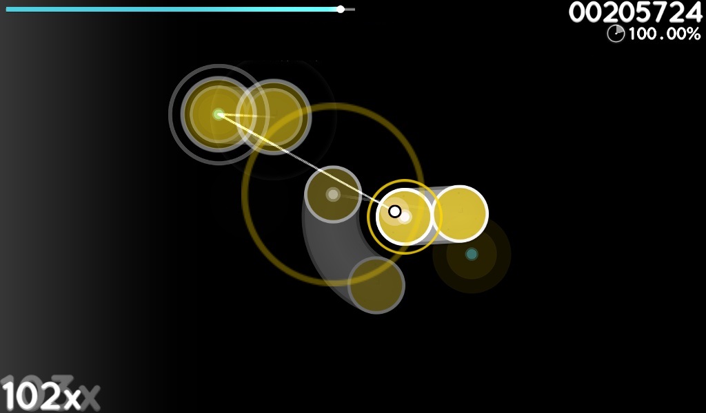
- Anti-aliasing is really bad, at first I thought you had no HD images
- Reassign hitcircleoverlap to the proper amount (some multiple of the width of the "default" image at 2x)
- I'd prefer more transparency to make stacked notes easier to read
- Align the difficulty stars to the left edge of the text, a little closer to the text vertically for even spacing, maybe slightly larger circles as well (they don't graduate or scale well)
- Your color choices in a lot of areas seem very arbitrary
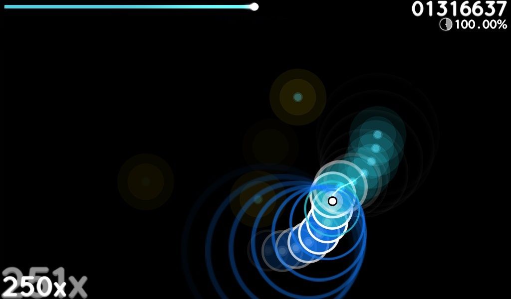
- Maybe experiment with single-ended sliders (using default-0, default-1, etc. as the entire hitcircle)
- Menu buttons seem like of sloppy, especially with function key labeling. Mode selector overlay is not aligned properly
- Hitsounds are meh
- "score" images have no vertical spacing
- "300" images aren't really helpful in-game
That might seem like a lot of complaints, but basically I'm just going as in depth as I can. I like this skin a lot.
 D
D