forum

Thaehan - Help

posted
Total Posts
49
show more
Pachiru
@3mplify, didn't fixed the position cause it was fine as it is.

@MrMenda, didn't change it cause: - the overlap is not a problem, since it's abrely noticeable
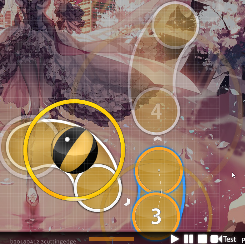
- the jumping part was thought like this, to give more emphasis on the strong beat placed on the 7.
- the kiai is made with reversed 1/4 cause it would be too hard with 5 notes bursts, and would be as complicated as the Extra, and it's something I don't want to. I wanted to make something I could play.
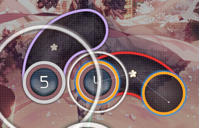
- the last part, i preferd to emphasis the decreasing sound with a progresive descreasing spacing instead. and for the very last part of it, i don't agree with the idea of circles, cause i wanted to represent the intensity of the whole part with spacing and sliders.

@Yusomi, didn't changed the jumps suggestions, cause they're already big jumps here. fixed the rest.

@bigfrog, changed the first suggestion to polish the map, but denied the rest, cause to me, the suggestions wouldn't fix issues.
- the second one would harm the flow and the structure of this section.
- the latter one would be too hard if i was ctrl+g this pattern, cause 3 would be too far from the previous object.
glad you liked the map though :)

@Gordon123, fixed all.

@YukiZura-, fixed all.

[]

Thanks guys for modding, I appreciate the help~
Topic Starter
Nozhomi

Gordon123 wrote:

heey from my q ^^

[General]
[Collab Extra]

  • 00:22:999 (4) - maybe make it x:292 y:172 for a great circle between 00:22:693 (3,1) - these objects - Nah I want that emphasis for snare and stack with 00:24:070 (4) -
    00:28:203 (1) - can be omitted this object a little lower in order to show a small gap between 00:27:897 (3) - and (1) (for difference in distance) - The NC make it easier to get, and people from that lvl won't have any issue reading that rhythm change.
    00:51:162 (7) - x:484 y:120 and 00:51:468 (1) - x:296 y:124 i think looks better (imo) - 1st one yes, 2nd one no that's way to down on the grind and pattern.
    00:58:432 (4,1) - make a smoother transition between circles - That's the point of not doing it smooth, to emphasis the rhythm acceleration.
    01:25:294 (5) - make a curve? https://puu.sh/zRkV7/b1a9f1ceeb.jpg - That's the kind of pattern I like, it flows well and looks cute.
    01:53:917 (1) - why this slider repeats only once? it looks weird and unclear! - Is it ? Unclear I don't think, weird that's questionnable. And why this slider couldn't be done only one time ?
    02:11:978 (4) - x:180 y:104 - Stack with 02:10:754 (5) -
[Hard]

  • 00:25:754 (4,6) - same ^ - Nah I like that different direction to match the speedup of the song.
    00:41:519 (8,1) - maybe blanket? - Never intended to be blanket.
~~~~~~~~~~~~~~~~~~~~~~~~~~~~~~~~~~~~~~~~~~~~~~~

Good Luck ;)

bigfrog wrote:

hi, m4m from pm :>

[Genera]
  1. seems fine
[Easy]
  1. 00:37:386 (2) - maybe can try this pattern - So your idea is nice indeed, but since both sliders cover the same type of sound, I want them to stay the same.
  2. 00:46:111 (3,1,2) - make the same distance between seems more neat imo - Yes but distance spacing rip so no.
  3. 00:49:019 (1,3) - blanket? looks nice :> - Wasn't intended to be blanket so no need to.
  4. 01:09:836 (3) - i guess the red dot can be put at the curve place of the slider, 01:10:448 - I put it here to fit the drum hit here like on the start.
  5. 02:08:612 (3,4) - seems more fit to use a long slider & circle in this part imo xD it's fine to use two slider too tho - Yeah could work, but will keep consistency with 01:58:816 (3,4) - .
[Normal]
  1. 00:24:223 (4,3) - stack? just suggestion lol - Would kill all the patterns for not much so nah I won't.
  2. 01:27:897 (6) - i think it's more fit to use a slider here to emphasize the tight rhythm :> - Imo would be a bit too hard, we'll see if more complain about it.
  3. 01:44:122 (4) - hmm i'm not sure but a little stack the blood strip while playing -wat
  4. 02:07:387 (1) - same as 01:44:122 (4) -wat
[Hard]
  1. 02:08:000 (2,3) - parallel? - They are, unless you mean parallel the other way but no they're nice like that.
[Collab Extra]
i may give all subjective suggestion so feel free to just reply rejected lol
  1. 00:12:131 (4) - stack on 00:11:060 (1) - head? - I feel like flow would be too broken.
  2. 00:28:050 - hmm feel a little pity to make a blank here ;u; - There's nothing interesting to play here, and that small blank emphasis more the next sound.
  3. 00:48:713 (5,6,7,8,1) - i guess this pattern can be placed better by moving 00:49:019 (1) - to the correct place, i think you want to make the flow to - Tell me the correct place next time XD
    00:49:172 (2,3) - so i also recommend to put (2,3) to 00:48:254 (3) - tail :3 - Don't like the flow it create and ruin spacing.
  4. 01:34:019 (5,6) - ctrl+g the place? same reason as 00:41:978 (2,3) - Imo don't work this time.
  5. 01:56:213 (1,2) - umm seems very confused ;u; maybe just to me.. - It just follow the movement from before, nothing hard.
[Virtuosu!]
sry i'm not good at modding high star diff but i'll try xD
  1. 00:27:284 (5) - ummm seems not very beauty for me maybe can try this way - Will end out of screen and ruin the flow.
  2. 00:37:386 (6,7) - using stream here maybe more fit this diff imo lol - There's no stream possible here, only 1212 and I don't want that.
  3. 01:40:448 (1,3) - blanket? - It is already.
that all i guess xD and i think maybe you can check the hitsound by looking through whole map :3
GL for rank!!
Thx
Will answer rest of the mods when back the 19th.
CXu
Lol I suck I had way less time during Easter than I thought and then I kinda forgot, so sorry I'm like a billion years late.

[General]
  1. Fine
[Virtuosu!]
  1. 00:17:182 (1) - The speed-up on this slider comes a bit abrupt as it's head still follows the piano like 00:14:733 (1,2,3) - and whatnot, and it's not obvious if it's supposed to follow the increasing sound in the background. Imo just keeping the same speed here as the previous sliders would work better.
  2. 00:26:519 (3,1) - Add soft-whistle to both of these? For the high pitched piano.
  3. 00:36:774 (1,2,3,4,5,6,7) - Consider something like this maybe? https://files.catbox.moe/kg7B7b.png It feels odd to have (6) as a slider when there's an added emphasis for the heads on (5,7) in the music, and the stream using 1/4's would emphasize the stronger drum-sounds better as well.
  4. 00:41:672 (1) - Possibly lower SV for this, then increase it for 00:42:897 (1) - , to fit with how you've been increasing/decreasing SV based on pitch of that noisething?
  5. 00:57:591 (1) - I would change this to 2 notes instead, as at this point you'll be hitting every piano-note at 00:57:897 (1,1,1,1,1,1) - .
  6. 00:58:815 - Nice stream.
  7. 01:19:172 (4) - This is kinda close to (3) and could look like a 1/4, so maybe space it out a bit more.
  8. 01:20:856 (1) - Well same things as previous part, so if you decide to do that, then do the same here.
  9. 01:44:887 (3,4,5,1) - Same whistles as 00:26:519, and if you didn't do that, at least add a whistle on (4) for consistency I guess.
  10. 01:55:142 (1,2,3,4,5,6,7) - Hey look it's the same thing again, so apply here too if you did the previous one.
  11. 02:00:040 (1,2,3,4,5) - I feel like this rhythm would be more appropriate considering the added drums in this section: https://files.catbox.moe/buu7TB.png

[Collab Extra]
  1. 00:07:386 (4) - Maybe ctrl+g and rotate it like this? https://files.catbox.moe/nb85sB.png The more linear flow of the pattern leads better into the slider this way.
  2. 00:16:570 (2) - Move the end to 371;188 to line up the slider-body with (1)?
  3. 00:26:978 (1,2,3) - Uhm? If this is intentional, it doesn't look like it. Would just space this regularly.
  4. 00:28:050 - Just having a gap here is pretty weird, and also you don't really use these kind of pauses in other parts of this section, and there's still a piano going on that note. Consider adding a note here, maybe by stacking it on 00:28:203 (1) - , then ctrl+g'ing 00:27:897 (3,4) - If not, at least do something with the spacing as the sudden 1/1 kind of comes out of nowhere in a sea of 1/2's.
  5. 00:31:876 (1) - This slidershape looks kind of out of place compared to like every other slider. Consider just making it one of those round sliders, since you've been using fairly curved sliders in general through the map.
  6. 00:36:774 - I get that it's on the sharper drum that you jump out, but at least imo this should really be NC'd as https://files.catbox.moe/5A0lyC.png, and grouping them with stacks on the (1,2)'s while not on the (3,4), if that makes sense. Basically like this https://files.catbox.moe/xXOCx7.png (as in the logic, not the pattern; that's just some random placing I did for the screenshot.) If you want to keep your current logic going, I'd place 00:37:999 (2) - in the stack as well, since it has the same sound as the other ones, instead of this random note out in the middle of nowhere.
  7. 00:56:825 (1) - Not really a need for an NC here, and is inconsistent with your previous NCing.
  8. 00:56:825 (1,2,3,4,5) - Also, maybe fix the star pattern so it's an even star? It kinda just looks sloppy righ tnow.
  9. 01:03:407 (3) - Make this a note stacked on 01:03:713 (1) - like you do at 01:00:958 (3,1) - and 01:10:754 (3,1) - ?
  10. 01:27:897 (5,6,7,8,1) - Straight line pls
  11. 01:43:968 (5,6,1) - Maybe point these in the direction of (4) so they lead into the slider better?
  12. 01:46:417 - Same as before
  13. 01:49:019 (6) - NC
  14. 01:55:142 - Same as before
  15. 02:06:009 - Same as before
  16. 02:06:392 - Would add a note here to follow the drums more properly, since you already have 02:06:698 (3) -, so the pattern is following the drums.
  17. 02:10:295 (2,3) - Kind of a random triple that isn't really following anything.
  18. 02:14:733 - Well, same as before, NC patterning and whatnot should be 4-4-1 imo.
[Pachiru's Insane]
  1. 00:23:764 (2) - Would shorten this to a 1/2 starting at 00:23:917 - , then adding a note at 00:23:764 - to follow the drums here.
  2. 00:30:040 (3,4) - I get the extended sliders, but personally would prefer that you don't skip the drum at 00:30:193 - . You also don't extend them at 01:48:407 (3,4) - or 02:07:999 (3,4) - , so it would be more consistent as well.
  3. 00:33:560 (2) - Same as 00:23:764
  4. 00:37:999 (1,2,3,4) - Slightly increase SV for every slider? Since the music is increasing in pitch and whatnot.
  5. 00:38:917 (4) - Well, I guess it's not really a problem, but I do think it would be better to either reduce repeats by 1, or moving this closer to 00:39:223 (1) - (or the other way around). Same with other big 1/4 jumps after repeats like 00:59:733 (4,1) - and 01:02:794 (2,3) - etc.
  6. 00:49:325 (2) - Turn this into two notes to be consistent with 00:51:774 (2,3) - ?
  7. 01:36:774 (1,2,3,4) - Same as 00:37:999
  8. 01:42:131 (2,3) - drum-hitnormal on (2) sliderend and (3)
  9. 01:46:876 (2) - Shorten this to 01:47:029 - and add a note at 01:47:106 - so you don't skip the piano sound at 01:47:029?
  10. 01:56:366 (1,2,3,4) - Same as 00:37:999
  11. 02:14:733 (1,2,3,4,5,1,2,3) - Could you make this star more star-like xd
[Hard]
  1. 00:27:284 (3,4,5) - Move these so that (2,3,5) form a triangle like this https://files.catbox.moe/xnBorh.png ? Will also make spacing between 00:27:131 (2,3) - look more consistent with 00:26:519 (6,1) - and 00:27:284 (3,4) -
  2. 00:37:999 (6) - NC here, since you similarly break your NCing pattern at 00:28:203 - and every other place where you go into like a new section of the music.
  3. 00:48:713 (7) - Everything should probably have drum-hitnormal on this repeatslider.
  4. 00:51:009 (8) - Would stack this on (7) instead so you get two doubles rather than a single + a triple stack.
  5. 00:52:386 (3) - Curve this? Looks better in the overall pattern imo https://files.catbox.moe/73Om8p.png
  6. 01:11:978 (1) - Remove NC for consistency.
  7. 01:27:897 (7) - Same as 00:48:713
  8. 01:30:040 (7,8,9,10) - Same as 00:51:009
  9. 01:37:080 (2) - Curve this as well? It's like the only straight slider in the combo, so it kinda stands out.
  10. 02:01:877 (5) - drum-hitnormal on end
  11. 02:03:714 (5,7) - Missing normal-hitnormal on (5) end and (7) repeat.
  12. 02:11:826 (7) - Missing normal-hitnormal on end here too. Might be some hitsounds that're missing that I missed (lol nice sentence) so you should probably just listen through it and add whatever's not there.
  13. 02:13:510 (5) - ^
  14. 02:14:733 (1,2,3,4,5,6,7,8) - Well, as you probably figured from the other diffs, I think (4) should stand alone then have (5,6) as a double stack instead: https://files.catbox.moe/h48nqv.png
  15. 02:20:856 (3) - I think it would be appropriate to NC here too, since the piano gets significantly stronger and you break the pattern of those repeatsliders here.
[Normal]
  1. 00:57:591 (4) - Maybe move this up a bit so it's not as close to 00:56:366 (1) -
  2. 01:34:478 (1) - I get that the spinner is following that sound that's increasing in volume and whatnot, but eh, the piano melody here is really strong and in the center, so I think it would be better to map this part rather than just throwing in a spinner.
  3. 02:00:653 (2) - Missing normal-hitnormal on end.
  4. 02:13:510 (3) - ^
  5. 02:19:631 (1,3) - From the way the anchor points look it seems like they're supposed to be symmetrical, but they kinda aren't (and also I personally don't think they look that great, nor do they really fit with the general slider-design of the diff). You also kind of don't capture the difference in intensity for the piano here, like you do in the other diffs. I'd suggest just remapping the pattern in some other way tbf, unless you really, really like how it looks xd
[Easy]
  1. 00:22:080 (1) - 00:24:529 (1) - 00:31:876 (1) - etc. should have a soft-hitwhistle on their ends for that piano note. Also makes the hitsounding not sound as boring/bland since you have to skip a lot of the drum-sounds that you use in higher diffs.
  2. 01:00:040 (3) - ctrl+g this? The flow from (1,2) suggests entering the slider from the top for a newer player.
  3. 01:46:571 (3) - Curve this so it makes a circle with 01:47:795 (1) - around (4)?
  4. 02:20:856 (4) - I would personally NC here too just because it's so different from the other 3 sliders :P
Pachiru
[quote="CXu"]

[Pachiru's Insane]
  1. 00:23:764 (2) - Would shorten this to a 1/2 starting at 00:23:917 - , then adding a note at 00:23:764 - to follow the drums here.
  2. 00:30:040 (3,4) - I get the extended sliders, but personally would prefer that you don't skip the drum at 00:30:193 - . You also don't extend them at 01:48:407 (3,4) - or 02:07:999 (3,4) - , so it would be more consistent as well.
  3. 00:33:560 (2) - Same as 00:23:764
  4. 00:37:999 (1,2,3,4) - Slightly increase SV for every slider? Since the music is increasing in pitch and whatnot. I prefer to keep it like this, not really fan of the idea of SV changes x_x
  5. 00:38:917 (4) - Well, I guess it's not really a problem, but I do think it would be better to either reduce repeats by 1, or moving this closer to 00:39:223 (1) - (or the other way around). Same with other big 1/4 jumps after repeats like 00:59:733 (4,1) - and 01:02:794 (2,3) - etc.
  6. 00:49:325 (2) - Turn this into two notes to be consistent with 00:51:774 (2,3) - ?
  7. 01:36:774 (1,2,3,4) - Same as 00:37:999 Same as above
  8. 01:42:131 (2,3) - drum-hitnormal on (2) sliderend and (3)
  9. 01:46:876 (2) - Shorten this to 01:47:029 - and add a note at 01:47:106 - so you don't skip the piano sound at 01:47:029? I really like how this pattern is doing, and I think it's reprensenting the song in my own way, even if it skip a piano sound.
  10. 01:56:366 (1,2,3,4) - Same as 00:37:999 Same as above
  11. 02:14:733 (1,2,3,4,5,1,2,3) - Could you make this star more star-like xd
MV1 FORMATTING UHHHHHHHHHHHHH

https://pachiru.s-ul.eu/78TzsGZN
Topic Starter
Nozhomi

Yusomi wrote:

hii M4M from pm~

Virtuosu!

00:19:325 (7,8,9,10) - maybe 2 kick sliders might be nice here to follow the increasing spacing pattern from 00:18:407 (1,2,3,4,5,6) - - Streams > kicksliders
00:34:172 (6,7,1) - if you want, you could rotate by 15degrees or so to reduce spacing here 00:34:019 (5,6) - - The point is to have spacing increasing.
00:39:682 (3) - and 00:40:907 (3) - you could maybe use a 1/4 repeat slider here ? - Music don't suggest that.
00:53:764 (6,1) - maybe this should be a triple like 00:54:989 (6,7,1) - - Could work indeed, but I prefer how it focus piano more here.
01:00:193 (3,4,5,6,7,8) - this turn is quite harsh, i think? idk something looks odd here imo, just though i'd point it out - No problem from my view :/
01:03:101 (3) - might be nice to use 2 kicksliders here instead of a repeat https://puu.sh/zTqFC/6aebe6101d.png - Was long to do but done.
01:12:897 (3) - same here also - Same
02:00:346 (2) - might be better at x:1 y:142 so this spacing is even 02:00:346 (2,3,4) - - Increased a bit but wanted that difference to emphasis violin.
I'm surprised you didn't use this 02:17:182 (1,2,3,4,5,6,7,8) - to make 02:20:856 (1,2,3,4,5,6,7,8) - - Both could work at these places, just wanted a buffed version of 02:19:631 (1,2,3,4,5,6,7,8) - to emphasis piano.

Collab Extra

00:12:897 (2) - you could stack with 00:11:060 (1) - sliderend - fix
00:17:259 - would a spinner be a good idea here? - Would be a bit too short, and that's not smth than me or xfrac wants here since this break is used as transition to heavy part.
00:22:999 (4,4) - you could make these stack if you want - Would kill a lot of things for smth not really worth.
00:25:754 (1) - and this stack too. - Yes ?
there are quite a few stacks like this i'll stop mentioning them now - ye
00:27:744 (2,3,1) - this spacing seems non-intuitive, some players might think 00:27:897 (3,1) - this is a 1/2 rather than 1/1 - fix
00:36:774 (1,2,3,1,2,3,4,1,2) - this is so hard to read for me :o maybe try something like https://puu.sh/zTsi8/64f3b494f5.png (I spaced it out only to make the screenshot more clear) the music does sound more like a 1-2-3-4 1-2-3-4 to me anyways. - Did not smth as spaced than your but k.
00:38:075 (1,1) - why are the sounds not mapped here, just curious - Simply because starting just after the spinner would be a free break for any player here.
00:48:713 (5,6,7,8,1) - this looks strange since it is on it's own. you could maybe make those previously unmapped sounds into a stream the same shape as this - There's nothing strange here :/
00:57:897 (3,4) - you could make these kick sliders to capture those 1/4 sounds - They're not strong enough for that imo.
00:58:203 (1,2,3,4,1,2,3,4) - oo very pretty :) - Gratz xfrac
01:23:151 (6,1) - you could do a triple here - Better focus on piano here.
01:55:142 (1,2,3,1,2,3,4,1,2) - actually if you want to keep this 1-2-3 1-2-3-4 1 rhythm maybe use this pattern first to introduce the player to it, then use that earlier harder to read pattern second? - It's not really easier, both are enough readable to be played without problem.
02:14:733 (1,2,3,1,2,3,4,1,2) - i think this would be better if it were more consistent with the previous patterns - fix

Hard

00:42:131 (2,3) - this spacing might be confused for 1/2, maybe move 00:42:591 (3) - down to x:350 y:375 or smth - fix
00:51:162 (9,10) - might be better to use a 1/2 slider here - Did two 2 circles stacks instead.
01:27:897 (7) - might look better if you ctrl+h it to match 01:26:979 (4,5) - - fix
01:30:346 (9,10) - if u agree with my earlier thing then 1/2 slider would be nice here too - Same

Normal

looks like perfect map

02:17:029 (5) - i think it might be best to delete this note since you didn't map it 02:15:958 (3,4) - between these. it also might feel better since the music goes calm right after it - I prefer keep it for transition.

Easy

01:01:264 (1) - you can maybe try a wave slider here? https://puu.sh/zTuDE/2092563cbb.png works better imo since you usually use curves to map those vocals - fix
01:11:060 (1) - also suggest using a curved one here too - Nah this one is fine.
02:19:631 (3) - maybe move down and stack tail with 02:17:182 (1) - ? - Not visible ingame and not really worth.

nice mapset ! Maybe combo colour 4 could be more golden rather than brown, looks a lot nicer imo - fix

MrMenda wrote:

Hi! Late M4M from PM (Sorry for that)

Easy

  1. 00:11:978 - There should be a circle here, since you previously mapped it that way in 00:06:161 (2,3,4) - - I used circles only for transition moment, and this one isn't one here.
  2. 00:41:672 (1,2) - and 00:46:570 (1,2,3) - should be the same since they are the same sound. - Different to make transition into different rhythm section.
  3. 01:03:713 (1,2,3) - This triangle here might be a bit problematic for easy players, but not completely sure since the tail of 1 points towards 2. Doing kind of what you do in 01:13:509 (1,2,3) - would be optimal. - It's super readable since it point the direction without any doubt possible.
  4. 01:37:999 (1,2,3) - given some patterning in the map, and how positioning out of straight sliders was treated, this will be harder to read, since the triangle would mislead the player. Same could be applied in 01:41:673 (2,3,1) -. Changing angles a bit would do for this issue. - Comco color makes player notice how elements will be played, so it's fine here.

Normal

  1. 00:13:509 (2,3,1) - Making this a square would help readability. - I don't see why it would be that different.
  2. 00:30:346 (3,5) - not really sure about this overlap. - The reverse give enough time to make the 300 disapear and make next circle readable.
  3. 01:11:060 (1,2,3) - In this one, giving 2 a straight exit out of the slider would help to diferenciate which one goes first, since the exit is pretty ambiguous. - Yea

    Cool diff!

Hard

  1. 00:42:131 (2,3) - Giving 3 a bit more of spacing would help in order to introduce that kind of 1/1 gap. The one used later was easier to read. - Already done with other mod.
  2. 00:57:591 (1) - Missing Drum Sampleset - Intended.
  3. Even if it breaks the DS, overlapping 01:40:142 (7,2) - would make much of a difference in gameplay and would look neater. - That kind of overlap is not even noticable ingame.
  4. In 01:55:142 (1,2) -, using something like would be much more representative of the intensity of the song. - But would create a diffspike and I don't want that.
  5. 02:15:193 (4,5,6) - Using a triple overlap so late into the map would definitely make some players misread the pattern. - That's how the song sound, it should be fine imo.

Collab Extra

  1. 00:25:754 (1) - Really nitpicky overlap. - fix
  2. 00:35:244 (4,2) - Move those 2 a bit so they dont overlap. - fix
  3. 00:42:897 (1,2) - try to make the entry cleaner by moving 1 a bit to the right. - fix
  4. 00:54:835 (7,8,9) -, 00:56:060 (7,8,9) - Overmapped triples, there is nothing in the white tick. - fix
  5. 00:58:203 (1,2,3,4,1,2,3,4) - There is no 1/4 rhythm yet to map a stream. If something, this could be mapped with 1/4 sliders. - There's sound, and kicksliders are meh.
  6. I think mapping 02:14:733 (1,2,3,1,2,3,4,1,2) - like 00:36:774 (1,2,3,1,2,3,4,1,2) - would be really cool, since it is one of the best patterns in the map and the sound is the same. - fix
  7. The last part seems to be a bit overspaced, since the sound isn't that strong and when the important one (the last one) kicks in, the spacing difference is very little. Reducing the first part's spacing to increase it at the end would be ideal.

Virtuosu!

  1. 00:39:223 (1) - This slider overlapping with the rest of the stream feels too sudden, to make it consistent with your previous bursts, I'd rotate it by 90º - The stack is still readable like this since circles will disapear fast enough with the high AR so it's fine.
  2. 01:06:774 (9,10,11,12,13,14,15,16) - Reducing spacing again here would make for the piano going tremendously quiet. - Imo it's better to keep it constant since it's the same part of piano section.
  3. 02:13:203 (6,2) - Overlap those 2. - You mean stack right ? Fix

Good luck!

3mplify wrote:

Hi, I'm really sorry for such a late reply (gomenasai), but now I'm here, so let's go!~

General


  1. Add Bwa to Tags - That's the name of album, proof - Yeah
  2. Audio bitrate is higher than 192kbps. Consider recompressing to CBR 192kbps or VBR ~1.0. - Read map description thx.

Easy


  1. 00:08:611 (5) - Meh meh, fix blanket - fix
  2. 00:06:161 (2,4) - these ones are pretty unproportional and if I put note between these two sliders, you can see that it's pretty messy - fix
  3. 00:09:835 (1) - I'd better move it to x:326 y:211 to create a 90 degrees angle - I prefer my version.
  4. 00:14:886 (1) - you are allowed to make spinner up to 00:18:407 (when you end it on the middle of WOOOOOOOOOOOOOO that sounds pretty strange) - it's for recovery time.
  5. 00:28:203 (3) - rotate this by 2 and 00:29:427 (1) - fixhttps://imgur-archive.ppy.sh/V4cA8ov.png - fix
  6. 00:30:346 (2) - add whistle and fix ds - There's no whistle on purpose and there's no DS issue here.
  7. 00:37:999 (3) - [url=https://i.imgur.com/UEMFxE8.png]I think this placement is better, because it's too close to 00:36:774 (1) [url] (but then you should fix ds with 00:40:448 (2)) - There's no real issue here, it's close but not overlapping and don't create a gameplay issue.
  8. 00:53:917 (1) - this can be hard to read/play for new players - How ?
  9. 01:42:897 (3) - i'd better place to x:254 y:244 - I think you did a wrong copy pasta.
  10. 01:46:265 (2,3,4,1) - https://i.imgur.com/AqqMzYI.png - Next time, explain why this is supposed to be wrong.
  11. 02:20:856 (4,1) - how about adding finish? - Nah this is fine without.


Normal


  1. 00:12:284 (1) - move to x:192 y:326 - fix
  2. 01:03:713 (1) - rotate by 2 - fix
  3. 01:58:510 (3,4) - Maybe better to reduce ds or even stack - It's fine like this, better keep consistency.


Hard


  1. 00:37:999 (1) - nc - fix
  2. 00:46:111 (1) - rotate by -1 - fix


Collab Extra


  1. 00:07:386 (4) - ctrl+G - Nah, would make a spacing too big for intro who is calm.
  2. 00:12:131 (4) - move to x:168 y:161 - Not that but improved.
  3. 00:29:427 (1) - I'd better make more curvy, but that's only for aestetics - A bit more curved.
  4. 00:41:672 (1,4) - copy and move to x:273 y:45 - No reason to do so.
  5. 00:43:356 (3) - overlap - fix
  6. 00:56:825 (1,2,3,4,5,1,2,3,4) - https://i.imgur.com/IZo6TXX.png - Your idea is good, but can't work here without break everything around. Still improved it.
  7. 01:23:458 (2) - I'd better move a bit higher - No reason to do it.
  8. 02:19:019 (1,2,3,4) - Maybe would be nice if you do them like 02:17:795 (1,2,3,4) - Did smth a bit like previous one.


Virtuosu!


  1. 00:42:131 (1) - make spacing between 00:42:131 (1,1) equal to spacing between 00:42:131 (1,2) - I don't see the point of doing that.
  2. Wow, this diff is almost perfect. Anyway, would be nice if you find somebody (or do it by yourself) to keysound streams - I don't really plan to keysound it, I'm not a big fan of that anyway. Thx~

CXu wrote:

Lol I suck I had way less time during Easter than I thought and then I kinda forgot, so sorry I'm like a billion years late.

[General]
  1. Fine
[Virtuosu!]
  1. 00:17:182 (1) - The speed-up on this slider comes a bit abrupt as it's head still follows the piano like 00:14:733 (1,2,3) - and whatnot, and it's not obvious if it's supposed to follow the increasing sound in the background. Imo just keeping the same speed here as the previous sliders would work better. - I want it as a transition slider who follow the background sound, so it fits as intended.
  2. 00:26:519 (3,1) - Add soft-whistle to both of these? For the high pitched piano. - fix
  3. 00:36:774 (1,2,3,4,5,6,7) - Consider something like this maybe? https://files.catbox.moe/kg7B7b.png It feels odd to have (6) as a slider when there's an added emphasis for the heads on (5,7) in the music, and the stream using 1/4's would emphasize the stronger drum-sounds better as well. - I'm simply not fan of kicksliders, and streams fits more how I see the map.
  4. 00:41:672 (1) - Possibly lower SV for this, then increase it for 00:42:897 (1) - , to fit with how you've been increasing/decreasing SV based on pitch of that noisething? - Did for slower the 1st one.
  5. 00:57:591 (1) - I would change this to 2 notes instead, as at this point you'll be hitting every piano-note at 00:57:897 (1,1,1,1,1,1) - . - They sounds different from others due to drums being low here.
  6. 00:58:815 - Nice stream. - Merci
  7. 01:19:172 (4) - This is kinda close to (3) and could look like a 1/4, so maybe space it out a bit more. - fix
  8. 01:20:856 (1) - Well same things as previous part, so if you decide to do that, then do the same here. - fix
  9. 01:44:887 (3,4,5,1) - Same whistles as 00:26:519, and if you didn't do that, at least add a whistle on (4) for consistency I guess. - fix
  10. 01:55:142 (1,2,3,4,5,6,7) - Hey look it's the same thing again, so apply here too if you did the previous one. - Same.
  11. 02:00:040 (1,2,3,4,5) - I feel like this rhythm would be more appropriate considering the added drums in this section: https://files.catbox.moe/buu7TB.png - But the violin on 02:00:652 - fits more with a slider so...I'll keep it sorry :c

[Collab Extra]
  1. 00:07:386 (4) - Maybe ctrl+g and rotate it like this? https://files.catbox.moe/nb85sB.png The more linear flow of the pattern leads better into the slider this way. - fix
  2. 00:16:570 (2) - Move the end to 371;188 to line up the slider-body with (1)? - Did it differently.
  3. 00:26:978 (1,2,3) - Uhm? If this is intentional, it doesn't look like it. Would just space this regularly. - fix
  4. 00:28:050 - Just having a gap here is pretty weird, and also you don't really use these kind of pauses in other parts of this section, and there's still a piano going on that note. Consider adding a note here, maybe by stacking it on 00:28:203 (1) - , then ctrl+g'ing 00:27:897 (3,4) - If not, at least do something with the spacing as the sudden 1/1 kind of comes out of nowhere in a sea of 1/2's. - Fixed by keeping same pattern but changing start of sliders.
  5. 00:31:876 (1) - This slidershape looks kind of out of place compared to like every other slider. Consider just making it one of those round sliders, since you've been using fairly curved sliders in general through the map. - fix
  6. 00:36:774 - I get that it's on the sharper drum that you jump out, but at least imo this should really be NC'd as https://files.catbox.moe/5A0lyC.png, and grouping them with stacks on the (1,2)'s while not on the (3,4), if that makes sense. Basically like this https://files.catbox.moe/xXOCx7.png (as in the logic, not the pattern; that's just some random placing I did for the screenshot.) If you want to keep your current logic going, I'd place 00:37:999 (2) - in the stack as well, since it has the same sound as the other ones, instead of this random note out in the middle of nowhere. - I see what you mean, but the pattern was designed to stack same sounds and playing around that. So 00:37:233 (1,2,3) - have to be stacked, and NCing done to reflect that. I just moved 00:37:999 (2) - to have it following the curve started with 00:37:080 (3,4) - .
  7. 00:56:825 (1) - Not really a need for an NC here, and is inconsistent with your previous NCing. - fix
  8. 00:56:825 (1,2,3,4,5) - Also, maybe fix the star pattern so it's an even star? It kinda just looks sloppy righ tnow. - Improved as much I could.
  9. 01:03:407 (3) - Make this a note stacked on 01:03:713 (1) - like you do at 01:00:958 (3,1) - and 01:10:754 (3,1) - ? - fix
  10. 01:27:897 (5,6,7,8,1) - Straight line pls - fix
  11. 01:43:968 (5,6,1) - Maybe point these in the direction of (4) so they lead into the slider better? - Looks more fancy like that.
  12. 01:46:417 - Same as before - Would be really too complicated to stack them, and it works nicely like that.
  13. 01:49:019 (6) - NC - fix
  14. 01:55:142 - Same as before - Same
  15. 02:06:009 - Same as before - Same
  16. 02:06:392 - Would add a note here to follow the drums more properly, since you already have 02:06:698 (3) -, so the pattern is following the drums. - fix
  17. 02:10:295 (2,3) - Kind of a random triple that isn't really following anything. - fix
  18. 02:14:733 - Well, same as before, NC patterning and whatnot should be 4-4-1 imo. - Well same as before sadly.

[Hard]
  1. 00:27:284 (3,4,5) - Move these so that (2,3,5) form a triangle like this https://files.catbox.moe/xnBorh.png ? Will also make spacing between 00:27:131 (2,3) - look more consistent with 00:26:519 (6,1) - and 00:27:284 (3,4) - - Fix
  2. 00:37:999 (6) - NC here, since you similarly break your NCing pattern at 00:28:203 - and every other place where you go into like a new section of the music. - Fix
  3. 00:48:713 (7) - Everything should probably have drum-hitnormal on this repeatslider. - Fix
  4. 00:51:009 (8) - Would stack this on (7) instead so you get two doubles rather than a single + a triple stack. - Stacked on slider because it fits more piano.
  5. 00:52:386 (3) - Curve this? Looks better in the overall pattern imo https://files.catbox.moe/73Om8p.png - Fix
  6. 01:11:978 (1) - Remove NC for consistency. - Fix
  7. 01:27:897 (7) - Same as 00:48:713 - Fix
  8. 01:30:040 (7,8,9,10) - Same as 00:51:009 - Fix
  9. 01:37:080 (2) - Curve this as well? It's like the only straight slider in the combo, so it kinda stands out. - Fix
  10. 02:01:877 (5) - drum-hitnormal on end - Fix
  11. 02:03:714 (5,7) - Missing normal-hitnormal on (5) end and (7) repeat. - Fix
  12. 02:11:826 (7) - Missing normal-hitnormal on end here too. Might be some hitsounds that're missing that I missed (lol nice sentence) so you should probably just listen through it and add whatever's not there. - Fix
  13. 02:13:510 (5) - ^ - Fix
  14. 02:14:733 (1,2,3,4,5,6,7,8) - Well, as you probably figured from the other diffs, I think (4) should stand alone then have (5,6) as a double stack instead: https://files.catbox.moe/h48nqv.png - I stacked them because it's the same sound for 02:15:193 (4,5,6) - .
  15. 02:20:856 (3) - I think it would be appropriate to NC here too, since the piano gets significantly stronger and you break the pattern of those repeatsliders here. - Fix
[Normal]
  1. 00:57:591 (4) - Maybe move this up a bit so it's not as close to 00:56:366 (1) - - Don't see why it should be done, it works like that.
  2. 01:34:478 (1) - I get that the spinner is following that sound that's increasing in volume and whatnot, but eh, the piano melody here is really strong and in the center, so I think it would be better to map this part rather than just throwing in a spinner. - I'll keep for now the spinner, will consider if more point that.
  3. 02:00:653 (2) - Missing normal-hitnormal on end. - fix
  4. 02:13:510 (3) - ^ - fix
  5. 02:19:631 (1,3) - From the way the anchor points look it seems like they're supposed to be symmetrical, but they kinda aren't (and also I personally don't think they look that great, nor do they really fit with the general slider-design of the diff). You also kind of don't capture the difference in intensity for the piano here, like you do in the other diffs. I'd suggest just remapping the pattern in some other way tbf, unless you really, really like how it looks xd - Changed that end.
[Easy]
  1. 00:22:080 (1) - 00:24:529 (1) - 00:31:876 (1) - etc. should have a soft-hitwhistle on their ends for that piano note. Also makes the hitsounding not sound as boring/bland since you have to skip a lot of the drum-sounds that you use in higher diffs. - fix
  2. 01:00:040 (3) - ctrl+g this? The flow from (1,2) suggests entering the slider from the top for a newer player. - fix
  3. 01:46:571 (3) - Curve this so it makes a circle with 01:47:795 (1) - around (4)? - fix
  4. 02:20:856 (4) - I would personally NC here too just because it's so different from the other 3 sliders :P - Not necessary.
Thx all!
Will finish asap to answer rest of mods, I'm too tired right now ^^'
DONE !
pishifat
top
00:15:958 (3,4) - not sure why 1/2 is overlapped like this when the rest of the section spaced things normally. like there's nothing special in the music here so would go with http://puu.sh/AethX/87bae16600.png
00:27:284 (5) - movement is pretty gross when curve of the stream doesn't lead into curve of slider at all. would go with a straight slider so transition is more reasonable to play lol http://puu.sh/AetkT/1e74a9f130.png
00:49:019 (1) - should have a finish. applies to all diffs probably
01:02:412 (16,1) - should have equal spacing to the stream. looks like a mistake g
01:15:958 (1,2,3,4,5,6,7,8,9,10,11,12,13,14,15,16,1) - would do a super noticeable drop in spacing or cover the 1/4 with sliders. because percussion dropped out of the song here, it feels weird when the map isn't changing structure at all

collab ex
00:02:488 (1,2,3) - would go with a perfect triangle since you got things arranged in 120degree rotations
00:27:897 (3,1) - 1/1 gap is pretty weird. song doesn't have a very prominent pause, so a 1/2 slider on 3 would likely feel more natural, or at least more predictable spacing that won't be confused for another 1/2 gap http://puu.sh/AetzY/f751b3e0ff.png
00:59:733 (5,1,2) - should use smae comboing as 01:09:682 (6,1) -
00:58:203 (1,2,3,4,1,2,3,4) - would use the same hitsound for each object in the stream. alternating between samplesets makes the blue ticks stand out more than they deserve lol
01:15:958 (1,2,3,4,5,6,1,2,3,4) - like the top diff, would calm things down more to show major song variation (though this diff does it better than the top one in its current state at least)
01:46:264 (3,1) - not appreciating hte 1/1 out of no where without spacing indication still:( should go with 3,1 stacked or other rhythm
02:05:856 (5,1) - sam e
01:55:601 (1,2,3,2) - would put this stacked stuff in the center of the playfield so the spinner afterwards is aligned with objects s s s s
02:05:397 (1,2,3) - would use these hitsounds on 02:04:937 (1,2,3) - as well. things are mapped to be like symmetrical versions of each other, so when feedback makes them feel different, comes off as weird

pachir
00:19:631 (1) - should change rotation direction in this section more. you got more than 10 seconds of counterclockwise movement lol
00:39:223 (1) - 01:18:407 (1) - im sure someone's pointed it out but like dude not following the loud basss thing on red ticks makes this section so gross. it's just 1/2 spam with priority on white ticks everyhwere, even though there's interesting to play rhythms in the song aaaaaaaaaaaaaaaaaaaa
00:58:203 (3,4,5,6,7) - what i said on collab ex about hitsounds
00:59:733 (4,1) - wish the spacing idea here were applied to 00:38:917 (4,1) - . spacing feels so extreme for 1/4 after such tiny 1/2. more standard spacing like 01:56:366 (1,2,3,4,1) - would be ok too
02:07:233 (9,10,1) - spacing tho

hard
00:57:591 (1,2,3,4) - 01:17:182 (1,2,3) - that thing about blue ticks standing out on collab ex becuase of hitsounding is especially relevant here
01:27:897 (7,1) - not sure why you're doing spaced 1/4 here when other reverse sliders either cut off the last reverse or overlapped

normal
00:36:162 (5,1) - spacing

will decide wehther or not to icon after seeing responses
Pachiru

pishifat wrote:

pachir
00:19:631 (1) - should change rotation direction in this section more. you got more than 10 seconds of counterclockwise movement lol ok i changed few directions, let see if it works for you
00:39:223 (1) - 01:18:407 (1) - im sure someone's pointed it out but like dude not following the loud basss thing on red ticks makes this section so gross. it's just 1/2 spam with priority on white ticks everyhwere, even though there's interesting to play rhythms in the song aaaaaaaaaaaaaaaaaaaa yeah but here i'm following the piano and the bass when it's really important, i still added few circles somewhere in this section to avoid the slider spam
00:58:203 (3,4,5,6,7) - what i said on collab ex about hitsounds i let noz fix that
00:59:733 (4,1) - wish the spacing idea here were applied to 00:38:917 (4,1) - . spacing feels so extreme for 1/4 after such tiny 1/2. more standard spacing like 01:56:366 (1,2,3,4,1) - would be ok too lets go for the first option
02:07:233 (9,10,1) - spacing tho oops
noz check the hitsounds pls
(and 00:58:203 (3,4,5,6,7) - aswell)
Topic Starter
Nozhomi

pishifat wrote:

top
00:15:958 (3,4) - not sure why 1/2 is overlapped like this when the rest of the section spaced things normally. like there's nothing special in the music here so would go with http://puu.sh/AethX/87bae16600.png - Probably a missclick or smth anyway fixed.
00:27:284 (5) - movement is pretty gross when curve of the stream doesn't lead into curve of slider at all. would go with a straight slider so transition is more reasonable to play lol http://puu.sh/AetkT/1e74a9f130.png - Sure
00:49:019 (1) - should have a finish. applies to all diffs probably - Ja
01:02:412 (16,1) - should have equal spacing to the stream. looks like a mistake g - Hmmm weird, but fixed anyway.
01:15:958 (1,2,3,4,5,6,7,8,9,10,11,12,13,14,15,16,1) - would do a super noticeable drop in spacing or cover the 1/4 with sliders. because percussion dropped out of the song here, it feels weird when the map isn't changing structure at all - Reduced it more.

collab ex
00:02:488 (1,2,3) - would go with a perfect triangle since you got things arranged in 120degree rotations - More like a triangle now.
00:27:897 (3,1) - 1/1 gap is pretty weird. song doesn't have a very prominent pause, so a 1/2 slider on 3 would likely feel more natural, or at least more predictable spacing that won't be confused for another 1/2 gap http://puu.sh/AetzY/f751b3e0ff.png - Thought it was enough to make it less akward to play with a bigger gap, but fine. Did a 1/2 slider for 00:27:897 (3) - .
00:59:733 (5,1,2) - should use smae comboing as 01:09:682 (6,1) - - Woops~
00:58:203 (1,2,3,4,1,2,3,4) - would use the same hitsound for each object in the stream. alternating between samplesets makes the blue ticks stand out more than they deserve lol - Yes
01:15:958 (1,2,3,4,5,6,1,2,3,4) - like the top diff, would calm things down more to show major song variation (though this diff does it better than the top one in its current state at least) - Reduced by a 0.9 factor like top diff.
01:46:264 (3,1) - not appreciating hte 1/1 out of no where without spacing indication still:( should go with 3,1 stacked or other rhythm - Stack
02:05:856 (5,1) - sam e - oui
01:55:601 (1,2,3,2) - would put this stacked stuff in the center of the playfield so the spinner afterwards is aligned with objects s s s s
02:05:397 (1,2,3) - would use these hitsounds on 02:04:937 (1,2,3) - as well. things are mapped to be like symmetrical versions of each other, so when feedback makes them feel different, comes off as weird - Well it sounds weird because a drum hitsound was missing on 02:05:091 (3) - for all diffs, and that's now fixed. And to avoid the weird hitsound effect on 02:05:014 (2) - , I prefer add a Drum hitsound as well instead of a Normal one.

hard
00:57:591 (1,2,3,4) - 01:17:182 (1,2,3) - that thing about blue ticks standing out on collab ex becuase of hitsounding is especially relevant here - Yes
01:27:897 (7,1) - not sure why you're doing spaced 1/4 here when other reverse sliders either cut off the last reverse or overlapped - Same as other now.

normal
00:36:162 (5,1) - spacing - Yes

will decide wehther or not to icon after seeing responses
Also fixed hitsound stuff for Pachiru's diff.
Well I'm waiting for your judgent now. Thx for your time and help.
AshbeII
Majestic set
Smokeman
General

00:00:040 - 00:14:733 - The hitsounds should be way quieter imo at around 30%. The hitsounds distract more than help emphasize the music.


Virtuoss

00:39:223 (1) - off-stack this under the stream so its easier readable. Its like the only thing which is hard to read in the map. Like https://puu.sh/AjfBH/5530cbfcc3.png or even a bit more.
01:04:325 (9,10,11) - Why not put 1/4 sliders in here? You might want to change it up but the 1/2 really feels odd when the melody stays consistent.
01:14:121 (9,10,11) - same
01:48:714 (6,1) - This is pretty much almost not movement at all. It's really underwhelming considering its such a huge jump between the notes in the melody and their intensity. Either space them more and/or increase the SV to 1.3-1.4 for just these two.
it's really a shame that e.g. 01:40:448 (1,2,3,4,5,6,1) - and 01:50:244 (1,2,3,4,5,6,1) - are mapped with the same intensity (arguably the latter even less intense than the first). I really feel this Ending section could use some more diversity and nuance regarding feedback in regards to song intensity.
It's also a shame that the ending Climax (Kiai) is barely any distinct visually nor rhythmically but the barely noticeable 20% sv increase, especially when that speed is barely felt when slider bodies are omitted for constant slider lineincy cuts and with just a 1 to 1 increase in spacing in regards to the sv. It's just an upscaled version of the similar parts of the song.
02:17:182 (1,2,3,4,5,6,7,8,1,2,3,4,5,6,7,8) - I don't think i like the sudden shift from back and forth to barely-any-spacing 1/2 rhythm. The melody doesn't change this drastically between the two sections! Make them both the same type or come up with something more inventive, especially the transition 02:19:478 (8,1) - was dreadful. (Also 02:19:631 - is not as different from the prior two measures to warrant such a strong contrast)


Collab

00:36:774 (1,2,3,1,2,3,4,1,2) - this whole jump rhythm is off. It should be 4-4-1 and not 3-4-2 (the 00:37:233 - and 00:37:846 - ) repeat the same synth sounds as a finisher to the 4 hit rhythm). You guys aren't really taking any big liberties in term of rhythm in this so this was rather unexpected. I'd propose a Rhythm like that with the following movement emphasis: https://puu.sh/AjgqY/7199066c29.jpg pretty much low spacing/ amount of movement between the 3rd and 4th notes which have the big drum hit to compensate which is still higher than spacing the 1st and 2nd notes have as a way to contrast everything nicely.
01:55:142 (1,2,3,1,2,3,4,1,2) - same
01:52:540 (5,1,2,3,4,5,1) - Woudl you mind explaining to me what rhythm you are going to follow in this part? What i can tell is that 00:39:223 (1,2,3,4,5) - goes for the bass but then 00:40:448 (1,2,3,4,5,6,7) - is some hybrid between piano drums and bass all of a sudden. At 00:49:019 - it seemed like you realised the piano takes over and went with that but neglect the bass, see: 00:51:468 (1,2,3,4,5,6) - or any other pattern in this half of the section. I would like to see some consistency in this as the only real thing holding this together is the played rhythm which falls apart gravely here.
01:52:540 (5,1,2,3,4,5,1) - I have a really hard time getting behind this movement. All your movement is predictable in some sense, this just does some random turns and twists around the playfield.


pachi

00:50:550 (6,7,8,9) - I would recommend you put a pattern here that stands out to emphasise the way the piano stands out when the all the other layers stop a brief time. You ar econstantly using tilted shapes so you could go with parallel lines to x for a quick fix or something greater. (you almost kidna did it here 01:29:427 (5,6,7,8) - i just wished you went all the way )
00:54:835 (4,5,6,7) - This stands out nicely but is blending in too well with the rest of the map.
01:44:121 (1,2,3) - you probably like this pattern, but having th ebig note in the melody clickable is something worth considering if you ask me. 01:44:886 - note here instead (especially when 01:44:580 (2) - isnt really on any significant long note in the song but just the continuation of where 01:44:121 (1) - started ) etc.
02:00:040 (1,2,3,4) - You had me hooked at 01:57:591 (1,2,3,4) - but then you hit me with this weak-ass pattern. You barely move on that darn thing and you call that proper emphasis... Just take a second and compare the two patterns good lord...

rest tomorrow, i need a drink after this oof
Pachiru
smoke mod
1st suggestion: ok i tried something like the pattern u timestamped
2st suggestion: i don't think thats a big issue tbh, it add some diversity of patterns in the map and it's not off with emphasis
3rd suggestion: okay, i tried something here aswell
4th suggestion: tbh i don't feel like it's worth changing it, cause the spacing is high on all big sounds so nothing wrong here, and if i would change the pattern it would kill the visual which is what i've based my map on
Topic Starter
Nozhomi

Smokeman wrote:

General

00:00:040 - 00:14:733 - The hitsounds should be way quieter imo at around 30%. The hitsounds distract more than help emphasize the music. - Yes


Virtuoss

00:39:223 (1) - off-stack this under the stream so its easier readable. Its like the only thing which is hard to read in the map. Like https://puu.sh/AjfBH/5530cbfcc3.png or even a bit more. - Looks super unclean and saw worse as stacking on recent mapping, but fine.
01:04:325 (9,10,11) - Why not put 1/4 sliders in here? You might want to change it up but the 1/2 really feels odd when the melody stays consistent. - Why I did that, is simply because during that specific moment, piano is a bit weaker, creating a moment of possible break for the player. Also I'm not a fan of 1/4 spam myself so I'm not that okay for doing it.
01:14:121 (9,10,11) - same - yeah like above.
01:48:714 (6,1) - This is pretty much almost not movement at all. It's really underwhelming considering its such a huge jump between the notes in the melody and their intensity. Either space them more and/or increase the SV to 1.3-1.4 for just these two. - K for a bit more spacing (now 2.20x).
it's really a shame that e.g. 01:40:448 (1,2,3,4,5,6,1) - and 01:50:244 (1,2,3,4,5,6,1) - are mapped with the same intensity (arguably the latter even less intense than the first). I really feel this Ending section could use some more diversity and nuance regarding feedback in regards to song intensity.
It's also a shame that the ending Climax (Kiai) is barely any distinct visually nor rhythmically but the barely noticeable 20% sv increase, especially when that speed is barely felt when slider bodies are omitted for constant slider lineincy cuts and with just a 1 to 1 increase in spacing in regards to the sv. It's just an upscaled version of the similar parts of the song. - Well what can I say ? Obviously it looks like previous section just with triplet additions for drum because excepting that, there's nothing really different, that's why I did just a small SV change a bit more spaced. It don't have to be totally different just for that imo.
02:17:182 (1,2,3,4,5,6,7,8,1,2,3,4,5,6,7,8) - I don't think i like the sudden shift from back and forth to barely-any-spacing 1/2 rhythm. The melody doesn't change this drastically between the two sections! Make them both the same type or come up with something more inventive, especially the transition 02:19:478 (8,1) - was dreadful. (Also 02:19:631 - is not as different from the prior two measures to warrant such a strong contrast) - Did both same even if I dislike that.


Collab

00:36:774 (1,2,3,1,2,3,4,1,2) - this whole jump rhythm is off. It should be 4-4-1 and not 3-4-2 (the 00:37:233 - and 00:37:846 - ) repeat the same synth sounds as a finisher to the 4 hit rhythm). You guys aren't really taking any big liberties in term of rhythm in this so this was rather unexpected. I'd propose a Rhythm like that with the following movement emphasis: https://puu.sh/AjgqY/7199066c29.jpg pretty much low spacing/ amount of movement between the 3rd and 4th notes which have the big drum hit to compensate which is still higher than spacing the 1st and 2nd notes have as a way to contrast everything nicely. - That's not a 4-4-1 but more a 2-1-1 * 2 + 1 lol
01:55:142 (1,2,3,1,2,3,4,1,2) - same
01:52:540 (5,1,2,3,4,5,1) - Woudl you mind explaining to me what rhythm you are going to follow in this part? What i can tell is that 00:39:223 (1,2,3,4,5) - goes for the bass but then 00:40:448 (1,2,3,4,5,6,7) - is some hybrid between piano drums and bass all of a sudden. At 00:49:019 - it seemed like you realised the piano takes over and went with that but neglect the bass, see: 00:51:468 (1,2,3,4,5,6) - or any other pattern in this half of the section. I would like to see some consistency in this as the only real thing holding this together is the played rhythm which falls apart gravely here. - Will update later because I'm tired lo
01:52:540 (5,1,2,3,4,5,1) - I have a really hard time getting behind this movement. All your movement is predictable in some sense, this just does some random turns and twists around the playfield. - Did smth.


rest tomorrow, i need a drink after this oof
Same
Smokeman
eh didnt want to edit it (no kds cause illigal)

Hard

00:53:917 (1,2,3,4,5,6,7,8) - It would be great if you made this feel distinct as only the piano melody plays here yet it looks like the rest of the patterns. You can achieve that by using a patterns only involving straight lines and right angles or if you changed these 00:53:917 (1,2) - to 1/2 reverse sliders and kept everything really close to each other.
01:28:968 (4,5,6,7,8,9,10) - same on these (at least Nc them)
01:34:326 (5,6,7,8,9) - and so on


Normal

00:03:713 (2) - i would actually propose you put this into the symmetry line as well despite "breaking time distance equality". It not noticeable especially when the pattern in question is 2/1 distance https://puu.sh/Akc9z/87c5bbdac4.jpg (only changes the spacing factor by 0.8)
00:06:162 (2,3) - same with this. I think keeping the symmetry in tact would allow for great contrast between this introduction section and the rest of the map
00:28:203 (3) - change this into a 1/2 repeat just like 00:26:978 (1) - . Dont fall into the trap of constantly repeating 1/1 rhythms make it fresh!
00:55:754 (5) - flip this the others direction to reflect the pronounced piano in the song through lightly breaking your visuals https://puu.sh/Akcfz/4d3a2b35b5.jpg
01:05:549 (5,1,2,3,4,5,6) - i would propose the follow restructuring to pronounce the songs intensity more distinct: https://puu.sh/AkckV/6877b31485.png
01:30:652 (1) - rotate this a bit to let 01:29:427 (4,5) - be more distinct (flip it like this https://puu.sh/Akcok/dd9cbabbfd.jpg)
01:58:510 (3,4,5) - You do this only once in the entire map. can you either make more of those in this kiai or just dont cause it just ruins your balance


Easy

00:03:713 (4,5,1) - This pattern in this context is a bad decision imo. You have big gaps between the sliderbodies but here the are helly close. Make them like https://puu.sh/AkcqS/f0de017b00.jpg (for reference 00:08:611 (5,6,1) - )
02:01:264 (3) - i think moving this further away would emphasize the relatively high intensity of the climax better.
02:20:856 (4) - NC to make it stand out more


Pachiru wrote:

smoke mod
4th suggestion: tbh i don't feel like it's worth changing it, cause the spacing is high on all big sounds so nothing wrong here, and if i would change the pattern it would kill the visual which is what i've based my map on
The thing is that despite you wanting good visuals it plays like ass cause its the same type of movement on all 4 of those w/o taking into account how the melody is progressing there. Also my concern was that it was way too weak. You could just scale it up to make it more intense to play which would be like.. ideal considering how you spaced everything in the rest of your map. In general i woudl increase the spacing of each of those 4 1/2 slider patterns to make the climax feel more like a climax (slider leniency can be a bitch)

peace
Topic Starter
Nozhomi

Smokeman wrote:

eh didnt want to edit it (no kds cause illigal)

Hard

00:53:917 (1,2,3,4,5,6,7,8) - It would be great if you made this feel distinct as only the piano melody plays here yet it looks like the rest of the patterns. You can achieve that by using a patterns only involving straight lines and right angles or if you changed these 00:53:917 (1,2) - to 1/2 reverse sliders and kept everything really close to each other. - Would be interesting, if piano was what I follow with 00:53:917 (1,2) - . They follow bass sound like before so they're rounded, and rest is piano with short reverse. I don't see why I should change that.
01:28:968 (4,5,6,7,8,9,10) - same on these (at least Nc them) - Why NC ? It would make it inconsistent with everything else.
01:34:326 (5,6,7,8,9) - and so on - Well same :/


Normal

00:03:713 (2) - i would actually propose you put this into the symmetry line as well despite "breaking time distance equality". It not noticeable especially when the pattern in question is 2/1 distance https://puu.sh/Akc9z/87c5bbdac4.jpg (only changes the spacing factor by 0.8) - Did even better.
00:06:162 (2,3) - same with this. I think keeping the symmetry in tact would allow for great contrast between this introduction section and the rest of the map - Dunno if I did what you wanted, but anyway it was supposed to be like 00:04:937 (1) - so yeah now it is.
00:28:203 (3) - change this into a 1/2 repeat just like 00:26:978 (1) - . Dont fall into the trap of constantly repeating 1/1 rhythms make it fresh! - If I did the other one as 1/2 repeat, it's because there's drum to support it, not here, so I don't want that here.
00:55:754 (5) - flip this the others direction to reflect the pronounced piano in the song through lightly breaking your visuals https://puu.sh/Akcfz/4d3a2b35b5.jpg - Stop kill mappers spirit (done).
01:05:549 (5,1,2,3,4,5,6) - i would propose the follow restructuring to pronounce the songs intensity more distinct: https://puu.sh/AkckV/6877b31485.png - 01:05:703 - drum / 01:07:540 - no drum, so nah I definitly prefer mine.
01:30:652 (1) - rotate this a bit to let 01:29:427 (4,5) - be more distinct (flip it like this https://puu.sh/Akcok/dd9cbabbfd.jpg) - That's really picking but k.
01:58:510 (3,4,5) - You do this only once in the entire map. can you either make more of those in this kiai or just dont cause it just ruins your balance - Added one at 02:08:152 - because that's the only other place possible.


Easy

00:03:713 (4,5,1) - This pattern in this context is a bad decision imo. You have big gaps between the sliderbodies but here the are helly close. Make them like https://puu.sh/AkcqS/f0de017b00.jpg (for reference 00:08:611 (5,6,1) - ) - Ja
02:01:264 (3) - i think moving this further away would emphasize the relatively high intensity of the climax better. - I won't take risk to kill all this part for smth that small, even more when that's an Easy. The rhythm variation is way enough here to do that.
02:20:856 (4) - NC to make it stand out more - Would be inconsistent with other diffs, and I don't think that's really a necessity.

peace
Wew, just waiting for xfrac to comment about rhythm choice on Collab. Will poke you when all is done.
Collab : changed some sliders into circles to reflect more piano around 00:39:223 - , ending being more consistent with next section.
Pachiru

Smokeman wrote:

The thing is that despite you wanting good visuals it plays like ass cause its the same type of movement on all 4 of those w/o taking into account how the melody is progressing there. Also my concern was that it was way too weak. You could just scale it up to make it more intense to play which would be like.. ideal considering how you spaced everything in the rest of your map. In general i woudl increase the spacing of each of those 4 1/2 slider patterns to make the climax feel more like a climax (slider leniency can be a bitch)

peace
i've increased the spacing between objects here, it fits a little bit better now
Topic Starter
Nozhomi
Everything updated.
Smokeman
Pachiru

Smokeman wrote:

pishifat
smokewoman
Topic Starter
Nozhomi
May the pishifat be with you.
Thx a lot ><
Smokeman

pishifat wrote:

smokewoman
Please sign in to reply.

New reply