Welcome
This skin is made all by me, with my own images and stuff, so credits go all to me and copyrights too.
Screenshots
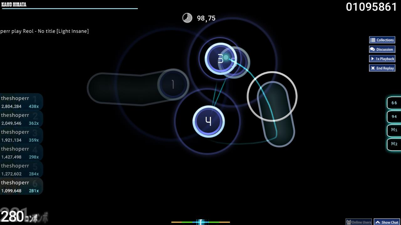
Gameplay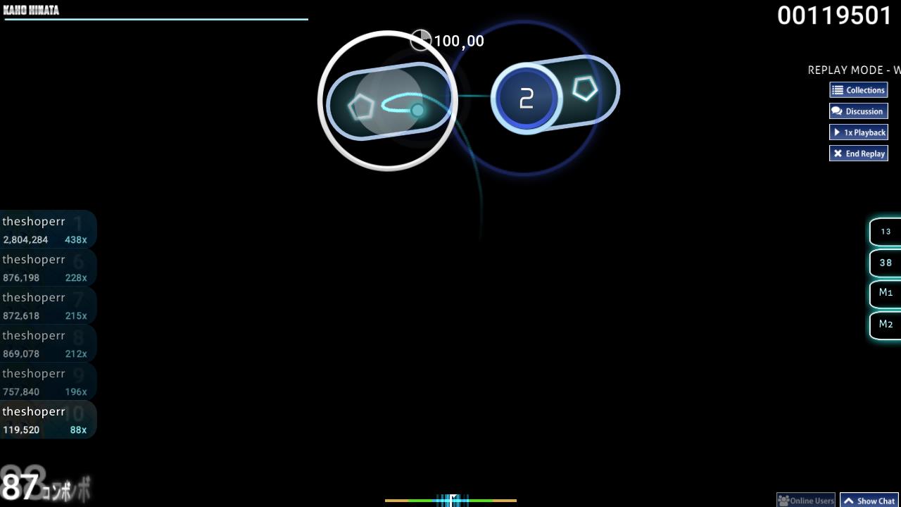 Rever arrow and slider
 Hitcircles
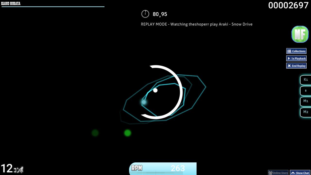 Spinner
UI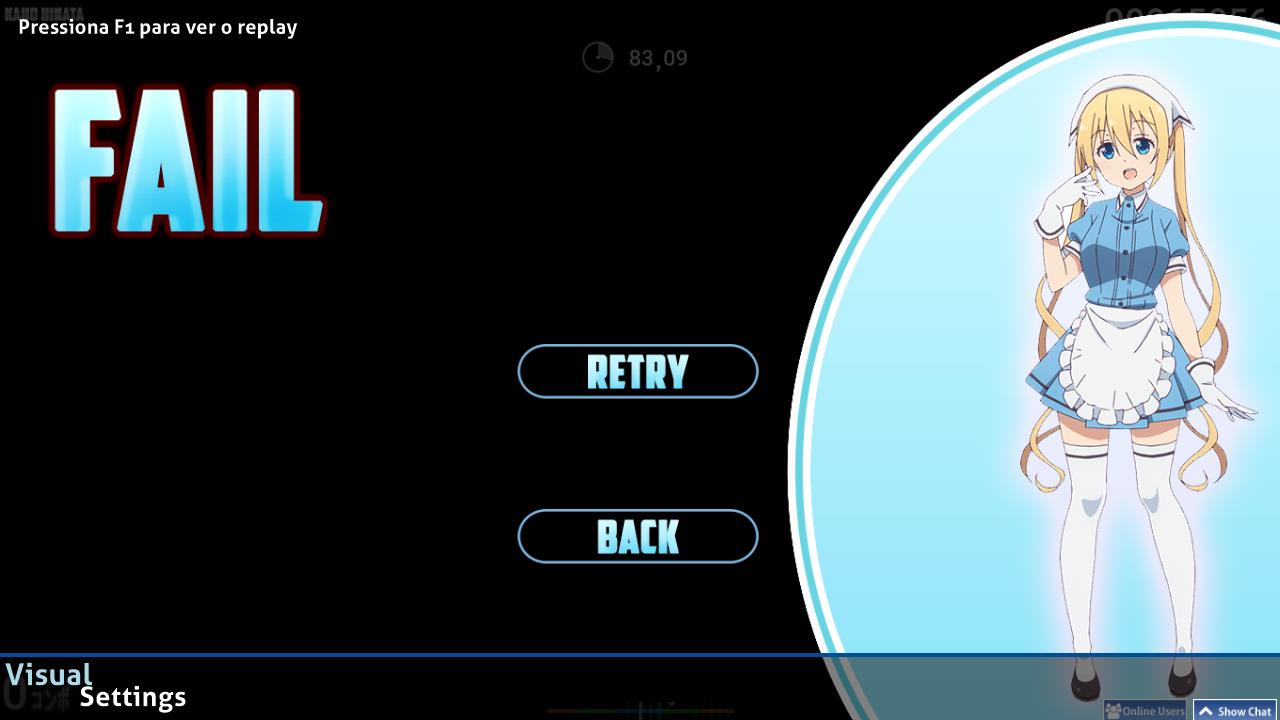 Fail screen
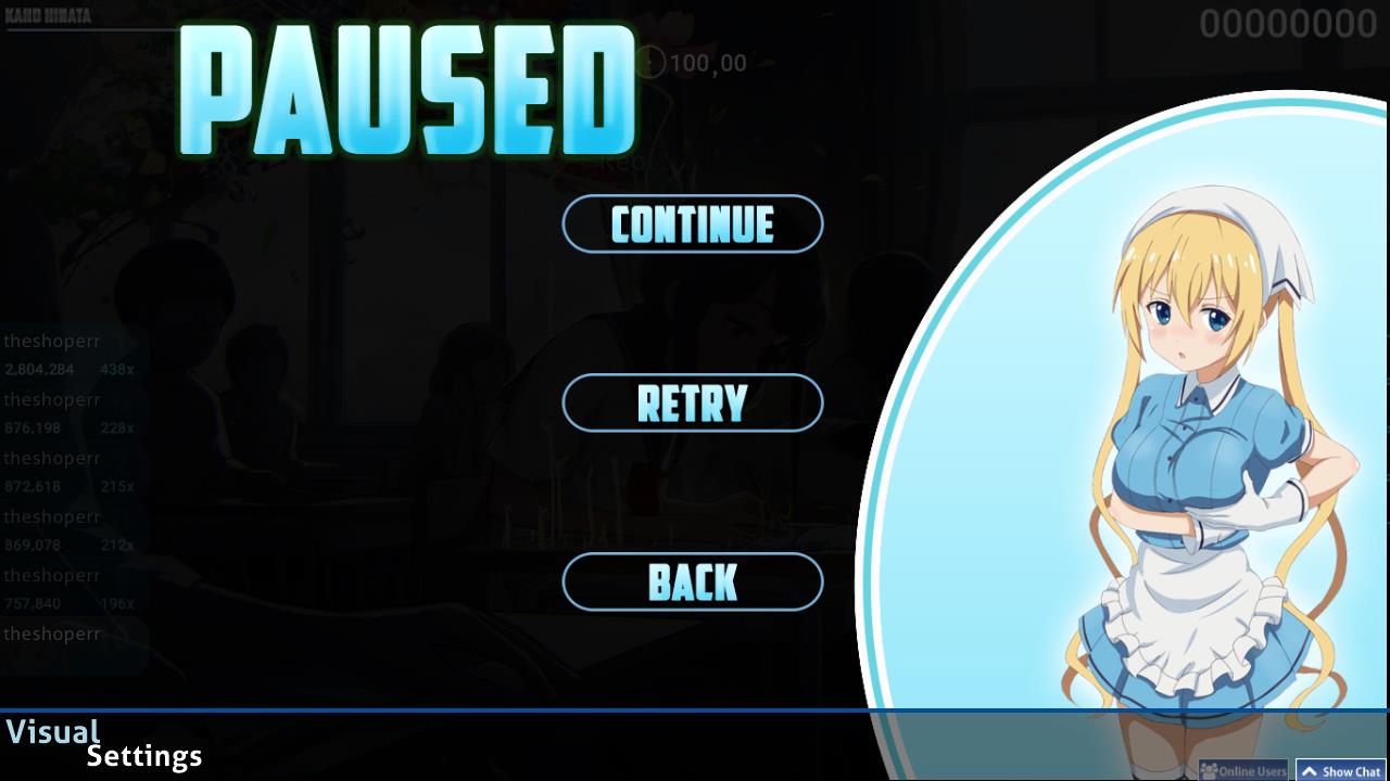 Pause screen
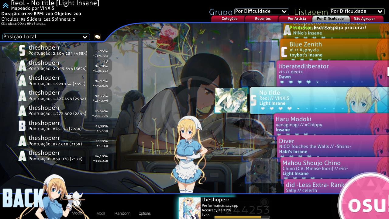 Songs menu
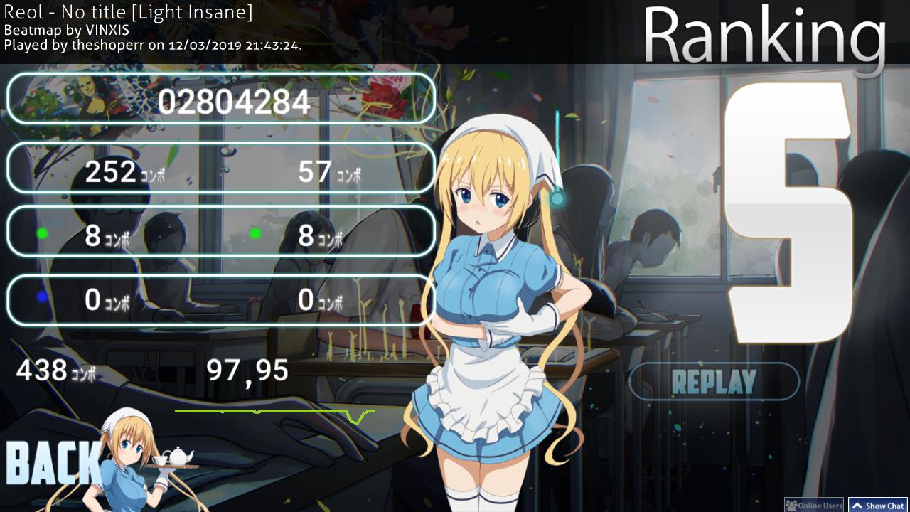 Ranking board
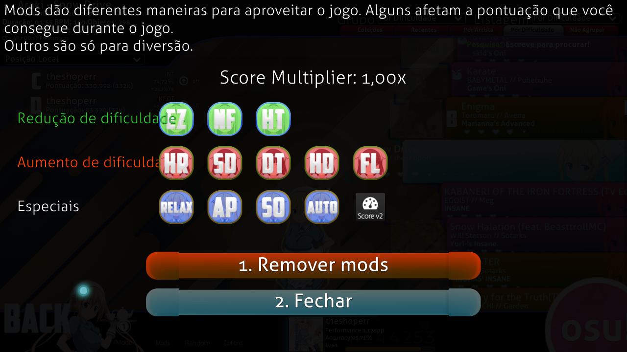 Mods selection
Gamanoid wrote:
Okay so here is a few remark of mine:
The skin looks pretty ok at first but the more i look it, more and more bad things i found.
-First, you use the same picture for a lot of elements, like: You used the same picture for the ranking panel, for the pause overlay, for the menu buttons, and for the selection mode.
-Second, the hitcircle looks a bit off for me, i dont know that its intended or not, i'm gonna mention it just in case: https://i.imgur.com/zxoCdtQ.png
-Third, the edges of the inputoverlay's glow is cut down, it looks a bit poor.
-The score-x is squeezed, it looks weird.
-The skip button is a bit low quality in resolution but it's not that bad.
-The miss is too small.
+1: I personally dont like the font, and it could be a lot nicer if you were using more fonts in my opinion, thats not really a criticism, its more like a personal preference.
But dont worry, there is a lot of things that i like:
-I absolutely LOVE the look of that hitcircle, well except for the problem i mentioned.
-I absolutely LOVE the Hitsounds, good choices.
-The cursor is dope.
-The general looks are ok.
I hope that this little rewiew help. All i can say after that, good work, but consider looking at those things that i mentioned in the first section. Keep up the good work, piece.
-Gamanoid