Just as peppy is sick of hearing the words "storyboard" and "toggle" next to each other in the same sentence, I too am sick of looking at and dealing with bad combo colors. Not just combo colors, but default combo colors. One of the many customizable features in osu! tends to be passed up for default colors or poor looking combo colors that only marginally match the background.
Combo colors are very easy to decide on, only taking 2 minutes to out of your day. But sometimes, an unfortunate event occurs where down the line one will decide that for some reason they just have to have a grey combo colors paired with bright green and red. Either that, or they just never decide on it because their mind is focused on more important matters., such as...timing. And everyone knows timing is the least important aspect of a map.
So I'm here today to show you your combo colors don't have to suck.
First off, and this should be obvious, your combo colors should match your background. And sometimes, these colors are basically provided for you. Provided these colors don't blend into your map, you can just extract these colors using Paint. This is pretty self explanatory (eyedropper in Paint, select a color, input RGB format into osu!) so if you know how to do that, go ahead and skip over this.
Let's assume this is our background, the background of Careful What You Pack by They Might Be Giants:
Other backgrounds won't be so easy with their colors, as these are flat colors, but we'll get to that later.
So open up an image editing program with an eyedropper tool (I don't know any that doesn't, so Paint will do just fine) and then open up your background. Take the eyedropper tool and pick a color from your background. With the color selected, go to edit your colors and bring up this menu:
osu! uses this exact menu for combo colors as in Paint, making our lives easier. Anyway, if you didn't already know, monitors handle colors differently than real life through RGB (Red Green Blue) format, and the easiest way to input colors into osu! is by typing in the RGB colors. You can also enter in the Hue, Sat and Lum. So, the color I selected (a reddish pink) has a RGB format of 255,153,151. So just bring up osu! and your combo colors and type in or copy/paste the data in the RGB boxes. The easiest way to do this is to just switch to Paint, copy, bring up osu! and paste. That was easy, right?
So we repeat this for however many colors we'd like, and we have our three colors:

And after inputting the RGB into osu!, we get these colors:
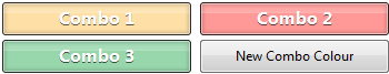

Looks good, right? HAHA! NOPE!
These colors are muted and boring in contrast to the very bright background! Let's take a look at the teal color...

You see how low the selection is placed and how dull it looks when you really take a look at it? Right! And the background looks so bright, correct?
The thing is, even when you select colors from the background, you usually don't want that exact color, even when the background isn't flat. You should move the selection around a bit and make it brighter, provided that it matches your background. Additionally, if your background is mostly made up of this color, it has a chance of blending in too much, and nobody wants that.
Generally, you should stay away from the bottom part of the selection with any color unless it's purposefully dull. Even for dark colors you should stay in this area, otherwise they'll still look dull. Use the bar on the right for darkness and lightness.

Muted, dull colors usually don't fit the map at all unless the background is dull and muted. For example, this background is the album art for The Spine by They Might Be Giants (in low-res form):


These were directly selected from the background, and then altered a bit. But they are dull, and match the background.
So in order to get our colors to match our background more and not blend in as much, all we need to do is brighten them.

Bam! Bright! Blue! It looks nice. Now let's do this to the rest.
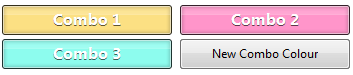
And our combo colors look nice and bright. Let's take a look at a ranked map with dull, boring colors in great contrast with the background. Here is the background for Electronic Boutique - Miles. It's a very wonderful backgroung with a palette of purples, blues and bright pinks. Mostly purples.
And while there's a video that doesn't have as much purple, it's an American tragedy that makes Hulk Hogan sob himself to sleep when we look at the combo colors, especially since not too many people bother with videos these days.


Ewww! They're so gross, man! A wonderful background with a very interesting, purple palette wasted on the combo colors. Do you see why it bothers me so much, enough to create a guide? So, that's why I'm here. Now, let's fix these boring combo colors. Using the same method of opening Paint, we extract the best colors from the background.
As a side note, this background has some jpg artifacts and is somewhat fuzzy, so make sure when you pick colors, you don't pick up any colors from the jpg artifacts

Okay let's just--HOLD DAT! Before we make these brighter, let's mix up the order. In-game, the combo colors would descend from brightest to darkest. Instead, we'll switch them up to have them alternating between lightest and darkest.

There! And now, let's make these look good. Here's our result:

Bada-boom! And finally, we enter the RGB data into osu!, with the old combo colors below it for comparison!


WHOA SON!!! Your combo colors suddenly don't suck and the world is a happier place.
BUT WAIT yes there's more i have a lot to talk about alright WHAT IF THE COLORS AREN'T PROVIDED FOR YOU IN THE BACKGROUND OR IT'S ALL JUST ONE COLOR!? OR YOU DON'T FEEL LIKE THE COLORS SHOULD MATCH THE BACKGROUND EXACTLY?!
That just means you've got to be creative. Now, usually, you would have to understand color theory and the color wheel in order to create a good set of combo colors without the help of selecting them from your background. But the internet is awesome and it'll do all that for you without spending thousands of dollars in an Design major!
Presenting the Color Scheme Designer! With just a few settings, this can set a super good looking set of colors for you in no time. Here's an example:

In order to input these into osu!, just take a screenshot or puush the selection, and then do the same eyedropping method. And you've got a sweet looking color scheme for your combos!
The best selections for combo colors are Tetrad and Analogic.
There's not much to explain here, because you can just experiment yourself. But make sure you keep them close to your background in terms of contrast and complimenting.
Aaaand, that's it I guess. It seems like a pretty simple thing to create a guide about, but I've seen so many maps with poor combo colors, I suppose everyone just needed some guidance. I hope combo colors improve through this guide, and more importantly I hope I don't have to keep fixing combo colors for everyone who posts in my queue!
Addendum: Make sure your hitcircle and approachcircle's color do not blend in with the background! It shouldn't unless you're directly extracting the colors from the background with no changes. If you have a black background, don't use black colors! And everything to that effect. Your colors should be readable, but also look good!
Combo colors are very easy to decide on, only taking 2 minutes to out of your day. But sometimes, an unfortunate event occurs where down the line one will decide that for some reason they just have to have a grey combo colors paired with bright green and red. Either that, or they just never decide on it because their mind is focused on more important matters., such as...timing. And everyone knows timing is the least important aspect of a map.
So I'm here today to show you your combo colors don't have to suck.
First off, and this should be obvious, your combo colors should match your background. And sometimes, these colors are basically provided for you. Provided these colors don't blend into your map, you can just extract these colors using Paint. This is pretty self explanatory (eyedropper in Paint, select a color, input RGB format into osu!) so if you know how to do that, go ahead and skip over this.
Let's assume this is our background, the background of Careful What You Pack by They Might Be Giants:
Other backgrounds won't be so easy with their colors, as these are flat colors, but we'll get to that later.
So open up an image editing program with an eyedropper tool (I don't know any that doesn't, so Paint will do just fine) and then open up your background. Take the eyedropper tool and pick a color from your background. With the color selected, go to edit your colors and bring up this menu:
osu! uses this exact menu for combo colors as in Paint, making our lives easier. Anyway, if you didn't already know, monitors handle colors differently than real life through RGB (Red Green Blue) format, and the easiest way to input colors into osu! is by typing in the RGB colors. You can also enter in the Hue, Sat and Lum. So, the color I selected (a reddish pink) has a RGB format of 255,153,151. So just bring up osu! and your combo colors and type in or copy/paste the data in the RGB boxes. The easiest way to do this is to just switch to Paint, copy, bring up osu! and paste. That was easy, right?
So we repeat this for however many colors we'd like, and we have our three colors:
And after inputting the RGB into osu!, we get these colors:
Looks good, right? HAHA! NOPE!
These colors are muted and boring in contrast to the very bright background! Let's take a look at the teal color...
You see how low the selection is placed and how dull it looks when you really take a look at it? Right! And the background looks so bright, correct?
The thing is, even when you select colors from the background, you usually don't want that exact color, even when the background isn't flat. You should move the selection around a bit and make it brighter, provided that it matches your background. Additionally, if your background is mostly made up of this color, it has a chance of blending in too much, and nobody wants that.
Generally, you should stay away from the bottom part of the selection with any color unless it's purposefully dull. Even for dark colors you should stay in this area, otherwise they'll still look dull. Use the bar on the right for darkness and lightness.
Muted, dull colors usually don't fit the map at all unless the background is dull and muted. For example, this background is the album art for The Spine by They Might Be Giants (in low-res form):
These were directly selected from the background, and then altered a bit. But they are dull, and match the background.
So in order to get our colors to match our background more and not blend in as much, all we need to do is brighten them.
Bam! Bright! Blue! It looks nice. Now let's do this to the rest.
And our combo colors look nice and bright. Let's take a look at a ranked map with dull, boring colors in great contrast with the background. Here is the background for Electronic Boutique - Miles. It's a very wonderful backgroung with a palette of purples, blues and bright pinks. Mostly purples.
And while there's a video that doesn't have as much purple, it's an American tragedy that makes Hulk Hogan sob himself to sleep when we look at the combo colors, especially since not too many people bother with videos these days.
Ewww! They're so gross, man! A wonderful background with a very interesting, purple palette wasted on the combo colors. Do you see why it bothers me so much, enough to create a guide? So, that's why I'm here. Now, let's fix these boring combo colors. Using the same method of opening Paint, we extract the best colors from the background.
As a side note, this background has some jpg artifacts and is somewhat fuzzy, so make sure when you pick colors, you don't pick up any colors from the jpg artifacts
Okay let's just--HOLD DAT! Before we make these brighter, let's mix up the order. In-game, the combo colors would descend from brightest to darkest. Instead, we'll switch them up to have them alternating between lightest and darkest.
There! And now, let's make these look good. Here's our result:
Bada-boom! And finally, we enter the RGB data into osu!, with the old combo colors below it for comparison!
WHOA SON!!! Your combo colors suddenly don't suck and the world is a happier place.
BUT WAIT yes there's more i have a lot to talk about alright WHAT IF THE COLORS AREN'T PROVIDED FOR YOU IN THE BACKGROUND OR IT'S ALL JUST ONE COLOR!? OR YOU DON'T FEEL LIKE THE COLORS SHOULD MATCH THE BACKGROUND EXACTLY?!
That just means you've got to be creative. Now, usually, you would have to understand color theory and the color wheel in order to create a good set of combo colors without the help of selecting them from your background. But the internet is awesome and it'll do all that for you without spending thousands of dollars in an Design major!
Presenting the Color Scheme Designer! With just a few settings, this can set a super good looking set of colors for you in no time. Here's an example:
In order to input these into osu!, just take a screenshot or puush the selection, and then do the same eyedropping method. And you've got a sweet looking color scheme for your combos!
The best selections for combo colors are Tetrad and Analogic.
There's not much to explain here, because you can just experiment yourself. But make sure you keep them close to your background in terms of contrast and complimenting.
Aaaand, that's it I guess. It seems like a pretty simple thing to create a guide about, but I've seen so many maps with poor combo colors, I suppose everyone just needed some guidance. I hope combo colors improve through this guide, and more importantly I hope I don't have to keep fixing combo colors for everyone who posts in my queue!
Addendum: Make sure your hitcircle and approachcircle's color do not blend in with the background! It shouldn't unless you're directly extracting the colors from the background with no changes. If you have a black background, don't use black colors! And everything to that effect. Your colors should be readable, but also look good!
