forum

Yoshino Nanjo - Kimi ga Emu Yuugure

posted
Total Posts
10
Topic Starter
allein
This map has been deleted on the request of its creator. It is no longer available.
LowAccuracySS
hey :b: here's ur BONELESS mod as requested !!!!!!!!
attempting a new style that goes crazy in depth !!!!!!!

NOT DONE, I'M JUST TAKING A BREAK

KEY (Does not apply to song setup):
= Unrankable. Change required.
= Questionable/Needs more reasoning.
= Could be executed better with a reason as to why.
= General suggestion in the specified category.
or = Very minor suggestion/Praise depending on what I'm pointing out.

[ Song Setup]
  1. Metadata
    1. Metadata looks fine from the artist's official discography page. I would just add the tags "KOTOKO" and "Iuchi Maiko".
  2. Difficulty Settings
    1. Insane
      1. HP Drain Rate: There is such a small difference between the HP setting in both difficulties, but I think that 5 or 5.5 (or a little less than bearizm's diff) would be fitting due to the low bpm of the map.
      2. Circle Size: No issues here.
      3. Approach Rate: As I stated in Bearizm's diff, I believe that AR 8.5 would fit much better as the map is only 83 bpm.
      4. Overall Difficulty: omg 69 dont you get it Lol XD??? Jokes aside, just set OD to 7 because it makes little to no difference
    2. Bearizm's Wish
      1. HP Drain Rate: It's okay, but I personally think that 5 or 5.5 would fit better due to the low bpm of the song.
      2. Circle Size: No complaints here, 4.2 is perfectly fine as it makes such a small difference from 4 that I could care less :^)
      3. Approach Rate: Again, due to the low bpm of the song, I think that 8.5 is more fitting.
      4. Overall Difficulty: No complaints. If you wanted a very slight nerf I would recommend 7.5 or 7 but it's fine as is from my view.
  3. Combo Colors
    1. In my opinion, colors are fine except for color 3 which I think could be changed to 190, 0, 190 to have better contrast with the rest of the colors.
  4. Design and Advanced Tabs
    1. Disable Widescreen Support on Insane.
  5. Map Files
    1. Doing fine here as well from what I can see, other than the fact that several of the default hitsounds are included in the folder, which is weird as these hitsounds already exist within osu! and can just be used instead. Deleting these will decrease file size and get rid of unnecessary hitsounds.
    2. I would recommend finding a higher quality image for your background as the current size (1366x768) and quality (jpg) make the background look grainy.
[ Insane]
  1. Playibility
    Playibility is self-explanatory, the points in this section focus on how the map plays rather than focusing on aesthetic issues. Since playibility is quite subjective, please take that into consideration.


    • // 00:10:896 (1) - I think the movement between (1, 2, 3) would be much smoother if this slider was ctrl+j'd.
      // 00:15:956 (6,7) - (6) is facing away from (7), making the movement from the sliderend of (6) to (7) awkward.
      // 00:16:679 (1,2) - (1) is distanced an insane amount when you consider the the jumps before and after this pattern. (6) to (7) is awkward, but it doesn't have nearly as much spacing, and (2) to (3) is also much lower. In other words, this spacing is just abrupt and will throw people off because it's used only that one time in that section of music.
      // No time defined - Following my point above, the jump distance between some of these are made even more awkward due to the quite low slider velocity that is present. The player will move slowly on the sliders and then be expected to gain speed for the jumps, which can be quite weird to play.
      // 00:38:366 (3,4) - You were normally using this kind of spacing for 1/2 patterns, so using 1/2 spacing for a 1/4 jump is going to throw someone off.
      // 01:12:703 (4) - I think that you could change the slider so that there's a more circular movement between (3, 4, 5).
      // 01:17:221 (4) - I feel as though this is normally just too spaced out. I believe it would play better if (4) was stacked on the sliderend of (2), which makes it look clean and still emphasizes (1).
      // 01:18:305 (4) - While this could be identified as an aesthetic issue, I feel like snapping (4) to the same coordinates as 01:19:751 (1) would look really nice and play good as well. Keep in mind I highly recommend following the aesthetic suggestion at 01:17:763 (2) - for it to look optimal :)
      // 01:33:305 (1) - The current movement from (5) to (1) is quite weird, and moving to (2) is even worse. I think this slider should be ctrl+g'd and ctrl+h'd so it plays better throughout. If you want to, you can also stack (2) on the sliderhead of (3). Here's an image in-case I didn't explain myself well: https://osu.ppy.sh/ss/8893668
      // 01:48:667 (5,6,7) - This should probably go into rhythm but this also has to do with playibility so I'll put it here. This part feels overmapped. (5) doesn't have any beat assigned to it, (6) has ridiculous spacing for an insane and (7) just plays better being stack on top of (1).
      // 02:16:317 (2,3,4,5) - This part plays well, but I think it would be worth having a gradual space increase from (2) to (5) to represent the increasing vocals. Something like this works well: https://osu.ppy.sh/ss/8893830
      // 02:39:089 (2) - It's kind of awkward to keep moving down even after the slider moved down, so I recommend putting the circle right after the sliderend :^)
      // 02:49:932 (1) - I believe stacking on (8) and/or turning (1) into a slider would emphasize the sustained guitar sound better.
      // 02:53:546 (4) - stack onto the sliderend of (1)? this makes it a nice triangle and has circular flow for the pattern (2, 3, 4, 5)
      // 03:04:751 (2,3,4,5) - Technically it belongs in aesthetics but this: https://osu.ppy.sh/ss/8894121
      // 03:30:233 (4) -Alll of the sounds here are the same intensity, so they should have the same spacing. I would stack (2) and (4) on the slider (1).
      // 03:47:763 (1,2,1,2,1,2,1,2) - Such a simplistic pattern, yet it represents the music very well. Great job!
      // 04:05:474 (2,3,4,5,6,7) - a hexagon pattern like this plays well imo: https://osu.ppy.sh/ss/8894201
  2. Rhythm
    Rhythm (pertaining to osu!) is the arrangement of circles and sliders in a difficulty. This section focuses on that and how it could be improved.
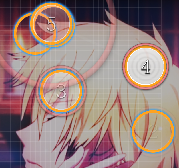
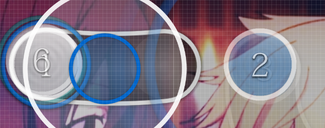
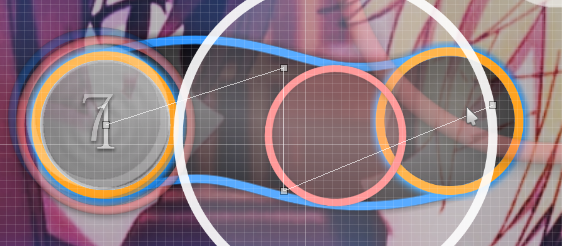

    • // 00:09:269 (4,1) - I don't agree with how this is currently because (1) is not nearly as intense as the circle before it. I would make (4) a slider instead.
      // 00:16:679 (1,2) - Wouldn't it be better if (2) started on the white tick? Just remove 1 and in my opinion it plays much better.
      // 00:20:655 (4,5) - (5) is mapped to a very weak sound/no sound. You could change (4) into a slider to represent the guitar sound though. Something like this represents the music better (checked without hitsounds and 25%) https://osu.ppy.sh/ss/8894982
      // 00:33:848 (5) - Mapped to no sound or am I going deaf? lol
      // 00:45:414 (2) - Shouldn't the slider start here instead, as the sustained vocal starts there
      // 01:09:992 (2,1) - If you're following the background drums, (2) should be the start of the slider
      // 01:34:209 (4) - Mapped to nothing?
      // 01:48:667 (5,6,7) - As mentioned in the previous suggestion, this feels off. I would extend slider (4) to the blue tick and then move the circles according to the previous suggestion.
      // 02:17:763 (6) - I would replace this with a singular hitcircle stacked on (1) and move (1) back to the blue tick (while also extending it back to the white tick) so it follows the vocals better.
      // 02:40:896 (6) - Shouldn't the slider start at the blue tick? This is very similar to the point at 00:45:414 (2) .
      // 03:20:836 (6) - Mapped to nothing?
      // 03:43:968 (1) - Mapped to nothing?
      // 03:50:655 (1) - You might want to move the red anchor back more so it changes direction exactly on the white tick.
  3. Aesthetics
    Aesthetics are the visual aspects of a map- such as slider shapes and blankets. All of these points are subjective, and should be treated as such. This section is image heavy, as pictures explain my point much better.


    • // 00:09:269 (4) - I feel like (4) would look better if the direction of the slider kept moving with the hit circle. Since my wording is terrible, a picture: http://i.imgur.com/JAc8HrS.png
      // 00:14:510 (3,4) - Since (3) and (4) go together, what about curving (3) so it looks a bit more like (4)?
      // 00:23:185 (1) - This is probably a stupid suggestion but why not put (1) in the center of the screen?
      // 00:30:100 - I would ctrl+h this slider to blanket (3) and move better to (1).
      // 00:35:113 (2,3,4,5) - This pattern can be cleaned up by making it more rectangular shaped or by doing something like this (2- x499 y208, 3- x353 y144, 4- x487 y105, 5- x337 y37)
      // 00:41:076 (3) - I understand this is really nazi but it really annoys me how the angle of (1) and the red anchor's angle on (3) are not the same lol
      // 00:42:703 (1) - Why is that last red anchor pointed up? It makes the slider look weird
      // 00:54:992 (3) - If you angle this slider the same angle as (2) it makes the movement to (4, 5) better and makes the slider not look like it's going offscreen :^)
      // 01:09:992 (2) - Why not place this on the sliderend of (1), like you did at 01:08:727 (1,2) ?
      // 01:17:763 (2) - I would angle (2) so that (5) blankets it, making for good flow from (1) to (2) and allowing the playibility suggestion at 01:18:305 (4) to work quite well.
      // 01:22:643 (1) - Wouldn't it just be easier and better to snap this to the sliderend of the blue combo's (2)?
      // 01:30:233 (5) - I'd just make this a line with (3, 4, 5) lol
      // 01:40:354 (4) - You could use (1) to blanket this circle imo
      // 01:40:534 (1) - you could blanket (3) with this slider, which also has better movement to (2).
      // 01:43:968 (2,3,4,5) - http://i.imgur.com/TORmhKp.jpg
      // 01:46:317 (1) - Dunno why (1) is so far right, you could make it like a line: http://i.imgur.com/dzKwYDZ.png
      // 01:48:125 (3) - x288 y227
      // 01:55:715 (3) - You could snap (3) to the sliderend of (1) and have it move better to (4)
      // 01:56:076 (4) - Same point as 00:42:703 (1)
      // 01:57:884 (1) - I personally think this slightly curved slider(tm) would be better if it was bulit from a straight slider (e.g. this instead).
      // 02:00:775 (1) - Fixed it for you
      // 02:03:125 (7) - Placing (7) at x272 y285 makes the jumps from (6)->(7) have the same kind of feel (both circles would be bit off from the sliderhead/sliderend).
      // 02:13:787 (3,4) - You could make the end part of the red anchor straight and then have (4) go right after it. http://i.imgur.com/3jAG98d.png
      // 02:17:763 (6) - This point is similar to 00:41:076 (3) but why not just angle (6) the same as the first part of (1)?
      // 02:19:209 (2) - same point as 02:00:775 (1)
      // 02:30:233 (2,3,4,5,6,7) - hexgrid this you normie REEEE (2 and 3- x297 y19, 4- x451 y105, 5- x304 y193, 6- x392 y21, 7- x348 y107)
      // 02:39:631 (4) - Curve the other way so it blankets (2)?
      // 02:58:607 (1) - I feel like it would be better to curve the slider the other way because there is a big jump from (2)->(3).
      // 03:04:209 (5) - Stack onto the end of (4) because where it is currently has an ugly, very slight overlap?
      // 03:05:474 (6) - If you move this up and over a little bit, it'll look more like a star pattern :^)
      // 03:07:281 (1) - Rotate 15 degrees so it blankets (2)?
      // 03:15:776 (4) - Very similar point to 01:40:354 (4).
      // 03:21:739 (1) - Move up a little so it has equal spacing to (3) and (4)?
      // 03:40:173 (3) - Make perfect triangles normie REEEEEEEEEEE (3- x250 y51, then redo the rotate)
      // 03:47:040 (9) - Rotate 15 degrees counterclockwise and increase the curvature to blanket (10, 11).
      // 04:16:499 (4) - Similar suggestion to 01:40:354 (4).
      // 04:26:980 (1,2,3) - Make perfect triangles normie REEEEEEEEEEE (2- x223 y110, 3- x36 y88).
      // 04:43:787 (2) - Same suggestion as 00:42:703 (1)
      // 04:46:679 (2) - Blanket (1)

TOTAL MOD TIME: 12+ hours
Ethan
^ space for bn 2018
Topic Starter
allein

Ethan wrote:

^ space for bn 2018
I agree!
Mir

boy i like playing "find the mod point!"
Renumi
a+ formatting
lcfc
ok what the fuck
Ancelysia
jesus christ Space.. and all of that for one kudosu
Topic Starter
allein

[ Space ] wrote:

Rhythm


  • // 02:40:896 (6) - Shouldn't the slider start at the blue tick? This is very similar to the point at 00:45:414 (2) . this point has more intensity than first vocal only one, i'd prefer to follow background instruments here too
    // 03:20:836 (6) - Mapped to nothing? background guitar sound

Aesthetics


  • // 02:19:209 (2) - same point as 02:00:775 (1) symmetry b
TOTAL MOD TIME: 12+ hours
HHHHHHHHHHHHHHHHHHHHHHHHHHHHHHH wtf is that wallmod thanks

also please stop shitposting and lets return to map discussion
LowAccuracySS

InternalLight wrote:

please stop shitposting and lets return to map discussion
BanchoBot
This modding thread has been migrated to the new "modding discussions" system. Please make sure to re-post any existing (and unresolved) efforts to the new system as required.
Please sign in to reply.

New reply