Mirrukyun~!
Thank you Mir and keep up the good work! Mirrukyun~ wrote:
Hi, I'm going to outline a couple of the issues I have with the topdiff in terms of its overall symmetry concept. The jist of it is the symmetry forces random high-spacing jumps on unemphatic notes inconsistently. There's also the fact that the majority of the map is just way too high spacing in places that it ruins any sort of contrast you could make between the kiai and the non-kiai parts. Hi, so we've talked a bit on Discord and you already know my thoughts as to why I disagree with all of these but I'll relay them on forum because you spent the time to do it here too. First, I'll preface most of these arguments with a classic definition of emphasis faking despite it not being my sole argument for a lot of things:"The core of emphasis faking lies in using synergistic mapping techniques to augment the implementation of the map as it relates to the song.
At its most quintessential, we can see that the goal of emphasis faking is to holistically create artificial "highs" and "lows" insofar as to make the player feel that a repetitive part of the song is still variable rather than remaining in its fundamental, monotonous state.
As you very well know already, symmetry is the core concept of this map and it's virtually impossible to achieve proper emphasis when using this concept.
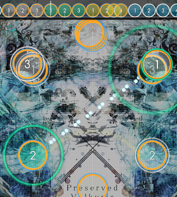
The Entrance to Valhalla
00:04:953 (1,2) - The song barely started and you already have a half-screen jump. It's a bit excessive I think lol, especially considering 00:07:856 (2,3) - has the same sound on it yet you don't go for this kind of spacing here. It would make sense to, but I would advise against it. I think nerfing these double-jump things would be the best course of action. Overall though, the intro just seems way too much. I don't believe you're seeing this eye-to-eye with me because the first two objects you pointed out are clear isolated beats compared to the latter. In addition, the latter you mentioned does have about a half-jump spacing (with added slider-leniency) so I'm not sure what you're trying to get at here. Yes, the map has only started but I find it important to lay out a foundation for the kind of spacing that will be reflected later in the song but in its' impending increase of density.
00:19:953 (1,2,3,4,5,6,7,8,9,10,11,12,13,14,15) - This is extremely hard to read considering the majority of the intro has utilized this spacing for streams only half of the speed. It's basically asking to be missed on the first runthrough and if you're not paying attention you'll miss it and die instantly. The spacing of this anyways is too high for the song I think, since it's only the intro and while I understand the sound is quite intense, in context the rhythm density itself is enough emphasis, so putting spacing on top of that seems excessive. With the kind of variable spaced streams I have in the beginning sections, whether this is low DS or high DS will always be hard to read because of the different snap. So I opted to the kind of DS I felt comfortable using for this. Also, looking at first-run tries is not a good argument since people who are not familiar with the song beforehand will usually have difficulty. Considering how this is an 8.3* map, it's naturally going to be difficult in multiple aspects...
00:43:824 (1,2,3,4,5,6,7,1,2,3,4,5,6,7) - The piano is getting softer and lower yet your spacing increases. This doesn't really make sense to represent what the song is doing and I suggest you change it to be the opposite way. I can agree with this, but I'll also disagree with it. There are two ways to look at this: ending period dramatically or ending it passively. Both work because it's the end of the period and there's a rhythmic gap to separate what happened beforehand. I decided to make the spacing bigger cuz that's just something I like to do, end phrases or periods with small spikes and then restart the highs/lows on the new phrase or period. Not to mention for this particular stream, the piano ends on a high note so... I believe it reinforces my idea to end it with higher spacing too. I'm sure lowering spacing gradually also works but my idea is also valid.
00:48:616 (2,3,1,2) - This is one of many examples here where the spacing is higher than it really needs to be and the angle that it produces is extremely uncomfortable due to how wide it is. At this BPM sharp angles play the best, and you do utilize those sharp angles, but the sudden switch to wide angle right afterwards is very difficult to hit properly and feels extremely awkward in game. This is the most obvious recurring theme that happens in the map and as to not repeat myself dozens of times I'm just going to say that the spacing is not a real emphasis and that patterns are to be seen individually rather than to compliment each other through general spacing principles.
00:50:934 (3,1) - Another very emphasized jump, but really the song is doing nothing different than 00:48:752 (3,1) - which was much less emphasis. The angle here is even harder if you consider how the player has to move from a wide angle to the right all the way to a sharp angle into the left of the screen. Naturally this is very taxing on the player and for a part not as intense as the kiai it doesn't seem very fitting. It's not a real emphasis. To reiterate, the patterns are meant to be played as one after the other without much connection between NC's (that's why they are NC's afterall).
00:52:434 (1,2,3,1,2,3,1,2,3,1,2,3) - Here the spacing increases substantially despite the song being exactly the same as 00:48:616 (2,3,1,2) - and seems a little bit overemphasizing the same thing and inconsistent with itself at that. This goes back to what I previously stated with my idea for building-up. The song is more/less the same but to keep the map moving and feel like the player is going along with the song, the spacing will gradually increase until it hits it's peak and then the highs/lows reset.
00:57:480 (4,1) - There's so much spacing here and the actual interesting part of the song barely even started. It's also comparable to spacing you use in the kiai at 01:51:343 (1,2,3,1,2,3,1,2,3) - which kind of ruins any contrast the kiai would otherwise give this part. I think in general your non-kiai parts are extremely spaced, adversely affecting how much contrast you can give to the actual kiai. Some more examples of places like this:
01:00:616 (1,2,1,2) -
01:03:343 (1,2) -
01:02:116 (2,3,1) - If I really wanted to, I could just make this a kiai section since it is the base melody for the kiai moments that are included in the map already. I didn't want to make this as a kiai tho because it's not as powerful with jumps as the later parts. What makes this section weaker is how simple the patterns are and how friendly the sliders are to each other. Compared to the later kiais, there is contrast because of higher density of circles and more complicated patterns. The direct symmetry here is not hard to understand than the later parts.
Your piano part also has inconsistent emphasis that should be addressed:
01:11:116 (1,2) - 01:08:525 (1,2) - and 01:12:343 (3,4) -
01:09:480 (1,2,3) - and 01:12:071 (1,2,3) -
01:13:298 (3,4,5) - Same spacing as 01:09:480 (1,2,3) - but compare how soft the 1:13 is. Compare 01:14:934 (1,2,3,1) - as well of which the latter 1 is extremely hard to hit with the angle and the spacing seems a bit much too.
01:15:343 (1,2,3,4) - with 01:14:252 (1,2,1,2) - compare how you angled and NC'd this. The base piano you're following has the same rhythm, but the higher pitch piano is the only difference. I would recommend this instead.
01:16:434 (1,2,1,2) -01:17:116 (1,2,1,2) - and 01:14:252 (1,2,1,2) -
01:18:071 (1,2,3,4) - and 01:18:616 (1,2,3,4,5) - should have similar spacing since their intensity is similar. I looked through all of these and I'm really not sure you're understanding the mapping tbh... You're absolutely trying to nitpick volumes and pitches and keys and as I mapped this, I figured that that would be overly complicated to match with the map. I'd rather have something more simplified and clean to look/play rather than trying to be 1:1 accurate with the song's tone and pitches because frankly, it goes all over the place here. What I do consistently however is isolate the obvious high notes with an antijump 1/2 and separate the basses from the trebles in terms of NCs.
01:19:298 (6) - Is overmapped, would replace the whole pattern with a pentagon rather than a hexagon here to compensate for its removal? It's part of the sheet music.
01:19:843 (1,2,3,1,2,3) - Pitch is decreasing here but spacing is increasing? Seems backwards like that stream in the intro climax. This isn't inherently wrong either as I mentioned before with the stream section.
01:25:161 (1,2,3) - This angle plays so badly, like the implied movement here is so crass, and would play a lot nicer if you didn't blanket 1,2 or did something like 01:29:525 (1,2) - instead. Possible, I chose not to however.
01:25:571 (3,4,1,2,1,2,3) - I don't really agree with having this much spacing for these notes and the same spacing for 01:27:343 (1,2,3,4,1,2,3,4) - which is a lot stronger. I get it's more circles but the movement amount is the same. I would suggest nerfing the first set so the jumps stand out more. You understand that it's more circles and that's the exact intention I bring. What you suggest is either nerf the first or buff the latter but the third option of higher density is contrast enough. It's also a bit more complicated to play and it does stand out visually more than the first.
01:28:298 (4,5) - Related to the above, if you want to follow the melody here a slider on 4 would be optimal since the song's melody stops on that and starts on 01:28:571 (1) - again which would reinforce your rhythm more than if you slapped a note on 01:28:434. Seems unnecessary to have something there.
01:29:934 (3,1) - Similarly to the above, you could have a slider here instead to put more contrast on the triple 01:30:207 (2,3,4) - (which honestly should be way more spaced than it is) and follow the melody more succinctly. I showed this to you and one other before but here is the section of the sheet music that helps me define how this jump pattern is to be played out rhythmically
01:31:161 (1,2,3,4,5,6,7,8) - I don't really know why this gets so much spacing yet 01:34:980 (1,2,3,4,5,6,7,8) - gets nowhere near as much despite being similar in intensity and even higher in pitch. The former you pointed out leads into a stronger period (thats why its higher spacing) where the latter leads into a weaker period (that's why it's a bit lower spacing). Despite their pitches, their place in the music is reflects their intention for how they're mapped with the rest of what's next to come in the song.
01:46:434 (1,2,1,2) - 01:44:252 (1,2,1,2) - Literally cross screen jumps mapped to what exactly? The piano is low pitched, tense, not highly active here. Spacing like 01:43:707 (1,2,3,4) - is way more reasonable. Then you look at 01:49:161 (1,2,3,1,2,3) - which is way more intense and doesn't have so much spacing, coupled with 01:50:798 (1,2,1,2) - which is more intense yet has the same spacing. Your contrast all over is just dead, there's no contrast at all. Everything feels the same intensity and the song has so much dynamic that isn't being expressed. It's the same build-up theme thing I did all throughout the map with just about everything else you've pointed out. It's okay to keep everything spaced the same if the music is all the same but it's also more exciting and convey visual movement if I artificially create the concept of rising points and climaxes which is what this entire map is all about.
01:52:980 (1,2,1,2) - This isn't consistent with what you did above with 01:50:798 (1,2,1,2) - so.. and neither is 01:55:161 (1,2,1,2) - in terms of movement. I'm not really looking for movement here, so much as patterns
01:56:934 (1,2,3,4,5,6,7) - Here, the only place where you actually have some contrast, it turns out to be a bit too much contrast. The song doesn't suddenly drop in intensity like the pattern here implies, but rather it slowly decreases. Something that decreases in intensity more gradually may fit more here. This idea is possible too but I chose not to, the song doesn't end on a high note so that's why all this spacing ends lower. If I ended it higher like some people mentioned, it would be jarring to the last slider since it feels too sudden.
01:57:889 (1,2,3,4) - With the lack of 1/3 in the last kiai I think having a slider here or something would be nice, or space it significantly more.No


