forum

angela - Zenryoku*Summer! TV Size

posted
Total Posts
84
show more
Topic Starter
MeAqua tete

fufu- wrote:

you seem very new to mapping! i cant point out all of your maps flaws, that would take way too long for a 56 second song. but i want to help as much as possible!
check out pishifat's youtube channel. he has tons of videos about popular mapping concepts and how to make your map high quality and fun to playuseful videos seems to me,thanks a lot! :)
i highly recommend watching most of his videos!
regardless of your ability, here is my mod (sorry its so short!)

i like the background which is why im modding this :Dbg problem has been fixed,i'm just looking for a better bg and then... :(

insane
00:02:154 (5,1) place 1 under 5 and move 2 closer to it. the way it is now confuses players on its timing

00:09:179 (6,7,8,9,10) move them farther away

00:12:787 (9) delete this note, no sound here

00:29:109 (6) place 6 higher up, and then make 7 angle down. like this

00:36:514 (3) place it lower or people confuse it and 4 as a double

00:47:906 (8) place 8 over the 3 that came before it

00:53:982 (11) delete note, no sound here

overall
you have potential, but your map needs lots of work before we can talk about ranking it. good luck in the future! try to work on aesthetics, youre mostly lacking there

hope you meet your goals!
All accepted,thanks a lot! :)
Mashed
[General]
You should add any GD names to the tag such as Vanilla Vat

[Easy]
00:11:457 (3,4) - These sliders shapes are not consistent
00:11:457 (3,4) - Positioning looks strange

[Normal]
00:40:312 (3,4) - This circle and slider just doesn't look straight and bugs me :?
00:46:198 (2,3,4) - Spacing
00:47:907 (6) - Move this circle closer to the left

[Insane]
00:05:665 (4,5) - Spacing just doesn't look right
00:08:229 (6) - Move slider a bit to left + up
00:37:843 (7) - Positioning is off
00:38:033 (1) - NC

[vat's Insane]
00:02:343 (3,4) - This positioning looks weird
00:03:102 (5) - Move this slider closer to the circles
00:42:305 (2,3) - More strange positioning
Topic Starter
MeAqua tete
Mashed's Mod

Mashed wrote:

[General]
You should add any GD names to the tag such as Vanilla Vatonly 1 gd from vanilla vat

[Easy]
00:11:457 (3,4) - These sliders shapes are not consistent
00:11:457 (3,4) - Positioning looks strange

[Normal]
00:40:312 (3,4) - This circle and slider just doesn't look straight and bugs me :?I think following the drum may be better here?
00:46:198 (2,3,4) - Spacing
00:47:907 (6) - Move this circle closer to the left

[Insane]
00:05:665 (4,5) - Spacing just doesn't look right
00:08:229 (6) - Move slider a bit to left + up
00:37:843 (7) - Positioning is off
00:38:033 (1) - NC

[vat's Insane]
00:02:343 (3,4) - This positioning looks weird
00:03:102 (5) - Move this slider closer to the circles
00:42:305 (2,3) - More strange positioning
no reply=accepted,thanks a lot! :)
Mashed

My Angel Yuki wrote:

Mashed's Mod

Mashed wrote:

[General]
You should add any GD names to the tag such as Vanilla Vatonly 1 gd from vanilla vat

[Easy]
00:11:457 (3,4) - These sliders shapes are not consistent
00:11:457 (3,4) - Positioning looks strange

[Normal]
00:40:312 (3,4) - This circle and slider just doesn't look straight and bugs me :?I think following the drum may be better here?
00:46:198 (2,3,4) - Spacing
00:47:907 (6) - Move this circle closer to the left

[Insane]
00:05:665 (4,5) - Spacing just doesn't look right
00:08:229 (6) - Move slider a bit to left + up
00:37:843 (7) - Positioning is off
00:38:033 (1) - NC

[vat's Insane]
00:02:343 (3,4) - This positioning looks weird
00:03:102 (5) - Move this slider closer to the circles
00:42:305 (2,3) - More strange positioning
no reply=accepted,thanks a lot! :)
According to the ranking criteria, Guest mappers must be added to the tags of a mapset.
https://osu.ppy.sh/wiki/Ranking_Criteria
Topic Starter
MeAqua tete

Mashed wrote:

According to the ranking criteria, Guest mappers must be added to the tags of a mapset.
https://osu.ppy.sh/wiki/Ranking_Criteria
I‘m so sorry for this unexpected mistake :( Thanks for reminding me!!!
josh1024
From the queue:

General
  1. Hitsound volume is a bit too quiet. consider raising it.
  2. Timing here 00:54:179 is a bit late here 00:55:893 a bit early. it's prbbly still rankable tho.
  3. Blankets could be done better.
  4. Always Ctrl+Shift+A to check for mistakes. Use the Check distance snap box to check for unintended gaps and slider lengths.
Easy
  1. Star diff is a bit over 1.5 consider lowering it by undermapping or tweaking the diffculty settings.
  2. dunno why slider tickrate is on 2 but it's up to you.
  3. 00:09:938 (1,2) may as well blanket these.
  4. 00:19:052 (1,2) ^
  5. 00:32:906 (1,2) ^ gonna stop here, just change want you want.
  6. 00:25:311 dunno why u leave out this sound. consider mapping it.
Normal
  1. A lot of unsnaped objects.
  2. A lot of objects that don't follow time-distance equality (not distance snapped). Seems to just be mistakes tho.
  3. 00:03:862 (1) check your timing panel cuz this doesn't seem right.
  4. 00:28:919 you ignored this sound yet mapped 00:32:527 (1) this. focus on one thing to represent, in this case it's the vocal.
Hard
  1. 00:01:204 (2) slider end doesn't follow music.
  2. 00:04:147 (1) extra nc?
  3. 00:09:179 (4,5) difference between over (1/4 gap) and under stacks (1/2 gap) may not be obvious enough. it's up to you tho.
  4. 00:20:571 - 00:23:793 uh, just awkward to map I suppose.
  5. 00:54:179 Hitsounds suddenly inaudibale. prbbly not a good idea.
The rest is over 4 star so I'll have to stop here.
Shima Rin
buhei爷给你做GD

你是要飞

加油
Vulkin
isnt angela without the capitalized letter?
also why some diffs are without capital letter?
Topic Starter
MeAqua tete

Vulkin wrote:

isnt angela without the capitalized letter?
also why some diffs are without capital letter?
fixed except vats insane(mapset fixing)
Vegeterian
Can you please put a less cringy background?
Topic Starter
MeAqua tete

Vegeterian wrote:

Can you please put a less cringy background?
cringy?you mean what?
Sandrew
[general]
song setup里的enable combl color建议打开,然后根据bg颜色自己选几个combo color
同样的步骤每个难度重复一次,或者直接复制diff文件里的颜色代码
[easy]
可以少用一些直滑条,比较影响美观度,多用一些三点式滑条之间看起来衔接会好一点
00:12:976 (1,2) - 这里是准备blanket?是的话包好一点,不是的话可以把尾巴摆开点
00:20:977 (1) - 保险起见easy的转盘后面可以空四小节
00:25:303建议这里补个音,毕竟是比较重的音
00:38:215 (4,1) - 这个擦边实在不是很好看
00:52:645 (3,1) - blanket
[normal]
00:08:419 (3) -有一点视觉陷阱嫌疑,建议尾巴摆开
00:18:293 (2,1) - blanket再微调一下
00:56:871 (1) - 为什么和easy结束位置不一样?
[hard]
00:02:343 (1,2,3) - 吓得我退回去看了一眼难度和bpm
之后的几十秒了1/4的spacing变了n次,而音乐本身没有太大变化,像00:06:900 (1,2,3,4) - 1/4和1/2都有点接近了,作为hard最好还是统一一下,全用00:17:533 (1,2,3) - 这样的spacing,或者改成hyper然后再做个正常点的hard
00:20:572 (6) - nc?
00:20:572 (6,7,8) - 这一段不管跟人声还是音乐都尽量跟紧一点吧,三个长滑条感觉打不在点上
00:55:048 (2,1) - 这个overlap没啥必要而且不好看
[insane]
排版有点乱,左上角几乎没怎么用到
00:20:381 (5) - 往上摆,总之摆开,不要一起overlap了
00:20:572 (1) - 不是很懂这里开始sv反而要加,要加也是这里00:23:785 (1) - 加,这样和后面的衔接会好一点
00:42:012 (1,2) - 后面一个滑条改一改吧,overlap不好看
00:56:871 (1) - 转盘开头放个note再接转盘,打击感会好一点
[vat's insane]
00:12:217 (1,2,3,4,5) - 00:19:812 (5,6,7,8,9) - spacing比kika还大真的好吗
00:29:386漏音
超出我打图水平的diff比较摸不动,不能往死里摸了还请见谅
还有一个神麻婆的diff不摸了
GL :) 可以再多排点mod q
Topic Starter
MeAqua tete
SPOILER

Sandrew wrote:

[general]
song setup里的enable combl color建议打开,然后根据bg颜色自己选几个combo color
同样的步骤每个难度重复一次,或者直接复制diff文件里的颜色代码
[easy]
可以少用一些直滑条,比较影响美观度,多用一些三点式滑条之间看起来衔接会好一点
00:12:976 (1,2) - 这里是准备blanket?是的话包好一点,不是的话可以把尾巴摆开点Blanket,已修改
00:20:977 (1) - 保险起见easy的转盘后面可以空四小节
00:25:303建议这里补个音,毕竟是比较重的音
00:38:215 (4,1) - 这个擦边实在不是很好看
00:52:645 (3,1) - blanket
[normal]
00:08:419 (3) -有一点视觉陷阱嫌疑,建议尾巴摆开似乎问题不是很大,我再考虑一下
00:18:293 (2,1) - blanket再微调一下
00:56:871 (1) - 为什么和easy结束位置不一样?
[hard]
00:02:343 (1,2,3) - 吓得我退回去看了一眼难度和bpm
之后的几十秒了1/4的spacing变了n次,而音乐本身没有太大变化,像00:06:900 (1,2,3,4) - 1/4和1/2都有点接近了,作为hard最好还是统一一下,全用00:17:533 (1,2,3) - 这样的spacing,或者改成hyper然后再做个正常点的hard
00:20:572 (6) - nc?
00:20:572 (6,7,8) - 这一段不管跟人声还是音乐都尽量跟紧一点吧,三个长滑条感觉打不在点上
00:55:048 (2,1) - 这个overlap没啥必要而且不好看
[insane]
排版有点乱,左上角几乎没怎么用到
00:20:381 (5) - 往上摆,总之摆开,不要一起overlap了本来是想摆个对称的,既然这样那就移开吧
00:20:572 (1) - 不是很懂这里开始sv反而要加,要加也是这里00:23:785 (1) - 加,这样和后面的衔接会好一点
00:42:012 (1,2) - 后面一个滑条改一改吧,overlap不好看
00:56:871 (1) - 转盘开头放个note再接转盘,打击感会好一点
[vat's insane]
00:12:217 (1,2,3,4,5) - 00:19:812 (5,6,7,8,9) - spacing比kika还大真的好吗
00:29:386漏音
超出我打图水平的diff比较摸不动,不能往死里摸了还请见谅
还有一个神麻婆的diff不摸了
GL :) 可以再多排点mod q
没写的内容就是按照你说的进行了修改,谢谢你的mod~ :)
Dendy
Hi

Insane
00:01:204 (2,1) - fix blanket
00:02:343 (1) - ^
00:03:292 (2,2) - make it stacking
00:06:331 (7,8) - maybe better to make it face downwards? it will have better look and will easier for a player to click
00:08:799 (5) - you can try to make the curve more oval so the flow for the next stream will have straight jump towards streams. Also this 00:08:703 (4) 1/4 looks bit upper than the whole stream, fix
00:09:559 (10) - NC
00:12:406 (7) - this beat is actually not so strong to make this big spacing, however, 00:12:596 (8) this beat is much stronger, large intensity = bigger spacing
00:18:673 (7,8) - is it better to change it as slider
00:19:052 (1) - curve looks little bit out of place, and next 00:19:432 (2) slider is not like to be following after this slider
00:19:812 (3,4,5) - you can make it look better, possibility

00:26:633 (6,1) - blanket?
00:27:858 - missed sound
00:29:101 (6,7) - stack?
00:30:240 (2,3,4) - equal spacing
00:53:405 (3) - this slider is not actually fitting to the section, maybe better to just change it as a circle
00:54:613 (2,3) - intensity is growing, but spacing is staying the same, also the pattern can be different to create blankets here 00:55:048 (3,1) and here 00:54:179 (1,2)
Topic Starter
MeAqua tete
SPOILER

DendyMudak wrote:

Hi

Insane
00:01:204 (2,1) - fix blanket
00:02:343 (1) - ^
00:03:292 (2,2) - make it stacking
00:06:331 (7,8) - maybe better to make it face downwards? it will have better look and will easier for a player to click
00:08:799 (5) - you can try to make the curve more oval so the flow for the next stream will have straight jump towards streams. Also this 00:08:703 (4) 1/4 looks bit upper than the whole stream, fix
00:09:559 (10) - NC
00:12:406 (7) - this beat is actually not so strong to make this big spacing, however, 00:12:596 (8) this beat is much stronger, large intensity = bigger spacing
00:18:673 (7,8) - is it better to change it as slider the last sound is not long enough to put a slider there
00:19:052 (1) - curve looks little bit out of place, and next 00:19:432 (2) slider is not like to be following after this slider
00:19:812 (3,4,5) - you can make it look better, possibility

00:26:633 (6,1) - blanket?
00:27:858 - missed sound intended
00:29:101 (6,7) - stack?
00:30:240 (2,3,4) - equal spacing
00:53:405 (3) - this slider is not actually fitting to the section, maybe better to just change it as a circle the vocal 'aho' can be stressed by a 1/4 slider imo
00:54:613 (2,3) - intensity is growing, but spacing is staying the same, also the pattern can be different to create blankets here 00:55:048 (3,1) and here 00:54:179 (1,2)
no reply=fixed,very useful mod,thanks you! :)
Vegeterian

My Angel Yuki wrote:

Vegeterian wrote:

Can you please put a less cringy background?
cringy?you mean what?
it looks like it was choosen by a horny 12 yr old weeabo is what im trying to say, as the image is not relevant to the anime or characters personality..
in short: it looks like a hentai cover
Vanilla Vat
我也来蹭个摸~~~
[Insane]
首先是物件之间的摆放
00:03:862 (1,2) - 个人不太喜欢把滑条这样叠起来,感觉不好看
00:39:544 (1,2,3) - 1回去后又翻过去接2,这里太急,个人觉得可以去掉往返改成一个note
http://osu.ppy.sh/ss/8936363 emmm虽然也不算好看不过至少违和感小了一些

00:04:622 (3,4,1,2,3,4,5,6,7,8) -
00:51:126 (1,2,3,4,5,1,2,3,4,5,6,1,2,3,4) -
这个diff整体上排版有些乱,主要还是这些串摆的不好看导致的

(以下图都只是粗略地举个例子,仅供参考)

00:10:888 (4,5,6,7,8,1,2,3,4,5,6,7,8) - 这样的串像这样摆也许会好看些
https://osu.ppy.sh/ss/8936237

还有一些串可以摆得稍微emmm……圆一些?(
00:12:976 (1,2,3,4,5,6) - 像这里
https://osu.ppy.sh/ss/8936253
这样也许好看点
00:14:115 (7,8,9,10,1) - 这里反过来弯感觉会好看点
此外个人喜欢让连打与较长的滑条尾远离一些,挤在一起感觉也会显得乱

还有一些地方是因为DS比较乱
00:40:493 (1,2,3,4) - 2和3靠的太近了,而且1接2应该可以改得更加顺畅些,光标离开直的滑条然后走直线去接弯的滑条有种违和感
https://osu.ppy.sh/ss/8936291
下的节奏不变的话我可能会这样摆

00:23:785 (1,2,3,4) - 这里的滑条间距也要改一下,此外个人觉得像虚线一样摆的几个短条打起来可能会有点无聊,试试交错着摆? :)

其实让排版看得更加整洁一些还可以在一定程度上统一一下滑条的样式,也就是复制粘贴滑条摆放而不是重新拉新的滑条出来
还有一种就是狂摆三角形

00:38:595 (6,7,1) - 这里也是一样,可以把7拉出来一点,然后让1配合7的轨迹
https://osu.ppy.sh/ss/8936321
你可以模拟顺着滑条的弧度画弧线出来,然后模拟它转弯接上下一个滑条的样子,然后想办法把这个转弯的违和感减小,这就能提高图的顺滑感,也就是flow,你可以多试玩图然后找出违和的地方,或者看auto的光标轨迹,以此降低摆列的违和感

总而言之,这个diff比起之前的版本好了许多,不过需要改进的也还有很多,主要还是排版的改进,也就是DS(间距)和flow
个人觉得不用想得太虚,我的话主要就是思考:1,怎么把串儿摆的好看一些;2,怎么让滑条之间的衔接更加顺畅;3,尽量让auto的光标不要忽快忽慢,速度不稳定(间距控制)
:) 这只是我作为一个新人麻婆的一些小心得,希望有所帮助,good luck!
-zilva-
from my queue :)

[Easy]

00:15:255 (4,1) - Is the DS lower intentionally? if not fix.

00:25:683 (1,1) - totally personal opinion but I don't like these shapes. the second slider seems to shrink like that to fit with 00:25:303 (1) but don't really follow any kind of pattern.

00:32:519 (4,1,2) - make this a triangle and blanket 1 and 2? like this https://osu.ppy.sh/ss/8940796

00:35:177 (3,1) - better blanket

00:37:455 (3,1) - try not to miss out these aesthetic opportunities? https://osu.ppy.sh/ss/8940821

00:48:088 (2) - did you try to make it symmetrical? because its not.

[Normal]

Timing point at -694 wtf xP it happens on every diff except easy, which I guess is the one correct?

00:20:774 (1) - why does it starts here? start it like you did on easy diff.

00:27:202 (2) - instead of a single slider, how about note+slider? https://osu.ppy.sh/ss/8941038

00:31:759 (5) - bad repeated slider. theres a Su-mi~ sound (don't know what it says really xD) on white tick and red tick. so either a single slider starting on white tick or two notes. but not a repeated slider.

00:40:114 (3) - theres a strong beat here, maybe put a slider instead of a not on 00:40:304 (3) here.

00:41:063 (5) - why you ignore vocals here, you've been mapping vocals

00:42:013 (1,2) - weird rhythm choice. probably two sliders would fit better. https://osu.ppy.sh/ss/8941102

[Vat's Hard]

00:21:585 (7,8) - https://osu.ppy.sh/ss/8941133 ? i know the map isn't really about blankets but here its so close that just make it lol

00:25:683 (2,3) - change this to this https://osu.ppy.sh/ss/8941154

[Insane]

General - Try using more editing space, most of the map feels very centered and there are some overlap that doesn't seem intentional.

00:12:597 (8) - end it as a single note as you did 00:06:521 (8) it emphatize better imo.

00:27:962 (4,1) - increase DS here or place it like you do here (you do it constantly) 00:29:860 (1,2)

[Vat's Insane]

00:09:464 (6,7,1) - don't make these weird overlaps in this kind of mapping, its unnecessarely hard to read.

00:18:293 (5,6,7,8,9,2,3,4) - ^

the map is fun to play but it constantly have those overlaps, you don't really scape from the center so its normal to have those issues, unless its intentional I would try to expand more to the corners and use more patterns to keep those overlaps controlled at the very least.

[buhei's extra]

00:05:381 (1,2) - the slider definetly starts on the red tick. maybe having two kick sliders like this? https://osu.ppy.sh/ss/8941368

00:49:797 (1,2,3,4) - as no other diff mapped this they didn't bother to time this correctly. but its definetly offbeat. a fast timing tells me its 145~


thats all from me
good luck with the mappset :D
coke bottle
hihi from my q

General
Move your first timing point(red) to 00:00:824 - as downbeat starts here. This goes for all diff.


Vat's Hard
00:47:898 (4) - has no sound on it. Change 00:47:709 (3) - to a slider starting from 00:47:709 - to 00:47:898 - .
00:53:405 (2) - change to 1/2 slider with 1 repeat (alternative)

Insane
why put 00:56:871 (4) - as slider? just put circle cause there's no ending sound on the slider end

oi nice map boi
Kibbleru
general


buhei
uhh... hitsounds? lol
00:18:293 (1,2,3,4,5) - imo spacing should be lowered a bit?
00:19:812 (1,2,3,4,5) - ^
00:33:468 (1) - why NC?
00:56:871 - add circle? x.x

vat
00:20:977 - it really should end here..
00:47:709 (7,8,3,4,5) - the overlapping :(
00:49:607 (1) - imo this circle isnt even necessary

insane
00:07:280 (4,5) - this is spaced like a 1/4 lol..
00:34:797 (2,3) - again why is the spacing so small o_O
00:49:512 (7,8) - these 2 are overmapped imo
00:56:871 (4) - this is kinda unecessary. .

hard
00:04:242 (2,4) - its not really good to have these overlap imo. gets kinda cluttered
00:15:255 (1) - i think u should prioritize mapping out this triplet rather than 00:15:540 (2) -
00:20:572 (6) - needs NC?
00:29:481 (2,1) - ehh spacing so small?

normal
00:08:419 (3,4) - this can be very misleading. it looks like the 1/2 slider is a double repeat when its not
00:34:418 (6,1) - why is this 1/1 spaced differently from the rest lol

easy
i think tick rate 1 would do better here
TR2 seems a bit excessive for this diff considering the rhythm density
Topic Starter
MeAqua tete

Vanilla Vat wrote:

我也来蹭个摸~~~
[Insane]
首先是物件之间的摆放
00:03:862 (1,2) - 个人不太喜欢把滑条这样叠起来,感觉不好看拆了
00:39:544 (1,2,3) - 1回去后又翻过去接2,这里太急,个人觉得可以去掉往返改成一个note这里其实是想做成blanket的来着
http://osu.ppy.sh/ss/8936363 emmm虽然也不算好看不过至少违和感小了一些

00:04:622 (3,4,1,2,3,4,5,6,7,8) -
00:51:126 (1,2,3,4,5,1,2,3,4,5,6,1,2,3,4) -
这个diff整体上排版有些乱,主要还是这些串摆的不好看导致的

(以下图都只是粗略地举个例子,仅供参考)

00:10:888 (4,5,6,7,8,1,2,3,4,5,6,7,8) - 这样的串像这样摆也许会好看些重摆了
https://osu.ppy.sh/ss/8936237

还有一些串可以摆得稍微emmm……圆一些?(
00:12:976 (1,2,3,4,5,6) - 像这里重摆了
https://osu.ppy.sh/ss/8936253
这样也许好看点
00:14:115 (7,8,9,10,1) - 这里反过来弯感觉会好看点重摆了
此外个人喜欢让连打与较长的滑条尾远离一些,挤在一起感觉也会显得乱

还有一些地方是因为DS比较乱
00:40:493 (1,2,3,4) - 2和3靠的太近了,而且1接2应该可以改得更加顺畅些,光标离开直的滑条然后走直线去接弯的滑条有种违和感两个kick slider现在这样的摆法个人觉得违和感比较小 ds太大的话可能让人误解
https://osu.ppy.sh/ss/8936291
下的节奏不变的话我可能会这样摆

00:23:785 (1,2,3,4) - 这里的滑条间距也要改一下,此外个人觉得像虚线一样摆的几个短条打起来可能会有点无聊,试试交错着摆? :)

其实让排版看得更加整洁一些还可以在一定程度上统一一下滑条的样式,也就是复制粘贴滑条摆放而不是重新拉新的滑条出来
还有一种就是狂摆三角形

00:38:595 (6,7,1) - 这里也是一样,可以把7拉出来一点,然后让1配合7的轨迹重摆了,不过ds略微小了点,图里的ds对于一个1/4的移动来说可能太大了点...
https://osu.ppy.sh/ss/8936321
你可以模拟顺着滑条的弧度画弧线出来,然后模拟它转弯接上下一个滑条的样子,然后想办法把这个转弯的违和感减小,这就能提高图的顺滑感,也就是flow,你可以多试玩图然后找出违和的地方,或者看auto的光标轨迹,以此降低摆列的违和感

总而言之,这个diff比起之前的版本好了许多,不过需要改进的也还有很多,主要还是排版的改进,也就是DS(间距)和flow
个人觉得不用想得太虚,我的话主要就是思考:1,怎么把串儿摆的好看一些;2,怎么让滑条之间的衔接更加顺畅;3,尽量让auto的光标不要忽快忽慢,速度不稳定(间距控制)
:) 这只是我作为一个新人麻婆的一些小心得,希望有所帮助,good luck!
谢谢你的mod和这些suggestions! :)
Topic Starter
MeAqua tete

Reynolduh wrote:

hihi from my q

General
Move your first timing point(red) to 00:00:824 - as downbeat starts here. This goes for all diff.


Vat's Hard
00:47:898 (4) - has no sound on it. Change 00:47:709 (3) - to a slider starting from 00:47:709 - to 00:47:898 - .
00:53:405 (2) - change to 1/2 slider with 1 repeat (alternative)

Insane
why put 00:56:871 (4) - as slider? just put circle cause there's no ending sound on the slider enddeleted

oi nice map boi
Thanks for modding! :)
Topic Starter
MeAqua tete

Kibbleru wrote:

general


buhei
uhh... hitsounds? lol
00:18:293 (1,2,3,4,5) - imo spacing should be lowered a bit?
00:19:812 (1,2,3,4,5) - ^
00:33:468 (1) - why NC?
00:56:871 - add circle? x.x

vat
00:20:977 - it really should end here..
00:47:709 (7,8,3,4,5) - the overlapping :(
00:49:607 (1) - imo this circle isnt even necessary

insane
00:07:280 (4,5) - this is spaced like a 1/4 lol..extended ds
00:34:797 (2,3) - again why is the spacing so small o_Oextended ds
00:49:512 (7,8) - these 2 are overmapped imodeleted 8 but 7 has a sound to support it imo?
00:56:871 (4) - this is kinda unecessary. .deleted

hard
00:04:242 (2,4) - its not really good to have these overlap imo. gets kinda cluttered
00:15:255 (1) - i think u should prioritize mapping out this triplet rather than 00:15:540 (2) -
00:20:572 (6) - needs NC?
00:29:481 (2,1) - ehh spacing so small?

normal
00:08:419 (3,4) - this can be very misleading. it looks like the 1/2 slider is a double repeat when its not
00:34:418 (6,1) - why is this 1/1 spaced differently from the rest lol

easy
i think tick rate 1 would do better hereall right
TR2 seems a bit excessive for this diff considering the rhythm density
nice suggestions,thanks for modding! :)
buhei

marth0 wrote:

[buhei's extra]

00:05:381 (1,2) - the slider definetly starts on the red tick. maybe having two kick sliders like this? https://osu.ppy.sh/ss/8941368 i followed the voice

00:49:797 (1,2,3,4) - as no other diff mapped this they didn't bother to time this correctly. but its definetly offbeat. a fast timing tells me its 145~ wait for bn

Kibbleru wrote:

buhei
uhh... hitsounds? lol well i'll add them in a week
00:18:293 (1,2,3,4,5) - imo spacing should be lowered a bit? no
00:19:812 (1,2,3,4,5) - ^ ^
00:33:468 (1) - why NC? it's a mistake lol
00:56:871 - add circle? x.x alright
Mking
Hi there here, from my modding queue ~

You forget a capital letter on the Summer in the title (If my research was correct)

[buhei's extra]
00:02:347 (1,2) - why are these spaced different than these 00:00:828 (1,2) - when theyre the same and same sound?
00:16:018 (1,2,3) - these are like same pitch and same volume, so why're they spaced differently? isn't there any other way to place them
00:21:180 (2,3) - maybe 2 should be like an extended slider or they should make one big reverse slider cause you can hear the vocal extending on the blue tick

[Vet's Insane]
00:02:344 (3,4) - move these to x284 y224 to not encourage players to not finish the slider?
00:31:759 (3,4) - is the spacing bigger here to emphasize a sound? if it isnt maybe place it back or if it is maybe increase spacing to have more emphasize as this is like too much inbetween

[Insane]
00:06:711 (9) - This is a bit too much up, maybe move it some pixels down so its more in line with the slider?
00:21:180 (2) - put a little more curve in this end as its almost straight here and doesnt help with flow as it could

I think these are all just minor things so checking the lower diffs wont do much, hope it helped though!
Topic Starter
MeAqua tete

Mking wrote:

Hi there here, from my modding queue ~

You forget a capital letter on the Summer in the title (If my research was correct)

[buhei's extra]
00:02:347 (1,2) - why are these spaced different than these 00:00:828 (1,2) - when theyre the same and same sound?
00:16:018 (1,2,3) - these are like same pitch and same volume, so why're they spaced differently? isn't there any other way to place them
00:21:180 (2,3) - maybe 2 should be like an extended slider or they should make one big reverse slider cause you can hear the vocal extending on the blue tick

[Vet's Insane]
00:02:344 (3,4) - move these to x284 y224 to not encourage players to not finish the slider?
00:31:759 (3,4) - is the spacing bigger here to emphasize a sound? if it isnt maybe place it back or if it is maybe increase spacing to have more emphasize as this is like too much inbetween

[Insane]
00:06:711 (9) - This is a bit too much up, maybe move it some pixels down so its more in line with the slider?deleted
00:21:180 (2) - put a little more curve in this end as its almost straight here and doesnt help with flow as it couldcurved

I think these are all just minor things so checking the lower diffs wont do much, hope it helped though!
Thanks for modding! :)
Gust
from irc request

[General]
准备ranked的话,把Ai mod报错的地方改了。不黑大师的gd,歌曲名字甚至都不一样(大小写)。

[Vat's Insane]
曲子的重点抓不好就很容易不知道哪里该下简单哪里该下难一些。
我觉得全图最难的部分是 00:09:939 (1) - 到00:12:787 (6) - 这里。但曲子的节奏与后面的00:12:977 (1,2,3,1,2,3,1,2,3,4,5,6,7) - 是差不多的。这里却下了一堆跳加短滑条,反正我打起来比kiai还难打。考虑到歌曲本身的走向,并不合理。

00:03:863 (1,2,3,4) - 00:04:622 (5,6,7,8,1,2,3) - 00:05:382 (4,5,6,7,8) - 这一段如果下组合的话,根据曲子应该分这三组去下,而不是现在的这样,
再听一听vocal看看是不是这样的。
00:09:939 (1,2,3) - 00:10:319 (4,5) - 这里也是

00:07:945 (2) - 00:25:588 (2) - 00:28:247 (2) - 00:41:348 (6) - 这里好像没有音。
00:27:107 - 这种有音的可以加
00:51:886 (1,2) - 可以换成一个slider

00:16:205 (1) - 没有必要NC
00:32:139 (1) - ^
00:44:291 (1) - ^
00:13:357 (1) - 00:51:506 (1) - 属于类型一样的,放在一起,同上

00:03:103 (5,6,7) - 摆成正三角,可以用自动生成多边形(偷懒手摆的话也要摆得差不多一些,这个差得有点大)

[buhei's Extra]
00:22:093 - 我怎么感觉vocal是在这个蓝线上。。
00:37:266 (1) - 长白线是重音,这里拆一下比较好感觉

GL
Topic Starter
MeAqua tete
SPOILER

Gust wrote:

from irc request

[General]
准备ranked的话,把Ai mod报错的地方改了。不黑大师的gd,歌曲名字甚至都不一样(大小写)。

[Vat's Insane]
曲子的重点抓不好就很容易不知道哪里该下简单哪里该下难一些。
我觉得全图最难的部分是 00:09:939 (1) - 到00:12:787 (6) - 这里。但曲子的节奏与后面的00:12:977 (1,2,3,1,2,3,1,2,3,4,5,6,7) - 是差不多的。这里却下了一堆跳加短滑条,反正我打起来比kiai还难打。考虑到歌曲本身的走向,并不合理。

00:03:863 (1,2,3,4) - 00:04:622 (5,6,7,8,1,2,3) - 00:05:382 (4,5,6,7,8) - 这一段如果下组合的话,根据曲子应该分这三组去下,而不是现在的这样,
再听一听vocal看看是不是这样的。
00:09:939 (1,2,3) - 00:10:319 (4,5) - 这里也是

00:07:945 (2) - 00:25:588 (2) - 00:28:247 (2) - 00:41:348 (6) - 这里好像没有音。
00:27:107 - 这种有音的可以加
00:51:886 (1,2) - 可以换成一个slider

00:16:205 (1) - 没有必要NC
00:32:139 (1) - ^
00:44:291 (1) - ^
00:13:357 (1) - 00:51:506 (1) - 属于类型一样的,放在一起,同上

00:03:103 (5,6,7) - 摆成正三角,可以用自动生成多边形(偷懒手摆的话也要摆得差不多一些,这个差得有点大)

[buhei's Extra]
00:22:093 - 我怎么感觉vocal是在这个蓝线上。。
00:37:266 (1) - 长白线是重音,这里拆一下比较好感觉

GL
Thanks for modding~ :)
[Kamiya]
from pm

[Easy]
细节来说很多没做好的地方。
00:09:938 (1,2) - 没包好
00:12:976 (1,2) - ^
00:35:177 (3,1) - ^
00:48:088 (2) - 没对称。
00:52:645 (3) - 节奏上有点怪。1/1的折返加个单点应该是可以的。

[Normal]
Normal DS 100% 还有整洁度和细节多注意。kiai time 里的节奏不一。节奏应该是:00:26:822 - 开始00:38:785 - 结束00:38:974 - 开始00:49:607 - 结束 两段的节奏是镜像的感觉会好些
细节:00:18:293 (2,1) - 没包好
00:25:683 (1,2) - 不平行。

[Insane]
00:02:723 (2,3,1) - 小建议
00:03:862 (1,2) - flow没做好
00:06:521 - “su”的音落在这就放这把感觉做成滑条有点画蛇添足。
00:12:597 (8) - ^
00:23:785 (1,2,3,4) - 等距或者渐远间距(1.0x→1.2x→1.4x这样)
00:25:303 (1) - 放在2滑条上面
00:35:747 (7,1) - 7最好放1滑条中间
00:36:506 (3,4) - 节奏反了你干脆3单点白线再用滑条
00:38:595 (6,7) - 包住吧
00:39:544 (1,2) - flow就很奇怪。
00:40:493 (1,2) - flow不顺畅
00:54:179 (1) - 不够弯

以上
多注意滑条弯度的一致性就好了
GL!
Karen
Vat
00:08:705 (7,8) - 节奏错了吧
00:12:217 (1,2,3,4,5) - 蓝线没音也强行连打吗
00:13:167 (3,1) - 这里分开了为什么00:13:736 (1,2) - 这里连着
00:19:243 (2,3) - 前面类似地方叠起来的这里又分开了?
00:20:572 (2,3,1,2) - 5%约等于静音 unrankable的
00:21:180 (3,3) - 这两个滑条不知道跟人声还是什么,确定一条轨跟
00:26:633 (7,1) - 这么强的重音跳这么小真的没问题吗
00:41:633 (8,1) - 无意义重合就很难受
00:54:179 (1,1,1,1,1,1,1) - 嗯,unrankable
Topic Starter
MeAqua tete
Karen's Mod
23:04 My Angel Yuki: karen你好啊~请问你现在有时间来试一下我的图么?非常感谢的说^ ^
23:05 *My Angel Yuki is editing [https://osu.ppy.sh/b/1361935 angela - Zenryoku*Summer! [Insane]]
23:22 Karen: 深夜没法试图
23:25 My Angel Yuki: 如果能给点建议的话感激不尽的说>_<|||
23:26 Karen: 除了不黑的难度
23:26 Karen: 槽点都有很多...
23:27 My Angel Yuki: 还请指出>_<
23:28 Karen: 先看你自己的insane
23:28 Karen: 00:01:964 (2,1) - 这种明显重音还是跳一下
23:28 Karen: 00:03:862 (1,2,3,4,5,6,1,2,3,4,5,6,7,8,1,2,3,4,5,6,7,8,9,1,2,3,4,5,6,7) -
23:28 Karen: 这里都在绕圈
23:29 Karen: 00:06:900 (1) - 至少这里开始换一下方向
23:29 Karen: 00:10:888 (4,5,6,7,8,1,2,3,4,5,6,7,8) - 前面还有分开的 这里突然都粘一起了?
23:30 Karen: 00:12:976 (1,2,3,4,5,6,7,8,9,10) - 这里也是
23:30 Karen: 00:08:799 (2,3,4,5,6,7) - 要么都像这样分开 要么都接一起
23:30 My Angel Yuki: ok
23:30 My Angel Yuki: 明白
23:31 Karen: 00:22:793 (5) - 看不懂这个跟什么音
23:31 Karen: 明确一条轨 别都跟
23:31 Karen: 00:26:633 (6,1) - 这种重音 跳应该比前面大
23:32 My Angel Yuki: 00:22:793 (5) - 这里是想跟人声
23:33 Karen: 00:23:393 - 人声不在这
23:33 Karen: 00:23:193 - 跟人声这里停
23:34 Karen: 00:21:180 (2) - 这个滑条也有一样的问题
23:34 My Angel Yuki: ummmm 好的
23:35 Karen: 00:16:014 (1,2,3) - 这种间距很坑,你3/4滑条后面那么大间距,然后1/2滑条后面用一样的?
23:35 Karen: 就很难分辨是3/4还是1/2
23:35 Karen: 00:17:913 (2,3) - 要用1/2就像这个一样拉远点
23:35 Karen: 防止误读
23:36 My Angel Yuki: ok
23:36 Karen: 00:40:493 (1,2,3) - 这里也是一样的问题
23:36 Karen: 你看看能不能弄懂
23:37 Karen: 00:48:088 (1,2,3) - 这3个歪了
23:37 Karen: 其他没啥了
23:38 My Angel Yuki: 歪了是指 起点不在一条线上么?
23:38 Karen: 你看中间的距离也不一样..
23:39 My Angel Yuki: 看到了> <
23:39 My Angel Yuki: 好的
Thanks for modding! :)
Garden
fixed some stuff via irc
2017-09-17 10:43 My Angel Yuki: 花园你好呀 这里是蛋蛋^ ^ 想问一下你现在有没有时间呢?可以来试一下我做的图么?
2017-09-17 10:44 Garden: hao
2017-09-17 10:44 My Angel Yuki: ACTION is listening to [https://osu.ppy.sh/b/1405452 angela - Zenryoku*Summer!]
2017-09-17 10:44 My Angel Yuki: 谢> <
2017-09-17 10:46 Garden: 打起来没什么问题√
2017-09-17 10:47 My Angel Yuki: 主难度也试一下吧
2017-09-17 10:47 My Angel Yuki: 谢谢
2017-09-17 10:47 Garden: 我现在听到这曲子后面自动接香格里拉了(
2017-09-17 10:47 Garden: 不知道你有没有听过那个mashup
2017-09-17 10:49 Garden: 不太适合跳这么大阿.. 个人感觉
2017-09-17 10:50 Garden: 当然我最近aim也不太行 x.x
2017-09-17 10:52 My Angel Yuki: buhei可能有点想提高星?(
2017-09-17 10:53 Garden: 大概他觉得合适呗
2017-09-17 10:53 My Angel Yuki: 可以来个quick mod么?/-\
2017-09-17 10:55 Garden: o
2017-09-17 10:55 Garden: 那就摸一下你的难度
2017-09-17 10:55 Garden: 00:12:976 (1) - ds偏了0.3阿
2017-09-17 10:56 Garden: easy
2017-09-17 10:56 Garden: 00:15:255 (4,1) - 这里又忽然0.9
2017-09-17 10:56 Garden: 最低难度相同间隔(如1/1 1/2)的ds要保持一致
2017-09-17 10:57 Garden: 00:20:977 (1) - 转盘从00:20:571 - 开始更好吧?
2017-09-17 10:57 My Angel Yuki: 好
2017-09-17 10:58 Garden: 00:25:683 (1) - 低难度这里nc我觉得就不必要了
2017-09-17 10:58 Garden: 副歌开始都没音效阿喂
2017-09-17 10:59 Garden: *几乎没
2017-09-17 10:59 My Angel Yuki: 哇 什么情况qwq
2017-09-17 10:59 My Angel Yuki: 我会补上的
2017-09-17 11:00 My Angel Yuki: emmmm 前面那个ds问题 ai mod竟然没提示...
2017-09-17 11:00 Garden: 00:40:113 (2) - 这种前后接物件的note 前后间距也注意一下.. 虽然都在0.05x误差范围内但你现在这样就看得出来间距不同
2017-09-17 11:00 Garden: 开着lock note过一遍ds很快的
2017-09-17 11:01 Garden: 没啥节奏硬伤,排版整洁度还有提升空间
2017-09-17 11:03 Garden: normal 00:18:293 (2,3) - 也是ds问题. 低难度为了摆梗也不能随便变间距
2017-09-17 11:03 Garden: 00:20:774 (1) - 这转盘也是同easy
2017-09-17 11:04 My Angel Yuki: 好
2017-09-17 11:04 Garden: 副歌可以多跟到一些人声
2017-09-17 11:04 Garden: 00:27:202 (2) - 可以换成圈+1/1滑条
2017-09-17 11:05 Garden: 00:29:860 (6,7) - 这里ds统一成其他1/2间隔的0.5x
2017-09-17 11:06 Garden: 00:30:810 (8,9,10) - 也是
2017-09-17 11:06 My Angel Yuki: 嗯嗯
2017-09-17 11:07 Garden: 00:32:519 (1,2,3,4) - emm细节间距还是注意一下吧,1/1和1/2各统一用一种不要变动了
2017-09-17 11:07 Garden: 00:33:468 (4,5,6) - 像这种就可以对称一下,也是提升整洁度的一个方面
2017-09-17 11:09 Garden: 后面还有一些类似的间距问题自己检查一遍吧
2017-09-17 11:09 My Angel Yuki: ok
2017-09-17 11:11 Garden: insane你看看开头3~11s全在逆时针转 ..
2017-09-17 11:12 Garden: 00:26:443 (5,2) - 这里为了stack牺牲了 00:26:822 (1,2) - 的视觉间距,看着就很拥挤
2017-09-17 11:12 Garden: 可以00:26:633 (6,7,1) - 移动到让00:25:683 (2,1) - blanket的位置
2017-09-17 11:13 My Angel Yuki: emmm 的确是这样
2017-09-17 11:15 Garden: 00:40:493 (1,2,3) - 这里flow好像太贪吃蛇了 1-2还有1/2的间隔一点移动都不给打起来有点憋
2017-09-17 11:15 Garden: https://osu.ppy.sh/ss/9108563
2017-09-17 11:15 Garden: 可以试试这种感觉
2017-09-17 11:16 Garden: 大致就这样,节奏问题不大,排版确实还是有不少提升空间
2017-09-17 11:16 Garden: 可以自己琢磨一下
2017-09-17 11:16 My Angel Yuki: ok 谢谢> <
2017-09-17 11:16 Garden: 3个难度都是
2017-09-17 11:16 Garden: 音效的话我个人会比较倾向用whistle跟旋律而不是噗噗噗的节拍器
2017-09-17 11:17 Garden: 不过这个是另外的话题了233
2017-09-17 11:17 My Angel Yuki: 我可以再想一想下音效的问题
2017-09-17 11:18 My Angel Yuki: 如果可以的话 我觉得vat的haerd也需要mod一下。。
2017-09-17 11:20 Garden: 对了不黑的难度可以作为音效方面的参考
2017-09-17 11:20 Garden: 是我个人比较喜欢的音效的感觉
2017-09-17 11:20 My Angel Yuki: 好的w

Vat's Hard
  1. 00:00:824 - 00:26:822 - 00:38:974 - 可finish
  2. 00:00:824 (1,2,3,4) - 这里节奏比较奇怪,00:01:394 - 这里旋律跟到比较合适吧,和 00:01:964 (4) - 类似。我觉得可以这样-> https://puu.sh/xBCuI/00626243bc.png 用对称的节奏也比较容易排梗
  3. 00:02:343 (1,2) - 这里1/4间距作为hard的话不合适,正常ds比较好
  4. 00:04:622 (3) - ctrlg打起来顺
  5. 00:20:572 - 00:54:179 - 10%几乎是inaudible的用30%左右我觉得就可以了 00:55:893 - 也太轻
  6. 00:21:382 - 空着怪怪的? 如果有意的话间距区分度也弄得大一点,你00:21:585 (7,8) - 1/2反而更大了
  7. 00:25:303 - 需要开始提升音量了
  8. 00:43:057 (2,5) - 注意一下这里stack以后前面三连看上去就歪掉了
  9. 00:44:671 (8,1,2,1) - 这段1/2间距跟前面1/4都一样了 :?
  10. 00:12:976 (1,2,3,1,2,3) - 00:14:495 (1,2,1,2,3) - 举两个间距处理得不错的例子,你自己作为参考整体改改吧
不知道是不是一开始是按insane思路做的后来魔改成了hard,有些地方比较不伦不类,而且目前和normal难度差得也比较多spread不合格。
一个比较大的问题就是间距的处理,1/2 1/4缺乏区分度,一些地方排版乱的问题(如00:29:101 (1,2,1) - 无意义overlap等)在处理好间距以后也应该是能够得到改善。
还有nc乱,你像 00:09:938 (1,2,3,1,2,3) - 单独nc我没意见,00:04:147 (1) - 00:30:430 (1) - 00:42:772 (1) - 00:32:139 (1,2,3,4,1,2,3,1,2,3,4,1,2,1,2,3) - 等有些nc就比较冗余建议重新下一遍。
Topic Starter
MeAqua tete
:) Thanks for modding!
Topic Starter
MeAqua tete

Vegeterian wrote:

it looks like it was choosen by a horny 12 yr old weeabo is what im trying to say, as the image is not relevant to the anime or characters personality..
in short: it looks like a hentai cover
bg changed as you wished :)
- titan
hii, m4m from my queue
SPOILER
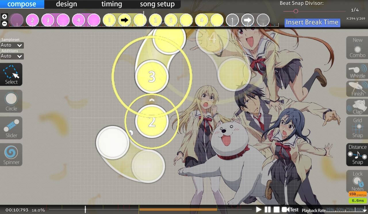
throughout all of your difficulties blankets aren't right. that's fine, because you may have chosen to focus on other aesthetics over blanket, but in case it was unintentional, here's how you can make good blankets easily.

first scroll on the timeline to where the approach circle reaches the slider body


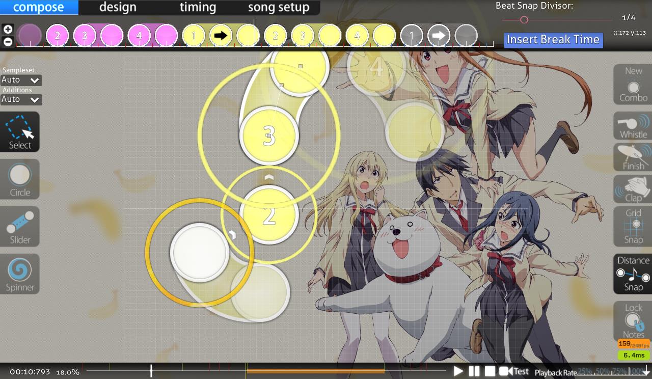
then just change the slider shape until it wraps around nicely!


(sorry for not cropping the images ahhhh)

i'll probably point out a lot of blankets in my mod, so if you like the aesthetics like this just ignore them.

Easy
00:09:938 (1,2) - blanket
00:16:014 (1,2) - ^
00:19:052 (1,2) - ^
00:35:177 (3,1) - ^
00:38:974 (1) - this slider body gets really close to 00:38:215 (4) and it looks bad imo
00:48:088 (2) - curves on this slider look imperfect (you could use more white ticks to make the it rounder)

Normal
00:01:584 (2,3) - blanket
00:17:533 (1) - ctrl+g and then reposition for flow?
00:47:709 (2,3) - blanket
00:52:645 (5,6) - clap sounds?

Vat's Hard
i think a higher od would be better for this diff for the spread and also because od5 just feels too low for almost 3.5*
00:06:141 (4) - this is mapped differently from 00:09:179 (3) .
00:28:721 (2,1) - these touch
00:29:101 (1,1) - ugly overlap imo
00:43:531 (1,2,3) - blankets could be improved
00:55:048 (2,1) - these also touch ?

Insane
00:01:204 (2,1) - blanket
00:01:964 (2,1) - ^
00:11:173 - add a note here?
00:16:204 - you miss an important sound here (same thing every time you use this rhythm)
00:35:747 (7,1) - move these apart ? (almost overlapping and it looks bad)
00:38:974 (1,2,1) - blankets
00:41:821 (8,1) - ^
00:52:171 - missing a sound

buhei's Extra
default combo colors ?
00:36:886 (6,1) - blanket
00:53:690 (8) - what sound is this circle on?
fun diff
like i said in pm anything i have in pending is fine to mod.
cool map / good luck!
Aeril
my side also im kinda curious on what the old bg was lol...

00:50:367 - the song sounds like its supposed to end here but it doesnt

buhei's Extra
  1. 00:07:470 (5,6,1) - i think it would be nice if these had a slight movement rather than a stack because its vocals are smoother and different from the staccato 00:07:090 (2,3,4) - here
  2. 00:13:071 (2) - idk dont really like this not here tbh, doesn't fit anything in the music imo, rather if 00:12:976 (1) - this was a 1/4 slider
Insane
  1. 00:07:849 (6) - i thought this would be nice as 1/4 slider because it connects to the next note in vocals
  2. 00:13:356 (3,4) - maybe have both these face the other way because both intonation of vocals and like the (clarinet?) thing changes note here
  3. 00:22:393 (4,5,6) - snapping!!
Vat's Hard
  1. 00:29:101 (1,1) - this just stands out to me because its one of 2 times you do this odd overlap thing in the entire map, 00:52:266 (2,1) - this being the other one. idk just seems out of place for no reason
  2. 00:29:386 - also a note here might be nice since you map it every where else
Normal
  1. 00:19:052 (3) - i think if you changed this to repeat then added a hit circle 00:20:192 - here it would be a nice change in rhythm
  2. 00:48:848 (1) - maybe ctrl g to change it from the previous pattern?
  3. 00:52:645 (5) - i think change this to 1/1 slider because its mapped the same as 00:53:405 (6) - but sound very different or maybe 00:53:405 (6) - change this one to like 1/2 slider and hit circle
Easy
  1. kinda hard for an easy but meh
cool mapper c;
[Crz]Makii
Marked.
[Crz]Makii
[General]
A little Big Gap between Normal and Hard(1.52-1.87-3.45-4.35-5.1)
可能会被搞事.
[Easy]
  1. 00:00:824 (1,2,3,4) - 音效声音偏小了,建议大一点
  2. 00:16:774 (2,3) - 后面类似的地方都是一个滑条,这里两个圈圈的用意是什么呢...
  3. 00:32:898 (1,2) - blanket一下?
[Normal]
  1. aimod距离问题
  2. 00:12:217 (5,6,7) - 我是比较建议换折返或者1/2滑条+圈的,连续三个靠近的圈对新手不大友好
  3. 00:19:812 (2) - 也应该折返吧,vocal一样的
  4. 00:48:848 (1) - 不用NC的
  5. 全图间距可以改成1.1/1.2,来加星数,解决gap大的问题.
[Vat]
  1. 00:05:381 (1,2,3) - 间隔太远..比00:06:900 (1,2,3) - 远了0.7x
  2. 00:09:749 (4) - 别叠滑条尾巴,叠在00:09:938 (1) - 开头更好一些
  3. 00:09:179 (3,1) - this overlapped can avoid.
  4. 00:25:968 (3) - clap一下比较好
  5. 00:28:721 (2,1,1) - 00:29:860 (1,4) - overlap不好看的..
  6. 00:31:379 (8) - NC,00:32:139 (1) - 取消NC比较好
  7. 00:37:455 (1,2,3,4,5,6,7) - 难到爆炸了
  8. 00:53:025 (1) - 取消NC比较好
  9. 感觉有点随意?可以让排列更干净整齐一些的
[Insane]
  1. 00:07:659 (5,6,7,8) - 感觉有点空,前面后面的小节都有抓蓝线,这里4个1/2就不大好
  2. 00:12:597 (8) - 太近了,可以拉远点
  3. 00:19:052 (1,2) - blanket?
  4. 00:19:812 (3,4) - ..?滑条太容易拉断了,因为是二次折返,感觉可以换成两个1/4滑条+圈
  5. 00:20:572 (1,2,1,2,3,4,5) - 这里...节奏不明,00:21:788 - 这里漏掉音,vocal前面没抓住
  6. kiai直线滑条有点多,不大好看...其实也是排版有些乱,可以更整洁的
[不黑]
  1. 00:10:698 (1,2,3,4,5,6) - 应该没有拆开连打的必要
  2. kiai我怎么觉得有些锐角有点过头了,太锐角了...
GoodLuck~
Topic Starter
MeAqua tete

- titan wrote:

Easy
00:09:938 (1,2) - blanket
00:16:014 (1,2) - ^
00:19:052 (1,2) - ^
00:35:177 (3,1) - ^
00:38:974 (1) - this slider body gets really close to 00:38:215 (4) and it looks bad imomaybe,but I'm not favour in changing it
00:48:088 (2) - curves on this slider look imperfect (you could use more white ticks to make the it rounder)

Normal
00:01:584 (2,3) - blanket
00:17:533 (1) - ctrl+g and then reposition for flow?
00:47:709 (2,3) - blanket
00:52:645 (5,6) - clap sounds?

Vat's Hard
i think a higher od would be better for this diff for the spread and also because od5 just feels too low for almost 3.5*
00:06:141 (4) - this is mapped differently from 00:09:179 (3) .
00:28:721 (2,1) - these touch
00:29:101 (1,1) - ugly overlap imo
00:43:531 (1,2,3) - blankets could be improved
00:55:048 (2,1) - these also touch ?

Insane
00:01:204 (2,1) - blanket
00:01:964 (2,1) - ^
00:11:173 - add a note here?looks good right now
00:16:204 - you miss an important sound here (same thing every time you use this rhythm)not too bad in this way imo
00:35:747 (7,1) - move these apart ? (almost overlapping and it looks bad)just stack and triangle it
00:38:974 (1,2,1) - blankets
00:41:821 (8,1) - ^
00:52:171 - missing a sound

buhei's Extra
default combo colors ?
00:36:886 (6,1) - blanket
00:53:690 (8) - what sound is this circle on?
No reply=Fixed,thanks for modding! :D
buhei

Mking wrote:

[buhei's extra]
00:02:347 (1,2) - why are these spaced different than these 00:00:828 (1,2) - when theyre the same and same sound? no
00:16:018 (1,2,3) - these are like same pitch and same volume, so why're they spaced differently? isn't there any other way to place them no
00:21:180 (2,3) - maybe 2 should be like an extended slider or they should make one big reverse slider cause you can hear the vocal extending on the blue tick no

Gust wrote:

[buhei's Extra]
00:22:093 - 我怎么感觉vocal是在这个蓝线上。。 不是很清楚,放在1/2好读一点
00:37:266 (1) - 长白线是重音,这里拆一下比较好感觉 这一小段跟vocal了,不冲突再跟鼓
GL

- titan wrote:

buhei's Extra
default combo colors ? added colors
00:36:886 (6,1) - blanket moved a bit
00:53:690 (8) - what sound is this circle on? 'a ho ga a ru' wwww

Aeril wrote:

buhei's Extra
  1. 00:07:470 (5,6,1) - i think it would be nice if these had a slight movement rather than a stack because its vocals are smoother and different from the staccato 00:07:090 (2,3,4) - here ok
  2. 00:13:071 (2) - idk dont really like this not here tbh, doesn't fit anything in the music imo, rather if 00:12:976 (1) - this was a 1/4 slider no

[Crz]Sword wrote:

[不黑]
  1. 00:10:698 (1,2,3,4,5,6) - 应该没有拆开连打的必要 就这样吧
  2. kiai我怎么觉得有些锐角有点过头了,太锐角了... 我自己用鼠标打着挺爽的233
GoodLuck~
changed some thx
show more
Please sign in to reply.

New reply