Cool
forum
Helblinde - Call of the void
posted
Total Posts
40
From my modding queue
Well this map needs a lot of work if you need more help ask me for help if you see me ingame.
General
Since you are new to mapping try mapping with distance snap on and if you are not going to make other difs try to map starting section and make it reach 5 minutes of drain time so it is possible for marathon map.
Lost in the void
Remember always put circles and sliders on 1/2 tick unless its stream
00:21:689 (3) - move one tick to white like this
00:22:591 (1) - try this
and fix all further circles and slider that are not on 1/2 tick. If you are unsure set playing speed to 50% and listen carefully
00:24:722 (2,3,5,8) - ^
00:30:870 (2,2,3,4,1,3,4) - ^
00:47:345 (5) - ^
01:21:034 (3) - no circle after this?
Well this map needs a lot of work if you need more help ask me for help if you see me ingame.
Topic Starter
zhu wrote:
From my modding queueGeneralSince you are new to mapping try mapping with distance snap on and if you are not going to make other difs try to map starting section and make it reach 5 minutes of drain time so it is possible for marathon map.Lost in the voidRemember always put circles and sliders on 1/2 tick unless its stream
00:21:689 (3) - move one tick to white like this
00:22:591 (1) - try this
and fix all further circles and slider that are not on 1/2 tick. If you are unsure set playing speed to 50% and listen carefully
00:24:722 (2,3,5,8) - ^
00:30:870 (2,2,3,4,1,3,4) - ^
00:47:345 (5) - ^
01:21:034 (3) - no circle after this?
Well this map needs a lot of work if you need more help ask me for help if you see me ingame.
Thanks a lot ! ^^ i'll fix this
 i will probably add you in game ahah
If you want to map more Helblinde, there's already a featured section with pre-timed maps: https://osu.ppy.sh/beatmaps/artists/5
The BPM is 184 and the offset should be fine, but the notes aren't placed in correspondence with the music very well.
I would suggest placement like this for the beginning, but there could be other methods as well.
Good luck!
The BPM is 184 and the offset should be fine, but the notes aren't placed in correspondence with the music very well.
I would suggest placement like this for the beginning, but there could be other methods as well.
Good luck!
Topic Starter
Thanks for your help, I did not know that there was a database for related artists with template of BPM !L a n d o n wrote:
If you want to map more Helblinde, there's already a featured section with pre-timed maps: https://osu.ppy.sh/beatmaps/artists/5
The BPM is 184 and the offset should be fine, but the notes aren't placed in correspondence with the music very well.
I would suggest placement like this for the beginning, but there could be other methods as well.
Good luck!

hmm, i think my old BPM was good, There is 183 bpm on the template of Helblinde not 184 XD
Topic Starter
+
i'll change the map from ~2:11 to ~2:25, this part is really really ugly atm
00:24:966 (3,4) - i think will better if you move it a little bit left like this https://puu.sh/wQlX4/cc7509d342.png
00:34:064 (3) - will looks better like this https://puu.sh/wQm0l/ad040b3a33.png
00:37:835 -This bit loud, I think at this moment you can put a note
00:56:195 (4,5) - Bits sound alike, do same space like this 00:55:868 (2,3) -
02:46:195 (6,7) - do space more https://puu.sh/wQmhl/fd577021ae.png
03:53:573 (10) - do this slider shorter
04:11:605 (3,4,1) - The distance to the timeline is the same, but the spacing is different, Fix it
Topic Starter
My Angel DanyL wrote:
00:24:966 (3,4) - i think will better if you move it a little bit left like this https://puu.sh/wQlX4/cc7509d342.png
00:34:064 (3) - will looks better like this https://puu.sh/wQm0l/ad040b3a33.png
00:37:835 -This bit loud, I think at this moment you can put a note
00:56:195 (4,5) - Bits sound alike, do same space like this 00:55:868 (2,3) -
02:46:195 (6,7) - do space more https://puu.sh/wQmhl/fd577021ae.png
03:53:573 (10) - do this slider shorter
04:11:605 (3,4,1) - The distance to the timeline is the same, but the spacing is different, Fix it
Thank you so much (again xD) for your improvement, I fix all of this
<3irc mod
19:40 Valeze: yeah ^^
19:40 Valeze: sorry i was on overwatch eheh :/
19:40 Valeze: still here too ?
19:40 Fursum: ye
19:40 *Fursum is playing [https://osu.ppy.sh/b/1360789 Helblinde - Call of the void [Lost in the void]] -NoFail
19:41 Valeze: some feedbacks ? ^^
19:41 Fursum: im gonna play it first
19:42 Valeze: yay
19:42 Fursum: you are supposed to spec now
19:42 Valeze: it's my first map, so be rude with me >.<
19:47 Fursum: first of all, you need a higher od
19:47 Valeze: od ?
19:47 Fursum: overall diff
19:48 Valeze: oh ok !
19:48 Valeze: yeah i know, i go up this
19:48 Fursum: 00:29:556 - dont make those kinds of streams
19:48 Fursum: they look bad and play bad as well
19:49 Fursum: also try to keep the stream numbers odd
19:49 Fursum: like 1,3,5,7 etc
19:49 Fursum: so the players end with the same finger they start
19:49 Fursum: unless the rythm really suggests otherwise
19:49 Valeze: oh didnt't know that O.O
19:50 Fursum: 00:31:605 (1) - when mapping long sliders
19:50 Fursum: make sure there are no other sounds in the slider body
19:50 Fursum: for example this skips over two important sounds
19:50 Fursum: 00:31:933 - 00:32:261 -
19:50 Fursum: also theres a wub 00:32:097 -
19:51 Valeze: oh, just wanted to make this my beatmap easier
19:51 Valeze: but yeah, you are right
19:51 Fursum: if you are going to map a marathon theres no point in doing that
19:52 Valeze: i'm going to make a marathon x)
19:52 Fursum: 01:19:556 (1,2,3,4) - dont do this
19:52 Fursum: they play like normal circles
19:53 Valeze: oki ^^
19:53 Valeze: thanks a lot helping and taking your time for me :s
19:53 Fursum: the rythm is almost fine if you move them forwards but dont do the spacing like that
19:53 Fursum: im not done yet
19:53 Valeze: post a message here, i'll giv you a kudosu
19:53 Valeze: t/619069
19:54 Valeze: eheh ^^"
19:54 Fursum: so you need to change your mindset about the object placement
19:55 Fursum: for example
19:55 Fursum: 02:16:523 (7,8) - these two objects appear partially under the slider
19:55 Fursum: because of that, they look bad
19:55 Fursum: same idea goes for slider to sliders
19:55 Fursum: 02:23:081 (5,7) -
19:55 Valeze: right, i change this
19:56 Fursum: 02:27:507 (3,4,5,6,7) - dont break the burst shapes like this
19:56 Fursum: most of them should be simple
19:56 Fursum: 02:30:130 (4,5,6,7,8) - same thing
19:56 Fursum: you can keep the idea but tone it down
19:56 Fursum: this makes the stream harder because the movement is more strict
19:57 Valeze: i'll make it closer ^^
19:58 Fursum: 03:21:769 (7,1) -
19:58 Fursum: the pattern needs to change 03:22:097 -
19:58 Fursum: if you are doing these kinds of things
19:58 Fursum: change the patterns at strong notes
19:58 Fursum: also most of the section here 03:21:933 - is offbeat
19:59 Valeze: i put slider on piano notes.. :S
19:59 Fursum: but heads fall into weak notes
19:59 Fursum: ends fall into strong notes
19:59 Fursum: when making slider art
20:00 Fursum: 03:35:704 (4) - put a red anchor before every curve
20:00 Fursum: to make it look smoother
20:00 Valeze: a red anchor ?
20:00 Fursum: if you double click while placing an anchor
20:01 Fursum: it becomes red and it makes the edge sharp
20:01 Valeze: oh ok
20:01 Fursum: if you put one before and after every curve
20:01 Fursum: the curves will look smoother and be easier to adjust
20:02 Valeze: roger that
20:03 Valeze: i have a lot of work XD
20:03 Fursum: https://osu.ppy.sh/ss/8664957
20:03 Fursum: small example
20:03 Valeze: enjoying that
20:04 Valeze: oh, yeah it's really better like this :O
20:05 Valeze: 02:10:000 -> 02:20:000
20:05 Valeze: this part is good ? i make some "slider arts " xD
20:06 Fursum: hmm
20:06 Fursum: did you put a circle slider under that while making it
20:06 Fursum: also there are ways to create perfect circles with many anchors
20:07 Fursum: they are the best in the map only because you used red anchors lol
20:07 Valeze: like a shape ? good idea !
20:07 Fursum: they can be better though
20:07 Fursum: 02:13:900 (6) - like this ones head and end stands out
20:07 Valeze: i take it from the osu forum xD i'm not an artist :S
20:08 Fursum: 02:17:835 (1) - dont use these kinds of shapes
20:09 Fursum: only use simple curves as a start
20:10 Valeze: alright
20:10 Fursum: also there are problems with note density
20:10 Fursum: 02:47:999 - like here
20:10 Fursum: the music is more intense
20:10 Fursum: but you used way less notes
20:11 Valeze: yeah, this is stupid :/
20:11 Fursum: 03:50:950 - same with here
20:11 Fursum: you have many gaps that could have notes
20:11 Fursum: since this is a kiai
20:12 Fursum: dont even have 1/1 gaps
20:12 Fursum: unless the music like stops
20:12 Valeze: i dont understand... sorry my english suck
20:13 Fursum: 03:50:950 (1,2) - you have empty space here
20:13 Fursum: and many other places
20:13 Fursum: this is bad for kiai
20:13 Fursum: or like here 03:54:884 (6,7) -
20:13 Fursum: this is a 1,5 beat space
20:14 Valeze: Oh, i understand ^^
20:14 Valeze: i know my job :3
20:14 Fursum: also
20:14 Fursum: your spacing is very low on 1/2 notes
20:15 Fursum: 04:25:868 (5,6,7,8,9) - its mostly like this
20:15 Fursum: no reason to have small spacing
20:15 Valeze: maybe i have to work more with "distance snapping"
20:16 Fursum: not really
20:16 Fursum: ill draw something one moment
20:16 Valeze: take your time ^^
20:17 Valeze: i can not thank you enough ! you are taking a lot of your time for me ^^
20:17 Fursum: no problem
20:19 Fursum: so i want to show you something about visual spacing
20:19 Fursum: https://puu.sh/wR5b4/d635d40d84.png
20:19 Fursum: you have something like this
20:20 Fursum: see how 6 and 8 are very close to each other
20:20 Fursum: try avoiding that if you have no reason
20:21 Fursum: this applies to every other pattern
20:21 Fursum: try having the same distance between every object in a pattern unless you have like big spacing for strong notes
20:22 Valeze: hum, i see, i have to make this "symetrical" in the same pattern
20:22 Fursum: you dont have to make it symmetrical
20:22 Fursum: just dont have random space between objects
20:22 Fursum: heres another example
20:22 Fursum: 04:11:113 (1,2,3,4) -
20:22 Fursum: 1 and 2 is close and 3-4 is far
20:23 Valeze: oh ok, i understand what you means
20:23 Fursum: 04:27:999 - these objects are very close to each other
20:23 Fursum: doesnt look good
20:24 Fursum: also do you know about blanketing
20:25 Valeze: no :/
20:25 Valeze: i know nothing (jon snow)
20:25 Valeze: :S
20:26 Fursum: so you have this https://puu.sh/wR5sm/b250128802.png
20:26 Fursum: and you could do this to make it look better https://puu.sh/wR5sm/b250128802.png
20:27 Fursum: the second one is called blanket
20:27 Valeze: meh, its the same image xD
20:27 Fursum: oops
20:27 Valeze: xD
20:27 Fursum: https://puu.sh/wR5qY/0459ceda76.png
20:27 Fursum: this is your placement
20:27 Fursum: 02:07:015 - here
20:29 Fursum: same thing can be done with sliders https://puu.sh/wR5wV/fb7bee44e8.png
20:29 Valeze: uhm
20:30 Fursum: https://puu.sh/wR5zI/4c99b50e95.jpg
20:30 Fursum: heres a different shape
20:30 Fursum: you basically make the distance same on every part of the objects
20:30 Fursum: [https://puu.sh/wR5zI/4c99b50e95.jpg if the link is broken]
20:31 Fursum: i have to go sorry
20:31 Valeze: np np ^^
saw this on modreqs
to begin with, there is one serious issue in this beatmap. you map absolutely same parts of the song in very different ways. In first case you emphasize some important sounds and in second you skip them when the song didn't change even little. Example: 02:47:999 (1,2,3,1,2,3,4,5,6,7) - you map piano sounds with long sliders and then you map streams and every beat of the song (02:55:868 (1,2,3,4,5,6,7,8,1,2,3,4,5,6,7,8,1) - ) but nothing changed in the song. Make your map more consistent.
also i think it would be good to will move your offset to the very beginning of the song when first sound kicks in (00:00:130 - )
listen to the music more closely next time and think on the ways you can represent it, good luck <3
to begin with, there is one serious issue in this beatmap. you map absolutely same parts of the song in very different ways. In first case you emphasize some important sounds and in second you skip them when the song didn't change even little. Example: 02:47:999 (1,2,3,1,2,3,4,5,6,7) - you map piano sounds with long sliders and then you map streams and every beat of the song (02:55:868 (1,2,3,4,5,6,7,8,1,2,3,4,5,6,7,8,1) - ) but nothing changed in the song. Make your map more consistent.
also i think it would be good to will move your offset to the very beginning of the song when first sound kicks in (00:00:130 - )
SPOILER
00:22:097 (3) - i don't think that there is a need to map this sound, so removing circle would be fair
00:23:081 (4) - same
00:22:835 - you skipped important sound emphasized already before (00:21:114 (1,2) - )
00:23:409 - it feels unnatural to have this important sound on the end of slider. Taking into accound previous point, this part should be like http://puu.sh/wR2nI/791d4f9407.jpg 00:27:999 (2,3) - should be fixed same way
00:24:556 (1,2,3) - good one
00:25:376 - same problem as before. You can move this slider 00:25:212 (5) - to the next white tick and place circle on the red
00:26:032 - ^
00:26:359 - and 00:26:687 - all the same
00:26:032 - i think placing 3/4 slider here is good idea. something like this http://puu.sh/wR4nY/dcf996d3b3.jpg
00:25:376 - skipped
00:29:556 (1,2,3,4,5,6,7) - i don't see any changes in music or any sounds that justify stream here. It doesn't fit the song i guess, so it should be mapped with emphasizing beats as before.
but you can make stream started from here 00:30:622 - for a five notes. This one would be natural to play
00:29:966 - skipped important sound
00:30:458 - ^
00:30:212 - you can make 3/4 slider started from here. like this http://puu.sh/wR4Rt/7728aaa277.jpg because rhythm isn't natural enough to follow with circles
00:31:605 - music has become way more intense here with many streams in it and you started mapping piano with 3/2 long sliders. So map something faster there
00:48:654 (7) - top of the slider is off-screen, fix it
00:52:589 - 01:02:097 - like this part
01:02:097 (7) - top of the slider is off-screen, fix it
01:03:081 - skipped beat. You can make slider 1/4 shorter (with end on blue tick) and place another slider here
01:04:392 (8) - this slider is too long for intense kiai, don't you think? even if you won't replace it with something fast, make it at least as 1/1 slider with reverse
01:10:950 (8,9) - almost good example what you can make. Only mistake here is that first and second sliders should be 3/4 long ending on blue ticks
01:12:261 (9,10) - same but you can make second slider 1/1 ending on white tick because you emphasize other sounds after this (01:13:081 (1,2,3,4) - )
01:21:441 (8,9) - ^
01:22:917 - i hear triple here and it's the sounds you mapping there, so you can make slider end here 01:22:917 - , put circle here 01:22:999 - , and start 1/1 slider here 01:23:081 - . It's pretty good i think.
01:37:179 - you suddenly started mapping another sounds. Better to make this part like one you made before: 01:26:687 (1,2,3,4,5,6,7,8,9) -
01:42:425 (4,5,6,7,8,1,2,3,4,5) - i can't see any reasons for streams. Some 1/1 sliders are enough.
02:06:032 (1,2,3) - decrease volume for this objects
02:11:277 (5,6) - i suggest you to separate these 2 sliders into 4 because you miss important sounds here 02:12:589 - and here 02:15:212 - which are the same with 2 you start your sliders on
02:17:835 (1,2,3,4,5,6,7) - this is too different and inconsostent from part before without any changes in music
02:20:458 (1,2,3,4,5,6,7) - and another way you map same sounds, such variations are unjustified there.
02:27:343 - skipped important sound
02:29:638 - 03:06:032 - nice part except some mistakes i'm about to mention
02:36:195 - should be stream from this point i guess
02:37:999 (2,4,4,9) - suddenly started make streams as short reversed sliders for too long. At least alternate it with common streams because it feels too slow in comparision with previous way you mapped this part.
02:46:687 - skipped stream
02:47:999 - again about consistensy. Aslo these sliders are too long for the intensivity of this part.
02:58:491 - ^
03:07:343 - you can start spinner here or on the better on the next white tick or you can continiue to map piano. Anyway these two streams 03:07:999 (1,2,3,4,5,1,2,3,4,5) - should be removed. If spinner is not the case, then you can start one big stream here 03:07:671 - with low volume on it
03:09:474 - put circle here if you map piano (there is nothing else to map anyway)
03:12:261 (5,7) - replace kicksliders with circles. Nothing special in music for kicksliders.
03:21:933 (1,2,3,4,5,6,7,1,2,3,4,5) - it feels weird having sliders on red ticks and also 03:22:097 - strong piano sound so there is no way to start sliders on red ticks
03:29:966 - 03:50:622 - like this part
03:48:327 (1,2,3,4,5,6,7,8,1,2,3,4,5,6,7,8,9) - i think something like this http://puu.sh/wR86k/6f3fbb9d9e.jpg is more suitable. Expample: http://puu.sh/wR844/c446105dea.jpg
03:50:950 - this second kiai has only 1/2 rhythms so there is no need to use triplets or 5-note streams
04:03:573 (1,2,3,4,5) - sliders with begining on red ticks have leave weird feeling when being played.
04:10:458 - missed important sound
04:38:163 (1,2) - consistensy. remove sliders and map this part like you mapped before this moment, it was good
04:48:654 (1,2) - ^
04:53:900 - starting from this point song doesnt have sound for this note 04:54:720 (4) - anymore so remove it and all same after. Wow, even some unnecessary consistancy finally
04:59:146 (1,2) - well you can leave it as is because music doesn't have many sounds now +became more peaceful so piano became important enough. Next sliders too.
listen to the music more closely next time and think on the ways you can represent it, good luck <3
oh fuk i replied to myself by some key combination
Topic Starter
I have a lot and a lot of work xD thanks Ampiduxmoe and Fursum, i'll follow my dream =^=
Fursum mod : Alsmost Finished
Ampiduxmoe : Fix like 60% of your modn i'll stay like that, I like some parts that you told me to change, I wait to see if another mod tells me to change too
Fursum mod : Alsmost Finished
Ampiduxmoe : Fix like 60% of your modn i'll stay like that, I like some parts that you told me to change, I wait to see if another mod tells me to change too
Hi from my mod queue! ([https://osu.ppy.sh/forum/p/6149351#p6149351)
Lost in the void
Firstly make the Overall Difficulty 8 or in this area at least, 6 is too low for a map of this difficulty. Also consider raising the HP to at least 5 or 6
00:31:114 (4,1) - make these parallel
00:49:638 (8) - centre this circle in the slider (roughly x:308 y:72)
00:49:966 (1) - move this slider further away from 00:49:638 (8) - so that players don't tap it too early. If you do this move 00:50:950 (2,3) - accordingly as well
01:20:458 (5) - same problem as before, this object is further away on the time line so it should also be further away on the play field, try flipping it horizontally.
00:52:589 (1,2,3,4,5) - make these into an actual pentagon with the slider tail or arrange 00:52:589 (1,2,3,4,5) - in to a rhombus
01:39:802 (9) - this needs to be snapped further from 01:39:638 (8) -
01:44:392 (1) - make this in the middle of 01:44:720 (2,3) -
03:09:966 (8) - make the tail of this slider on top of 03:09:310 (6) -
03:19:474 (1,2,3,4,5,6,7,8,1,2,3,4,5,6,7) - these jumps need a rework, the over laps at the moment make it difficult for the player to realise when to move on, maybe make the stacks smaller
03:49:638 (9) - make this slider more circular
Also do you think ending where you have is the best place? I think you could map the last few seconds with the objects getting closer together as a cool down time.
This mod was about twice as long before you updated it while I was modding and fixed about half the problems I found. This map looks quite promising good luck with it in the future!
Topic Starter
Thanks a lot Modding my map ^^[Nyx] wrote:
Hi from my mod queue! ([https://osu.ppy.sh/forum/p/6149351#p6149351)
Lost in the void
Firstly make the Overall Difficulty 8 or in this area at least, 6 is too low for a map of this difficulty. Also consider raising the HP to at least 5 or 6
00:31:114 (4,1) - make these parallel fix
00:49:638 (8) - centre this circle in the slider (roughly x:308 y:72) fix
00:49:966 (1) - move this slider further away from 00:49:638 (8) - so that players don't tap it too early. If you do this move 00:50:950 (2,3) - accordingly as well fix
01:20:458 (5) - same problem as before, this object is further away on the time line so it should also be further away on the play field, try flipping it horizontally. humm... maybe xD
00:52:589 (1,2,3,4,5) - make these into an actual pentagon with the slider tail or arrange 00:52:589 (1,2,3,4,5) - in to a rhombus fix
01:39:802 (9) - this needs to be snapped further from 01:39:638 (8) - fix
01:44:392 (1) - make this in the middle of 01:44:720 (2,3) - fix
03:09:966 (8) - make the tail of this slider on top of 03:09:310 (6) - fix and good idea
03:19:474 (1,2,3,4,5,6,7,8,1,2,3,4,5,6,7) - these jumps need a rework, the over laps at the moment make it difficult for the player to realise when to move on, maybe make the stacks smaller i change this, but i keep the idea in general
03:49:638 (9) - make this slider more circular fix
Also do you think ending where you have is the best place? I think you could map the last few seconds with the objects getting closer together as a cool down time.
This mod was about twice as long before you updated it while I was modding and fixed about half the problems I found. This map looks quite promising good luck with it in the future!
You and the last two Modders left me a lot of Work xD
Sorry if I had to make you redo of your Mod, I change this Map very regulary, and more with the latest mods xD
I'll fix all of this, thanks again <3
hihi
that's about it , Good luck!
SPOILER
00:11:605 (2) - Maybe try to make this rounder
00:16:851 (4) - Add a curve around here will maybe be better
00:38:818 (9) - Try to make this note more fitting please
00:40:458 (3,4,5,6) - This shape or placements for the circle and sliders are very uncommon
00:50:457 (2,3) - Try to make this parallel
01:13:573 (4,5) - Make these sliders follow each other properly (01:14:884 (8,9) - this too)
01:45:048 (3) - NC because SV change
02:19:474 (5) - rethink about this slider shape
02:20:458 (1,2,3) - 1 and 3 's slider end won't look nice when it collide
02:30:786 (1,2,3) - 1 and 3 is not in the same place . is this intentional
02:35:376 (2,3,4,5,6) - make this pattern distance the same
03:02:589 (2,3,4) - u can see here 3 and 4's distance is shorter than 2 and 3 but they are the same rhythm
03:05:540 (3,4,5,6,7) - distance not the same makes it hard to follow
03:12:917 (1,2) - maybe don't overlap these
03:26:032 (1) - slider art please (03:27:343 (2) - )
03:30:458 (3) - this slider shape looks odd
03:35:704 (4) - make both sides of slider symmetrical
03:45:704 (1,2,3,4) - they are the same beat but their distance is not the same , they should be the same
03:49:638 (9) - slider head looks out of place
03:54:884 (6) - ignored too much sounds
03:58:327 (3,4,5) - out of place
04:06:359 (3,4) - distance should be the same
04:20:458 (2) - slider end has important sound, need fix
04:32:589 (1) - don't NC this
04:32:916 (3) - NC here
04:43:081 (4,1) - looks weird
04:54:228 (2,3,4,5) - 2-3 , 3-4 's distance not the same
04:59:146 (1,2) - odd placement for slider, make it more curved
04:59:146 (1,2) - here u didn't put a circle in between ,05:04:392 (1,2,3) - but here you did, there are no sounds though (05:09:638 (1,2,3) - here too)
05:14:884 (1) - try to make them look the same
00:16:851 (4) - Add a curve around here will maybe be better
00:38:818 (9) - Try to make this note more fitting please
00:40:458 (3,4,5,6) - This shape or placements for the circle and sliders are very uncommon
00:50:457 (2,3) - Try to make this parallel
01:13:573 (4,5) - Make these sliders follow each other properly
(01:14:884 (8,9) - this too)01:45:048 (3) - NC because SV change
02:19:474 (5) - rethink about this slider shape
02:20:458 (1,2,3) - 1 and 3 's slider end won't look nice when it collide
02:30:786 (1,2,3) - 1 and 3 is not in the same place . is this intentional
02:35:376 (2,3,4,5,6) - make this pattern distance the same
03:02:589 (2,3,4) - u can see here 3 and 4's distance is shorter than 2 and 3 but they are the same rhythm
03:05:540 (3,4,5,6,7) - distance not the same makes it hard to follow
03:12:917 (1,2) - maybe don't overlap these
03:26:032 (1) - slider art please (03:27:343 (2) - )
03:30:458 (3) - this slider shape looks odd
03:35:704 (4) - make both sides of slider symmetrical
03:45:704 (1,2,3,4) - they are the same beat but their distance is not the same , they should be the same
03:49:638 (9) - slider head looks out of place
03:54:884 (6) - ignored too much sounds
03:58:327 (3,4,5) - out of place
04:06:359 (3,4) - distance should be the same
04:20:458 (2) - slider end has important sound, need fix
04:32:589 (1) - don't NC this
04:32:916 (3) - NC here
04:43:081 (4,1) - looks weird
04:54:228 (2,3,4,5) - 2-3 , 3-4 's distance not the same
04:59:146 (1,2) - odd placement for slider, make it more curved
04:59:146 (1,2) - here u didn't put a circle in between ,05:04:392 (1,2,3) - but here you did, there are no sounds though (05:09:638 (1,2,3) - here too)
05:14:884 (1) - try to make them look the same
that's about it , Good luck!
Topic Starter
- Matha - wrote:
hihiSPOILER00:11:605 (2) - Maybe try to make this rounder
00:16:851 (4) - Add a curve around here will maybe be better
00:38:818 (9) - Try to make this note more fitting please
00:40:458 (3,4,5,6) - This shape or placements for the circle and sliders are very uncommon
00:50:457 (2,3) - Try to make this parallel
01:13:573 (4,5) - Make these sliders follow each other properly
01:45:048 (3) - NC because SV change
02:19:474 (5) - rethink about this slider shape
02:20:458 (1,2,3) - 1 and 3 's slider end won't look nice when it collide
02:30:786 (1,2,3) - 1 and 3 is not in the same place . is this intentional
02:35:376 (2,3,4,5,6) - make this pattern distance the same
03:02:589 (2,3,4) - u can see here 3 and 4's distance is shorter than 2 and 3 but they are the same rhythm
03:05:540 (3,4,5,6,7) - distance not the same makes it hard to follow
03:12:917 (1,2) - maybe don't overlap these
03:26:032 (1) - slider art please (03:27:343 (2) - )
03:30:458 (3) - this slider shape looks odd
03:35:704 (4) - make both sides of slider symmetrical
03:45:704 (1,2,3,4) - they are the same beat but their distance is not the same , they should be the same
03:49:638 (9) - slider head looks out of place
03:54:884 (6) - ignored too much sounds
03:58:327 (3,4,5) - out of place
04:06:359 (3,4) - distance should be the same
04:20:458 (2) - slider end has important sound, need fix
04:32:589 (1) - don't NC this
04:32:916 (3) - NC here
04:43:081 (4,1) - looks weird
04:54:228 (2,3,4,5) - 2-3 , 3-4 's distance not the same
04:59:146 (1,2) - odd placement for slider, make it more curved
04:59:146 (1,2) - here u didn't put a circle in between ,05:04:392 (1,2,3) - but here you did, there are no sounds though (05:09:638 (1,2,3) - here too)
05:14:884 (1) - try to make them look the same
that's about it , Good luck!
99.99 % done
! and how i gave you 2 kudosu !?! 
[MTF] Wolfette
Topic Starter
AsrielDr33murr wrote:
00:11:605 (2) - slider path needs to be clear fixed
00:16:851 (4) - ^ hum, the path is clear i think
00:22:998 (4,5,6) - spacing is weird on this set of notes yeah sure, i try to make this look better
Also, the klai section is kinda lame, the jumps lack the proper intensity i know, i'll fixed this quickly
thanks a lot for your mod ^^ !
I think its random lol , idk eitherValeze wrote:
- Matha - wrote:
hihiSPOILER00:11:605 (2) - Maybe try to make this rounder
00:16:851 (4) - Add a curve around here will maybe be better
00:38:818 (9) - Try to make this note more fitting please
00:40:458 (3,4,5,6) - This shape or placements for the circle and sliders are very uncommon
00:50:457 (2,3) - Try to make this parallel
01:13:573 (4,5) - Make these sliders follow each other properly
01:45:048 (3) - NC because SV change
02:19:474 (5) - rethink about this slider shape
02:20:458 (1,2,3) - 1 and 3 's slider end won't look nice when it collide
02:30:786 (1,2,3) - 1 and 3 is not in the same place . is this intentional
02:35:376 (2,3,4,5,6) - make this pattern distance the same
03:02:589 (2,3,4) - u can see here 3 and 4's distance is shorter than 2 and 3 but they are the same rhythm
03:05:540 (3,4,5,6,7) - distance not the same makes it hard to follow
03:12:917 (1,2) - maybe don't overlap these
03:26:032 (1) - slider art please (03:27:343 (2) - )
03:30:458 (3) - this slider shape looks odd
03:35:704 (4) - make both sides of slider symmetrical
03:45:704 (1,2,3,4) - they are the same beat but their distance is not the same , they should be the same
03:49:638 (9) - slider head looks out of place
03:54:884 (6) - ignored too much sounds
03:58:327 (3,4,5) - out of place
04:06:359 (3,4) - distance should be the same
04:20:458 (2) - slider end has important sound, need fix
04:32:589 (1) - don't NC this
04:32:916 (3) - NC here
04:43:081 (4,1) - looks weird
04:54:228 (2,3,4,5) - 2-3 , 3-4 's distance not the same
04:59:146 (1,2) - odd placement for slider, make it more curved
04:59:146 (1,2) - here u didn't put a circle in between ,05:04:392 (1,2,3) - but here you did, there are no sounds though (05:09:638 (1,2,3) - here too)
05:14:884 (1) - try to make them look the same
that's about it , Good luck!
99.99 % done
~o~
Lost in the Void
00:16:851 (4) - i feel like this slider could be touched up a bit to be more symmetrical, it could have a shape more like a ribbon. idk
00:22:834 (3) - maybe reverse slider because the cirlce at 00:22:998 (4) isnt really on a strong sound.
00:28:244 (4) - same here
00:32:425 (5) - slider doesnt really make sense here, because the white tick (which is a stronger sound) is just a slider end while the weak sound (the red tick)
is being emphasized. try this maybe.
01:07:753 (1,2,3,4,5,6,7) - dont put these zig-zag streams in insane difficulties lol 01:09:064 (1,2,3,4,5,6,7) and 01:11:687 (1,2,3,4,5,6,7)
01:29:310 (9) - the white tick in the middle of this slider should be emphasized more, just make it 2 1/1 sliders.
Topic Starter
seems to be fixed :SAxon wrote:
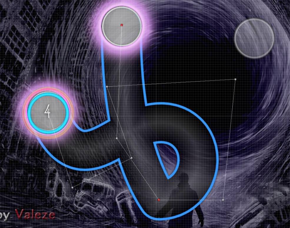
~o~Lost in the Void00:16:851 (4) - i feel like this slider could be touched up a bit to be more symmetrical, it could have a shape more like a ribbon. idk I want to make it look like a stylized ""B"" ^^
00:22:834 (3) - maybe reverse slider because the cirlce at 00:22:998 (4) isnt really on a strong sound. Fix
00:28:244 (4) - same here fix
00:32:425 (5) - slider doesnt really make sense here, because the white tick (which is a stronger sound) is just a slider end while the weak sound (the red tick)
is being emphasized. try this maybe. good idea and fix ! ^^
01:07:753 (1,2,3,4,5,6,7) - dont put these zig-zag streams in insane difficulties lol 01:09:064 (1,2,3,4,5,6,7) and 01:11:687 (1,2,3,4,5,6,7) i really love this stream shapes, maybe if another modders tell me to change it too, i'll, but actually i'll stay like this ^^
01:29:310 (9) - the white tick in the middle of this slider should be emphasized more, just make it 2 1/1 sliders.
ty <3 99.99% done :p
Hi, from my mod queue
You've got a pretty solid map going on here, although I find it to be very messy and lacks symmetrical lines.
I've got a lot to point out in the mod.
You've got a pretty solid map going on here, although I find it to be very messy and lacks symmetrical lines.
I've got a lot to point out in the mod.
Lost in the void
00:01:113 (2) - I really like the slider shapes you've made in this section, really fancy looking.
00:30:949 (3) - This object is Juuuust slightly shifted to the right, move it to the left a little bit so it lines up the two other objects before.
(Unless my eyes are playing tricks on me.)
00:57:343 (3) - Line this object up with 4.
00:59:146 (6) - Straighten this. (slightly higher than the others)
00:59:802 (2) - Line this up with 3.
01:01:605 (5) - ^ with 4.
01:10:375 (1,2,3,4,5,6,7) - fix this so that it's the same as 01:07:752 (1,2,3,4,5,6,7) (for an extra clean looking map, you could always abuse the copy and paste)
01:25:375 (3,4,5,6) - line these up straight, it might trigger OCD people.
01:33:900 (8) - Straighten this
01:35:211 (3) - maybe rotate this a little bit so that it flows with 01:34:884 (2) better, it's a bit awkward to play.
01:35:867 (4,5,6,7) - Maybe straighten these??
01:42:097 (3) - align this with 2
02:06:031 (1) - maybe straighten this, up to you.
02:16:523 (7,8,9,10) - Align these so its symmetrical with the grid, Like this
(Maybe re'make the diamond shape your going for like this. Copy and paste 7 and press CTRL+H, place it on this tick 02:17:179 on the timeline. Copy and paste 8 and press CTRL+J and place on this tick 02:17:507 on the timeline. to get the most symmetrical shape. I hope that made sense.)
02:21:605 (2,4,6) - Maybe delete these, I know you're following the piano here but it just seems random.
02:29:310 (1,2,3) - Straighten these.
02:30:621 (9,1,2,3) - Again straighten these, they look really messy.
02:32:261 (1) - Align this with the slider.
02:33:244 (8) - Align with the stream.
02:33:900 (4,5,6) - Straighten these, maybe do the copy and paste thing all over again.
02:36:687 (6,7,8,9,10) - Make this stream more circular. Could try using slider to stream tool. Make a slider, highlight slider, press CTRL+F or go into the Compose tab on the top left and create slider of any speed or amount of objects.
02:37:343 (12,1) - Align circle with slider or maybe align slider with circle.
02:38:490 (3) - Align this with 4
02:56:851 (8,1) - These two could flow better.
02:58:326 (1) - Align this with 8.
03:01:195 - Maybe put a buzz slider or kick sliders to represent the two beats in the song, like you did previously.
03:09:310 (1,2) - straighten these two again.
Continued into the Conclusion.
Conclusion
Placement and timing is fine, but your really lack the aesthetics of the map and symmetric lines. 03:08:982 From this point forward, basically everything I said in the mod just continues, everything is just really messy. When I listen to this song and think about how it would be represented with circles and sliders, I think everything would look clean and symmetrical, and this map isn't. I recommend not trying to get your first map ranked, it just never happens 'cause you just lack the knowledge of what makes a good map, so it usually takes a few tries before actually getting one ranked. I think you should just keep making maps so you learn what makes a good map and what doesn't, you wouldn't know all of this on your first map.
Practice makes perfect.
Good luck with your maps.
Practice makes perfect.
Good luck with your maps.
Topic Starter
-CerealBox- wrote:
Hi, from my mod queue
You've got a pretty solid map going on here, although I find it to be very messy and lacks symmetrical lines.
I've got a lot to point out in the mod.Lost in the void00:01:113 (2) - I really like the slider shapes you've made in this section, really fancy looking.
00:30:949 (3) - This object is Juuuust slightly shifted to the right, move it to the left a little bit so it lines up the two other objects before.
(Unless my eyes are playing tricks on me.)
00:57:343 (3) - Line this object up with 4.
00:59:146 (6) - Straighten this. (slightly higher than the others)
00:59:802 (2) - Line this up with 3.
01:01:605 (5) - ^ with 4.
01:10:375 (1,2,3,4,5,6,7) - fix this so that it's the same as 01:07:752 (1,2,3,4,5,6,7) (for an extra clean looking map, you could always abuse the copy and paste)
01:25:375 (3,4,5,6) - line these up straight, it might trigger OCD people.
01:33:900 (8) - Straighten this
01:35:211 (3) - maybe rotate this a little bit so that it flows with 01:34:884 (2) better, it's a bit awkward to play.
01:35:867 (4,5,6,7) - Maybe straighten these??
01:42:097 (3) - align this with 2
02:06:031 (1) - maybe straighten this, up to you.
02:16:523 (7,8,9,10) - Align these so its symmetrical with the grid, Like this
(Maybe re'make the diamond shape your going for like this. Copy and paste 7 and press CTRL+H, place it on this tick 02:17:179 on the timeline. Copy and paste 8 and press CTRL+J and place on this tick 02:17:507 on the timeline. to get the most symmetrical shape. I hope that made sense.)
02:21:605 (2,4,6) - Maybe delete these, I know you're following the piano here but it just seems random.
02:29:310 (1,2,3) - Straighten these.
02:30:621 (9,1,2,3) - Again straighten these, they look really messy.
02:32:261 (1) - Align this with the slider.
02:33:244 (8) - Align with the stream.
02:33:900 (4,5,6) - Straighten these, maybe do the copy and paste thing all over again.
02:36:687 (6,7,8,9,10) - Make this stream more circular. Could try using slider to stream tool. Make a slider, highlight slider, press CTRL+F or go into the Compose tab on the top left and create slider of any speed or amount of objects.
02:37:343 (12,1) - Align circle with slider or maybe align slider with circle.
02:38:490 (3) - Align this with 4
02:56:851 (8,1) - These two could flow better.
02:58:326 (1) - Align this with 8.
03:01:195 - Maybe put a buzz slider or kick sliders to represent the two beats in the song, like you did previously.
03:09:310 (1,2) - straighten these two again.
Continued into the Conclusion.ConclusionPlacement and timing is fine, but your really lack the aesthetics of the map and symmetric lines. 03:08:982 From this point forward, basically everything I said in the mod just continues, everything is just really messy. When I listen to this song and think about how it would be represented with circles and sliders, I think everything would look clean and symmetrical, and this map isn't. I recommend not trying to get your first map ranked, it just never happens 'cause you just lack the knowledge of what makes a good map, so it usually takes a few tries before actually getting one ranked. I think you should just keep making maps so you learn what makes a good map and what doesn't, you wouldn't know all of this on your first map.
Practice makes perfect.
Good luck with your maps.
Thanks a lot ^^ i fix 100% of you mod, but as you say in the conclusion, it's gonna be really hard to rank my map, i know it... but i want to rank this shit !
so i'll work over and over on it From Queue
Lost in the void
Lost in the void
- 00:06:359 (4) - this can be shape better since it don't as curve as it could be
- 00:37:507 (2,3) - has bigger spacing than 00:37:671 (3,4) - it should be the other way around tbh
- 00:47:343 (1) - this misses a sound here on the red tick 00:47:834 - so what u can do is shorten the slider to here and add another note on the blue tick
- 01:03:080 (1,2) - just an opinion but I really think the strong sound should be clickable rather than on the slider end of 01:03:080 (1) - so I think it be better to shorten 1 onto the blue tick and move (2) on the white tick
- oh course you may need to change every other slider like this if you went with this suggestion - - 02:41:441 (6,7,8) - right here should be a stream because I hear noise on the blue ticks - so make this a stream or a repeating slider like this 1 02:41:933 (9) -
Topic Starter
Thx !DJ Lucky wrote:
From Queue
Lost in the void
00:06:359 (4) - this can be shape better since it don't as curve as it could be Love the way i did it ^^"
00:37:507 (2,3) - has bigger spacing than 00:37:671 (3,4) - it should be the other way around tbh fix
00:47:343 (1) - this misses a sound here on the red tick 00:47:834 - so what u can do is shorten the slider to here and add another note on the blue tick a lot i change a lot of things here
01:03:080 (1,2) - just an opinion but I really think the strong sound should be clickable rather than on the slider end of 01:03:080 (1) - so I think it be better to shorten 1 onto the blue tick and move (2) on the white tick I had thought about it, but if you say it, I think it's clearly better
- oh course you may need to change every other slider like this if you went with this suggestion -
02:41:441 (6,7,8) - right here should be a stream because I hear noise on the blue ticks - so make this a stream or a repeating slider like this 1 02:41:933 (9) -
fix
Gl
done ! If this is still being worked on, I will mod.
Topic Starter
I still work on it, ^^ just a little pause for ~3-4 weeks xDSaltssaumure wrote:
If this is still being worked on, I will mod.
Thx if you mod it
SPOILER
21:46 Valeze: Hi ^^ I heard that I had to speak to you about my Beatmap, is it possible that you look at it when you can? thank you very much, good game
21:47 Valeze: t/619069/ enjoy ^^ thanks again taking time for me
21:50 Pho: lol, who told you that
21:52 Valeze: i'm a noob mapper x) i just look at this webpage (sorry for my english x) https://osu.ppy.sh/help/wiki/People/Bea ... tion_Group
21:56 Pho: i'm not even on that page anymore wh
21:57 Pho: well i can tell you're not a complete newbie anymore. map looks fairly structured because you relied a lot on ds
21:58 Valeze: thanks a lot ;.;
21:59 Valeze: I appreciate the compliment ^^ but I assure you, you are always on the page bn
21:59 Pho: pattern usage is a bit strange, sometimes you make these 00:59:474 (1,2,3,4,5,6) - (oldstylish) 90° patterns
22:00 Pho: that don't seem to fit the overall image of the map i think
22:00 Pho: sometimes you don't set accentuations to the song properly, e.g. 01:26:687 (1,2,3,4,5,6,7,8,9,10) - this slidertrain pattern where every beat is same spaced
22:01 Pho: but the odd-numbered sliders have emphasis in the music
22:02 Pho: or 01:37:179 (1,2,3,4,5,6,7,8,1,2,3,4,5,6,7,8) - where the 2nd combo feels much more different than the first one, but plays the same due to the spacing restriction
22:03 Valeze: oh yes, i miss That :S
22:05 Pho: that lack of differentiation between patterns to represent the music is probably the biggest issue in the set
22:06 Valeze: hum, i have to change a lot of thing my map is so symetrical :S
22:07 Pho: learning how to utilize jumps better would help a lot i believe
22:07 Valeze: i learn more about this ^^ i really want to rank this map :p
22:07 Valeze: of just approved x)
22:07 Valeze: or*
22:08 Pho: the map's already fairly clean with some neat patterns, ofc the latter could be improved so much more
22:08 Pho: there's still a long way to go if i have to be honest
22:09 Valeze: i know this ^^
22:09 Pho: if you want to get it approved. but it's a nice start actually
22:10 Pho: that's all i had to say i guess. learn more about jump usage/patterns and how to make more refined patterns in general
22:10 Valeze: thx ^^ can you post this on the forum page pls ?I do not know how to take the conversation from osu :/
21:47 Valeze: t/619069/ enjoy ^^ thanks again taking time for me
21:50 Pho: lol, who told you that
21:52 Valeze: i'm a noob mapper x) i just look at this webpage (sorry for my english x) https://osu.ppy.sh/help/wiki/People/Bea ... tion_Group
21:56 Pho: i'm not even on that page anymore wh
21:57 Pho: well i can tell you're not a complete newbie anymore. map looks fairly structured because you relied a lot on ds
21:58 Valeze: thanks a lot ;.;
21:59 Valeze: I appreciate the compliment ^^ but I assure you, you are always on the page bn
21:59 Pho: pattern usage is a bit strange, sometimes you make these 00:59:474 (1,2,3,4,5,6) - (oldstylish) 90° patterns
22:00 Pho: that don't seem to fit the overall image of the map i think
22:00 Pho: sometimes you don't set accentuations to the song properly, e.g. 01:26:687 (1,2,3,4,5,6,7,8,9,10) - this slidertrain pattern where every beat is same spaced
22:01 Pho: but the odd-numbered sliders have emphasis in the music
22:02 Pho: or 01:37:179 (1,2,3,4,5,6,7,8,1,2,3,4,5,6,7,8) - where the 2nd combo feels much more different than the first one, but plays the same due to the spacing restriction
22:03 Valeze: oh yes, i miss That :S
22:05 Pho: that lack of differentiation between patterns to represent the music is probably the biggest issue in the set
22:06 Valeze: hum, i have to change a lot of thing
my map is so symetrical :S22:07 Pho: learning how to utilize jumps better would help a lot i believe
22:07 Valeze: i learn more about this ^^ i really want to rank this map :p
22:07 Valeze: of just approved x)
22:07 Valeze: or*
22:08 Pho: the map's already fairly clean with some neat patterns, ofc the latter could be improved so much more
22:08 Pho: there's still a long way to go if i have to be honest
22:09 Valeze: i know this ^^
22:09 Pho: if you want to get it approved. but it's a nice start actually
22:10 Pho: that's all i had to say i guess. learn more about jump usage/patterns and how to make more refined patterns in general
22:10 Valeze: thx ^^ can you post this on the forum page pls ?I do not know how to take the conversation from osu :/
not really worth the kd, just pointed out general issues with the mapper.
GL
Hi Hi, here from My Mod Queue
GL!!
I hope I have helped you
Lost in the void
ps: http://ronniesblog.com/wp-content/uploa ... heVoid.jpg I like more for the bg 7u¬00:01:113 (2) - I think you can do more than this slider, example, here 00:02:752 - there is a small sound, you can put a note or something else
00:06:359 (4) - same, 00:07:998 - here is also a small sound
00:10:621 (1) - stacks the beginning of the slider with the end of 00:16:851 (4) -
00:25:540 (6) - NC?
00:22:589 (1,2,3,4,5,1,2,3,4,5,6,7,8,9,10,11) - Not important, I imagine, but I do not see it very well, the gameplay is good but the visual does not
00:35:458 (1) - No NC. 00:35:540 (2) - There, yes
00:38:163 (5) - NC xdd?
00:39:802 (2) - that way does not look better? (I think not but it's your opinion)
00:40:621 (4,8) - NC?
01:00:786 (1) - stack it with 00:59:966 (3) - boi
01:01:605 (5) - same with 01:01:113 (2) -
I think in what is the drop (the first Kiai) you can change the shape of the sliders
01:27:343 (4,7,10) - NC?
from here 01:29:310 - to here 01:31:933 - listen well to the sound, I feel that it can be done something stronger and intense
01:31:933 (5) - NC?
01:38:654 (1,2,3,4,5,6,7) - I do not like that mixture of triangle and square
01:40:129 - until then the slider should arrive
02:11:277 (5,6) - More notes, less sliders? Kappa
02:11:277 (5) - NC?
02:18:818 (3,5,7) - NC?
02:20:458 (1,2,3) - very copy, you can do something else
02:24:392 (5) - same
02:49:802 (5) - NC?
02:52:425 (4) - same xd?
03:24:884 (3,4,5,6) - you can improve it
03:53:245 (7) - NC?
03:54:884 (6) - same?
04:14:064 - a note there would not be bad
04:18:162 (3) - NC
04:18:818 (5) - same
04:21:113 (4) - same x2
04:23:081 (1,2,3,4,5,6,7) - those jumps lol, you can improve it
05:03:081 (6,8) - nc XD
05:04:392 (1,3) - improve it
05:14:884 (1) - NO BAD, NO BAD, GOOD SLIDER
GL!!
I hope I have helped you
Topic Starter
OsuDans wrote:
Hi Hi, here from My Mod QueueLost in the void00:01:113 (2) - I think you can do more than this slider, example, here 00:02:752 - there is a small sound, you can put a note or something else I really love the beginning ^^ i think it's a good start
00:06:359 (4) - same, 00:07:998 - here is also a small sound==
00:10:621 (1) - stacks the beginning of the slider with the end of 00:16:851 (4) - ==
00:25:540 (6) - NC? done !
00:22:589 (1,2,3,4,5,1,2,3,4,5,6,7,8,9,10,11) - Not important, I imagine, but I do not see it very well, the gameplay is good but the visual does not yeah i do not really like this part too, but i think it's the best way to picture the music ^^ (btw i change a little bit of circle position)
00:35:458 (1) - No NC. 00:35:540 (2) - There, yes done !
00:38:163 (5) - NC xdd? done !
00:39:802 (2) - that way does not look better? (I think not but it's your opinion)done !
00:40:621 (4,8) - NC? done ! but not at this position ^^
01:00:786 (1) - stack it with 00:59:966 (3) - boi done !
01:01:605 (5) - same with 01:01:113 (2) - done !
I think in what is the drop (the first Kiai) you can change the shape of the sliders
01:27:343 (4,7,10) - NC? done !
from here 01:29:310 - to here 01:31:933 - listen well to the sound, I feel that it can be done something stronger and intense i try something but i'm not sure of the result :S i'll probably change again
01:31:933 (5) - NC? yep ^^
01:38:654 (1,2,3,4,5,6,7) - I do not like that mixture of triangle and square
01:40:129 - until then the slider should arrive
02:11:277 (5,6) - More notes, less sliders? Kappa same as the beginning, i really love this part, but i will probably change it in the future,
i'll see... ^^
02:11:277 (5) - NC? done !
02:18:818 (3,5,7) - NC? done !
02:20:458 (1,2,3) - very copy, you can do something else i'm too lazy :p in the futur i'll change this 100%
02:24:392 (5) - same same ^^
02:49:802 (5) - NC? done !
02:52:425 (4) - same xd? done !
03:24:884 (3,4,5,6) - you can improve it done !
03:53:245 (7) - NC? done ! but the circle before ^^
03:54:884 (6) - same? done !
04:14:064 - a note there would not be bad done !
04:18:162 (3) - NC nah, i love this too ^^
04:18:818 (5) - same done !
04:21:113 (4) - same x2 done !
04:23:081 (1,2,3,4,5,6,7) - those jumps lol, you can improve it done !
05:03:081 (6,8) - nc XD done xD !
05:04:392 (1,3) - improve it i'm too lazy for now xD in the futur i'll change this for sure
05:14:884 (1) - NO BAD, NO BAD, GOOD SLIDER ty x)
ps: http://ronniesblog.com/wp-content/uploa ... heVoid.jpg I like more for the bg 7u¬ Nice looking ! O.O i'll see :p
GL!!
I hope I have helped you you helped me ^^ thx a lot <3
q
lost in the
lost in the
- the background doesn't need to add the creator. ppl will know who mapped this
- the entire of this map were no sound. plss increasing it (yes, totally can't here)
- seen electronics map should be more timing sections alike change sv, etc.
- 00:05:375 (3) - nc here
- 00:15:864 (3) - ^
- 00:22:752 (2,3) - this looks like according to old style map. try to stack them
- 00:27:998 (2,3) - ^
- 00:28:982 (6) - move it left or right bcs doesn't flawless
- 00:57:343 (3,4,5,6) - straight flow doesn't comfortable for this part xd. make them more slanting
- 00:58:490 (2,3,4,5,6) - ^
- 00:59:802 (2,3,4,5,6) - ^
- 01:02:589 (8,9) - avoid the overlap
- 01:23:572 (1,2,3) - empty feeling here xdd. make them into triangle
- 02:24:228 (4) - are u sure there's a note here?
- 03:12:261 (5,6,7,8) - no triple note here and remove it
- 03:47:015 (5) - nc here
- there's more need to fix this like nc, flow, emphasize but i'll not write in this list bcs it might you will more hardworking for this. take your time!
Topic Starter
Thanks a lotChibi Maruko wrote:
q
lost in thegl!
- the background doesn't need to add the creator. ppl will know who mapped this "vive la France" :p
- the entire of this map were no sound. plss increasing it (yes, totally can't here) I would start creating sounds when the BeatMap will be much better organized
- seen electronics map should be more timing sections alike change sv, etc. yes I know, but I like the idea of keeping it a bit symmetrical,
maybe i'll change a lot of Sv in thu future ^^ Update 10/10/17, i added a lot of new Sv changes and timing section- 00:05:375 (3) - nc here done !
- 00:15:864 (3) - ^ done !
- 00:22:752 (2,3) - this looks like according to old style map. try to stack them done !
- 00:27:998 (2,3) - ^ done !
- 00:28:982 (6) - move it left or right bcs doesn't flawless humm.. done ? :S
- 00:57:343 (3,4,5,6) - straight flow doesn't comfortable for this part xd. make them more slanting done ! i think its good
- 00:58:490 (2,3,4,5,6) - ^done ! and same
- 00:59:802 (2,3,4,5,6) - ^ done !
- 01:02:589 (8,9) - avoid the overlap done !
- 01:23:572 (1,2,3) - empty feeling here xdd. make them into triangle done !
- 02:24:228 (4) - are u sure there's a note here? no notes heres, well seen ^^
- 03:12:261 (5,6,7,8) - no triple note here and remove it done ! i change it to a triangle jump
- 03:47:015 (5) - nc here done !
- there's more need to fix this like nc, flow, emphasize but i'll not write in this list bcs it might you will more hardworking for this. take your time!
Hello mod from my queue~
Lost in the void
Good luck!- 00:11:605 (2) - not like this is bad but if you want you could make the circles more round
- 00:29:638 (3) - preferably already from earlier on with the triples, but atleast now that they are part of the constant rhythmics, NC this instead of 1 so it's clear which one is on the white tick (thus which is the "actual" leading note); same with 00:30:293 (7,3) - and all similars where the last note of triple is the most important in similar fashion to these (unless the whole triple is just in some combo and not in the transition part
- 00:43:409 (2) - NC instead of current one
- 00:53:900 (5,1) - either have these in combo of their own or in the previous combo, NC would be better at 00:54:556 (2) - where the thing begins again. Or alternatively NC at 00:53:900 (5) - and then next NC at 00:55:212 (6) - (which would tbh follow the actual musical structure even better)
- 01:07:752 (1,2,3,4,5,6,7) - why NC when didn't do with previous ones? Okay since it seems like there's lot of NCing stuff going on, just as a more overall note, usually, with most casual songs that is, NCing every 1st white tick of a measure (or twice per measure) is going to be good enough for simple and good enough structuring. And usually avoid stuff like 01:07:752 (1) - as in NCs beginning on random or unimportant ticks (blue tick in this case)
- I'll mostly skip visuals since I think it'd be better to get rhythms and such to better order before that but just couple things: for streams, since this now seems to have some, avoid stuff like 01:09:064 (3,4,5,6,7,8,9) - where the base shape is curves but there's sharp not so good-looking curve like 01:09:064 (3,4,5) - as in, it's fine to do more random gimmicky stream shapes imo (if they fit the music) but you gotta do them so that they actually look like that's exactly what you wanted instead of reminding of failing attempt at smth else. Now in this case it'd just be better to go along the ways of smooth streams like 01:03:818 (3,4,5,6,7,8,9) - and 01:05:129 (3,4,5,6,7,8,9) - and so on.
- Other for visuals: it's good beginning on visuals if you just always try to make it look as good as you can to your own eyes. It might still not look perfect to someone more experienced, but as long as you don't go easy on yourself you'll improve at it with time. Thus when seeing unwanted overlaps (that could be stacked perhaps for example 01:12:589 (1,2) - ) or possible blankets like 01:39:638 (7,8) - and so on.
- 03:24:228 (1) - just a reminder, not a good NC right here
- 03:59:474 (2,3,4,5,6) - not good way to map it, the white tick sounds are stronger than the red tick sounds so they should be clicked instead of vice versa
- 04:11:113 (1,2,3,4) - kinda similarish there have been some patterns I kinda feel could be emphasised with spacing more so that the rhythms make more sense. In this case I don't think using square for this is good idea considering it would hint towards equal rhythmical distances which isn't the case here
- This was now more on the overall side considering I think it read in the description this was your first map but hopefully it provided you with something.
Topic Starter
TheKingHenry wrote:
Hello mod from my queue~Lost in the voidGood luck!
- 00:11:605 (2) - not like this is bad but if you want you could make the circles more round
- 00:29:638 (3) - preferably already from earlier on with the triples, but atleast now that they are part of the constant rhythmics, NC this instead of 1 so it's clear which one is on the white tick (thus which is the "actual" leading note); same with 00:30:293 (7,3) - and all similars where the last note of triple is the most important in similar fashion to these (unless the whole triple is just in some combo and not in the transition part
- 00:43:409 (2) - NC instead of current one
- 00:53:900 (5,1) - either have these in combo of their own or in the previous combo, NC would be better at 00:54:556 (2) - where the thing begins again. Or alternatively NC at 00:53:900 (5) - and then next NC at 00:55:212 (6) - (which would tbh follow the actual musical structure even better)
- 01:07:752 (1,2,3,4,5,6,7) - why NC when didn't do with previous ones? Okay since it seems like there's lot of NCing stuff going on, just as a more overall note, usually, with most casual songs that is, NCing every 1st white tick of a measure (or twice per measure) is going to be good enough for simple and good enough structuring. And usually avoid stuff like 01:07:752 (1) - as in NCs beginning on random or unimportant ticks (blue tick in this case)
- I'll mostly skip visuals since I think it'd be better to get rhythms and such to better order before that but just couple things: for streams, since this now seems to have some, avoid stuff like 01:09:064 (3,4,5,6,7,8,9) - where the base shape is curves but there's sharp not so good-looking curve like 01:09:064 (3,4,5) - as in, it's fine to do more random gimmicky stream shapes imo (if they fit the music) but you gotta do them so that they actually look like that's exactly what you wanted instead of reminding of failing attempt at smth else. Now in this case it'd just be better to go along the ways of smooth streams like 01:03:818 (3,4,5,6,7,8,9) - and 01:05:129 (3,4,5,6,7,8,9) - and so on.
- Other for visuals: it's good beginning on visuals if you just always try to make it look as good as you can to your own eyes. It might still not look perfect to someone more experienced, but as long as you don't go easy on yourself you'll improve at it with time. Thus when seeing unwanted overlaps (that could be stacked perhaps for example 01:12:589 (1,2) - ) or possible blankets like 01:39:638 (7,8) - and so on.
- 03:24:228 (1) - just a reminder, not a good NC right here
- 03:59:474 (2,3,4,5,6) - not good way to map it, the white tick sounds are stronger than the red tick sounds so they should be clicked instead of vice versa
- 04:11:113 (1,2,3,4) - kinda similarish there have been some patterns I kinda feel could be emphasised with spacing more so that the rhythms make more sense. In this case I don't think using square for this is good idea considering it would hint towards equal rhythmical distances which isn't the case here
- This was now more on the overall side considering I think it read in the description this was your first map but hopefully it provided you with something.
Thx a lot ! ^^ i'll work on it this weekend or the next one, i'll give you feedbacks
edit : """NEXT Week End LOL"""4 month, but i did it !!! x)
and your mod was very good, thx again
Ayyyy from q.
General:
-The kiai sliders seem too slow especially when the kiai section is really intense compared to the sections around it. It'll make the kiai feel more intense to the player.
-The section after the first kiai feels way under mapped. There's a lot of strong sounds that you avoided here. I'd prefer it if you add more notes here.
-Starting from 02:44:064 (1) to 03:06:359 (1), spacing doesn't really change that much. The music gets louder and more intense. You should make the section harder as it goes on (increasing spacing, etc.)
-Same thing as above from 03:19:474 (1) to 03:26:031 (1).
-NCs are over the place (example is 02:46:523 (1), there's not really a reason to NC here). A safe rule is to put an NC every big white tick since most songs have a strong beat on them (example is at 02:16:523 (3) where there's a strong sound). Just be wary there might be exceptions on this map so you might have to listen carefully.
-2nd kiai, the 5 note streams don't fit. The 2nd and 4th notes don't support anything. (example: 04:13:572 (1,2,3,4,5). I don't hear anything in notes (2) and (4). Same with 04:14:228 (5,6,7,8,9), don't hear anything in (6) and (8)).
-Imo, the notes are too quiet especially in the kiais. Make them a little louder.
More specific things:
00:01:113 (2,2,2,2) - These sound like they're 1/8 tick too early.
00:25:212 (5) - Missing note at the blue tick after this note. It's a strong sound so you don't want to avoid it.
00:25:704 (7) - I don't hear anything here. Maybe remove the note.
00:30:129 (1) - ^
00:33:327 (4) - This should be placed closer to the last slider. Some ppl would misread this as having a 1/4 rhythm gap since the spacing from the notes before and after look similar yet rhythm gap is different.
00:54:556 (1,2,3,4,5,6) - Starting from this section, the music starts to become louder. You can start increasing spacing with each pattern so it would follow the increasing volume. Currently, the spacing doesn't change too much.
01:22:753 (1,1) - Remove the claps since they don't fit with the music.
01:23:736 (2) - Since there's a strong sound here, maybe you can put space it more from the last note for emphasis.
02:06:359 (2,3) - The first slider could be a lot slower since the note it's supporting doesn't seem to be that loud. After that you can make the second slider a bit faster since the note is getting a little bit louder as well.
02:29:638 (3) - Fix reverse arrow.
02:30:130 (4,5,6,7,8) - Put more spacing from last note because ppl would misread this and hit early.
03:09:638 (2) - Missing note.
03:10:785 - ^. I'd also move the slider from 03:10:950 (1) so that the slider head would be on the strong note.
03:32:753 (2) - This is way closer to the last note than usual.
03:40:950 (3) - ^
03:41:933 (2) - ^
03:43:736 (4) - There's a strong sound here so you can put a jump here.
05:04:392 (1,3) - This should look symmetrical with each other. Makes it look better.
05:09:638 (1,3) - ^
Overall, not bad. I think this has potential when you improve. GL!
hoio I think I can do modding v1 agen
General
Title probably should be Call of the Void. Metadata issues are unrankable
There are few hitsounds if any.
Grid snap isn't required for rank
Maybe rename your diff name to Lost in the Void, capital V
There are few hitsounds if any.
Grid snap isn't required for rank
Maybe rename your diff name to Lost in the Void, capital V
Lost In The Void
00:16:851 (2) - This sliderart should look better for rank
00:21:113 (1,2) - Maybe something like https://osu.ppy.sh/ss/10619888 would be better
00:24:720 (2,3,4) - Ctrl+Shift+R 5 degrees?
00:28:080 (3) - ^
00:30:786 (1,2,3,4) - bad flow
00:33:327 (4) - move 1/4 beat forward!
00:42:097 (1,2,3,4,5) -
00:46:031 (7) - NC
01:04:392 (1) - Make this slider straight
01:05:703 (1,2) - This isn't really pretty as it isn't so much of a circle.
01:08:326 (1,2) - ^
01:10:949 (1,2) - ^
01:12:589 (1) - Remove NC
01:24:720 (2) - Ctrl+G
01:29:310 (4) - Should look a bit better
02:11:277 (1) - Ctrl+G
02:28:327 (11) - NC
03:30:458 (3) - Doesn't look aesthetically pleasing
Topic Starter
xXOsuPersonXx wrote:
hoio I think I can do modding v1 agenGeneralTitle probably should be Call of the Void. Metadata issues are unrankable || I'll change this, but i have a bug, i can't change metadata : " you already have a beatmap with this name", i delete all my maps from my local files, but it change nothing
There are few hitsounds if any. I don't understand :/
Grid snap isn't required for rank
Maybe rename your diff name to Lost in the Void, capital V || Same bug as beforeLost In The Void00:16:851 (2) - This sliderart should look better for rank I try my best to make it round
00:21:113 (1,2) - Maybe something like https://osu.ppy.sh/ss/10619888 would be better Good idea !
00:24:720 (2,3,4) - Ctrl+Shift+R 5 degrees? Seems good
00:28:080 (3) - ^ I like the vertical sliders at this moment
00:30:786 (1,2,3,4) - bad flow I try something
00:33:327 (4) - move 1/4 beat forward! Done !
00:42:097 (1,2,3,4,5) - bad flow I change all this part
00:46:031 (7) - NCDone
01:04:392 (1) - Make this slider straight Done
01:05:703 (1,2) - This isn't really pretty as it isn't so much of a circle. I try my best, they are at the same angle i think
01:08:326 (1,2) - ^ same
01:10:949 (1,2) - ^ same
01:12:589 (1) - Remove NC oki dokki
01:24:720 (2) - Ctrl+G good !
01:29:310 (4) - Should look a bit better Try my best
02:11:277 (1) - Ctrl+G Done
02:28:327 (11) - NC Done
03:30:458 (3) - Doesn't look aesthetically pleasing Hum, i like this one, but i'll probably change it in the future
This modding thread has been migrated to the new "modding discussions" system. Please make sure to re-post any existing (and unresolved) efforts to the new system as required.