Submissions: closed! This time, I'll put the submissions in a spoiler since this week called for vertical signatures. Same rules for voting apply for this competition.
- Everyone is able to vote. However, the participants will not be able to vote for themselves, as votes towards themselves will not count.
- Voting is about who has the most skill.
- Votes will be counted by post, not poll.
- All votes must have a reason for their vote. You don't have to be a GFX artist to list technical reasons, of course. That said, constructive critcism is highly encouraged.
- One vote per person.
- This isn't a required part of voting, but if you would like to suggest themes for future GFX Bimonthies, go ahead. : >
- Does the signature fit the theme?
- Does it look pleasing?
- Do you think proper techniques were used?
Entries
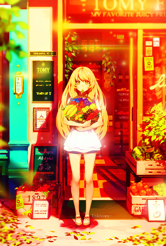
Fruits Basket
Life is Full of Colours

Removed due to plagiarism
Kirigiri

Konpaku Youmu

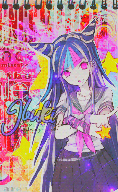
Ibuki
S U N S H I N E

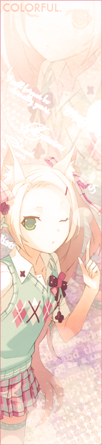
Colorful
Voting ends April 22nd!
Previous edit
A day late, but we can make up for that during voting.
Remember the following if you want to participate:
Updated/New Rules!
Remember the following if you want to participate:
- Anyone can enter unless specified by me. Yes, even beginners can partipate! It's all good clean fun.
- Your entry must follow the theme and GFX type.
- Your entry must be within size limits.
- Premade GFX is allowed.
- Work must be submitted before midnight GMT of the due date.
- Plagiarism is absolutely, most definitely, and highly not allowed. You will be disqualified if I find you editing someone else's GFX without permission and banned from future competitions.
- All submissions have to be anonymous. If you're participating, you can leave a post here saying that you're participating, but it's not required. You can also leave comments about your entry, but don't outright post what it looks like.
- As such, please PM me with the form below.
- Because this is all anonymous, if you have a watermark that includes your name, please use a different watermark.
Theme: Colorful
GFX Type: Vertical Signature
Max Size: 600 x 800
GFX Type: Vertical Signature
Max Size: 600 x 800
Form and Example:
[insert entry here]
[insert forum code for image here]
Proof:

[insert entry here]
[insert forum code for image here]
Proof:
[img]http://orig06.deviantart.net/f6f2/f/2014/158/a/4/a4abacda5735b72780f54392e700b5ff-d7lfc7o.png[/img]Proof: http://www.mediafire.com/file/01da4llnewsukau/cirno.psd
Due Date: April 16th

 and that paint splats behind the text but further it really is a beautiful art!