HI! you requested mods on #modreqs like... 3 days ago, and im here to see if i can help you with that!
lets see if my mod Works for you, since a lot of professional mappers/modders already modded it x.x
Melody1. 00:03:854 (1,2) - this is a suggestion, but try moving the secons slider to X:185-Y:131, so it can flow better with the curve of the first slider
2. 00:04:687 (1,2,3,4) - make this have a better shaped triangle
3. 00:13:854 (2,3,4) - move circle "2" a bit to the left, so the whole part can look like a cute triangle uwu
4. 00:14:521 (1,2,3) - the circles being separated from the slider doesnt really look good tho, why making them closer?
5. 00:17:187 (1,2,3) - same reason as #4
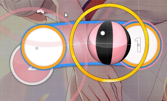
6. 00:26:187 (1,2,3) - make this circles have the same spacing between them
7. 00:27:521 (2) - move this circle more to the right, so it can flow a bit better (in my opinión :S)
8. 00:34:686 (1,2) - the second slider could look cooler if you make a curve on it
https://osu.ppy.sh/ss/8223563 like that
9. 00:43:353 (1,2,3) - give this circles a similar spacing too
10. 01:41:021 (3,4) - make the second slider have a curve too, it will make it cooler
http://osu.ppy.sh/ss/8223580 like that
11. 02:02:687 (1,2) - in this case, make a Little curve in the second slider too uwu
12. 02:10:687 (1,2) - move the second slider a bit more to the right, so it flows better with the first slider
13. 02:19:021 (2,3,1) - make this objects just a bit closer
14. 02:31:186 (3,4,5) - same reason as #13
15. 02:55:353 (3,4,5) - make something like this?
https://osu.ppy.sh/ss/822360116. 03:05:687 (2,3,1) - make this objects a bit closer too
17. 03:14:187 (4,5,6) - rotate this triplet on a -11 angle and move it to X:254-Y:144, it could make it cooler, and it will have a pretty decent space from the slider at 03:14:687 (1)
18. 03:27:354 (3) - move this circle a bit more down, so the jump can have more pretty good spice
19. 03:30:020 (3) - kind of a problemo here, if the slider will be a line, should the second gray dot be in the middle? doesnt look good :S
20. 04:20:687 (1,2,1) - this objects should have the same spacing, or at least make some spacing between the first and second slider
Thats all, you have a very good map and the song is beautiful
also, nice and cute background uwu, good luck!


