like people did last time i'll talk about all the entries and then choose who i vote for! also this is just my opinion and fair criticism, take it or leave it there its lying on the floor look at it ahh so cute (灬╹ω╹灬)[Kamikazy]
really good palette and choice of font. the textures are on point! i love zyra so i was really pleased to see this piece. only problem is the size, its not at all sized for a signature! other than that, one of my favourites.
juesus
i saw the first one you did and i have to say i prefer this one, you did good on revisiting your piece. theres a lot of good things like the background, its beautiful! i like the effect on the render too. one bad thing is the text, it doesnt really go well with the rest, and its quite hard to read. its also a bit too big to fit in as a signature
Kurochiie
i hate fiora she so cancer this one is really similar to kamikazy's, one tone palette and harsh textures but its more perfected in a sense. theres so much details! i like the font a lot. really good job, you're talented hoyl
XxCrystal
a lot of effects used! seems like your style and its great, having your own style is really important in art (in general, this applies to graphics as well). the two images used goes really well together, pls teach me how to do the bokeh effect haha, i like the "chara" but it hard to read whats beneath it! overall a really good one too. AND ITS THE GOOD SIZE!! yay
those entries are so much more complex than mine D':
- K a t h -
not a big fan of that one, maybe because of the ahri art ? imo the choice of artwork is really important. technically its really good piece though; i really like the effects, creates an eery atmosphere 8)
-Haise
theres some really good ideas here, i think its really a shame we dont see the background image more, its kinda blurred and masked by the textures. they are a little bit too strong here imo. the image doesnt really go well with the rest too. however, i really like the colors and the rough effect! my last point would be the text, i think theres room for creativity and improvement here too :3c
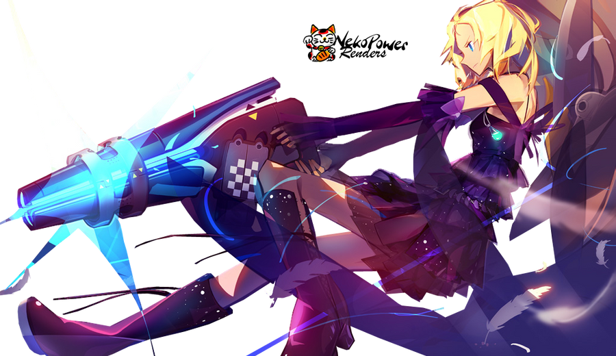
JayM3_
i gotta say i love this one. like a lot. too much maybe :'D the effects are so cool! so much action and dynamismmmm BUT i think the s4 logo is really ruinning (<strong word but not in the sense that its garbagefddsg far from it actually) the piece :'c your logo too is a little too big. but omg i really think its super good, keep it up!
Luisina
its way too big for a signature D': wow this one is stunning, the bokeh, the blur and the text! i dont have a lot to say on this one, i really like the colorful but well chosen palette of colors. its maybe a little too big so theres a lot of space wasted but its just a detail.
theres a lot of really talented people here! my vote goes for XxCrystal, i'm really inspired by this one and it fits my style/tastes! good job everyone~

