This map has been deleted on the request of its creator. It is no longer available.
forum
Ayane - IF (Short Vers.)
posted
Total Posts
10
useless mod kappa
18:34 sinn: ;O
18:34 Daoski: hm?
18:34 sinn: btw
18:34 sinn: did u forget
18:34 sinn: to put break
18:34 sinn: or isit just me
18:34 Daoski: oh
18:35 Daoski: forgot i actually had to add it
18:35 Daoski: zz
18:35 sinn: `btw
18:35 sinn: 00:22:124 (1) -
18:35 sinn: i dont rly see
18:35 sinn: how the reverse sliders
18:35 sinn: emphasise anything uh
18:35 sinn: unless its just me
18:35 Daoski: piano
18:35 Daoski: i will add it
18:35 Daoski: in
18:35 Daoski: specifically
18:35 Daoski: for normal ;D
18:37 sinn: 00:36:873 (4) -
18:37 sinn: remove
18:37 sinn: the reverse arrow clap
18:37 sinn: and put it at slider end
18:38 Daoski: ill do both
18:38 sinn: the
18:38 sinn: previous sliders
18:38 sinn: u only put it
18:38 sinn: on sliderend only
18:38 Daoski: listen
18:38 Daoski: the music transitions
18:39 Daoski: at that slider
18:39 Daoski: so both
18:39 Daoski:
18:39 sinn: tbh
18:39 sinn: sounds rly weird for me
18:39 sinn: but sure
18:39 Daoski: does it really?
18:39 sinn: i mena if music got
18:39 sinn: then sure
18:39 Daoski: what if
18:39 Daoski: i do
18:40 Daoski: both
18:40 Daoski: for all slider
18:40 Daoski:
18:40 Daoski: 00:32:850 (1) - startin here
18:40 sinn: eh
18:40 sinn: wait ar
18:40 sinn: lemme add one more thing
18:40 sinn: 00:55:644 (1) -
18:40 sinn: reverse slider add clap
18:40 sinn: 00:56:649 (2) -
18:40 sinn: clap
18:40 sinn: reverse slider add clap
18:40 sinn: 00:56:984 (3) -
18:41 Daoski: done
18:41 sinn: also tbh for the 32 sec
18:41 sinn: i rather u do slider ends only
18:41 sinn: like ur if else diffi
18:41 Daoski: hm ok
18:41 Daoski: its no big deal for me
18:41 Daoski: changed
18:42 sinn: 01:06:370 (1) -
18:42 sinn: did u forget this also ;o
18:42 Daoski: wat
18:42 Daoski: clap?
18:44 sinn: ye
18:44 sinn: o wait
18:44 sinn: end got
18:44 sinn: NVM
18:46 sinn: i cant
18:46 sinn: rly comment on the placing tho
18:46 sinn: quite solid
18:46 sinn: from what i see tho
18:47 Daoski: 00:32:850 (1,2,3,4) - piano keys apply or no?
18:47 Daoski: i did it for the one u mentioned already
18:47 sinn: wut u mean by apply or no
18:47 Daoski: do u want me
18:47 sinn: u can apply uh cuz i cant rly tell how good it would be
18:47 Daoski: to apply piano keys
18:47 sinn: sure go ahead
18:47 Daoski: oh
18:48 Daoski: i can update
18:48 Daoski: so u can redl for other part
18:48 *Daoski is listening to [https://osu.ppy.sh/b/1263039 Ayane - IF (Short Vers.)]
18:48 Daoski: redl ;D
18:48 Daoski: 00:22:124 (1,2,1) - i did it for this
18:50 sinn: i mean can luh
18:50 sinn: ;o
18:50 Daoski: i think my hitsound managing is very messy
18:50 Daoski: my file is basically filled with silence.wavs
18:50 Daoski: LOL
18:50 Daoski: folder8
18:51 Daoski: dude im normal mapper god
18:51 Daoski: too solid placement ;D
19:09 Daoski: ok
19:09 Daoski: fixed and hitsounded ;D
19:09 Daoski: had to add 3 new keys
19:10 sinn: wew god keysounder
19:10 sinn: all diffi when
19:11 Daoski: idk
19:11 Daoski: i got gd for hard
19:11 Daoski: but im not hitsounding for it
19:11 sinn: o
19:11 sinn: nice
19:11 Daoski: idk i told them
19:11 Daoski: i copy and paste
19:11 sinn: how many stars u making ur insane xd
19:11 Daoski: but they were like no fk off
19:11 Daoski: maybe 4.75
19:11 Daoski: and its done
19:11 sinn: orhhh
19:11 sinn: nice
19:12 Daoski: 4 diff mapset
19:12 Daoski: featuring 1 hard gd
19:12 Daoski: and maybe 1 insane
19:12 Daoski: if i dont finish it
19:13 sinn: oh
19:13 sinn: gl =D
19:23 Daoski: sinn
19:23 Daoski: do u want kds?
19:23 sinn: sure
19:23 Daoski: for mod normal
19:23 sinn: tfw
19:23 sinn: mod=hitsound
19:23 Daoski: still important
19:23 sinn: ok can luh
19:23 sinn: i mean i might mod it ltr anyw
19:23 sinn: the other diffis
19:23 sinn: once its done who knows
19:24 Daoski: lul
19:24 Daoski: more kds
19:24 sinn: no la
19:24 Daoski: bonus cookies
19:24 sinn: cannot give 2 liddat
19:24 Daoski: not
19:24 sinn: that one is no kd cuz mod b4 alr
19:24 sinn: !
19:24 Daoski: with that attitude
19:24 Daoski: >:)
19:24 sinn: na
19:24 sinn: i no cheat kd tbhg
19:24 Daoski: itsallgood
19:26 sinn: nah no need anyw
19:26 sinn: i just post this 1st
19:26 sinn: then i might mod it ltr agn
19:26 sinn: =D
mod when whole mapset finish?KappaNojk
OK... Not much to say bc I'm modding for the first time but ok let's try 
Normal:
As for normal diff HP Drain Rate should be between 3 and 5; Approach Rate should be between 4 and 6
I would put offset to 674 (and then resnap everything) but that doesn't make a big change so you can leave it if you want
00:27:487 (1) - this slider overlaps and it's bad bc you don't use overlapping objects like that in your map
01:12:403 (2) - ^
00:16:090 (2) - ^ it's like the same, wait till the slider fades out at least and then it wouldn't be a problem. For example this is better 01:54:638 (2) - ; 00:36:873 (4) -
I think you use to many different slider shapes 00:24:806 (1) - you could make this one same as this 00:22:124 (1) -
00:40:895 (1) - yeah, you should make simpler shapes as for normal
00:47:599 (1) - ^
01:10:392 (2) - ^ etc;
Your sliders (most of them) aren't going torwards the next object: 00:17:096 (2) - ; 00:27:487 (1) - ; 00:31:509 (3) -; 00:35:532 (3) - etc. It's ok to have some (like blankets or sth) but I think it's too much of them and it might be misleading for new players. You should put more sliders that are pointing towards the next object
01:32:012 (3,4,5) - all should be separated bc same rhythm
00:20:783 (3,4) - this is not similar to this 01:45:253 (1,2,3,4) - you should stick with sliders, or use more single taps throughout all your map
Hope this helps at least a bit
Good luck
Topic Starter
thx for mod seselis1
seselis1 wrote:
OK... Not much to say bc I'm modding for the first time but ok let's try
Normal:
As for normal diff HP Drain Rate should be between 3 and 5; Approach Rate should be between 4 and 6
I would put offset to 674 (and then resnap everything) but that doesn't make a big change so you can leave it if you want
00:27:487 (1) - this slider overlaps and it's bad bc you don't use overlapping objects like that in your map
While it may be true I overlapped over red anchors once, I think the previous slider implying that direction is enough for players to figure out that the next slider is there (considering I abused blankets so much, as well as the overlap disappearing well before the approach circle starts). No change
01:12:403 (2) - ^
I would consider it if it was the sliderhead overlapped, but considering that it is just the sliderend, no changes
00:16:090 (2) - ^ it's like the same, wait till the slider fades out at least and then it wouldn't be a problem. For example this is better 01:54:638 (2) - ; 00:36:873 (4) -
Hm.. I've looked at a lot of ranked normal difficulties <2* and I've seen a lot of maps using the same overlaps you've been highlighting me to change... so unless its literally unplayable/readable, I don't really feel inclined to change all of these specific overlaps. I mean at least these are complete overlaps unlike some of the goofy half-overlapped circles/sliders I've seen that are ranked. The overlaps do actually disappear soon enough that the overlapped objects do appear in full either way.
I think you use to many different slider shapes 00:24:806 (1) - you could make this one same as this 00:22:124 (1) -
too much copy+paste is not gud maybe
00:40:895 (1) - yeah, you should make simpler shapes as for normal
That is literally combination of 2 simple shapes, how exactly is this too complex for normal (since its almost straight)? To be fair, it says in https://osu.ppy.sh/wiki/Normal that creative sliders are encouraged
00:47:599 (1) - ^
literally the explanation i gave above
01:10:392 (2) - ^ etc;
^ still dont get how a combination of 2 curved sliders is too complex... so no change
Your sliders (most of them) aren't going torwards the next object: 00:17:096 (2) - ; 00:27:487 (1) - ; 00:31:509 (3) -; 00:35:532 (3) - etc. It's ok to have some (like blankets or sth) but I think it's too much of them and it might be misleading for new players. You should put more sliders that are pointing towards the next object
All the sliders --> circles are always either a triangle like 01:18:269 (3,4,5) - , a square, or a line as utilized at 01:22:459 (1,2,3,4,1) - so it isn't that hard to anticipate/read after 2-3 plays at most. Besides, what direction does a straight slider imply then?
01:32:012 (3,4,5) - all should be separated bc same rhythm
Specifically here, I overlapped the two hit circles with the singer saying the same syllable (the "tor" in "sutori" or story in japanese'd english), it matches the music and I've used a lot of 2 1/1 hit circles enough in the map to have it be consistent mapping, no changes
00:20:783 (3,4) - this is not similar to this
This has a problem when I did the same thing here 01:41:565 (2,3) - but yet that isn't highlighted? The slider blankets the other slider head nicely and it's not like the implied direction is any different if it were copy+paste straight slider... no changes
01:45:253 (1,2,3,4) - you should stick with sliders, or use more single taps throughout all your map
I intended to place emphasis/intensity here as 01:45:253 (1,2,3,4,1) - is where the guitar intensity peaks, and it peaks again in a similar fashion at 01:50:448 (2,1,2,1,2,1) - , but instead of using hit circles for the latter, I used tricky sliders with 1/2 gaps..
If anything, I made the section less hit circle abusive. Changed and Fixed!
I'll change my mind about the rejections I made from your suggestions if more mods do agree with yours
Hope this helps at least a bit
Thanks so much for the help, though!
Good luck
TY!!!!
o/, yeah you're right (I told some nonsense I was drunk probably), leave most of the stuff unchanged xD
I myself did a normal for the first time lol
thx for mod mod gonna need more m4ms ^^
I myself did a normal for the first time lol
thx for mod mod gonna need more m4ms ^^
R.I.P DubSteppinNinja's Hard  but Worry NOT V2 is coming soon! aha and if you pre-order now you can get special behind the scene ROASTING ft. Me!
but Worry NOT V2 is coming soon! aha and if you pre-order now you can get special behind the scene ROASTING ft. Me!
Topic Starter
kys lulzDubSteppinNinja wrote:
R.I.P DubSteppinNinja's Hard
okei quickie
combo colors:
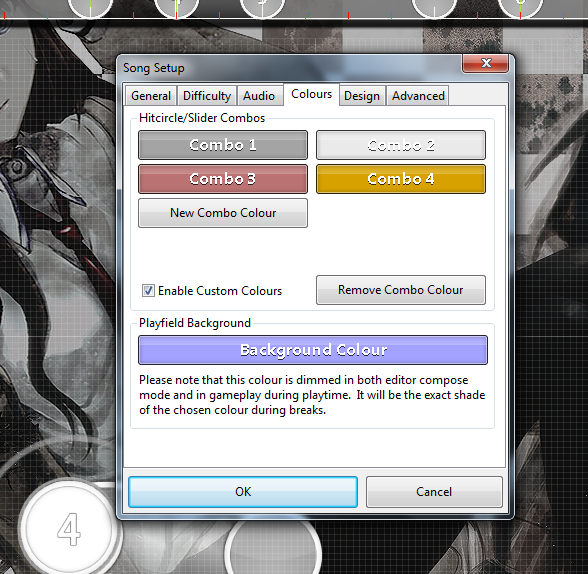
here, use grey/white for the slow parts and intro, and the other two for kiai and intense parts
NORMAL
00:06:035 (1) - just slider aesthetics but i think head is too scrunched but it could be fine xd
00:23:632 (2) - ask for testplayers for this one. stack might not be good this easy
00:35:532 (3) - this looks better to me
00:46:090 (2,3,4) - this rhythm plays better imo cause better click emphasis
01:24:806 (5,1) - this overlap is mildly displeasing but plays fine
ADVANCED
haha this gon be hard to read with HD
00:15:588 (2) - this rhythm plays better imo cause it preps the rhyhtm with good clicks and is easy to follow
00:24:135 (4,1) - the curve for these are too square for meeeeee, but works if you want it to be not as pretty on purpose
00:33:688 (2) - for each of these, consider circle + slider for better clicks
00:59:498 (1,2) - looks a bit not ok because of how stacking works ;;
01:07:543 (4) - i just personally dont like em but there are ppl that do
01:11:565 (6) - i would personally delete this to kill connection between 01:11:063 (5,1) -
01:24:806 (5) - this would be better as circle alone; more emphasis
INSANE
00:31:174 (4,5) - imo, the overlap is too little to look like a good overlap and too much to be clean
00:35:197 (3,4) - cuz of stacks, tiny bad overlap
00:46:928 (2,3) - too close for me but i guess ok
01:01:007 (1) - delet this xd (in seriousness, theres a better emphasis without this)
01:12:739 (1,2,1,2) - this is a bit not fitting (those strmz xd) so consider this remap:
01:23:632 (2,1,2) - some people might say this is "unreasonable and overmapped" so you might wanna care
01:30:169 (3) - consider making the tail clickable
THE OTHER THING
good.
00:49:442 (6) - maybe click the white tick or not
00:59:163 (1,2) - consider making this a 3 circle jump to mirror 00:58:325 (1,2)
01:00:839 (3) - this should be the last click, and the start of long slider (cuz nothing after unless im drunk right now)
01:50:867 (2,1) - cuz of stacks, this overlaps a bit
GOOD LUCK FOR RANK BBY
combo colors:
here, use grey/white for the slow parts and intro, and the other two for kiai and intense parts
NORMAL
00:06:035 (1) - just slider aesthetics but i think head is too scrunched but it could be fine xd
00:23:632 (2) - ask for testplayers for this one. stack might not be good this easy
00:35:532 (3) - this looks better to me
00:46:090 (2,3,4) - this rhythm plays better imo cause better click emphasis
01:24:806 (5,1) - this overlap is mildly displeasing but plays fine
ADVANCED
haha this gon be hard to read with HD
00:15:588 (2) - this rhythm plays better imo cause it preps the rhyhtm with good clicks and is easy to follow
00:24:135 (4,1) - the curve for these are too square for meeeeee, but works if you want it to be not as pretty on purpose
00:33:688 (2) - for each of these, consider circle + slider for better clicks
00:59:498 (1,2) - looks a bit not ok because of how stacking works ;;
01:07:543 (4) - i just personally dont like em but there are ppl that do
01:11:565 (6) - i would personally delete this to kill connection between 01:11:063 (5,1) -
01:24:806 (5) - this would be better as circle alone; more emphasis
INSANE
00:31:174 (4,5) - imo, the overlap is too little to look like a good overlap and too much to be clean
00:35:197 (3,4) - cuz of stacks, tiny bad overlap
00:46:928 (2,3) - too close for me but i guess ok
01:01:007 (1) - delet this xd (in seriousness, theres a better emphasis without this)
01:12:739 (1,2,1,2) - this is a bit not fitting (those strmz xd) so consider this remap:
01:23:632 (2,1,2) - some people might say this is "unreasonable and overmapped" so you might wanna care
01:30:169 (3) - consider making the tail clickable
THE OTHER THING
good.
00:49:442 (6) - maybe click the white tick or not
00:59:163 (1,2) - consider making this a 3 circle jump to mirror 00:58:325 (1,2)
01:00:839 (3) - this should be the last click, and the start of long slider (cuz nothing after unless im drunk right now)
01:50:867 (2,1) - cuz of stacks, this overlaps a bit
GOOD LUCK FOR RANK BBY
Topic Starter
Reply to Jezag
THANK YOU SO MUCH, THIS WAS REALLY HELPFULJeZag wrote:
okei quickie
combo colors:
here, use grey/white for the slow parts and intro, and the other two for kiai and intense parts
NORMAL
00:06:035 (1) - just slider aesthetics but i think head is too scrunched but it could be fine xd if u say it could be fine it prob will
00:23:632 (2) - ask for testplayers for this one. stack might not be good this easy ok, I've changed it so I removed those circles
00:35:532 (3) - this looks better to me I agree, but I don't rly know how to map the previous in a uniform manner like this one
00:46:090 (2,3,4) - this rhythm plays better imo cause better click emphasis agreed, changed (copied the timeline)
01:24:806 (5,1) - this overlap is mildly displeasing but plays fine stay triggered #topkek no changes
ADVANCED
haha this gon be hard to read with HD aw crap ima prob get picked on a lot for those maybe
00:15:588 (2) - this rhythm plays better imo cause it preps the rhyhtm with good clicks and is easy to follow ok, changed
00:24:135 (4,1) - the curve for these are too square for meeeeee, but works if you want it to be not as pretty on purpose #stopracismtowardsthesesquaresliders no changes lolz i like them
00:33:688 (2) - for each of these, consider circle + slider for better clicks changed, as you suggested in the game chat
00:59:498 (1,2) - looks a bit not ok because of how stacking works ;; ok, changed and confirmed in the game chat
01:07:543 (4) - i just personally dont like em but there are ppl that do stay triggered friend
01:11:565 (6) - i would personally delete this to kill connection between 01:11:063 (5,1) - i can see what you mean, but no changes
01:24:806 (5) - this would be better as circle alone; more emphasis more emphasis indeed, changed
INSANE
00:31:174 (4,5) - imo, the overlap is too little to look like a good overlap and too much to be clean FK WHY DID U NOTICE!!! changed
00:35:197 (3,4) - cuz of stacks, tiny bad overlap FK STACKS MAN, changed all similar sections accordingly to stay consistent
00:46:928 (2,3) - too close for me but i guess ok k then, no changes
01:01:007 (1) - delet this xd (in seriousness, theres a better emphasis without this) agreed, changed
01:12:739 (1,2,1,2) - this is a bit not fitting (those strmz xd) so consider this remap: alright, remapped!
01:23:632 (2,1,2) - some people might say this is "unreasonable and overmapped" so you might wanna care i understand, changed
01:30:169 (3) - consider making the tail clickable alright ill give it a try, changed
THE OTHER THING
good.
00:49:442 (6) - maybe click the white tick or not no >:D
00:59:163 (1,2) - consider making this a 3 circle jump to mirror 00:58:325 (1,2) this'll probably get changed entirely
01:00:839 (3) - this should be the last click, and the start of long slider (cuz nothing after unless im drunk right now) same as above
01:50:867 (2,1) - cuz of stacks, this overlaps a bit all fixed
GOOD LUCK FOR RANK BBY
ingame chat with JeZag simultaneously with reply to mod
18:05 Daoski: man
18:05 Daoski: even u are racist towards square lookin ass sliders
18:05 Daoski: feelsbadman
18:05 JeZag: LUL
18:05 JeZag: i dont like squares
18:05 JeZag: round are JUICY
18:05 Daoski: but
18:05 Daoski: ok
18:05 Daoski:
18:06 Daoski: but sometimes
18:06 Daoski: no loli\
18:06 Daoski: is bad map
18:06 Daoski:
18:06 JeZag: LOL
18:06 JeZag: GOOD TATES
18:06 JeZag: TASTES
18:06 Daoski: i mean at least i made it properly square with good placement
18:06 Daoski: to blanket hitcircle nicely
18:06 Daoski: so i dont have to execute these sliders right
18:06 Daoski:
18:07 JeZag: LOL
18:07 JeZag: wait
18:07 JeZag: i could make a meme for that
18:07 JeZag: "you dont need to blanket"
18:07 JeZag: "if you never use curved sliders"
18:07 JeZag: "blak man pressing temple"
18:08 Daoski: LOL
18:10 Daoski: dude
18:10 Daoski: im disappointed
18:10 Daoski: 00:33:688 (2) - for each of these, consider circle + slider for better clicks
18:10 Daoski: no img????? cmon man
18:10 Daoski: sloppy
18:10 Daoski: no kds
18:10 Daoski: kek
18:10 JeZag: LOL
18:10 JeZag: FEELSBAD
18:10 Daoski: but on a srs note i need a bit more clarity on it lol
18:10 JeZag: gimme a sec
18:10 JeZag: which diff and song is that again
18:10 Daoski: advanced
18:10 *Daoski is editing [https://osu.ppy.sh/b/1284006 Ayane - IF (Short Vers.) [Advanced]]
18:11 JeZag: ohhh
18:12 JeZag: yea make the white tick clickable maybe
18:12 Daoski: oh boy
18:12 JeZag: it would be better rhythm as a hitcircle + 1/2 slider after
18:12 Daoski: i think i can do it
18:12 JeZag: but it doesnt matter too much
18:12 Daoski: but
18:12 JeZag: but if you change one
18:12 Daoski: ill just 2 1/2 circles into a 1/1 gap
18:12 JeZag: ya hafta commit
18:12 Daoski: ik
18:12 Daoski: the feelsgoodchanges
18:12 JeZag: which is the hardest problem about making changes
18:13 JeZag: yeahhh it feelsbadman
18:13 JeZag: LOL
18:13 JeZag: R U MASO?
18:13 JeZag: CHIST
18:13 Daoski: dude
18:13 Daoski: ur a jesus christ
18:13 Daoski: chill
18:13 JeZag: :')
18:14 Daoski: https://osu.ppy.sh/ss/8092299 what are thoughts on this LUL
18:14 Daoski: wait im dumb
18:14 JeZag: its actually not bad
18:15 Daoski: nvm ill do like u said maybe it works better
18:15 JeZag: same tbh
18:15 Daoski: i like my first suggestion
18:15 Daoski: but then the overlaps started lingering me
18:15 Daoski: fondling my cringes
18:15 JeZag: LOL
18:16 Daoski: now i feel bad
18:19 Daoski: ok
18:19 Daoski: i made it work pretty decent
18:19 Daoski: without being bad overlap
18:19 Daoski: *changed*
18:19 JeZag: ahhh niiiiice
18:20 Daoski: 00:59:498 (1,2) - looks a bit not ok because of how stacking works ;;
18:21 Daoski: so.... i get rid of the stacking altogether?
18:21 JeZag: hmmm
18:21 JeZag: oh
18:21 JeZag: move both a bit down right
18:21 JeZag: aka, make 1 stack
18:21 JeZag: not 2
18:21 JeZag: even tho feels weird
18:21 Daoski: wait
18:21 Daoski: does the stacking ruin the blanket
18:21 JeZag: the downsides are: if someone plays with HR
18:21 Daoski: is that the problem here
18:21 JeZag: it will feel weird
18:21 JeZag: oh yeah it will
18:21 JeZag: ahhhh i see
18:22 JeZag: ok just make it not stack
18:22 Daoski: ok
18:22 Daoski: that
18:22 Daoski: i can do GUD SIR
18:22 JeZag: PLEASED TO HEAR
18:23 Daoski: o fk
18:23 Daoski: its a lot harder than i thought
18:23 Daoski: THE STRUGGLE BEGINS
18:23 JeZag: 00:59:498 (1) -
18:24 JeZag: cant u jsut push this down
18:24 Daoski: the blanket
18:24 Daoski: D:
18:24 Daoski: nooooo
18:24 *Daoski starts to rot away as he forces himself to break the blanket
18:24 JeZag: haha at least you'll get more sliderart practice ;w;
18:33 Daoski: [http://osu.ppy.sh/ss/8092397 is this too ambigiuous slider direction]
18:33 Daoski: o fkin grammar
18:33 Daoski: AMBIGUOUS*
18:33 JeZag: LOL
18:33 JeZag: i think thats okei
18:33 Daoski: ok
18:33 JeZag: but just for good measure
18:33 JeZag: for that tail, put a red tick
18:34 JeZag: so its more of an edge and bounce back
18:34 Daoski: wait thats how it works???
18:34 Daoski: dude im LEARNING NEW THINGS
18:34 JeZag: LOL
18:34 Daoski: WOOOOOOOOOOOOOOOOOOOOOOOOOOOOOOOOOOAAAAAAAAAAAAAAAHHHHHHHHHHHHHHHHHHHHHHHHHHHHHHH
18:34 Daoski: ok ill give it a try
18:34 JeZag: other ppl do it
18:34 JeZag: so can u!
18:35 Daoski: [https://osu.ppy.sh/ss/8092409 ok so doing that makes it look like this now...]
18:35 JeZag: oh
18:35 JeZag: thats not what i meant LOL
18:36 JeZag: right now
18:36 Daoski: uh oh\
18:36 JeZag: in that pic
18:36 JeZag: the 2nd to last red anchor
18:36 JeZag: you can make it red
18:36 JeZag: so the slider plays more like a hook
18:36 JeZag: rather than a ball at the end
18:36 Daoski: my god
18:36 JeZag: it makes the end of the slider more distinct
18:36 Daoski: that looks so cringe
18:36 Daoski: LUL
18:36 Daoski: ok
18:36 JeZag: LUL
18:36 Daoski: okok
18:36 Daoski: ill try making something that doesnt evaporate my eyeballs
18:36 JeZag: you still have to tweak it a bit
18:36 Daoski: with that in mind
18:37 JeZag: but it can work well
18:37 JeZag: LOL
18:38 Daoski: i like my ball slider more
18:38 Daoski: wtf is this shit
18:38 Daoski: D:
18:38 JeZag: LOL
18:38 JeZag: if you like it
18:38 JeZag: more likely than not you can keep it tbh
18:38 Daoski: OK
18:38 Daoski: I DID SOMETHING
18:39 Daoski: [https://osu.ppy.sh/ss/8092434 better not reject this piece of shit now u fker]
18:39 JeZag: wait whuts ur question again
18:39 JeZag: "is it good"
18:39 Daoski: is it good
18:40 JeZag: or "does this flow well into next thing"
18:40 JeZag: ooooooh
18:40 JeZag: yoooo
18:40 Daoski: it already flows well into the next thing
18:40 JeZag: the thing you had to begin with is good
18:40 JeZag: i thought you wanted to make the thing you started out with
18:40 JeZag: more easy to read
18:40 Daoski: well
18:40 Daoski: i made it more easy to read by applying ur suggestion
18:40 JeZag: ah tru
18:40 JeZag: right now its gud
18:41 Daoski: ok
18:41 Daoski: feelsgoodman
18:41 Daoski: i guess ill keep this
18:41 *Daoski has gained +1 in slider art vocabulary kek
18:41 JeZag: ayyy
18:41 JeZag: you pick em up as you goooo
18:41 Daoski: but i still like my ball sliders
18:41 Daoski: this slider is like
18:42 Daoski: "lets infect it with some lolizag slidertechniques
18:42 Daoski: me: ok dad
18:49 Daoski: 01:24:806 (5) - this would be better as circle alone; more emphasis
18:49 Daoski: just saying i agree it sounds better with just a click but i think thats too many 1/1 gaps to judge for advanced diff
18:49 Daoski: too many 1/1 gaps to judge in a row
18:49 Daoski: but ill give it a try
18:49 JeZag: LUL
19:17 Daoski: so did u finish spektre yet
19:18 JeZag: its pretty much
19:18 JeZag: im ironing stuff so if i rank
19:18 JeZag: no big issues
19:18 Daoski: lol
19:18 Daoski: inb4 kaifin
19:18 Daoski: ONCE A FKIN GAIN
19:18 Daoski: "remap kds thx"
19:18 JeZag: LUL
19:18 JeZag: FEELSBAD
19:19 Daoski: 01:12:739 (1,2,1,2) - this is a bit not fitting (those strmz xd) so consider this remap: [https://i.ppy.sh/9d8a3b1bc042f81c120b52fe84d71ecd60d74fb6/68747470733a2f2f736e61672e67792f796f745251332e6a7067 img 1] [https://i.ppy.sh/b568d64bc25b30ab6f2df545683014ac8d03177a/68747470733a2f2f736e61672e67792f356c684c62392e6a7067 img 2]
19:19 *Daoski is editing [https://osu.ppy.sh/b/1265130 Ayane - IF (Short Vers.) [Insane]]
19:19 Daoski: im confused
19:20 Daoski: im willing to change it but i dont exactly understand how even tho there are images
19:20 Daoski: im dumb
19:20 JeZag: ah what i mean
19:20 JeZag: is that i dont think streams fit the song
19:20 JeZag: gimme sec
19:20 JeZag: changing laundery
19:20 JeZag: but thats a remapping suggestoin
19:20 Daoski: ok
19:21 JeZag: so the pics are the highlighted stuff
19:22 Daoski: ok so essentially u want me to just remove the 1/4 repeating sliders?
19:22 Daoski: or just delete streaming as a diff element altogether
19:23 JeZag: all the driers are filled......
19:23 Daoski: now
19:23 Daoski: EXPLODE
19:23 Daoski: ORA ORA ORA ORA ORA
19:23 JeZag: anyway yeah i dont think the stream fit, so i deleted the 1/4 slider and remapped
19:23 JeZag: LOL
19:23 Daoski: ohhh
19:24 JeZag: yeah thats the shapes of all the things highlighted, in order
19:24 Daoski: ok i think i getr it
19:24 JeZag: ^^
19:24 Daoski: was just lost cuz theres no timestamp at all
19:24 Daoski: so had no idea where u really deleted up to
19:24 JeZag: oh OOPS
19:24 Daoski: LOLZ
19:24 JeZag: LOL
19:24 Daoski: i think i can backtrack
19:24 JeZag: biiiig whooopos
19:24 Daoski: dw
19:24 Daoski: im smart now
19:25 Daoski: OK
19:25 Daoski: I GET IT NOW
19:25 Daoski: U R RIGHT GUD SIR
19:26 JeZag: LOL
19:26 Daoski: ok i think i have a good grasp of things
19:27 Daoski: but ill have to remap both jumping sections entirely wewlad
19:27 Daoski: but
19:27 Daoski: WORTH IT
19:33 Daoski: ok i made the first set of jumps in kiai work as u said
19:33 Daoski: just not with the the exact shapes u had in mind lolz
19:34 JeZag: LOL
19:34 JeZag: ooooooh GL
19:34 JeZag: dont forget
19:34 JeZag: in general ppl will point out all ur streams a
19:34 JeZag: and ask you to justify em
19:34 JeZag: make sure you prepare an argument just in case
19:34 Daoski: what is this
19:34 Daoski: a lawsuit?
19:35 JeZag: thats what ranking is
19:35 Daoski: LUL
19:35 JeZag: you gotta defend a thesis
19:35 JeZag: but that thesis
19:35 JeZag: is ur map
19:35 Daoski: its ok
19:35 Daoski: rejecting 1 modder wont impede my progress to rank TOP KEK
19:35 Daoski: jk
19:35 Daoski: im learning a lot
19:35 JeZag: LOL
19:47 Daoski: oh boy
19:47 Daoski: time for the LAST DIFF mod
19:47 Daoski: wew
19:48 JeZag: go get emmmm
19:48 Daoski: THE OTHER THING
19:48 Daoski: good.
19:49 Daoski: i dont understand
19:49 Daoski: what exactly does this mean KEK
19:49 Daoski: no timestamp
19:49 Daoski: no kjudosu
19:49 Daoski: LUL
19:49 Daoski: jk
19:49 JeZag: LOL
19:49 JeZag: LMAO
19:49 JeZag: ITS UP TO
19:49 JeZag: PERSONAL INTERPRETATION
19:49 JeZag: YOU CANT BE WRONG
19:49 JeZag: SORTA LIKE WHAT THEY SAY IN LA CLASS
19:49 JeZag: UNTIL U GET A ZERO ON THAT ESSAY
19:49 Daoski: los angeles class
19:49 Daoski:
19:50 JeZag: feelsbaaaaad
19:50 JeZag: oh ur UCLA?
19:51 Daoski: wat
19:51 Daoski: no i understand what LA is
19:51 Daoski: i was just trollin dude
19:51 JeZag: ahhhhhhhhhhhhhhhhhhh
19:51 Daoski: cmon man
19:51 Daoski: CMON
19:51 JeZag: NO U
19:52 *Daoski is editing [https://osu.ppy.sh/b/1246825 Ayane - IF (Short Vers.) [if;else]]
19:52 Daoski: 01:50:867 (2,1) - cuz of stacks, this overlaps a bit
19:52 Daoski: is the overlap bad?
19:52 Daoski: i know it "stacks" but does it ruin something for it to be pointed out
19:53 JeZag: gimme sec
19:53 JeZag: i think the overlap is icky
19:53 JeZag: cuz the things its stacked on even if its placed right
19:53 JeZag: 01:50:867 (2) -
19:53 JeZag: just makes it look off regardless
19:53 Daoski: so ur saying
19:53 Daoski: to just separate them more
19:54 Daoski: if they'll stack anyways
19:54 Daoski: what does it look "off" with respect to?
19:55 JeZag: sry
19:56 JeZag: i was grabin a dryer
19:56 JeZag: 01:50:448 (1,2) -
19:56 JeZag: this just looks not good to me
19:56 JeZag: let them stack
19:56 JeZag: but move the whole stack right a bit
19:56 Daoski: oh
19:56 JeZag: just so that doesnt overlap a bit
19:56 Daoski: ok
19:56 JeZag: yeh
19:56 Daoski: so 1) either just stack them over the sliderend
19:56 JeZag: just nudge it
19:56 Daoski: 2) do a proper spread
19:56 Daoski: ok
19:56 JeZag: eh
19:56 Daoski: right?
19:56 JeZag: not stack over slider end
19:56 JeZag: move the whole stack right
19:57 JeZag: wait idk if what ur seeing is what im seeing
19:57 Daoski: I NEED
19:57 Daoski: IMGS
19:57 Daoski: AND TIMESTAMPS KAPPA
19:57 Daoski: jk
19:57 Daoski: but
19:57 JeZag: https://osu.ppy.sh/ss/8092741
19:57 Daoski: i can move it but i need to know for future references
19:57 JeZag: 01:50:448 (1,2) -
19:57 JeZag: these two
19:57 Daoski: wait
19:57 Daoski: what the fuk
19:57 JeZag: overlap right?
19:57 Daoski: jesus my eyes
19:57 Daoski: ok let me turn stacking on
19:57 JeZag: LOL
19:57 Daoski: and look at this again
19:57 Daoski: LMAO
19:57 JeZag: ohhhhhhhhhhhh
19:57 JeZag: yooooooo
19:58 JeZag: try testplaying
19:58 JeZag: it will stack auto
19:58 Daoski: god damnit
19:58 Daoski: dude
19:58 JeZag: LOL
19:58 Daoski: i always think stacking shoves it diagonally down
19:58 JeZag: yeah keep that in mind whenever you stack
19:58 Daoski: relative to the first note in stack
19:58 JeZag: loooool
19:58 JeZag: yeah
19:58 Daoski: kinda hate how it shoves diagonally up
19:58 JeZag: the first note is like nudged up
19:58 Daoski: with respect to the last circle in the stack
19:58 JeZag: it feelsbad
19:58 Daoski: what the fuck peppy\
19:58 Daoski: CMON MAN
19:58 Daoski: HOLY
19:58 JeZag: its good if you want the last to blanket
19:59 JeZag: but bad if you want the first
19:59 Daoski: im gonna kill peppy
19:59 Daoski: i swear to god
19:59 Daoski: this is tilting
19:59 Daoski: alright ill move it
19:59 Daoski: didnt even notice
20:02 Daoski: cool i finished ur mod then
I'm Pretty sure the s p r e a d is illegal, i think im gonna call the cops
This modding thread has been migrated to the new "modding discussions" system. Please make sure to re-post any existing (and unresolved) efforts to the new system as required.