definitely the most functional theme I've ever played on. actually got better scores on maps I sucked at before
forum
Nexus Slate & Nexus Ivory [Standard]
posted
Total Posts
248
Great work on the skin! 
Another godlike skin by Xiaon <3
Awesome work out here.
Awesome work out here.
holy crap this is awesome.
I haven't changed my cursor for over 1.5 year. Nexus made me do it now.
I haven't changed my cursor for over 1.5 year. Nexus made me do it now.
Another awesome skin 
I swear, this is the sort of skin that all skinners strive to make. Very sleek, very colorful, very stylish.
Awesome skin! Just awesome!
Here is a little suggestion for the White Note Add-On: because a white reverse arrow isn't very visible in a white circle, you should fill it with black. Like this:
Here is a little suggestion for the White Note Add-On: because a white reverse arrow isn't very visible in a white circle, you should fill it with black. Like this:

Hi, I came.
oh wow so good
Topic Starter
Done.XPJ38 wrote:
Awesome skin! Just awesome!
Here is a little suggestion for the White Note Add-On: because a white reverse arrow isn't very visible in a white circle, you should fill it with black.
Will add to the main post.
Topic Starter
this skin is good.
:3
:3
How did you encode these sounds? I wanted to amplify menuclick.wav, but audacity can't recognize it. (when i f2, there's not enough clicking sounds for my tastes  )
)
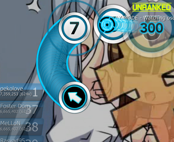
)One suggestion: make the 100s and 50s different colors from 300. Right now it's really difficult to tell how well I'm hitting because I usually rely on different colors to tell when I'm not getting 300s; it's too hard to read the 100 at a glance while playing.
I'll probably just edit the colors myself if you decide not to do it
I'll probably just edit the colors myself if you decide not to do it
I actually already did edit it. Ended up leaving 300 alone, 100 is yellow, 50 is red, Miss is purple.
Red looked the worst, and i see 50 the least, so yeah.
Also, xiao, you realize the taiko mod icon isn't used anymore right?
Red looked the worst, and i see 50 the least, so yeah.
Also, xiao, you realize the taiko mod icon isn't used anymore right?
Topic Starter
Huh. I exported it using Audacity, but I can't seem to open the menuclick file either.
I can recolour it for you. I originally planned to recolour it just as all other skins do (because when you're playing, colour identification is the fastest way to know what you hit). The only reason I went against it was for aesthetic purposes. I'll recolour it in a few moments; perhaps I'll use Cyclone's colouring system.
Also yeah, I noticed. I just skin it because it's in the folder.
edit: here http://puu.sh/32zX
I decided to use the normal colours because I'm used to them lol
Quick suggestion. You should probably edit any "invisible" elements down to 1 by 1. Sorry for the small, nearly pointless request.
~Edit~
Oh yeah, I forgot. The blue slider border looks kind of odd with the combo colors. Maybe you could color the track blue to match? Or at least make the border black to match with the hitcircles.
~Edit~
Oh yeah, I forgot. The blue slider border looks kind of odd with the combo colors. Maybe you could color the track blue to match? Or at least make the border black to match with the hitcircles.
OMG!! It's absolutely AMAZING!! Xiaounlimited, thanks for your work =)
Nice skin, plays well. Personally like the UI more than anything else. Looks like hticircles drew inspiration from Contease skin
Spinner is a bit wobbly..could probably fix that
Spinner is a bit wobbly..could probably fix that
Topic Starter
I do realize I should have edited them to a 1x1 file but the space saved is so minimal there's virtually no point in me going back to fix it. As for the track colours, everything is editable to a player's preference in the .ini file. I liked the tracks cyan; if you like them black, by all means change it. I thought it made it look very flat so I didn't go with black.theMikeAG wrote:
Quick suggestion. You should probably edit any "invisible" elements down to 1 by 1. Sorry for the small, nearly pointless request.
~Edit~
Oh yeah, I forgot. The blue slider border looks kind of odd with the combo colors. Maybe you could color the track blue to match? Or at least make the border black to match with the hitcircles.
The spinner is 1px off centre. Others and myself ended up finding it quite psychadelic so I left it as is. I also don't know what the skin you mention is but I'll be sure to look it up.Xact wrote:
Nice skin, plays well. Personally like the UI more than anything else. Looks like hticircles drew inspiration from Contease skin
Spinner is a bit wobbly..could probably fix that
Again, thank you for all the comments.
This skin looks amazing! Although I still might prefer XI for the simplicity of it (not as many colors).
Nice skin <3 I'm using it.
Another suggestions to perfect your skin.
1/ I find the reversearrows odd. The colours used to fill them are too... sharp with the rest of the skin during a play (a perfect white and perfect black).
What I would suggest is to use the same gradation used for your default numbers, i.e. 48-48-48 on the top and 0-0-0 on the bottom of the circle.
So instead of having the first reversearrow, you would have the second one, softer for the eye:

Of course this is only valid for the white note add-on. For the default skin with the white reverse arrow, you would use the same logic, with inverted colours: 255-255-255 and 207-207-207.
2/ Why not put some colours to your ranks? Like you did with your score star recolour add-on and with the red letter D, the ranks X, S, A, B, C would be far more easily recognizable if there was some colour to highlight them (AFAIAC I first check the colour to know my rank, not the letter). X and S in gold, A in green, B in dark blue and C in purple? For SH and XH, I don't know.
These are only suggestions of course.
1/ I find the reversearrows odd. The colours used to fill them are too... sharp with the rest of the skin during a play (a perfect white and perfect black).
What I would suggest is to use the same gradation used for your default numbers, i.e. 48-48-48 on the top and 0-0-0 on the bottom of the circle.
So instead of having the first reversearrow, you would have the second one, softer for the eye:
Of course this is only valid for the white note add-on. For the default skin with the white reverse arrow, you would use the same logic, with inverted colours: 255-255-255 and 207-207-207.
2/ Why not put some colours to your ranks? Like you did with your score star recolour add-on and with the red letter D, the ranks X, S, A, B, C would be far more easily recognizable if there was some colour to highlight them (AFAIAC I first check the colour to know my rank, not the letter). X and S in gold, A in green, B in dark blue and C in purple? For SH and XH, I don't know.
These are only suggestions of course.
Ahhh, heaven for the eyes.
This is amazing work, sir/miss
This is amazing work, sir/miss
Topic Starter
I originally did that, but I wanted the arrows to purposely look odd. I personally have a grudge against reverse arrows (I break on them far too often), so to combat that I made it as jarring as possible. The gradient is a non-issue, IMO.XPJ38 wrote:
1/ I find the reversearrows odd... etc
2/ Why not put some colours to your ranks? Like you did with your score star recolour add-on and with the red letter D, the ranks X, S, A, B, C would be far more easily recognizable if there was some colour to highlight them (AFAIAC I first check the colour to know my rank, not the letter). X and S in gold, A in green, B in dark blue and C in purple? For SH and XH, I don't know.I just used traditional osu! colours: http://puu.sh/3llr
★ S A B C D
SH and XH are both white
Ok np.Xiaounlimited wrote:
I originally did that, but I wanted the arrows to purposely look odd. I personally have a grudge against reverse arrows (I break on them far too often), so to combat that I made it as jarring as possible. The gradient is a non-issue, IMO.XPJ38 wrote:
1/ I find the reversearrows odd... etc
NiceXiaounlimited wrote:
2/ Why not put some colours to your ranks? Like you did with your score star recolour add-on and with the red letter D, the ranks X, S, A, B, C would be far more easily recognizable if there was some colour to highlight them (AFAIAC I first check the colour to know my rank, not the letter). X and S in gold, A in green, B in dark blue and C in purple? For SH and XH, I don't know.I just used traditional osu! colours: http://puu.sh/3llr
★ S A B C D
SH and XH are both white
this shit is awesome.
Hi Xiaounlimited
When I first used your Xi-Style skin a couple of years ago, I was hooked. Over time I tweaked it (Replacing the numbers and the sectionpass audio) but I loved the skin none-the-less.
Nexus... WOW. You did a absolutely AMAZING job on this. Really loving the voices for the countdown and has that...coolness imo.
Well done. Here is to more great skins from you in the future
"The best of the best"! I love it too, 'cos it is not burn my eyes and i can play with it.
I usually take the osu default skin... but this is AMAZING O_O holy sh*t this is Awesome!